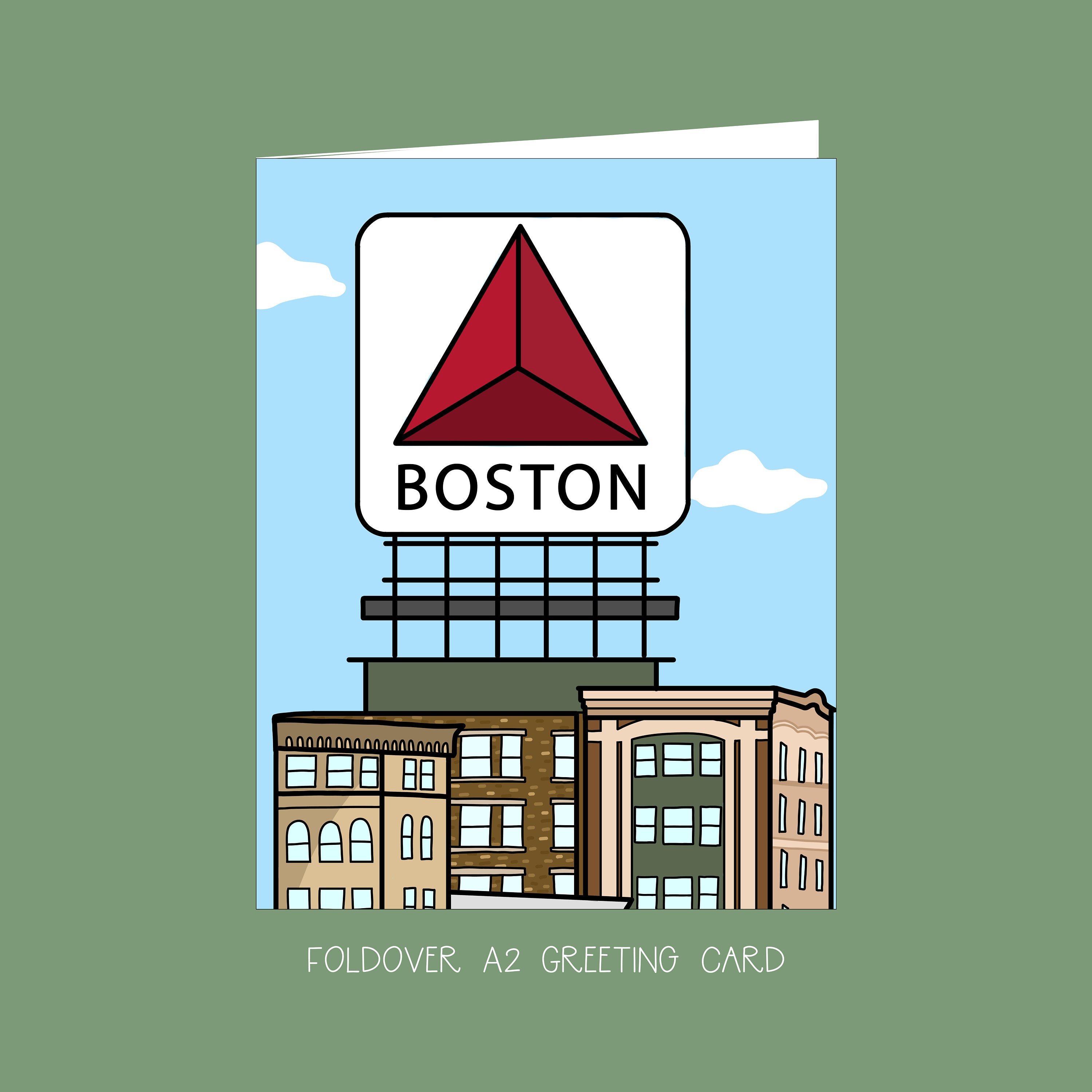
Citgo Sign

i bumped it cuz there was an extended, off-topic discussion (bedlam) about the Citgo sign going on the other thread - and rather than asking the parties involved to get a room, i thought i'd be extra polite by bumping the appropriate thread (subtle hint) and even throw in a Boston supertall as a bonus....

I've been thinking they should update the sign to be a full jumbotron to display different ads and public service announcements as well as the citgo sign. Maybe some artistic displays thrown in. Display the old citgo sign 25% of the time to throw a bone to the purists.

i had also a similar thought.

except, a near as makes no difference 900' skyscraper with 'Citgo' flashing on the middle floors from multiple sides, and then, put up an asston more neon, HD Billboards, and public messages on all the corners and new buildings. i believe there's a lot of room for compromise in preserving the Citgo Sign.
 
i'll swap it for an 875' Boston Supertall.

public service announcement.

Jacoby Brissett out with torn ligament on his thumb (throwing hand).

i bumped it cuz there was an extended, off-topic discussion (bedlam) about the Citgo sign going on the other thread - and rather than asking the parties involved to get a room, i thought i'd be extra polite by bumping the appropriate thread (subtle hint) and even throw in a Boston supertall as a bonus....


i had also a similar thought.

except, a near as makes no difference 900' skyscraper with 'Citgo' flashing on the middle floors from multiple sides, and then, put up an asston more neon, HD Billboards, and public messages on all the corners and new buildings. i believe there's a lot of room for compromise in preserving the Citgo Sign.

omg dude... lay off it with the tall buildings thing... some people live in this city and try to enjoy it without an obsession over height. trade the sign for some tall building, another bland addition with corporate, soulless retail at the base? let's just bulldoze kenmore and make it look like kendall, in that case. kenmore could be a lot more urban and have a lot more neon without changing anything about the buildings the citgo sits atop of. try addressing the buckminster building and get BU to allow some life to be breathed into the buildings between comm and beacon instead. a pair of flatiron buildings in those locations with bars and restaurants at ground level and neon signs above would totally revive kenmore much better than some masturbatory tower.

the sign is an icon. why? not because of the red sox, but because it's visible, and it's something everyone who actually lives in boston and grew up here is used to seeing, and many of us like it. not to mention that good old neon is a thing of the past and hard to come by these days. to those who talk about it symbolizing communism, corporations, or sports teams they dont care about: gimme a fucking break and loosen up. the sign is loved because of the sign itself. it's got nothing to do with anything else, other than the white square with an orange triangle. it's not a symbol of boston, but it's a symbol of kenmore square and wayfinding icon, a beacon, and kenmore would be dead without it.


I don't mind the Citgo sign per se, I just hate that it is becoming (has become?) the de facto symbol of Boston.

The Statue of Liberty
The Arch
The Space Needle
The Liberty Bell
The Golden Gate Bridge
...
The Citgo Sign

it is not the de facto symbol of boston. just because some postcards you can buy in a store show it means nothing, no matter how hard the shallow, cheesy would-be marketers of images in this day and age try. boston doesn't have an icon. another reason it's so great. if anything, the icon of boston is the view from the longfellow bridge looking at the basin with the pru and hancock in the background and sailboats a-plenty... or the common & public garden... possibly the state house or quincy market. this is an understated city that does not have massive or monumental symbols. nothing wrong with having those, but im fine without one. i like the sign not as a symbol of the city known to those outside of boston, but as a symbol of a part of the city known mostly to those who live here.
 
It has LED lights now.
Yeah, and as nostalgic as I can be about it, it just isn't the same. It's a disneyland version of the old neon sign that I can only really enjoy at a glance. If I spend too much time watching the lights, I miss the more vibrant color of neon and old light patterns.

Kenmore Square is long gone; like the Rat and it won't ever be coming back. I could stop for a drink, but I'll just keep moving along...

Disagree. Yes, Im aware that it is now LED... and I wasnt very young when the conversion happened. It still looks fantastic.

What Kenmore now lacks is a decent bar. So - as I just said - build up the Beacon and Comm arms and add some. Itll never be IHOP and Rat but it'll be better than it is now. Kenmore is the nexus for me, growing up in Brookline... it's a great square, even now.
 
Boston Landmarks Commission: Go Go Citgo!

A draft report being drawn up by the Boston Landmarks Commission would restrict any new owner’s ability to make drastic changes to the shape or views of the iconic sign, which sits above a building that Boston University is selling to development firm Related Beal.

They’re still determining how high the sign — which now sits atop a six-story building — might be allowed to go should the new owners want to build taller.

http://www.bostonglobe.com/business...y-protected/Y6eOG6KVO17LixpFTc6rwO/story.html
 
If this somehow saves the building the sign sits on, I'm all for it.

I just hope they don't tear down the current building and incorporate the sign into some alucobond-clad nightmare.
 
I vote no preservation, but rather setting aside Kenmore to be like Times Sq--always fully "of the moment"; forever neon-y and ephemeral. We wouldn't care what the buildings looked like or what era because they'd be wrapped in ads. There's a role for that in urbanism too. It'd be just as cool to be able to date Red Sox photos from ads in the background.
 
^^ agreed. additionally, considering the college neighborhood/club context.
Others have suggested this. i think it's a good, no make that great idea.
 

Back
Top