Motor Mart Tower | 201 Stuart Str. | Park Sq | Boston

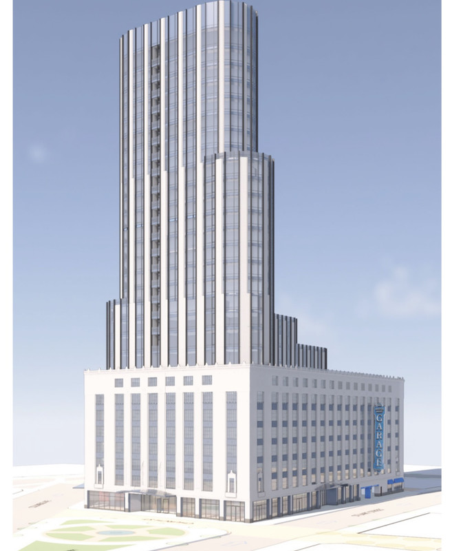
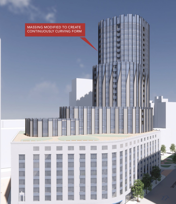
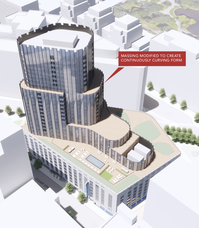
BCDC presentation - cut 60' off, but it wasn't that tall to begin with, so no big loss.

That's some very archboston logic right there - well stated.

(i.e. ordinary logic would say that 60ft is a larger percentage of a smallerbuilding - so the shorter it was to begin with the greater the loss. AB logic says show me the supertall).
 
The garage already has an active street presence so this is not a big upgrade for the area beyond the density.

I like the design and I think it should be built. A bit taller would have been nice, but if the shadow laws prevent it then so be it.
 
Needs a small aluminium spire surmounted by giant flagpole in one corner for sinister headquarters look.
 
Is this supposed to be an "homage" to The Castle down the street? Another flop from CBT. Awkward, incoherent, odd.
 
Needs a small aluminium spire surmounted by giant flagpole in one corner for sinister headquarters look.

astute.


i loved their ugly proposal formally known as Columbus Ctr.

i wish this ugly thing was approved for 420'.

/
 
Last edited:
Looks almost like the Trump Tower in Chicago!
 
Two thoughts: I like the lobby on Church Street and I wish we had a better statue of Abe Lincoln
 
Jeez, you guys are pretty sour on this one. I think it is ok. It doesn't have to be tall to work. Short with curved corners can come out well. Look at the Forte Condos in Brooklyn:

forte-brooklyn-ny-building-photo.jpg
 
Is this supposed to be an "homage" to The Castle down the street? Another flop from CBT. Awkward, incoherent, odd.

I think the curved lines play very nicely in this location, playing off of the Park Plaza Building and the Liberty Mutual Building.

It make a statement while playing nice with the neighbors.
 
Wow, it seems a bit "busy" - set backs, curves, recessed balconies, looks like some terracotta panels, etc.

Am I just part of the unwashed masses or can someone explain this aesthetic to me?
 
To me this alternate is by far the best version. The base is all vertical lines of limestone with glass inbetween so I like that continued to the tower. Its simple but elegant. I think understated mates up with the base the best. Especially when the up close renders show the detailing in the panels matching the garage when youre close enough to the tower to see.


“Simplified and extended”
https://postimages.org/
 
Last edited:
I like "extended" best, but they're all nice little towers

I like it a lot too.

“Extended”


“Simplified” is trash imo


I think “simplified and extended” and “extended” are both MUCH better than what they have proposed now.

I think I agree with Suffolk and like “extended” better now just cuz the diagonal cuts at the top of the tower create a pretty striking crown. The longer vertical lines make it seem taller too imo.
 
Last edited:
The way the diagonal cuts create a badass crown on that version vs an awkward transition midway up the tower is a billion times better.
 
No renders from 93S or the river ?
 
One thing I would like to commend the architects on is the amount of eye-level renders they have continued to include with every iteration. While it's still a small amount, it's more relative to recent projects with mostly strange aerial views/perspectives that nobody will ever see.

EDIT: I should add that I also appreciate the bird's eye views and unlikely perspectives to better understand the details/aesthetics. I just appreciate when they include how the average person on the street will see it.
 

Back
Top