It is very frustrating watching the Seaport develop so badly when there were so many existing models to learn from -- and not even overseas, but right here, locally.
^^ If that is true why do [the BSA's] members continue to design these horrible buildings?
ablarc, are there any recent examples of ... development that have applied these principles from scratch? I can think of infill projects around the world, but not a literal neighborhood built from the ground up that has successfully done so.
Problem is: lack of will.
We'll do it when we stop wringing our hands over the myriad reasons we
can't --and all the nattering theories that tell us we
shouldn't.
Architects refuse to do it because they've been trained otherwise. They're impaled on century-old theories of modernism, zeitgeist, historical inevitability...
Bauhaus, Esprit Nouveau, Functionalism and all that crap.
I bet they're still teaching it: hundred-year-old bones rattling in a bag. We even see a little of this tired, depleted wisdom regurgitated right here on this forum --exactly as though it were red hot and avant-garde.
Developers, politicians and their agencies don't trust fine-grained development; they only know the blockbuster road to big bucks. So they're not sure they can make money incrementally. Nothing ventured...
But where there's a will there's a way. Here's evidence, a recent development built from scratch in the western suburbs of Paris:
All nice and new, and the stucco is clean. Give it time and you'll think it's been there for centuries.
This is Krier-esque urban design: you just do it the way you know it will work --because it worked way back when we last built places for people on foot-- and you don't apologize that it looks familiar. You do, however, hunker down and await the tsunami of condemnation from professionals, critics, theoreticians, greybeard sages and young turks.
You can forgive the greybeards, but young turks should know the way back to the future.
"Disney!" they snicker, and then they moan, "kitsch."
"It's retro," and, "No one should be doing this these days" --exactly as though something had changed people.
It resembles how things looked when architecture and planning last made sense ...but what did you expect? Build upside down to express our topsy-turvy times? Or maybe crooked, leaky and expensive like Gehry the Modern?
Lately in the suburbs of Paris, they're also doing Haussmann (though not too well):
"Suburban" Paris (some suburb, huh?); nearly every building in this pic is new:
La Defense in background.
Has it occurred to the proponents of endless novelty that in any field the most effective solutions come first, and time's subsequent brainstorms bring diminishing returns? At some point, wholesale revolution has got to mean throwing out more baby than bathwater.
* * *
Saddled with revolutionary Modernism's puritan strictures and academic rules, it's not just architects who can't get things right; the public, planners and developers are equally at sea. When developers or public plump for something "imaginative" it often comes out like this, also from the suburbs of Paris:
It's clear from this that architects share with laymen the impotence that comes with seeing urban design in terms of style. People don't stay interested in places like this. Once you've seen it, you've no further desire to return. How many folks who live in Orlando visit Epcot regularly?
Or how about this jewel of retro-kitsch, also from Paris' richly-endowed suburbia:
Can you see the reliance on style? The architect has bought into the public's naive notion that it's "traditional" building style that conveys virtue in the built environment. But no amount of stage-set stylistics can conceal the barefaced truth that this is a suburban shopping center in an ocean of parking. The fundamentals are wholly suburban, and it's the fundamentals that matter. Style is utterly trivial by comparison --whether it's "traditional," regional (as in "Boston style") or fashionably trendy ("of our time"). Pshaw. Folks cling to such nostrums because they can't see the real issues.
Here's yet another Parisian suburb. Some would call it traditional, and it may be. The important thing is that it gets the fundamentals dead right (and you don't even need trees):
Look, they even let you park where naive theoreticians would put a sidewalk. Where the pedestrian is king, there's so little traffic --and what there is is so slow-- that people safely walk in the street. Much of Rome is like that, and Perugia, Senlis, Salzburg, Bellagio, Lindau, the mews of South Kensington, Barcelona's Bari Gotic, York, Poundbury, Carmel and Seaside. Do you always stick to the sidewalk on Salem Street or Cedar Lane Way or in Bay Village?
You just know there's a little store around the corner, and folks walk to it. They encounter their neighbors and they hear the gossip. On weekday mornings they drive to --or are dropped off at-- the RER station for the morning commute.
Go back to the first photo in this post: what's significant and good about it is that it gets all the fundamentals right. Style is utterly irrelevant to that --
unless it gets in the way of the fundamentals, which Modernism generally does.
This is because the urban design fundamentals of Modernism are themselves wrong; they bring you tedious gigantism and muddled symbolic order. (The style may also be a hindrance, but chiefly because it grows from first principles that are bad.)
Among its bad first principles, Modernism says a building is an object surrounded by space. In a city, however, space is surrounded by buildings.
If a building's surrounded by space it's an invitation to read it as a monument. Old and New State House, Faneuil Hall, the Custom House, City Hall, Trinity Church, the BPL, and (yes!) even the Copley Plaza all act like monuments. (Though some also define space --not required of a monument.)
All buildings that surround Post Office Square know the distinction between monument and infill. That's why we find that space so coherent and satisfying. It's not muddled spatially or symbolically. The two free-standing buildings --the Telephone Company and the Post Office-- function as monuments, and their massing reinforces that reading --as they aspire to the sky, not just streetwall.
You could argue the telephone company doesn't merit a monument, but for Ma Bell it works just fine. By contrast, you could say Symphony Hall lacks needed monumentality of placement (and maybe also treatment). A modernist building like Marriott Long Wharf is untroubled by the distinction; it simply snorts and farts itself upon the scene: a rump monument. Likewise Harbor Towers and its garage: free-standing, surrounded by space, look at me... what's to see?
Most Modernist buildings trash our cities functionally and visually by striving to be both free-standing and vast; a huge footprint yields both. Look at the footprints at the Seaport or NorthPoint or Kendall Square.
Visiting Manhattan, Corbusier remarked: "the skyscrapers are too small and too close together." As a cure, he gave us the the tower in the park, which is neither a monument nor urban --but alas it's become the paradigm and ruin of many a North American city. Make it big, and put plenty of space around it so you can see just how big it is. But what is to become of the pedestrian in the wide-open spaces? Oh... he can get in his car and zoom around Brasilia, admiring the sculptural buildings.
A Modernist idea is that a building is abstract sculpture. A sculpture stands free in space and relies on its form for effect, so its shape should be articulated and exhibitionistic, and space should be encouraged to flow over and through the building as you glide by in your Escalade.
Art historians call this open form. City Hall is an example; so is the Federal Reserve Building and the Hurley --and just check out the tinker-toy Haymarket end of City Hall Garage.
Modernism says a new building should look different from its surroundings; that's how it stands out as new. Occasionally this works, as in the Hancock Building, but mostly it's a formula for chaos. It's one of the many reasons folks hate works of Rudolph and will hate buildings by Thom Mayne and Stephen Holl after the newness wears off.
Though Modernism as a style has been somewhat tempered by Postmodernism, its false principles are now enshrined in government policy and even law. The BRA will give you an FAR bonus if you assemble a large building site. It would make more sense to give the bonus to someone willing to tackle the inefficiency of building on a small lot.
Streets are designed too wide, plazas too big.
Modernist buildings rely on their entire form to be ornamental; thus they have to be made of big, unadorned parts, which yields a gigantism of scale (Boston Public Library addition by Johnson); the pre-modern preference is to adorn a box (Boston Public Library by McKim). Compare the size of the arches on these two buildings. Compare their scale; the old building seems delicate beside its elephantine extension. One is clearly overbearing, even (dare one say?) oppressive --and yet the two have identical footprints and volume.
Free-standing buildings in infinite space is an idea you see everywhere in the American suburb with its legally-mandated setbacks, but it also appears far too often in our cities. You can see it at the Seaport.
Being a free-standing sculpture, a Modernist building insists on four elevations; an urban building, such as a South End row house, generally makes do with two --one of which is never seen by the public. A real urban building --being attached-- collaborates with its fellows to define a mutual space.
The quality of an urban building is in its relationships, not in its objecthood. As long as we discuss mostly the latter, we'll miss the point, which is that you can't make a city out of free-standing sculptural monuments.
But you
can make a suburb. (In fact the suburb requires you to do this, and makes sure with laws.) Setbacks and buffers are the universal hallmark of the suburban condition, which is all about separation. The city is all about togetherness.
The local architecture school I attended taught Modernist nonsense as urban design truth --and it probably still does today; profs brainwashed by their own teachers. At age ten I spent a delirious five weeks roaming solo through the subways and alleys of Paris. After that, I didn't believe anything architecture professors told me about cities; it was plainly nonsense.
The nonsense:
1. novel and different is the only way to be
2. a building is occupied sculpture surrounded by space
3. ornament is criminal unless disguised as something functional
4. bigger is better because it expresses the new technology
5. a building and a city should be zoned by use
6. all the above is an outgrowth of the historical imperative of modern times.
^ Bathwater.
* * *
Used to high-density banlieues, a Parisian would see Boston's Seaport as an inner suburb. Here's Saint-Mand?, an inner "suburb" of Paris that looks urban to most Americans. This is because it
is urban; buildings define space, they don't merely sit in it sculpturally:
Allston should look like this.
The further-out Paris suburb of Antony:
Tinker a bit with the zoning and Newton Center could turn out like this.
Or how about this as Roxbury (or Belmont?):
And could this be Harvard Street in Allston?:
St-Denis, a Metro-suburb with a new light rail line.
At remoter commuting distance, Paris' suburbs resemble the American model. Some even come with golf:
There be parking lots, both oceanically asphalt (back there with the tents) and lushly landscaped to near-invisibility. A type of French parking lot consists of closely-spaced trees growing out of a field of river gravel. You park between the trees, and when the cars are gone there's no parking lot:
Transferred to Suburbia's sprawl, the produce market of Rungis, which replaced Les Halles as the belly of Paris:
Clearly the workers arrive by train, and so does some of the produce.
Thanks to brisavoine at SSC for Paris suburb pics.
* * *
If you discard Modernist
planning theory while applying the Modernist
style to a sound pre-modern building type, the outcome can be OK. Here are Modernist-style townhouses being built in Berlin. They'll be OK --though not quite as good as if they were neo-classical like the ones they built 140 years ago in the South End:
Berlin keeps getting rebuilt. The latest wave attempts to correct the depradations of Commie-era blockbusters: too-big footprints and too-big spaces --the gigantism you'll find in Boston's Seaport.
Much new construction in Berlin emphasizes small building footprints...
...and the varied design that comes from separate buildings:
The result entertains pedestrians with frequent change:
Small increments:
And yet the developers aren't walking away:
Just about exactly the size and height of Fort Point's structures, each one of these buildings has two fire stairs and some elevators. If you combined all their footprints into one blockbuster, you'd still have two fire stairs and some elevators. Construction costs in Germany are higher than here and yet ... and yet ... the developers aren't going broke.
Lesson: if you make the rules to favor the public environment and somewhat reduce building efficiency (read "profit"), the developers will play anyway. They will grumble, but they will play.
And they will still be rich as Croesus.
If they can survive the public review process, they can survive anything. And if you think about it, public review might get short and sweet if developers didn't propose such lumbering blobs. NIMBYs may think it's the height they hate so much, but they're just wrong --as they are about so much else; they don't know their own minds.
So we mostly get massing by amateurs --and clueless amateurs to boot.
The current Berlin paradigm has much potential Boston applicability:
Just look at that harmonious lineup of midsize pieces; Boylston Street should look like that, but at, say, ten stories. In the foreground, where building footprints get bigger, you can see the scale getting coarse:
The Commies' too-big boulevards and spaces get whittled down by fine-grained infill:
Before.
After.
The Seaport could use some fine-grain like this. Now.
Sometimes big-footprint Modernism intrudes, disrupting landscape and scale (even if it
is green):
Maybe a little such rudeness, if contained, is actually OK.
Brand-new and old-timey:
Thanks to beta29 at SSC for Berlin pics.
* * *
The world's biggest city consists mostly of newish small footprints:
The result is very urban and full of interest that comes from variety and event --thousands of small buildings, not hundreds of big ones:
Two shores with two approaches. Left Bank does it much better than the Right.
* * *
New seaport development? We tend to forget this one because it seems so ... American:
And yet Boston's Seaport could learn some lessons from Canary Wharf:
See? It has nothing to do with style.
It has everything to do with relationships.
Juxtapositions.
Here's a familiar animal we've seen several times --some place pretending to be Paris. In this case, it's London:
Merci, M. Haussmann.
Or London being London:
Boston also does a pretty good job of being London, it's often remarked.
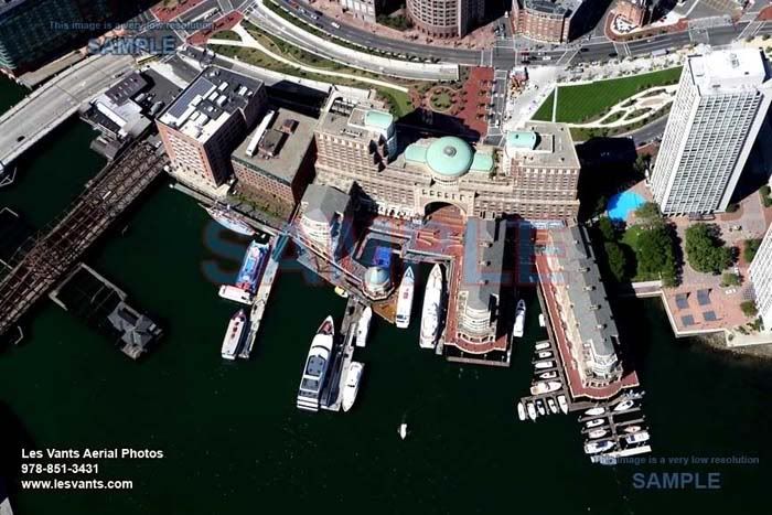
Seaport could have places like this:
Then Rowe's Wharf wouldn't be so lonely.
Or we could rethink the water's edge entirely and pray for no tsunamis:
Intimate urban space:
* * *
A street in Madrid:
A street in Rome:
Doesn't even have a sidewalk.
The buildings on the street in Madrid are awfully nice. They have a lot of style. But honestly I prefer the street in Rome because it's the right width for me on foot. It doesn't have three engineered lanes of traffic, a parking lane, and two sidewalks, and it doesn't bother me that its buildings are almost void of styling. If I lived here I'd be a true inhabitant of this place. I'd know my neighbors and they'd know me. I'd come out to admire their new scooter, know when they staggered home drunk, and commiserate with their relatives when they died.
* * *
P.S.
Does the Seaport have one of these?
Or one of these?


") ):
):