Here’s looking at you, Charleston…In other cities (e.g., New York) the particulars of architectural proposals are discussed and iterated and picked over by design professionals almost to a fault, but we're never going to get that under this team.

You are using an out of date browser. It may not display this or other websites correctly.
You should upgrade or use an alternative browser.
You should upgrade or use an alternative browser.
North End Piazza on The Greenway | 198 Hanover Street | North End
- Thread starter goldenretrievers
- Start date
stevebikes
Active Member
- Joined
- May 14, 2013
- Messages
- 315
- Reaction score
- 248
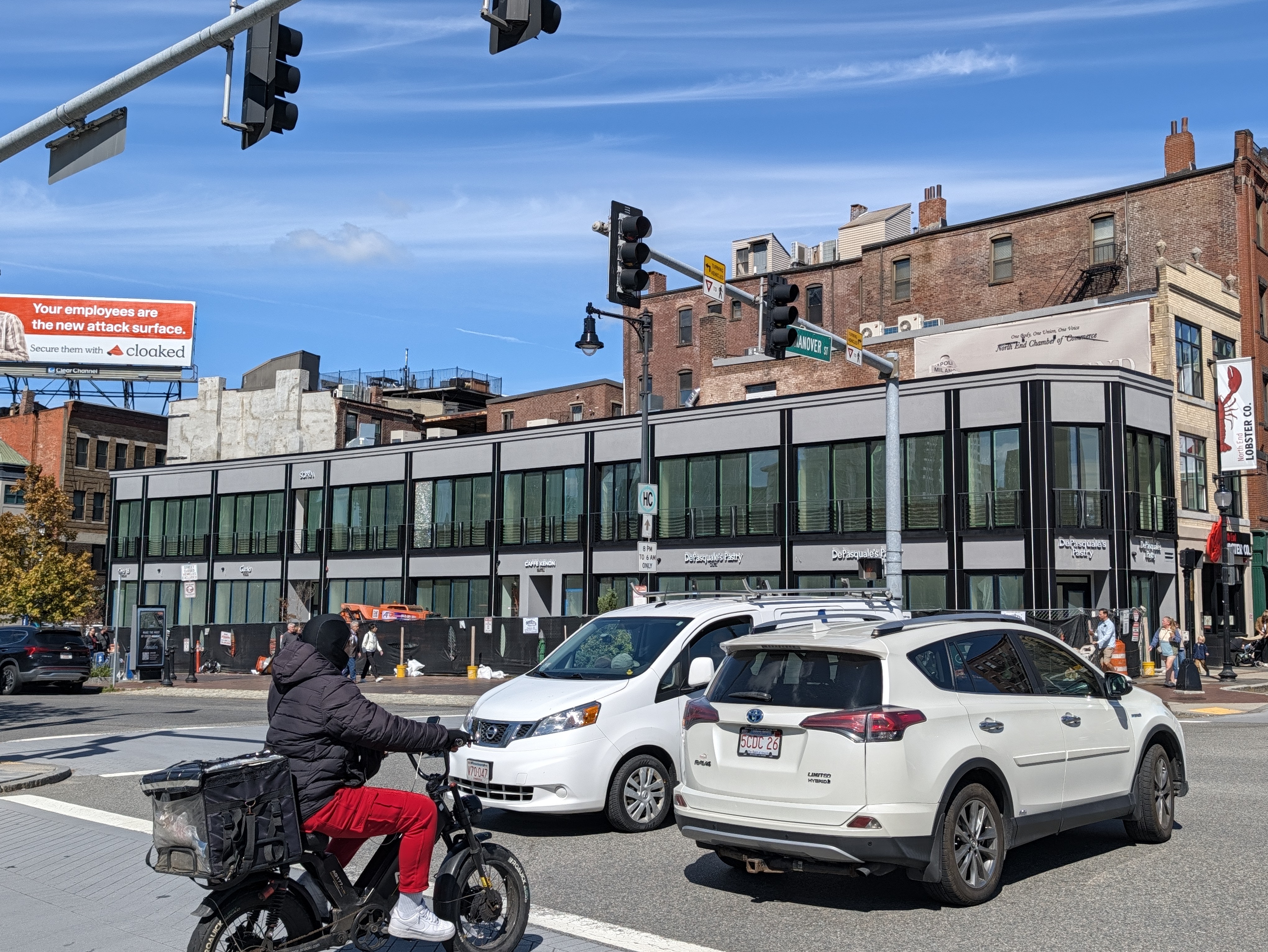
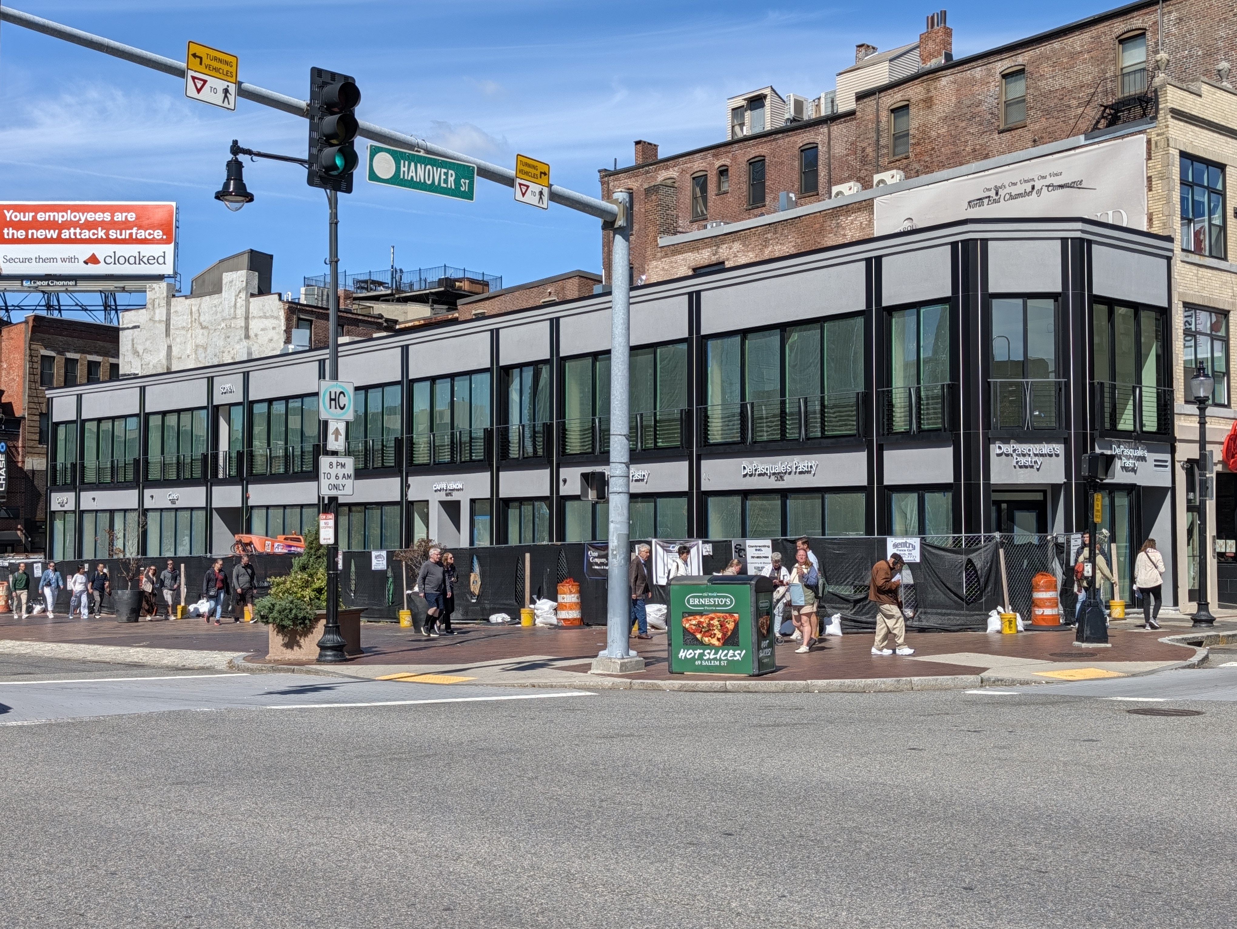
Shop names up.

stick n move
Superstar
- Joined
- Oct 14, 2009
- Messages
- 13,922
- Reaction score
- 26,450
Damn thats unfortunate. Should have added some colorful signs to liven it up a bit imo.
RandomWalk
Senior Member
- Joined
- Feb 2, 2014
- Messages
- 3,991
- Reaction score
- 7,617
The shattered window is fitting.

MjolnirMan
Active Member
- Joined
- Jan 18, 2016
- Messages
- 319
- Reaction score
- 711
What, you're saying that you liked it better before?!
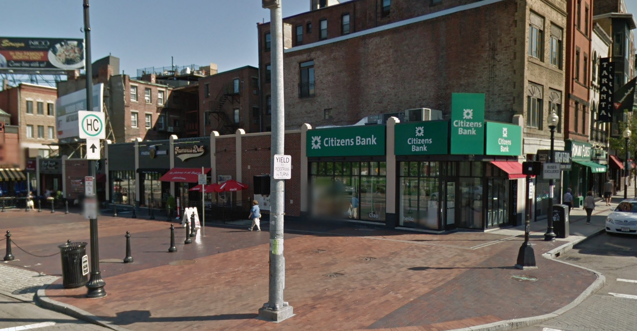
It had problems, so you can't complain about the new version. Plus, technically, it IS a piazza (kind of):
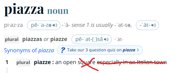
(Joking, it's terrible and arguably worse than nothing. Just injecting some Copley Square or City Hall Plaza renovation rhetoric.)
It had problems, so you can't complain about the new version. Plus, technically, it IS a piazza (kind of):
(Joking, it's terrible and arguably worse than nothing. Just injecting some Copley Square or City Hall Plaza renovation rhetoric.)
JeffDowntown
Senior Member
- Joined
- May 28, 2007
- Messages
- 5,108
- Reaction score
- 4,399
Maybe that is actually the essence of the problem. Multiple design committees.Sadly it is appropriate for our current Millennial gray era. What's most shocking is that this went before multiple design committees.
stick n move
Superstar
- Joined
- Oct 14, 2009
- Messages
- 13,922
- Reaction score
- 26,450
He actually did a correction video, Ill have to read more into article 80 when I get home I wasnt aware of this if its true. I dont think thats why it looks like crap though, I think thats just cheaping out.
stick n move
Superstar
- Joined
- Oct 14, 2009
- Messages
- 13,922
- Reaction score
- 26,450
Some more pics as well

HBH
Senior Member
- Joined
- Apr 17, 2018
- Messages
- 1,566
- Reaction score
- 4,761
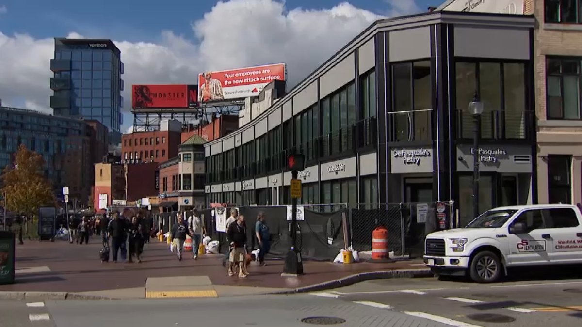
New ‘gateway' to North End divides public: ‘Beautiful' or ‘assault to the eyes?'
The historic Boston neighborhood has a specific character, but does the redevelopment between Hanover Street and Salem Street fit it? We asked around.
 www.nbcboston.com
Boston City Councilor-at-Large Erin Murphy said projects of this scale involve can be risky investments.
"In many ways, they're taking a risk," Murphy said, adding that they are "making the neighborhood better."
Murphy also expressed confidence in DePasquale.
"I think we should just trust him and trust that he's going to do right by the neighborhood, cause he always does," she said.
Is this the same Erin Murphy who opposed Plan: Downtown because tall buildings don't fit with the 'historic neighborhood' and regularly opposes new housing for similar reasons but supports this mess? Odd
I'm not sure of Boston's specific language, but typically any time you are working with Historic districts (typically I have seen it in renovations though) new construction should be "definitively different". That is certainly vague language as the goal is not to force a certain design on to projects, but rather set up one parameter that needs to be met.
An example I'll use is a hotel project in downtown Nashville that abuts the Honky Tonks of Lower Broadway. The building within the historic district was an old record storage building. The design committees said the new addition needed to have a different identity than the original, so the finished product was a facade that is meant to emulate the audio levels on a mixing board. Not perfect, does a reasonable job when working with the parameters.
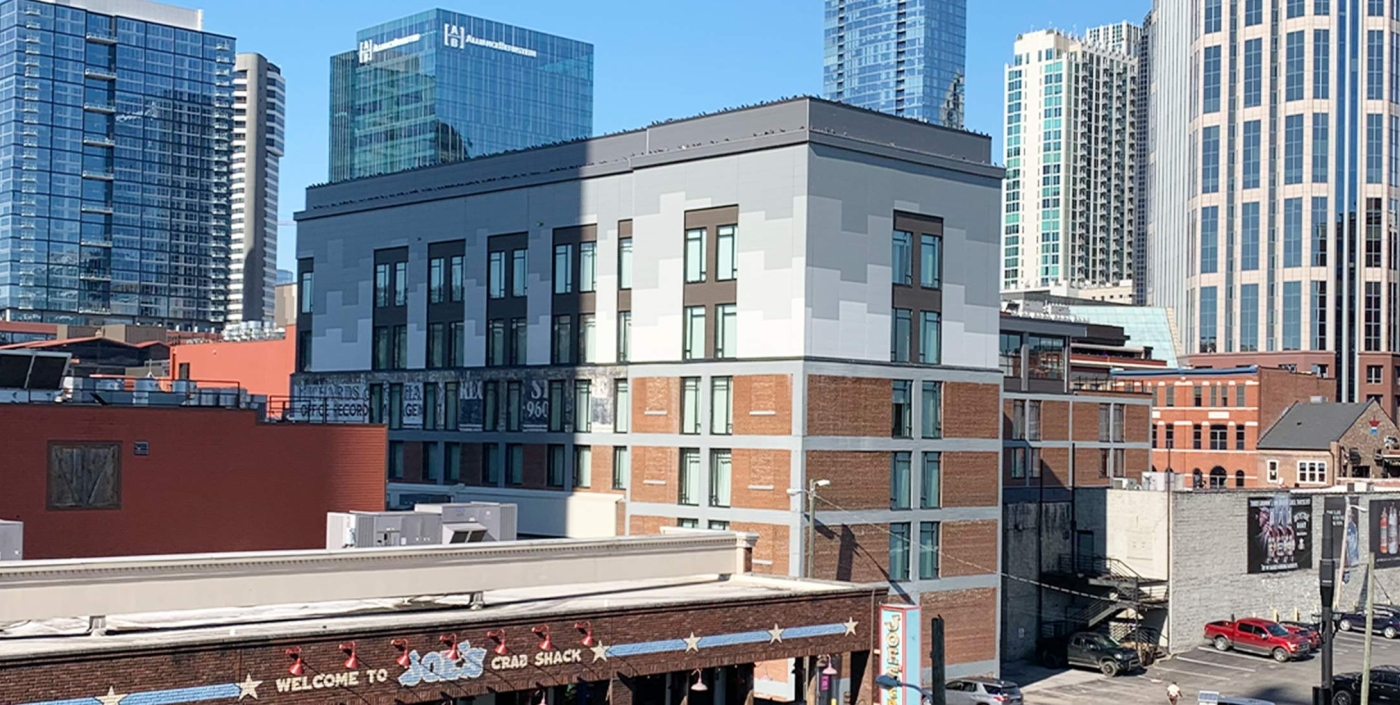
This project is ugly! The material choice (lick and stick stone base + panel and bad metal(?) above). The rhythm of the facade. The overall massing. Everything feels wrong. I agree that while going through multiple committees is a hurdle, there were so many decisions along the way that the developer could have done differently to improve this project. The city should shoulder some of the blame for the level of bureaucracy it has created for development projects, but I still put majority of blame on the developer for this monstrosity.
An example I'll use is a hotel project in downtown Nashville that abuts the Honky Tonks of Lower Broadway. The building within the historic district was an old record storage building. The design committees said the new addition needed to have a different identity than the original, so the finished product was a facade that is meant to emulate the audio levels on a mixing board. Not perfect, does a reasonable job when working with the parameters.
This project is ugly! The material choice (lick and stick stone base + panel and bad metal(?) above). The rhythm of the facade. The overall massing. Everything feels wrong. I agree that while going through multiple committees is a hurdle, there were so many decisions along the way that the developer could have done differently to improve this project. The city should shoulder some of the blame for the level of bureaucracy it has created for development projects, but I still put majority of blame on the developer for this monstrosity.
stick n move
Superstar
- Joined
- Oct 14, 2009
- Messages
- 13,922
- Reaction score
- 26,450
Ppl really dont like this thing lol

 www.facebook.com
5.1K views · 27 reactions | The historic Boston neighborhood has a specific character, but does the redevelopment between Hanover Street and Salem Street fit it? We asked around. | NBC10 Boston
The historic Boston neighborhood has a specific character, but does the redevelopment between Hanover Street and Salem Street fit it? We asked around.
www.facebook.com

Charlie_mta
Senior Member
- Joined
- Jul 15, 2006
- Messages
- 5,297
- Reaction score
- 8,108
What was there before had some color, variety, and some nice details, all of which the new building totally lacks.Just having any color at all would go such a long way towards its appearance.
Unless Frank is going to surprise us with a mini Trevi Fountain, this is a colossal failure for a "piazza" that was pretty hyped up. Also, this reeks of the Sephora building down the street.
stick n move
Superstar
- Joined
- Oct 14, 2009
- Messages
- 13,922
- Reaction score
- 26,450
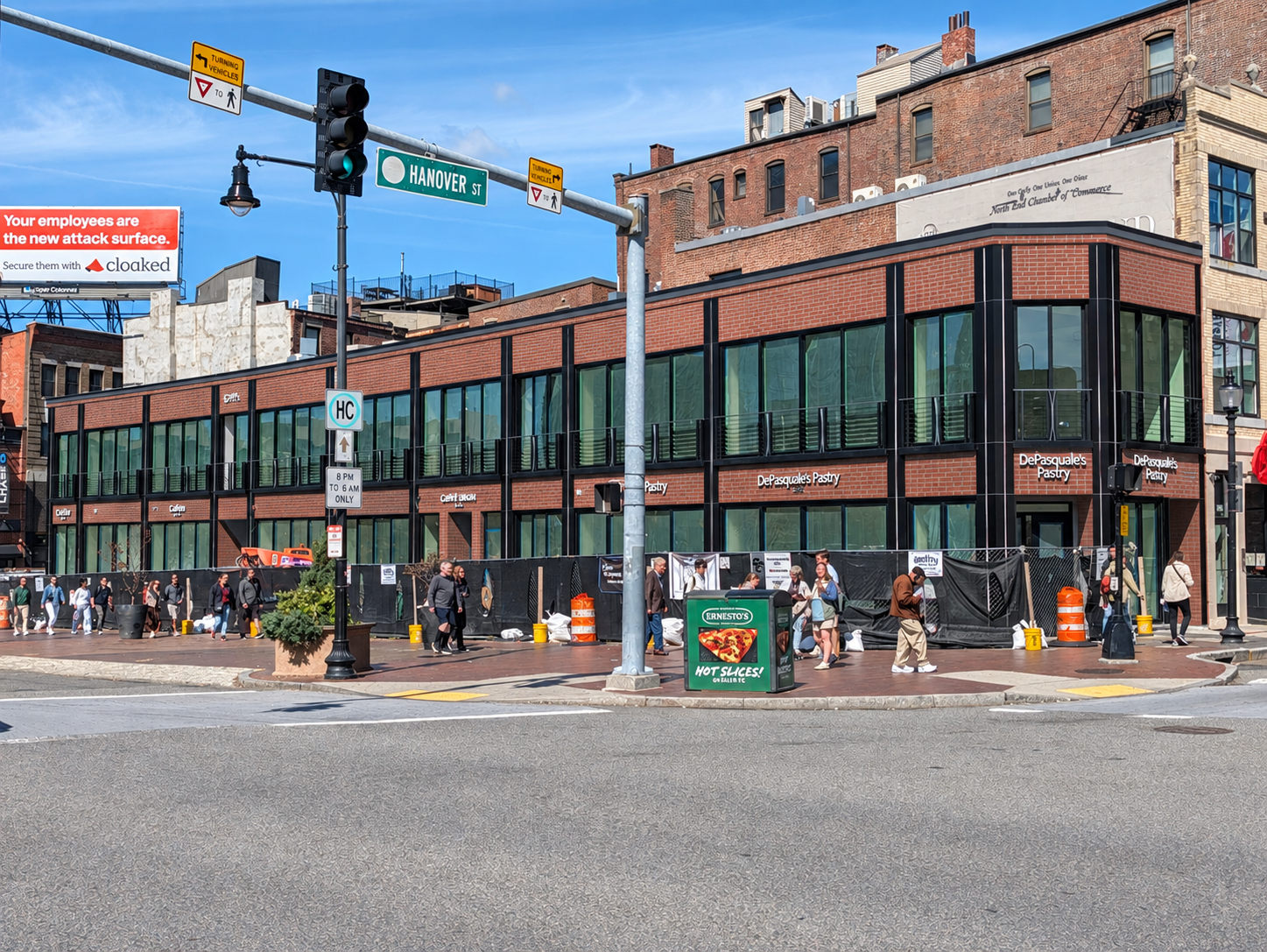
If they had added even just some thin crappy precast red brick instead of the grey panels it would have looked a million times better and looked like it belonged in the north end.
Bananarama
Active Member
- Joined
- Mar 18, 2020
- Messages
- 618
- Reaction score
- 1,293
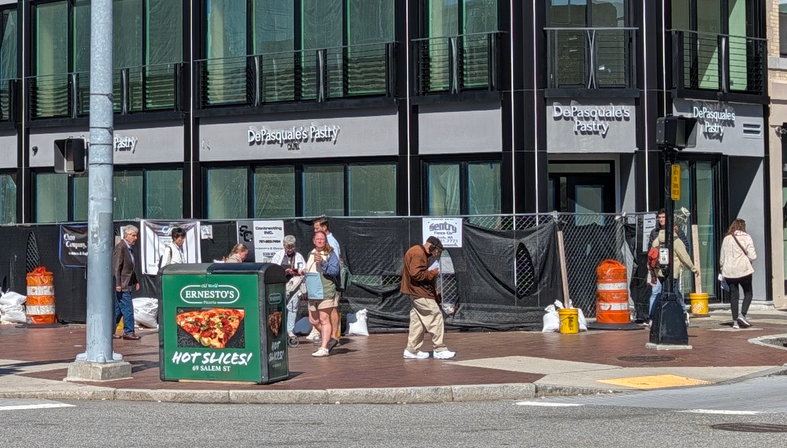
Plastering 4 puny signs on every available surface (in both double and single line format...) for this one business is comically ugly. Why would they not design 1 cool, properly sized on at the corner?
If they had added even just some thin crappy precast red brick instead of the grey panels it would have looked a million times better and looked like it belonged in the north end.
View attachment 75902
This would not have been hard to achieve.