185 Commercial Street | Portland

Max

Active Member
Joined
Jun 20, 2006
Messages
552
Reaction score
752
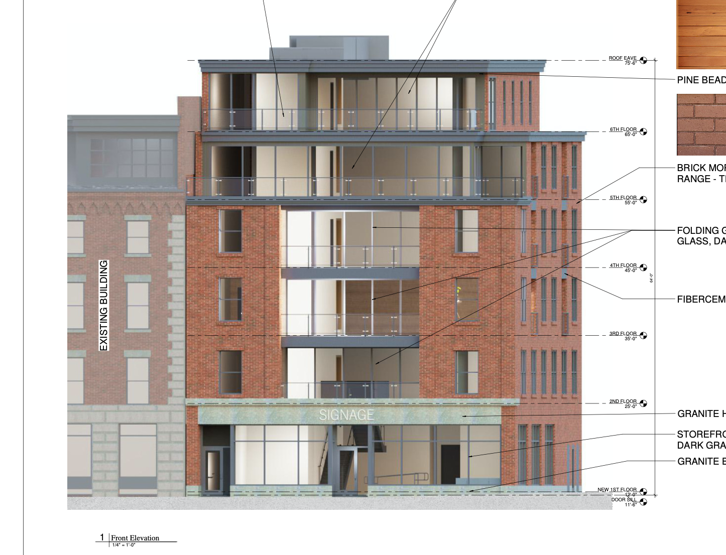
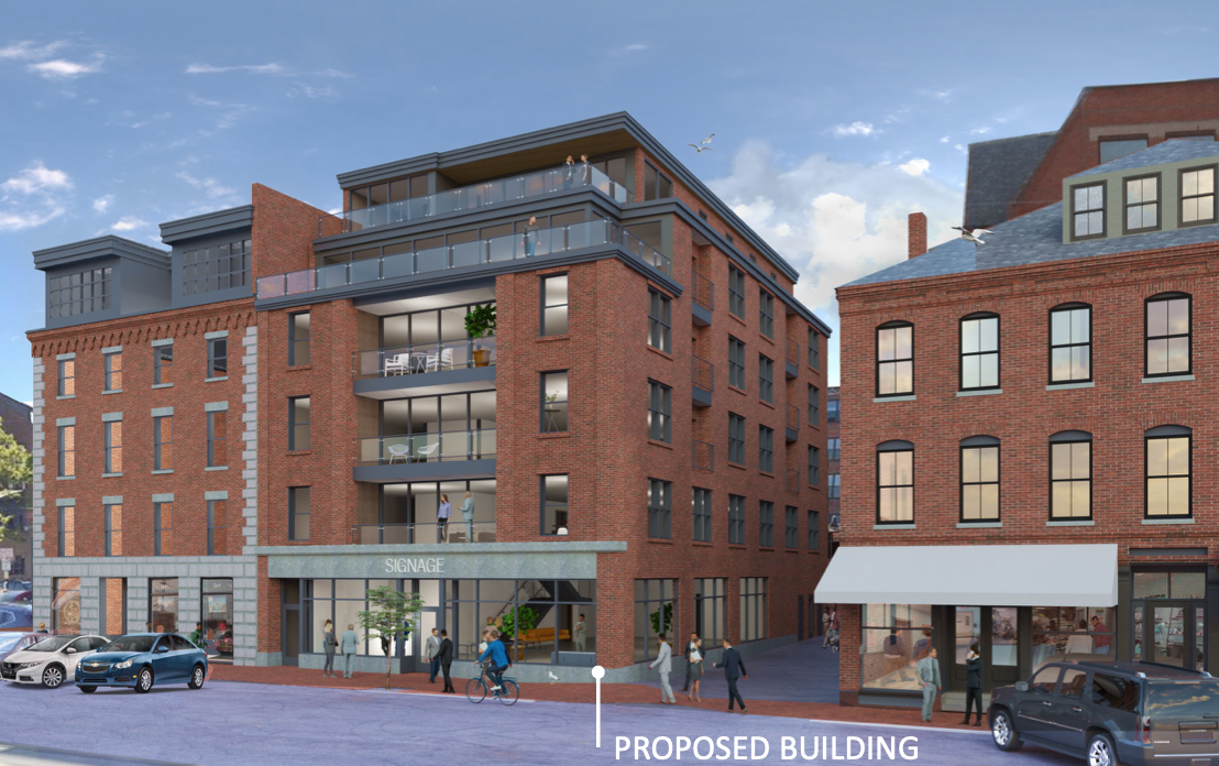
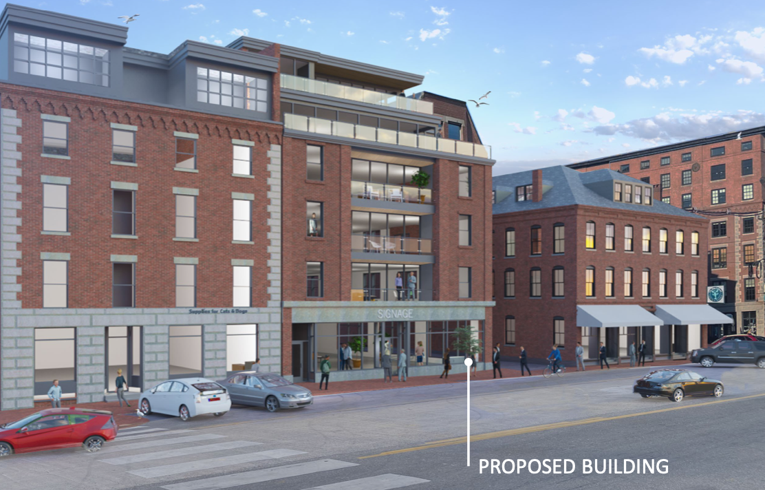
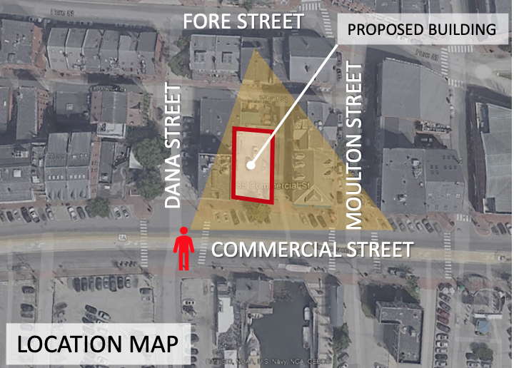
Looks like there's a new proposal for a 6-story building at 185 Commercial Street, on an existing parking / patio area between Wharf and Commercial. Proposal is calling for retail on floors 1 and 2 and five residential units on 3-6.

Seems like they're making the most of a tight lot. I'm sure the condos will command a premium. The design incorporates traditional Commercial Street materials of brick and granite with a good deal of glass and some modern elements on the recessed upper floors.


Screen Shot 2022-02-14 at 9.59.56 AM.png


Screen Shot 2022-02-14 at 9.59.20 AM.png


Screen Shot 2022-02-14 at 9.59.47 AM.png


Screen Shot 2022-02-14 at 9.59.39 AM.png
 

Attachments

  • Screen Shot 2022-02-14 at 9.59.20 AM.png
    Screen Shot 2022-02-14 at 9.59.20 AM.png
    1.8 MB · Views: 69
  • Screen Shot 2022-02-14 at 9.59.47 AM.png
    Screen Shot 2022-02-14 at 9.59.47 AM.png
    1.4 MB · Views: 64
Looks like there's a new proposal for a 6-story building at 185 Commercial Street, on an existing parking / patio area between Wharf and Commercial. Proposal is calling for retail on floors 1 and 2 and five residential units on 3-6.

Seems like they're making the most of a tight lot. I'm sure the condos will command a premium. The design incorporates traditional Commercial Street materials of brick and granite with a good deal of glass and some modern elements on the recessed upper floors.


View attachment 21446

View attachment 21447

View attachment 21448

View attachment 21450
Awesome! Looks good!!
Is the lot between 17 and 29 Commercial Street still being developed too? I love the in-fill of all of these empty lots.
 
Love it! The only other infill remaining on the land side of Commercial is the MEMIC parking lot up to Franklin Street. I would still like to see the city owned Fish Pier parking lot sold to a developer and turned into a much needed parking garage on that end of Commercial with retail on the bottom level.
 
Last edited:
There was a proposal back in the 80's to infill that lot..its been a long time coming. Looks like no more outdoor loud concert venue for Amigos....One less venue the Police have to worry about...
 
Only 5 residential units on those upper floors? They must all be penthouse suites.
 
Looks like no more outdoor loud concert venue for Amigos....
That's a depressing thought. Just because I'm no longer in the age bracket to spend my weekends down in the Old Port binge drinking and making other unwise decisions does not mean I do not fully support the right of today's 20 and 30-somethings to do so.
 
Only 5 residential units on those upper floors? They must all be penthouse suites.

I'm gonna go out on a limb and guess that these might become the most expensive condos in Portland. If I recall, the developers of the cPort building at the corner of Middle and India tried to sell the top two floors as a single condo unit for just north of $2 million. As best I can tell it hasn't been sold but rather rented as a luxury rental... it mostly looks empty or dark when I see it. As much as I'm not philosophically opposed to luxury condos there is no doubt that they are more often unoccupied than "market" or affordable rate housing, and subsequently have less impact on street level activity.
 
Looks like they've updated the renderings to include more glass. I'll be curious how the HPB reacts to this. Commercial Street is dominated by brick, but the early renderings for the new Maine Public headquarters down at the eastern end of the street are calling for mostly or all glass.

Screen Shot 2022-04-26 at 9.30.38 AM.png


Screen Shot 2022-04-26 at 9.30.52 AM.png


Screen Shot 2022-04-26 at 9.31.00 AM.png
 
Looks like they've updated the renderings to include more glass. I'll be curious how the HPB reacts to this. Commercial Street is dominated by brick, but the early renderings for the new Maine Public headquarters down at the eastern end of the street are calling for mostly or all glass.

View attachment 23787

View attachment 23788

View attachment 23789
Love renderings like this that give you such a clear idea of how the building will fit into the existing environment - looks great to me!
 
Although technically not on the same street (but still a block away) the new Fore St Garage renovation has lots of glass facing a wall of old brick buildings. And you have the Hyatt there too. They should pass this.

On the one hand I'm all for adding the glass - and overall I think this looks great - on the other I'm getting tired of this size glass pane. Is this a cheap option, is that why we see it everywhere? I also like that - at least for now - they have granite around the three windows on the left (I would prefer the lintel be taller, similar the building to the left).
 
Looks great. The all-glass structure next to the Portland Harbor Hotel on Fore Street didn't take anything away from the immediate neighborhood arch integrity, or the 4 story one adjoining Vignola. Glass is usually an architect's best friend. And the user? Even better. You get views.
 
I like it. They have tastefully blended the exterior colors and materials in the rendering. I think that the glass accentuates the older brick structures surrounding it.
 
Moreover in regards to glass, I love the way the Hyatt did its irregular floor to ceiling all-glass corner. However, since this is a hotel and it is so prominently featured in the Old Port with all its foot traffic, at night anyone staying in these rooms has to keep the curtains shut. Otherwise, a guest could walk up to the windows to look out at the scene, after just taking a shower? Years ago, when the Toronto Blue Jays built its stadium, a new hotel bordered the outfield seats. Well, it had big windows, and a couple "getting it on" were kind of careless. The game had to be stopped, and hotel management had to "step in."
https://www.thestar.com/sports/baseball/2012/09/16/skydome_hotel_scandals_over_the_years.html
 
Last edited:
On that note since floors 2-6 will be residential, I'm guessing that the windows facing Commercial will feature curtains or other privacy mechanisms that will be routinely employed, so the impact on the streetscape may be different than an office building like WEX down the street.
 
On that note since floors 2-6 will be residential, I'm guessing that the windows facing Commercial will feature curtains or other privacy mechanisms that will be routinely employed, so the impact on the streetscape may be different than an office building like WEX down the street.
This is a pet peeve of mine. Beautiful expanses of glass containing a mish mash of different window treatments. It ruins the look of the building. This of course is usually better controlled in commercial buildings where the type of window coverings (if any) are consistent.
 
This is a pet peeve of mine. Beautiful expanses of glass containing a mish mash of different window treatments. It ruins the look of the building. This of course is usually better controlled in commercial buildings where the type of window coverings (if any) are consistent.

I lived in an all glass condo that required a specific type of window treatment. Annoying, but the pay off was high.
 
Based on the staff notes in the packet, staff is less enthused about the move to more glass. Basically they're saying the facade is too complicated compared to most buildings on Commercial. We'll see what the Board thinks...

Screen Shot 2022-05-02 at 9.44.32 AM.png


Screen Shot 2022-05-02 at 9.44.47 AM.png
 
Too complicated? What about that giant black box housing a Gov secret entity (Sun Life could be a front) at the East End of the waterfront? I like this because it brings a slight modern look to Commercial. Do we really need to feel like it's the 19th Century every time we walk down this street?
 
Confusing HPB workshop last night - comments were all over the map, some vehemently opposed to the building, some generally fine with the latest design. Some members seemed to flip flop multiple times - the applicant's architect didn't seem to know where to take it and I don't blame her!

I feel like there will possibly be major changes to the design coming. One thing seemed to be clear by end - they feel like most buildings on Commercial St have a singular identity and are relatively symmetrical and that this design doesn't hit either. One major issue is the cantilevered glass corner - many didn't like the glass in general, but also that the right edge of the facade is glass and not brick. (Was it written somewhere that the Maine Public building was going to largely be glass? If so, it could face an uphill battle - one member essentially called the CIEE building a mistake due to the inclusion of glass on Commercial. Or maybe they didn't feel like it fit on Fore St side either)

There seems to be an obsession with the street wall here - the latest design includes an accordion glass partition for above the railings on the 2nd, 3rd and 4th floors. The idea is when these are closed it would maintain the 'street wall'. Of course it was mention that nobody is going to close these in the summer! There were drawings of the accordion partitions but I don't believe you could see them in any of the renderings. I can't imagine they are going to look that great bunched up against the brick when open. Also, the decks are set back slightly (another point of contention) so it wouldn't even be a flat surface.

Another change to the design is the 5th floor cornice - instead of just being squared off, it now has some shape. The 4th floor cornice (above the brick tower) is another place the design may change - some wondered what it would look like in the gray trim that now extends through the glass corner.

And finally, it seems like the developer will be including some sort of matching shades for the glass corner, should it survive. May or may not include the glass behind the deck.

New design with accordion open:

Screen Shot 2022-06-15 at 5.31.12 PM.png


With accordion closed:

Screen Shot 2022-06-15 at 5.30.57 PM.png
 
Confusing HPB workshop last night - comments were all over the map, some vehemently opposed to the building, some generally fine with the latest design. Some members seemed to flip flop multiple times - the applicant's architect didn't seem to know where to take it and I don't blame her!

I feel like there will possibly be major changes to the design coming. One thing seemed to be clear by end - they feel like most buildings on Commercial St have a singular identity and are relatively symmetrical and that this design doesn't hit either. One major issue is the cantilevered glass corner - many didn't like the glass in general, but also that the right edge of the facade is glass and not brick. (Was it written somewhere that the Maine Public building was going to largely be glass? If so, it could face an uphill battle - one member essentially called the CIEE building a mistake due to the inclusion of glass on Commercial. Or maybe they didn't feel like it fit on Fore St side either)

There seems to be an obsession with the street wall here - the latest design includes an accordion glass partition for above the railings on the 2nd, 3rd and 4th floors. The idea is when these are closed it would maintain the 'street wall'. Of course it was mention that nobody is going to close these in the summer! There were drawings of the accordion partitions but I don't believe you could see them in any of the renderings. I can't imagine they are going to look that great bunched up against the brick when open. Also, the decks are set back slightly (another point of contention) so it wouldn't even be a flat surface.

Another change to the design is the 5th floor cornice - instead of just being squared off, it now has some shape. The 4th floor cornice (above the brick tower) is another place the design may change - some wondered what it would look like in the gray trim that now extends through the glass corner.

And finally, it seems like the developer will be including some sort of matching shades for the glass corner, should it survive. May or may not include the glass behind the deck.

New design with accordion open:

View attachment 25469

With accordion closed:

View attachment 25470
How dare anyone propose something other than flat brick facing Commercial :rolleyes:
 

Back
Top