MjolnirMan
Active Member
- Joined
- Jan 18, 2016
- Messages
- 256
- Reaction score
- 576
A building's crown is often the most visible and distinctive element, and can make or break a building's design. For me, I tend to mostly notice them when they bother me, so I wanted to pose a question - what do you all think are Boston's best and worst crowns?
------------------------------------------------------------------------------
To get us started with the worsts, one of the most baffling to me:
1) Millennium Tower (1 Franklin St.)
While many people have complaints about it being one of several blue glass monoliths and a boring follower of lazy architectural trends (46 years behind Hancock setting the benchmark), I quite like it overall aesthetically. Except for the crown. According to multiple renders, there was supposed to be a slanted roof over the mechanical penthouse, leaving a trench where the window washing crane would emerge from:
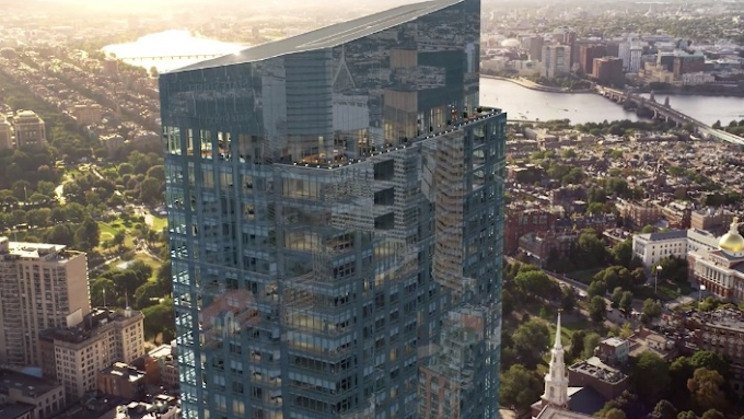
Unfortunately, they decided not to do so. The effect may have been minimal with a flat roof like Winthrop Tower, but with the distinctive slant, the result is hideous from many vantages to the South - including the Expressway (Photo credit DZH22):
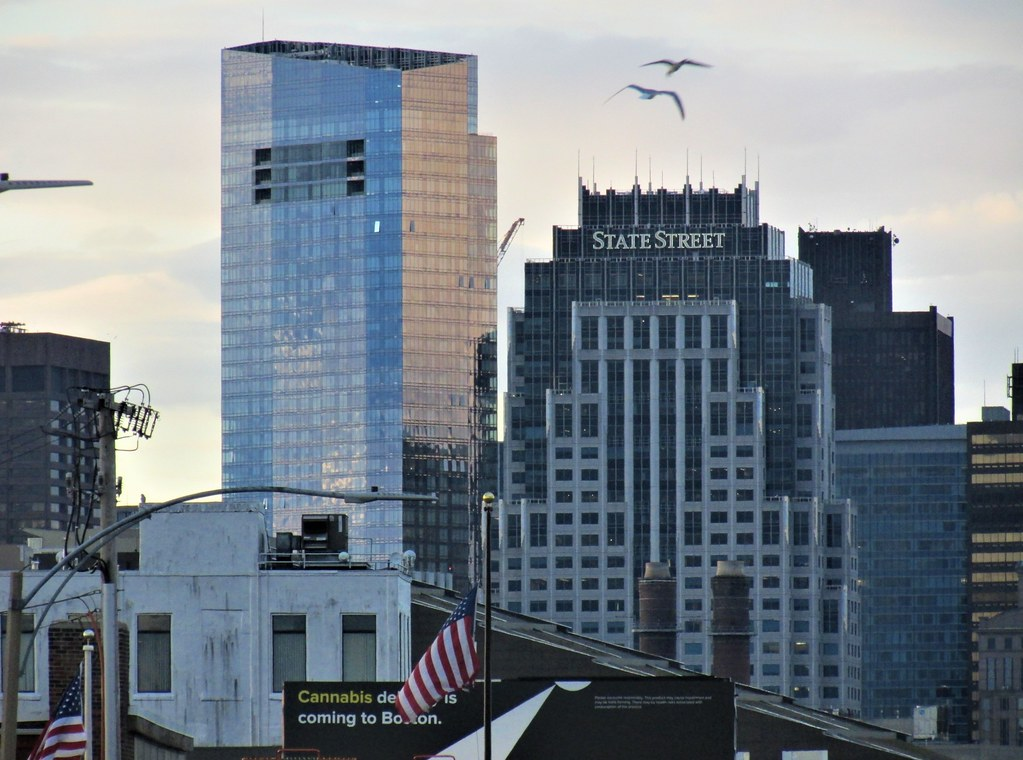
I think this is a borderline building-ruiner from an aesthetic perspective.
2) 888 Boylston St.
Most everyone wanted this to go higher, and many people have issues with, again, a blue glass tower. However, this one decided to include a very distinctive crown, with an outdoor patio area, prominent V-shaped white structural pylons echoing the ground floor, and most visibly, a series of vertical wind turbines on the East and West sides of the building. This resulted in a lot of press coverage at the time, such as headlines saying the building "Takes Sustainability to New Level for Boston Properties" and quoting their executive vice president saying they 'have become a “real design feature” of the city and epitomize the bold goals set out for the building.' Again, love it or hate it as a gimmick, it was certainly distinctive and decorative - and the entire crown is designed to support and highlight them.
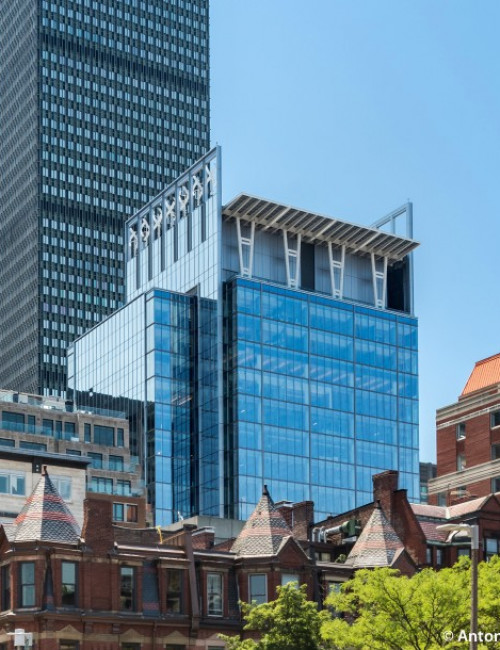
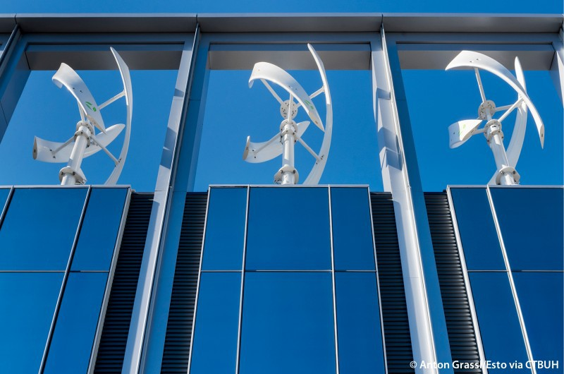
A couple of years ago, one of them was damaged, and was removed. Like the nearby Plywood Place before it, it started by missing one for a while, then another, and for years now the building has looked like this:
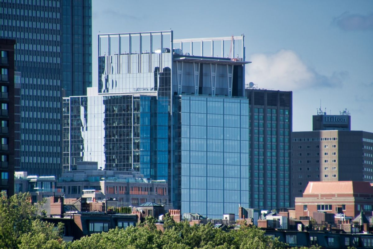
As far as I know, there's no plan to replace them, meaning the crown is dedicated to showcasing the empty brackets.
3) One Dalton
An example of a more minor detail that pissed people off, renders included an illuminated Four Seasons logo in the mechanical crown above the penthouse balcony. They omitted it for, I believe, concerns about it adversely affecting the penthouse tenant. However, as the aB hivemind collectively agrees that Boston lacks interestingly-lit crowns, this was viewed as a frustrating last-minute loss.
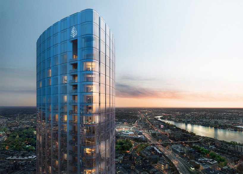
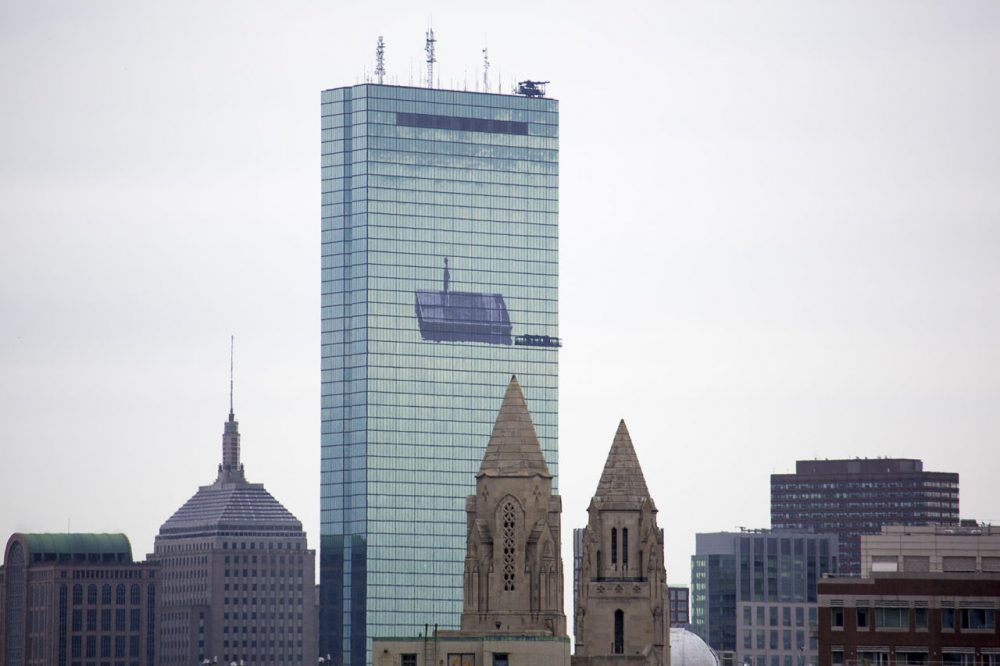
A runner-up for me is the Hancock Tower, whose sharp angles and minimalistic lines are somewhat marred by the assembly of functional antennas slapped on the top over the years. I also dislike the dark window strip only due to it reminding me of the observation deck I'll never get a chance to visit. I've attached a photo from when that decal was applied, which I thought was an interesting touch to keep the building aesthetically "fresh" (which I also appreciated for being temporary).
------------------------------------------------------------------------------
Okay, how about some bests?
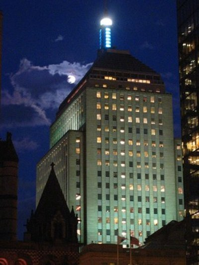
1) Hancock Building (200 Berkeley St.)
I'm a huge personal fan of art deco (very heterodox, I know), as well as merging of form and function. What's not to love about the Hancock Building? It's like the Empire State Building's hip younger brother. I'm also curious if anyone else has stood in Copley Sq. and gazed back and forth between Trinity Church and 197 Clarendon/200 Berkeley, and wondered if there was intentional evocation of massing and proportion.
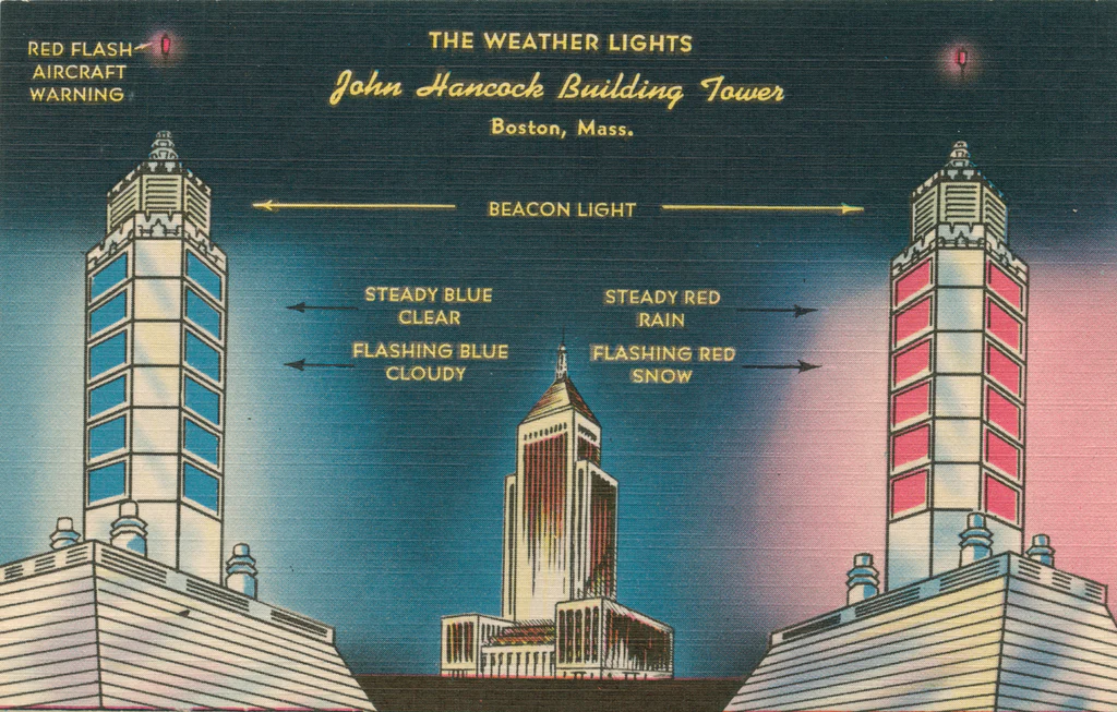
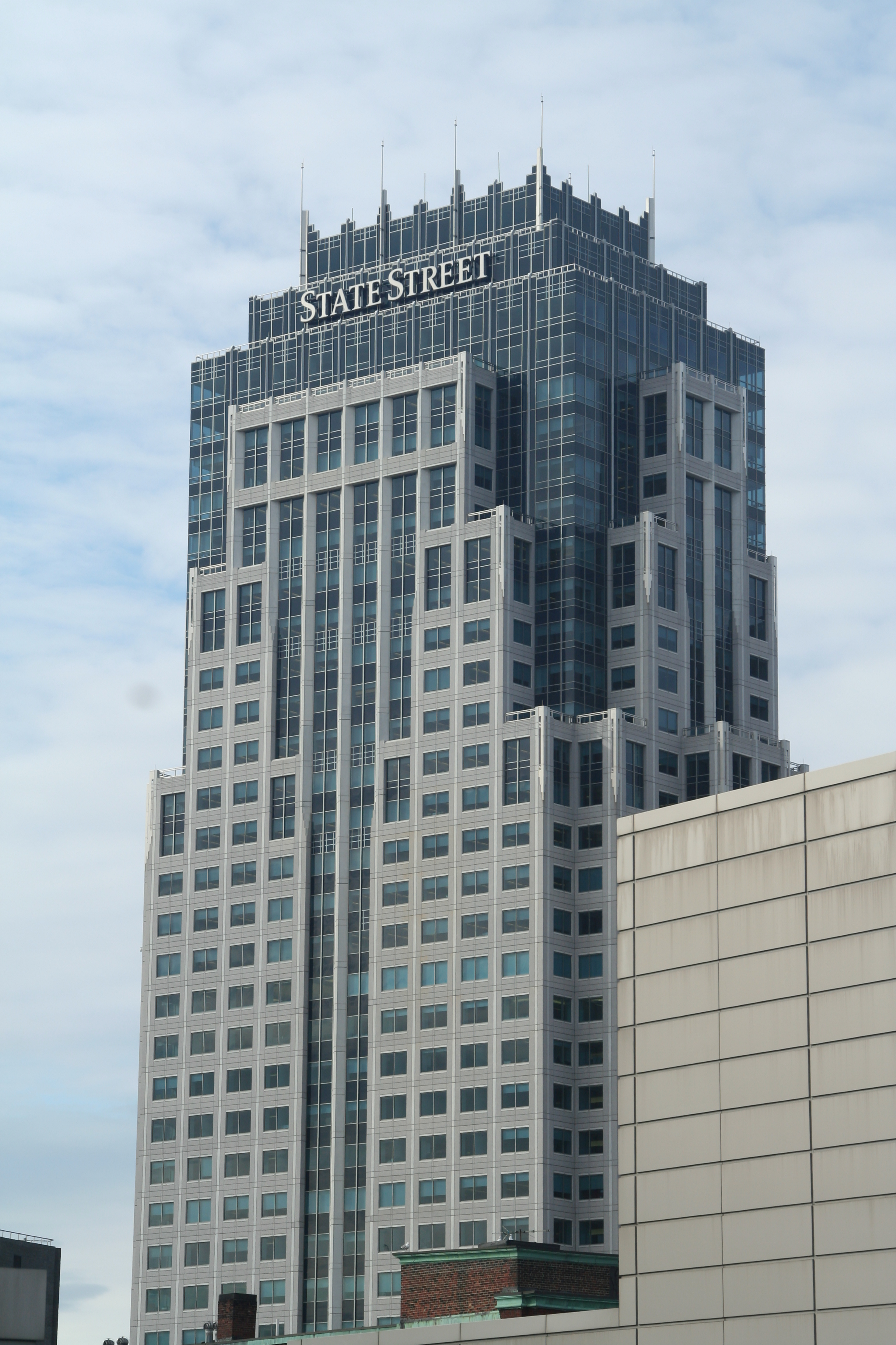
2) State Street Tower (1 Lincoln St.)
I can't imagine what this would have looked like if built in the early 90s as planned. The way the materials gradually shift to include higher proportions of dark blue glass as it approaches the top, stepping back almost to reveal an interior of glass excavated from "beneath" the masonry exterior, is just gorgeous and exciting to look at as more details emerge. In this case, "crown" is almost literal as a row of spires run around the length. I also think the signage (soon to be removed) is tasteful in its size and location, the last remnant of the beige of the masonry as gives way a floor or two below approaching the top.
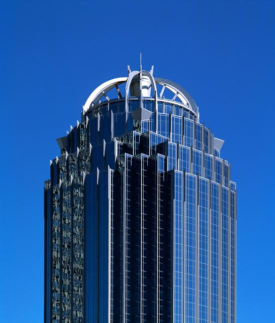
3) 111 Huntington
Thanks Mayor Menino for vetoing the flat top for the arched dome! It's entirely aesthetic but adds a very unique quality to this - yes, again - blue glass tower.
Curious to hear some of your favorites!
------------------------------------------------------------------------------
To get us started with the worsts, one of the most baffling to me:
1) Millennium Tower (1 Franklin St.)
While many people have complaints about it being one of several blue glass monoliths and a boring follower of lazy architectural trends (46 years behind Hancock setting the benchmark), I quite like it overall aesthetically. Except for the crown. According to multiple renders, there was supposed to be a slanted roof over the mechanical penthouse, leaving a trench where the window washing crane would emerge from:
Unfortunately, they decided not to do so. The effect may have been minimal with a flat roof like Winthrop Tower, but with the distinctive slant, the result is hideous from many vantages to the South - including the Expressway (Photo credit DZH22):
I think this is a borderline building-ruiner from an aesthetic perspective.
2) 888 Boylston St.
Most everyone wanted this to go higher, and many people have issues with, again, a blue glass tower. However, this one decided to include a very distinctive crown, with an outdoor patio area, prominent V-shaped white structural pylons echoing the ground floor, and most visibly, a series of vertical wind turbines on the East and West sides of the building. This resulted in a lot of press coverage at the time, such as headlines saying the building "Takes Sustainability to New Level for Boston Properties" and quoting their executive vice president saying they 'have become a “real design feature” of the city and epitomize the bold goals set out for the building.' Again, love it or hate it as a gimmick, it was certainly distinctive and decorative - and the entire crown is designed to support and highlight them.
A couple of years ago, one of them was damaged, and was removed. Like the nearby Plywood Place before it, it started by missing one for a while, then another, and for years now the building has looked like this:
As far as I know, there's no plan to replace them, meaning the crown is dedicated to showcasing the empty brackets.
3) One Dalton
An example of a more minor detail that pissed people off, renders included an illuminated Four Seasons logo in the mechanical crown above the penthouse balcony. They omitted it for, I believe, concerns about it adversely affecting the penthouse tenant. However, as the aB hivemind collectively agrees that Boston lacks interestingly-lit crowns, this was viewed as a frustrating last-minute loss.
A runner-up for me is the Hancock Tower, whose sharp angles and minimalistic lines are somewhat marred by the assembly of functional antennas slapped on the top over the years. I also dislike the dark window strip only due to it reminding me of the observation deck I'll never get a chance to visit. I've attached a photo from when that decal was applied, which I thought was an interesting touch to keep the building aesthetically "fresh" (which I also appreciated for being temporary).
------------------------------------------------------------------------------
Okay, how about some bests?
1) Hancock Building (200 Berkeley St.)
I'm a huge personal fan of art deco (very heterodox, I know), as well as merging of form and function. What's not to love about the Hancock Building? It's like the Empire State Building's hip younger brother. I'm also curious if anyone else has stood in Copley Sq. and gazed back and forth between Trinity Church and 197 Clarendon/200 Berkeley, and wondered if there was intentional evocation of massing and proportion.
2) State Street Tower (1 Lincoln St.)
I can't imagine what this would have looked like if built in the early 90s as planned. The way the materials gradually shift to include higher proportions of dark blue glass as it approaches the top, stepping back almost to reveal an interior of glass excavated from "beneath" the masonry exterior, is just gorgeous and exciting to look at as more details emerge. In this case, "crown" is almost literal as a row of spires run around the length. I also think the signage (soon to be removed) is tasteful in its size and location, the last remnant of the beige of the masonry as gives way a floor or two below approaching the top.
3) 111 Huntington
Thanks Mayor Menino for vetoing the flat top for the arched dome! It's entirely aesthetic but adds a very unique quality to this - yes, again - blue glass tower.
Curious to hear some of your favorites!


