Czervik.Construction
Senior Member
- Joined
- Apr 15, 2013
- Messages
- 1,932
- Reaction score
- 1,162
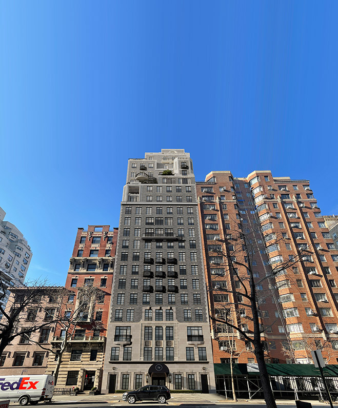
This is Robert Stern's Eleven in Minneapolis. It is really well executed.
I just posted this in my shiny new Minneapolis thread. As I stated there, I have no idea why there aren't 5 of these in Boston.

I just posted this in my shiny new Minneapolis thread. As I stated there, I have no idea why there aren't 5 of these in Boston.