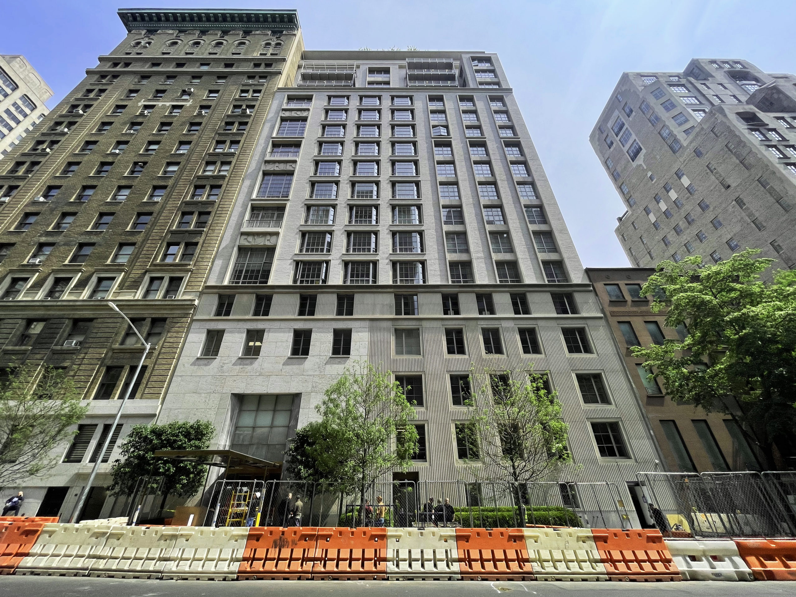
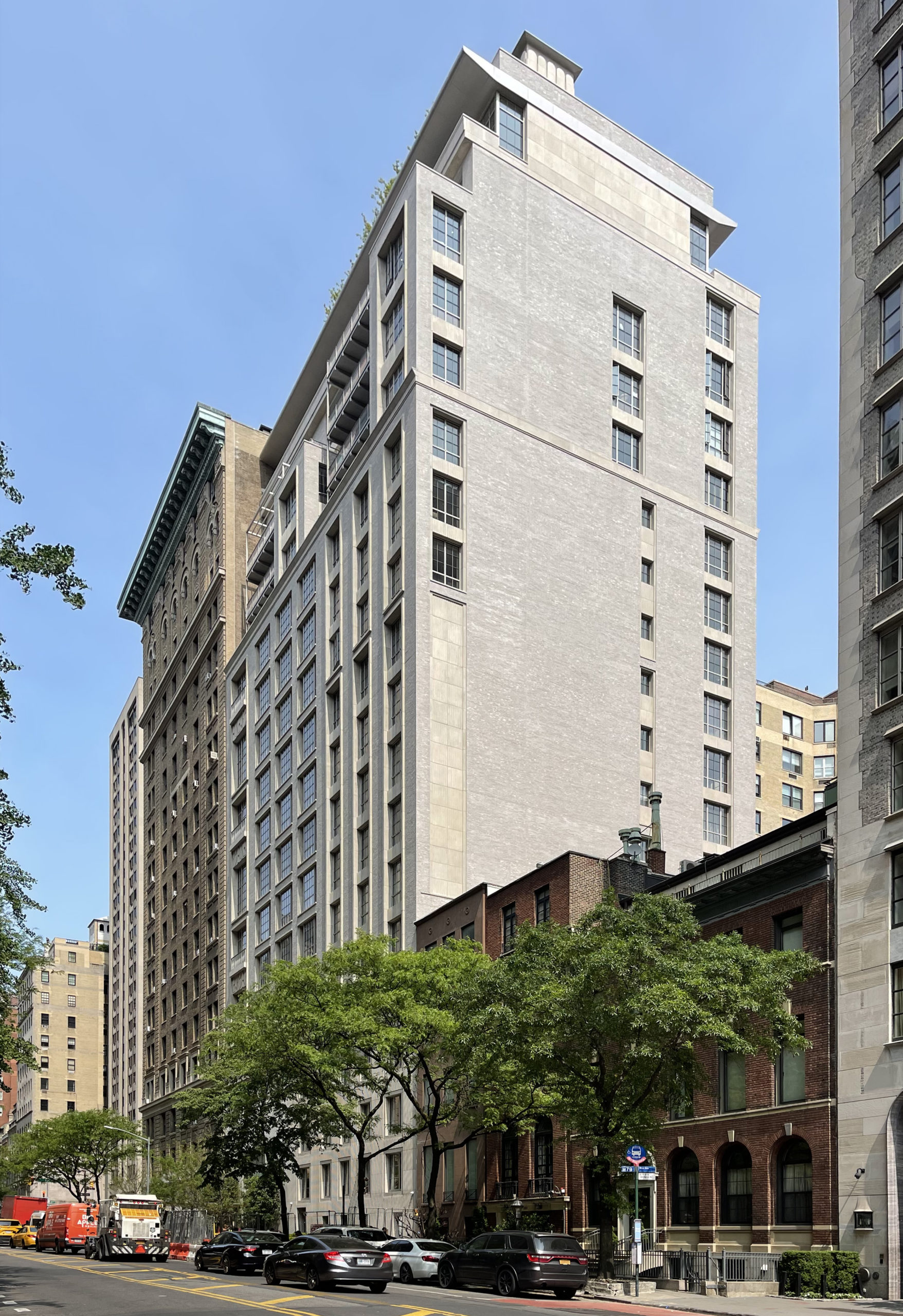
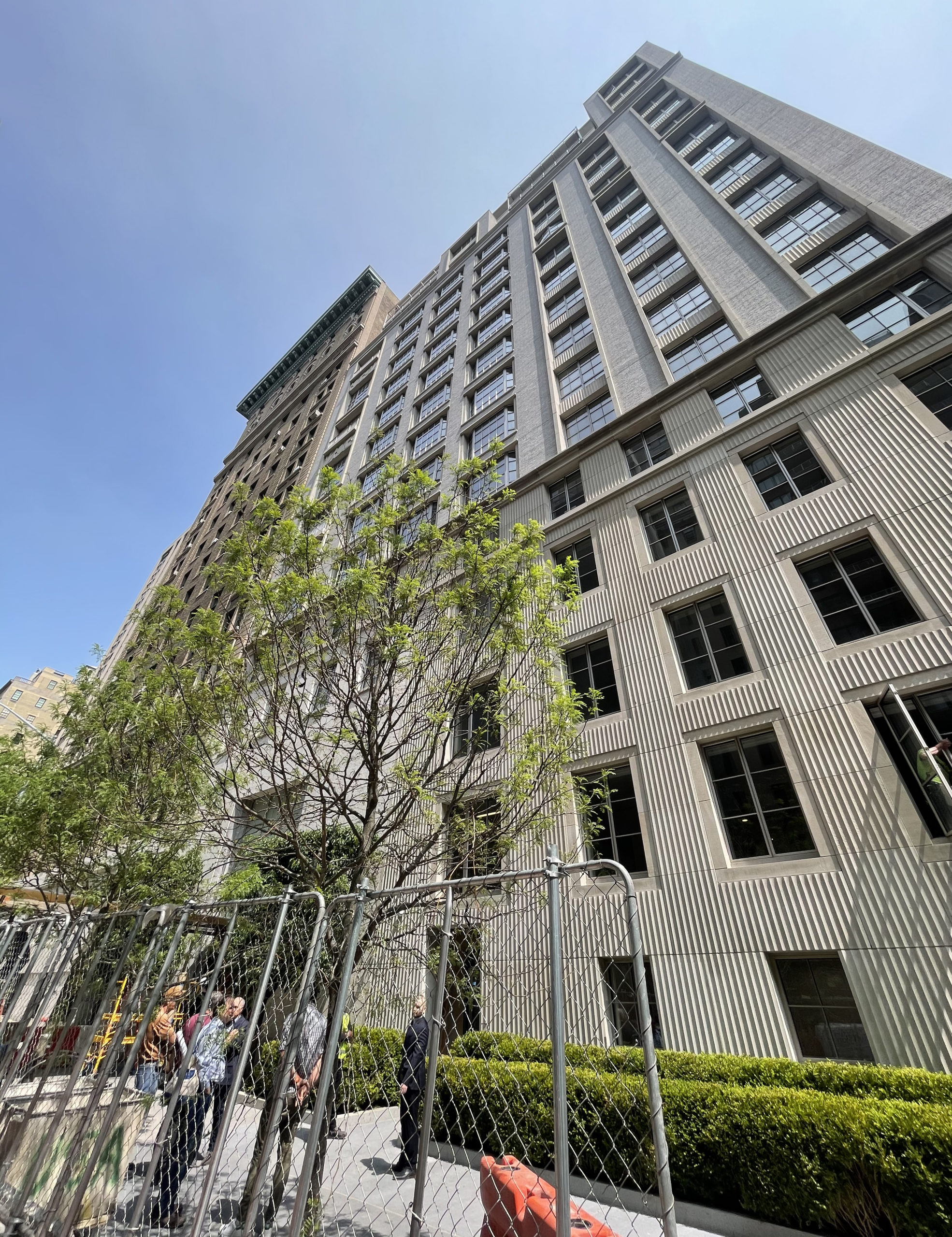
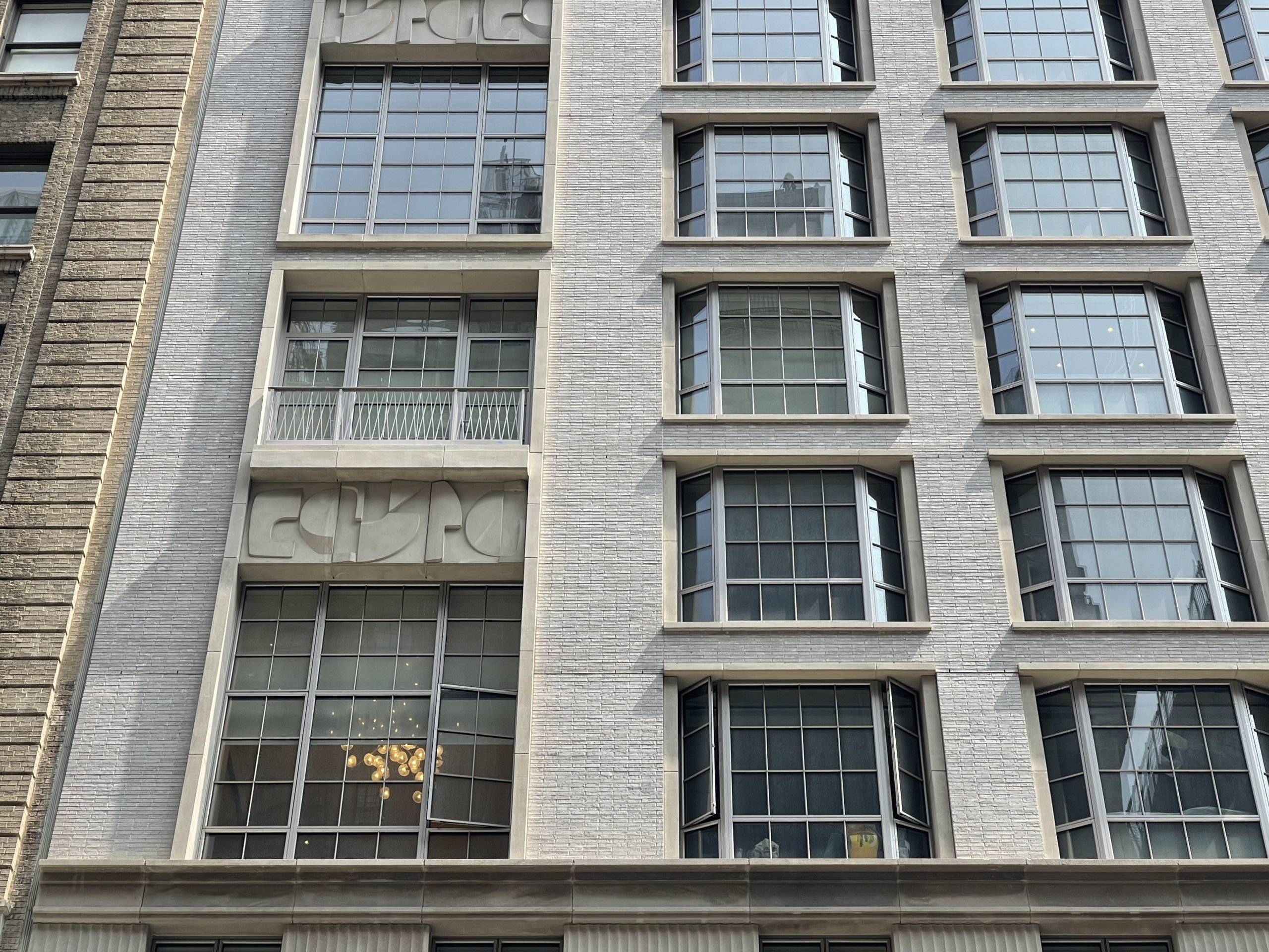
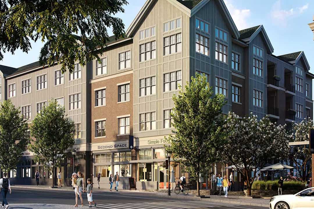
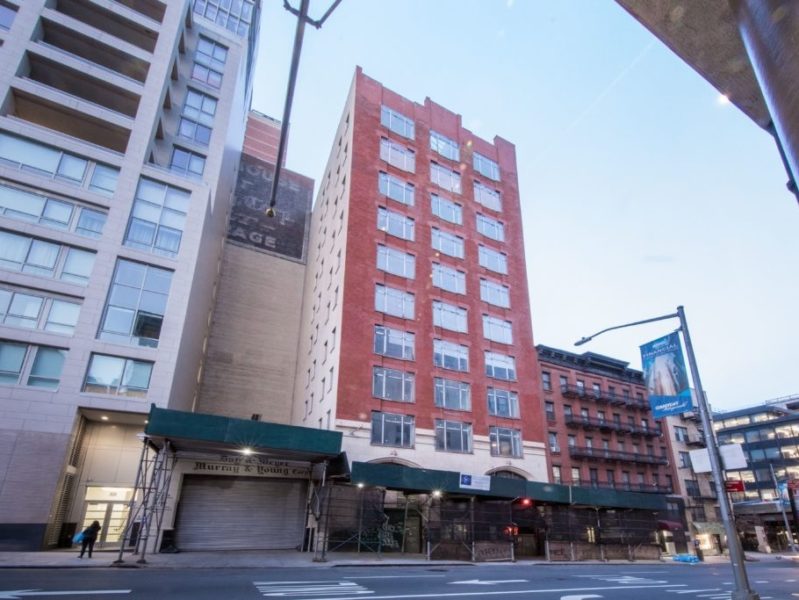
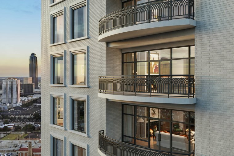
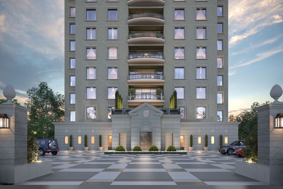
The lower 2/3 of it is very plain, but then all of a sudden the upper 1/3 becomes very busy. The busyness and plainness need to be balanced out more.
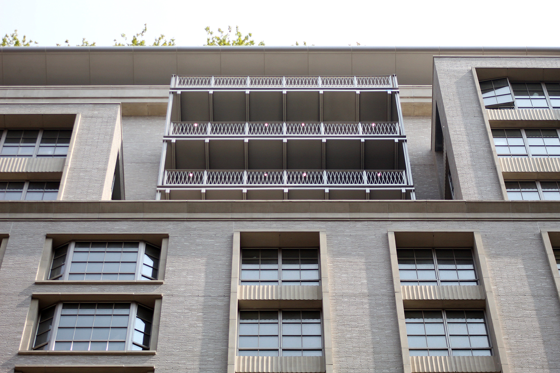
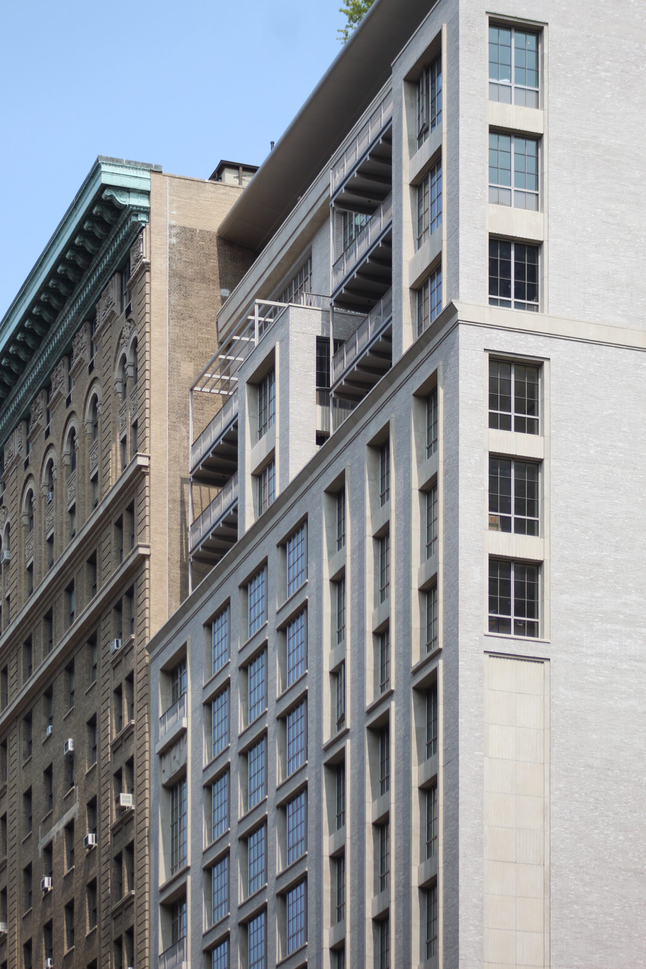
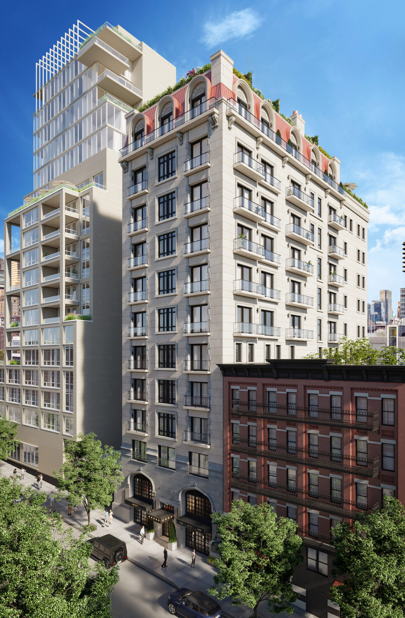
The only major change on the upper floors are the setback which help to scale what would otherwise be a pretty boring box.