odurandina
Senior Member
- Joined
- Dec 1, 2015
- Messages
- 5,328
- Reaction score
- 265
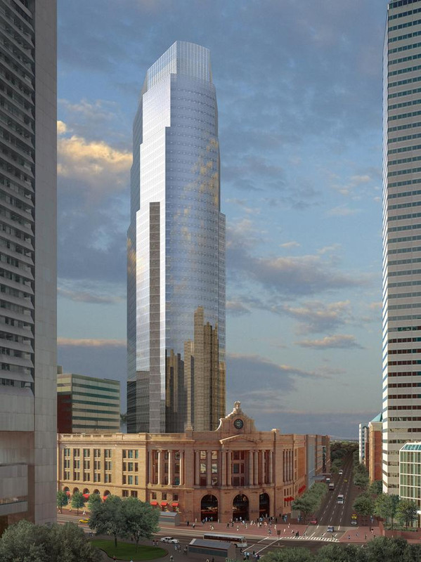
i think they did what they did, to get
1. height
2. all the cool stuff at the ground level.
3. adding revenue density at the bus station.
Bravo to the effort! Got to make it pay, BB.
1. height
2. all the cool stuff at the ground level.
3. adding revenue density at the bus station.
Bravo to the effort! Got to make it pay, BB.
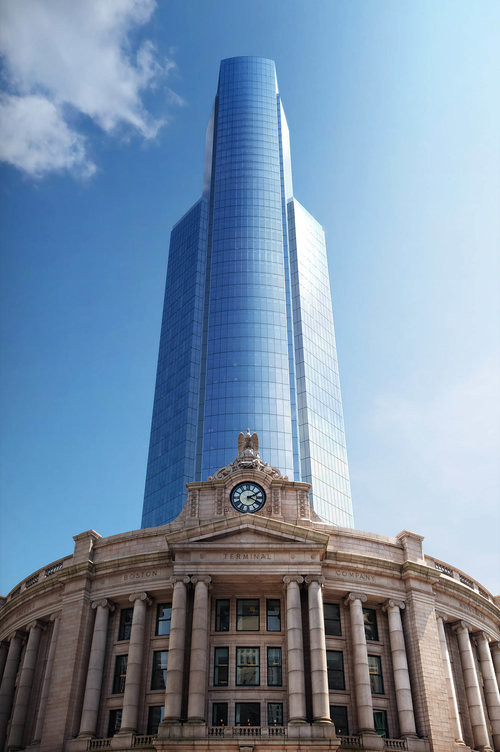
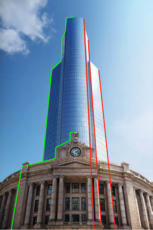
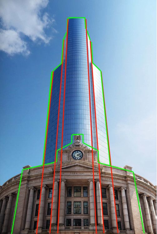
As a background building, it's acceptable; as an "addition" to our venerable southern transit hub, it remains a snooze...