
You are using an out of date browser. It may not display this or other websites correctly.
You should upgrade or use an alternative browser.
You should upgrade or use an alternative browser.
Your opinion on the State Street building
- Thread starter JSic
- Start date


TheRifleman
Banned
- Joined
- Sep 25, 2008
- Messages
- 4,431
- Reaction score
- 0
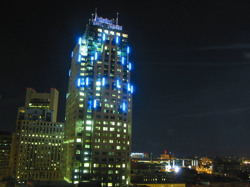
Love the Top:
The rest is boring. Ground floor Sucks
The rest is boring. Ground floor Sucks
F-Line to Dudley
Senior Member
- Joined
- Nov 2, 2010
- Messages
- 8,862
- Reaction score
- 7,518
It's a lot more awe-inspiring when you're on 93N about to descend into the tunnel and that top is the last thing you see and remember when taking the plunge. Can't put a price on that view.
But vantage point matters. It doesn't look nearly as good standing next to it on-street looking straight up at the cladding. And aerial shots vary from very nice to meh by viewing angle.
But vantage point matters. It doesn't look nearly as good standing next to it on-street looking straight up at the cladding. And aerial shots vary from very nice to meh by viewing angle.
theSil
Active Member
- Joined
- Apr 4, 2016
- Messages
- 306
- Reaction score
- 470
All in all, I'm glad it's there. The crown with its mini spires is a good addition to the downtown skyline. However, I think if it had a higher FAR or slightly different signage, it would look considerably better.
How the glass interfaces with the masonry also strikes me as a little awkward, but I don't know how one would fix that.
How the glass interfaces with the masonry also strikes me as a little awkward, but I don't know how one would fix that.
fattony
Senior Member
- Joined
- Jan 28, 2013
- Messages
- 2,098
- Reaction score
- 477
I love it. Boston is light on art deco in general this might be the only skyscraper with appreciable deco DNA. I could lose the sign, but I don't really like signs/names/words up that high (e.g. Converse is excellent where it is).
I personally like the slight awkwardness of the glass/stone transition. It creates enough tension to make you really look at the building without ever tipping over into a cringe.
The white/blue combo is A+
I personally like the slight awkwardness of the glass/stone transition. It creates enough tension to make you really look at the building without ever tipping over into a cringe.
The white/blue combo is A+
- Joined
- May 25, 2006
- Messages
- 6,963
- Reaction score
- 1,584
I love it. Who hates it?
TheBostonian
Active Member
- Joined
- May 25, 2006
- Messages
- 348
- Reaction score
- 1
I've always liked it. It adds variety to the skyline and the sign projects Boston's economic power.
I don't expect much of the ground floor of a tower.
I don't expect much of the ground floor of a tower.
I love it. Who hates it?
Its been called fatboy for being "short" and wide.
SeamusMcFly
Senior Member
- Joined
- Apr 3, 2008
- Messages
- 2,050
- Reaction score
- 110
Loves the lights at night.
Don't like the proportions. Too much girth for its height.
If proportions were better I might love it from a distance.
Corporate lobby and bollards will always limit the love as well.
It's a sign of the times. The times before Boston finally started to re-embrace height, and the introduction of slim towers to the hub.
fattony
Senior Member
- Joined
- Jan 28, 2013
- Messages
- 2,098
- Reaction score
- 477
Hasn't been mentioned yet but the blue lights look great at night. Solid piece of filler and a nice book-end when driving down Devonshire.
 How can you describe this building as filler?? It is one of the most eye-catching, distinctive, and memorable buildings in the entire city. Love it or hate it, it isn't filler.
stick n move
Superstar
- Joined
- Oct 14, 2009
- Messages
- 10,389
- Reaction score
- 11,770
I've always liked it, maybe would have looked better with better cladding, but overall its a quality tower. What is the material used it looks like concrete? Ive never walked up to it and touched it. In a city of 1970s office boxes its a nice change up to have some set backs and an art-deco inspired crown. I can see why people would say its fat, but its not bad at all. Definitely with more height the proportions would have looked much better, but Im much happier to have it than not.
citylover94
Senior Member
- Joined
- Oct 27, 2012
- Messages
- 1,140
- Reaction score
- 57
According to wikipedia the base is actual granite for the first two floors and then transitions to precast concrete panels. I don't know how accurate that is though.
Randomgear
Active Member
- Joined
- Jul 7, 2012
- Messages
- 359
- Reaction score
- 41
According to wikipedia the base is actual granite for the first two floors and then transitions to precast concrete panels. I don't know how accurate that is though.
Yep, granite at ground level and precast made to match that granite above. Very nice precast work.
I tend to be of two minds:
1 - it's a behemoth with not much happening at ground level to animate the street. The massive walls of precast can at times, despite the fine precast material, look pretty boring.
2 - the view at sunrise from Castle Island or from the top of Belview Hill on Washington St in Rozzie makes the building look pretty amazing.
Boston02124
Senior Member
- Joined
- Sep 6, 2007
- Messages
- 6,825
- Reaction score
- 5,971
One of my favorites /all glass and 10 stories taller wd have been awesome, but glad it finally got built!
Share you thoughts on this building. People seem to like it or hate it.
<3
- Joined
- Sep 15, 2010
- Messages
- 8,894
- Reaction score
- 271
I love it. It's quite literally a representation of the Post Modern era shifting to Contemporary, with the Contemporary glass volume rising triumphantly out of the PoMo mass. Would it be better if it was a sharp glass tower all the way down? Most likely (honestly, I think it would be pretty epic), but I find this building to be a fascinating example of the transition between two architectural periods.