General MBTA Topics (Multi Modal, Budget, MassDOT)

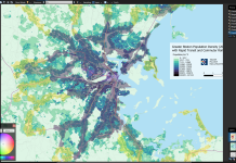
Would it be possible to re-create the MBTA's market analysis frequencies map if possible? (just the map that shows X census track supports 30 vs. 20 or 10 min frequencies, etc, etc,). The data used by the MBTA is about 10 years out of date, plus the fact that the MBTA's map does not extend past Lynn or Quincy Adams, meaning it's hard to see how Framingham/Beverly/Brockton stack up. The combined market analysis map is essentially a merged version of population + employment density to get the "x-supported frequency" for each city block.
So yeah, that MBTA map had been on my radar for a few weeks (I think it was you who brought it up, so kudos), and I do plan to try recreating that at some point. Of course, working on that also means a dedicated job density map as a byproduct - I hear the calls from all other comments above you.

Has the MBTA mentioned the exact formula, or weighting between residents and jobs, that they used to create their "composite transit demand" metric? I see your second screenshot about some general ranges of residential and employment density they used to categorize service levels, so I can try reverse-engineering the weights, but a more explicit measure would obviously be better.

One minor issue with the new maps is the the low density tracts do not have enough colors. I would suggest splitting the "2217-7121" bracket into two if possible (maybe even an extra bracket at 1000?).
I do see how that can be a concern. The color scales were generated automatically using the Jenks natural breaks optimization, which I picked because it shows the nuances of urban areas pretty well - and urban areas were my initial focus. I'll see if there's a systematic way to finetune low-density areas further (perhaps adding one more color class?).
 
The maps look very good!

I really appreciate creating the large 495 map, meaning the full MBTA service area (and even past to) Framingham, North Beverly, and Brockton, can be visualized on the map.

One minor issue with the new maps is the the low density tracts do not have enough colors. I would suggest splitting the "2217-7121" bracket into two if possible (maybe even an extra bracket at 1000?).

Would it be possible to re-create the MBTA's market analysis frequencies map if possible? (just the map that shows X census track supports 30 vs. 20 or 10 min frequencies, etc, etc,). The data used by the MBTA is about 10 years out of date, plus the fact that the MBTA's map does not extend past Lynn or Quincy Adams, meaning it's hard to see how Framingham/Beverly/Brockton stack up. The combined market analysis map is essentially a merged version of population + employment density to get the "x-supported frequency" for each city block, extending out to the edge of the T's district.

MBTA market analysis frequencies map (too small :(), and a sample market size analysis table, pulled from the T's market analysis PDF. I have been using the market analysis map and the urbanization 10m maps to get map data to work off of)
View attachment 50350View attachment 50351
I've just tried to generate a map of "population densities within 10 minute walking distance of an R/R crossing" by testing what happens if Teban54's population map is overlaid on top of the map, and the map cuts off North Beverly Station by 220px (oh no).

In any case I probably would need to change the colors of my own RR crossing map anyways.
1715267294510.png


I don't think there's anything too surprising or brand new from overlaying my RR crossings map onto Teban54's population map. The same underserved areas show up as usual mostly. In any case, it still shows how any westward expansion of rapid transit, should still aim to hit the Watertown <---> Waltham Center corridor. The Waverley <---> Waltham corridor is worse performing than it is from Watertown.

The biggest takeaways I see is that Boston Medical Center and Longwood Medical Area are horrendously underserved by the ROWs given their exceptional densities. Same with the hill on the B branch towards the west.

Northside Orange Line, especially in Charlestown, is also notoriously empty and devoid of housing in close proximity to the ROWs, especially in Charlestown's floodplains; save for some commercial areas near Assembly and Malden Center. Charlestown is especially criminally underserved compared to East Boston. The giant parking lots near Cambridge Crossing and Thompson Sq., really eats away at potential density.

I've leaving these as screenshots in the paint editor program, since if there's a better map in the future, it may be better to overlay it on that map instead.

1715268003287.png


So yeah, that MBTA map had been on my radar for a few weeks (I think it was you who brought it up, so kudos), and I do plan to try recreating that at some point. Of course, working on that also means a dedicated job density map as a byproduct - I hear the calls from all other comments above you.

Has the MBTA mentioned the exact formula, or weighting between residents and jobs, that they used to create their "composite transit demand" metric? I see your second screenshot about some general ranges of residential and employment density they used to categorize service levels, so I can try reverse-engineering the weights, but a more explicit measure would obviously be better.

I do see how that can be a concern. The color scales were generated automatically using the Jenks natural breaks optimization, which I picked because it shows the nuances of urban areas pretty well - and urban areas were my initial focus. I'll see if there's a systematic way to finetune low-density areas further (perhaps adding one more color class?).

Yea, that map and the urbanization maps have been my primary maps I've used to get useful data for underlying demand. I'm not aware of any exact values the T used for their underlying demand maps, so reverse engineering would probably be needed. The PDFs as far as I know only have some "weighted propensity" for population demand, but getting that data, I'm not sure how that would work out.
 

Attachments

  • 1715267634141.png
    1715267634141.png
    2.5 MB · Views: 66
Last edited:
I've just tried to generate a map of "population densities within 10 minute walking distance of an R/R crossing" by testing what happens if Teban54's population map is overlaid on top of the map, and the map cuts off North Beverly Station by 200px (oh no).

In any case I probably would need to change the colors of my own RR crossing map anyways.
View attachment 50352

I don't think there's anything too surprising or brand new from overlaying my RR crossings map onto Teban54's population map. The same underserved areas show up as usual mostly. In any case, it still shows how any westward expansion of rapid transit, should still aim to hit the Watertown <---> Waltham Center corridor. The Waverley <---> Waltham corridor is worse performing than it is from Watertown.

The biggest takeaways I see is that Boston Medical Center and Longwood Medical Area are horrendously underserved by the ROWs given their exceptional densities. Same with the hill on the B branch towards the west.

Northside Orange Line, especially in Charlestown, is also notoriously empty and devoid of housing in close proximity to the ROWs, especially in Charlestown's floodplains; save for some commercial areas near Assembly and Malden Center. Charlestown is especially criminally underserved compared to East Boston. The giant parking lots near Cambridge Crossing and Thompson Sq., really eats away at potential density.

I've leaving these as screenshots in the paint editor program, since if there's a better map in the future, it may be better to overlay it on that map instead.

View attachment 50354


Yea, that map and the urbanization maps have been my primary maps I've used to get useful data for underlying demand. I'm not aware of any exact values the T used for their underlying demand maps, so reverse engineering would probably be needed. The PDFs as far as I know only have some "weighted propensity" for population demand, but getting that data, I'm not sure how that would work out.
Question: What did you use to generate the 10-min walksheds? They seem a lot more fine-grained than the "circles with 800m radius" approach that I used, and I would love to improve my rapid transit walksheds if the process can be automated.
 
Question: What did you use to generate the 10-min walksheds? They seem a lot more fine-grained than the "circles with 800m radius" approach that I used, and I would love to improve my rapid transit walksheds if the process can be automated.
There isn't any automated way that I'm aware of. I literally just spent 2 sessions over the course of 2 long afternoons/evenings manually copying over generated walksheds from the travel time map, from each RR crossing, to my map. There aren't that many RR crossings, since my fantasy mainline ROW HRT map has only about 200 actual stations, and once one is out of the BERy service area, the gap until the next RR crossing is often higher than the optimal HRT stop spacing.

In any case, I'd probably analyze the Green Line's B, C, and E branches as part of street running services, and not as rapid transit services, given as their stop spacing and speeds is nothing like HRT rapid transit stop spacing or speeds.
 
Last edited:
Has the MBTA mentioned the exact formula, or weighting between residents and jobs, that they used to create their "composite transit demand" metric? I see your second screenshot about some general ranges of residential and employment density they used to categorize service levels, so I can try reverse-engineering the weights, but a more explicit measure would obviously be better.

Following up on this. I just did a closer inspection of the MBTA's 10 year old outdated maps (all of them are dated 2016).

The MBTA's maps do not seem to use a weighing factor between population density vs. employment density. As far as I can tell, the T overlays the employment map on top of the weighted population density map.

This means essentially, an employment hub supporting 15 min service and 0 residents, would show as 15 minute service on the combined map. If an area has a weighted population density supporting 15 minute service and 0 employment hubs, then it would also show as 15 minute service combined. An area could also support hourly service for population and hourly for employment, which added gets 30 minute service combined. South Boston, Kendall, Dorchester, and Everett are good places to see, for the issue of how the MBTA merges the maps.

Some areas show as more frequent service on the combined map (which I assume uses either larger block sizes, or some kind of addition factor is used on the map)

The MBTA does publish the exact values for weighed population density, which can be found on the 18th page in the MBTA's market analysis PDF (aka page 14).

I also feel like the final map would need more bins. Even the T's maps becomes a bit painful to read at lower density areas. (Example bin sizes for frequencies: 120, 60, 40, 30, 20, 15, 12, 10, and 5)

Below are all the relevant MBTA's 2016 maps placed side by side, so I hope this would help in creating employment maps, and combined service frequency demand maps.

1715275155379.png
 
Last edited:
A bunch of inbound (And only inbound?) Haverhill trains going via Wildcat and stopping at Anderson/Woburn
Not sure why it's inbound only, but this is due to construction. Absolutely no inbound service for much of the day from N. Wilmington inward from May 20 all the way to October 4.

I really don't like the lack of transparency with these construction schedules. I found out the October 4 date for Reading inbound service via a special order regarding free fares on the 137 bus that I can only see because I am an MBTA employee. And the Lowell construction schedule (which has affected me personally as someone who uses those late-morning inbounds to get to work) was supposed to be over this month, but was extended with absolutely no explanation to the public as to why the disruption has to be extended. The Reading line becoming a one-way operation for much of the day was also announced with absolutely no explanation to the public.
 
No sooner do I reference the lack of transparency than I see an alert that Magoun Square is going to be bypassed tomorrow.

The alert was barely posted over an hour ago (at the time of writing this message). There is also no reference to this in any of the T's press releases, only the prior bypass last Saturday. I re-checked our internal website and noticed there was also a special order, posted 42 minutes ago (at the time of writing this message). Talk about a last minute change. The Route 137 free fares thing was posted just above this on the internal site and got my attention before I could see the Magoun thing.

Screenshot 2024-05-10 at 10.38.45 AM.png
 
(For anyone who is somehow both extremely interested in the new CR timetables and yet not subscribed to the CR Ops thread, here's me letting you know that I've replied at length there with further thoughts.)
 
The MBTA's slow zone tracker indicates that as of yesterday, eight slow zones on the Red Line have been removed. Essentially, every speed restriction between Park and Andrew has been removed.

There are still speed restrictions between Andrew and JFK/UMass, but this segment of track is also scheduled to be closed in December. It's also closed this weekend for bridge work; theoretically they might also be doing track work.

We'll see what the time savings look like in Monday's data when the whole line is up and running.
 
Question: What did you use to generate the 10-min walksheds? They seem a lot more fine-grained than the "circles with 800m radius" approach that I used, and I would love to improve my rapid transit walksheds if the process can be automated.
I did something similar 5 years ago for my thesis, and I used something from ArcGIS online to do it, but was limited to going station by station for some reason.

For my bigger analysis I used parcel data from MassGIS, and set a very simple script in ArcMap that removed all the bad parcels based on land use code, and then cleaning up the rest by hand


Official MBTA announcement of work done on the Red Line shutdown:


On the official tracker all but Andrew to JFK norht and southbound have dropped off. Transitmatter's dashboard largely confirms this, although it still has a 15s Park -> DTX southbound slow zone. The Andrew to JFK is 69s & 12s for Northbound and Southbound, respectively. Bit of a shame they couldn't iron those out and have at least a full Ashmont to Park run with no restriction.

Next scheduled closure is Alewife to Kendall/MIT from July 8th - 23rd.
I don't understand the logic to "wait until the students are gone" to close the northside areas. If there is heavy student ridership from downtown to harvard, wouldn't it make sense to prioritize and get that work done first? 10mph service is barely better than bus shuttle service.
 
Maybe more so tourists attempting to visit the campus of crimson rather than students themselves?
 
I don't understand the logic to "wait until the students are gone" to close the northside areas. If there is heavy student ridership from downtown to harvard, wouldn't it make sense to prioritize and get that work done first? 10mph service is barely better than bus shuttle service.
Given the length of these closures, I suspect the logic is that a full closure is more disruptive than the slow zones, when you have the students around.
 
I don't understand the logic to "wait until the students are gone" to close the northside areas. If there is heavy student ridership from downtown to harvard, wouldn't it make sense to prioritize and get that work done first? 10mph service is barely better than bus shuttle service.
In speed - sure. In capacity - even a slow train is a lot better.

Pure anecdote since I don't even know where to start looking for that data, but even if overall daily volume isn't much lower in July, IMO it's more tourist/leisure spread out over the day + less rush-hour peak commuters.
 
????

She was quick with an answer when asked if there are other states or cities that are doing transportation right. She said California is the best in the world at electrifying trains. She hailed Quebec for its hydrogen-powered trains (“that’s something we’re looking at,” she said). She said the Pacific northwest is the best at funding transportation, Chicago is tops in expanding services, and Austin, Texas, is the best at building new subway lines. She said Washington State’s free bus service is the best in the US and London and Paris are leaders in keeping the cost of service reasonable.

 
Austin, Texas, is the best at building new subway lines.
I like to think this is true. I mean, Austin has no subway, and they're not building any. But I like to think that Austin is secretly the best in the world at building new subway lines. Just innately. They know they're the best and don't need to prove it to anyone. They could if they wanted to, but they don't want to.

Seriously though, that paragraph is bonkers. Austin has no subway. California's electrification probably isn't the world's best because they still don't run any electric trains. Is any part of that list of ideas even close to reasonably true?
 

Back
Top