Teban54
Active Member
- Joined
- Nov 13, 2021
- Messages
- 907
- Reaction score
- 2,311
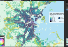
So yeah, that MBTA map had been on my radar for a few weeks (I think it was you who brought it up, so kudos), and I do plan to try recreating that at some point. Of course, working on that also means a dedicated job density map as a byproduct - I hear the calls from all other comments above you.Would it be possible to re-create the MBTA's market analysis frequencies map if possible? (just the map that shows X census track supports 30 vs. 20 or 10 min frequencies, etc, etc,). The data used by the MBTA is about 10 years out of date, plus the fact that the MBTA's map does not extend past Lynn or Quincy Adams, meaning it's hard to see how Framingham/Beverly/Brockton stack up. The combined market analysis map is essentially a merged version of population + employment density to get the "x-supported frequency" for each city block.
Has the MBTA mentioned the exact formula, or weighting between residents and jobs, that they used to create their "composite transit demand" metric? I see your second screenshot about some general ranges of residential and employment density they used to categorize service levels, so I can try reverse-engineering the weights, but a more explicit measure would obviously be better.
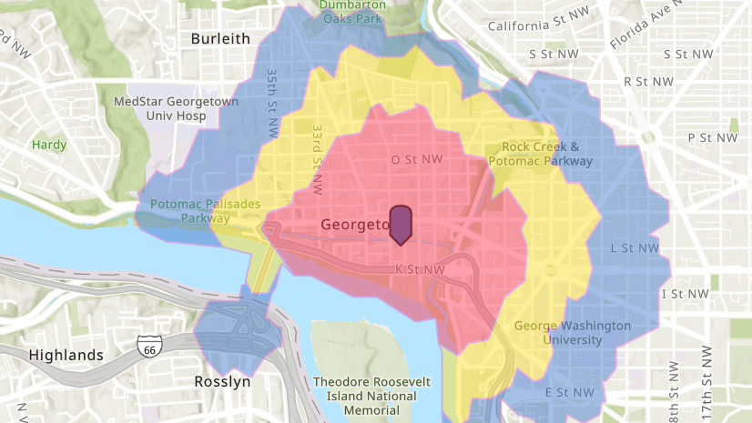
I do see how that can be a concern. The color scales were generated automatically using the Jenks natural breaks optimization, which I picked because it shows the nuances of urban areas pretty well - and urban areas were my initial focus. I'll see if there's a systematic way to finetune low-density areas further (perhaps adding one more color class?).One minor issue with the new maps is the the low density tracts do not have enough colors. I would suggest splitting the "2217-7121" bracket into two if possible (maybe even an extra bracket at 1000?).
 ), and a sample market size analysis table, pulled from the T's market analysis PDF. I have been using the market analysis map and the