11-21 Bromfield Street | DTX | Downtown

Again, TOTALLY DIFFERENT!!!

How about 100 Federal Street?
Constructed 1968-1970.

BA111101LG34.jpg
 
It makes sense. The city made a deal with the West End NIMBYs ... the height was reduced at North Station in exchange for a taller tower at the Garden Garage.

Aren't they different developers?
 
It makes sense. The city made a deal with the West End NIMBYs ... the height was reduced at North Station in exchange for a taller tower at the Garden Garage.

Correct. I think The BRA should listen to them with regards to street level interaction, shadows on landmarks, and demolishing the fabric of old Boston, but when it comes to height screw em. We have under built for so long that now those NIMBYs kids cant afford to live in the city anymore.
 
How about 100 Federal Street?
Constructed 1968-1970.

BA111101LG34.jpg

Ok you can't just state that just because one building's design has cantilever, that it is outdated. Are you guys saying that all cantilever buildings belong in the 60s/70s?
 
Stick -- Too Too Many Facetectomies makes for a faux city -- the classic is the Długi Targ, Gdańsk, Poland

at the end of WWII, retreating Germans, arriving vengeful Russians and some accidental Allied Bombing aimed at the Kriegs Marine wharfs managed to destroy about 80% of the original Grand King's Way and Long Market street

Danzig-1945.jpg


During the Communist era the city rebuilt the facades from meticulous plans documenting the history and photos made during the 1920's and early 1930's -- but with very few exceptions the buildings were nameless / faceless Communist Boxes with the Hanseatic League Gilding glued-on the front
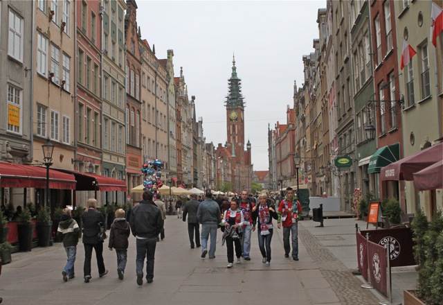
IMG_1811.jpg


I'm all for preserving the the facades of the Great Vaudeville and early Cinema-years Theatres and what is left of the Great Department Stores

However, the typical buildings in and around DTX don't have that charm and sense of history -- they are just oldish, late 19th or early 20th C, non-descript, commercial buildings -- the kind of buildings that were thrown-up quickly to replace what had burned in 1872 or were the 2nd gen structures that replaced the 1870's vintage structures circa 1910

Yea I hear you I think the street level of this building goes great with the area (except for the pass through road). The shorter millennium tower in DTX shows that you can add charm to the neighborhood with brand new architecture if you do it in a way that respects the neighborhood. If they keep the Payless building Ill be happy if they don't this will fit in great between the beautiful buildings it is situated between. I think DTX is really going to be great in either scenario.
 
Nice thing i like for 111 Fed is they know that thing has to rise at least 150' over 100 Fed for the wow factor. Someone at the BRA must have encouraged or agreed that this thing needs significant height separation from MT.

like MT, I believe the actual building will look 10x better than the renders.

and even better together! Build this!!

i'm organizing a small army with a goal of 25,000 signatures...

my email; odurandina@gmail.com
 
Last edited:
Btw, 150 Seaport Blvd is cantilevered. Do you guys think it is outdated too?

151208_BStreet.jpg
 
Lol no because that actually looks good and has a modern facade. People can let a lot of things "slip by" if the end result is undeniably good. If it is iffy or questionable a lot more starts to come into question. The height of that building also does not make the cantilever an eye sore. Take citicorp tower in NY, that building is cantilevered but it is not half way up the tower so it works well.
 
yea... but it was already approved so that explanation never made any sense.

And it still doesn't make sense. What makes sense is that they couldn't afford to build taller and they merely blamed residents for complaining about the height to deflect questions about their financial backing or lack thereof. It was a face saving explanation after the height was already approved.

Boston construction has been relatively vibrant, but a lot of proposed projects don't happen or get scaled back because the developers don't have the capital and the expense of construction drives up capital needs.

But you can blame the City of Boston for the expense of the permitting process which drives up costs and prevents projects from getting built or fully built.
 
Lol no because that actually looks good and has a modern facade. People can let a lot of things "slip by" if the end result is undeniably good. If it is iffy or questionable a lot more starts to come into question. The height of that building also does not make the cantilever an eye sore. Take citicorp tower in NY, that building is cantilevered but it is not half way up the tower so it works well.

Stick -- to Cantilever or Not that is the question -- Some of them work well others --


Well two words -- Fiduciary Trust -- the first time I saw that building and connected it with the company hailing from 1885 -- I figured the architect and CEO were smoking something strange together -- this was the company that invented the idea of Prudent Financial Management -- and then they built a popsicle and stuck the stick into the sidewalk

pict7155.jpg
 
Yeah I don't understand why people think One Bromfield's façade is old the metal accent strips look to me very contemporary and reminiscent of buildings like the Salesforce Tower or the Longfellow Place aka Garden Garage Tower. The only major difference is that in this tower the glass is a silver/grey color and the metal is dark grey or black.
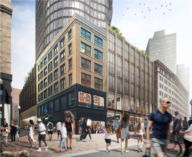
 
The only major difference is that in this tower the glass is a silver/grey color and the metal is dark grey or black.

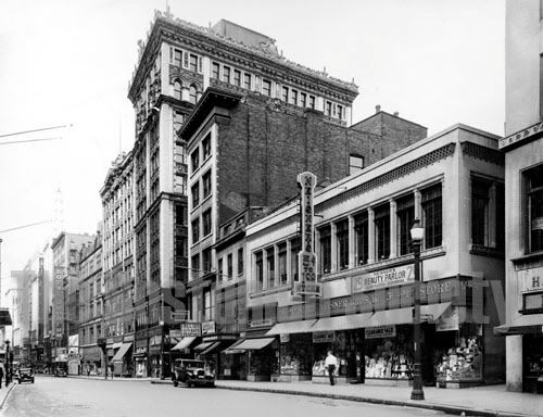
Which is a welcome addition/juxtaposition and so much better than putting more blue glass right next to Millennium.
 
I'm not a fan of the cantilevers either, it makes it look like the tall, slender cousin of the pregnant building.

Related to the streetscape, I give you an unapologetically bad photoshop. The perspective is off a bit and I'm pretty sure the scale is too, but you get the idea:
25635192504_44fd192364_o.png


Obviously you'd want to restore the original cornice:
Payless.jpg


I think retaining the Payless building, or at least the very least the facade, helps to break up the monotonous streetwall and homogony this proposal creates. Washington Street is, after all, a traditional downtown shopping district consisting of frequent facade changes of varying materiality and texture. Small retail bays are the hallmark of this, and should be retained even within larger developments. Too many large, continuous facades are detrimental to the human scale of a walkable retail street.
 
And it still doesn't make sense. What makes sense is that they couldn't afford to build taller and they merely blamed residents for complaining about the height to deflect questions about their financial backing or lack thereof.

I was told it was a meeting between the developer and the West End nimby that knocked the tower down ~100' last fall. If my memory serves me, it was a closed meeting. I would think the investment group has plenty of money to have built up to 600' and sat on a few empty units for an extended period.
 
I'm not a fan of the cantilevers either, it makes it look like the tall, slender cousin of the pregnant building.

Related to the streetscape, I give you an unapologetically bad photoshop. The perspective is off a bit and I'm pretty sure the scale is too, but you get the idea:
25635192504_44fd192364_o.png


Obviously you'd want to restore the original cornice:
Payless.jpg


I think retaining the Payless building, or at least the very least the facade, helps to break up the monotonous streetwall and homogony this proposal creates. Washington Street is, after all, a traditional downtown shopping district consisting of frequent facade changes of varying materiality and texture. Small retail bays are the hallmark of this, and should be retained even within larger developments. Too many large, continuous facades are detrimental to the human scale of a walkable retail street.

Well done! I actually think that looks great. Its kind of funny how we as a group can collectively come up with some amazing things on this site. I think the BRA should look through here every once in a while because they may find something they very much like. Its good to have a bunch of people who have no bias or agenda come together to find what just works or looks good. I think sometimes we really come up with some good ideas one here and there is no delay we can quickly come together and figure out solutions. Whether it makes a difference in the long run is another story but I hope the BRA keeps tabs on us here to see an outsiders perspective.
 
Related to the streetscape, I give you an unapologetically bad photoshop.
Obviously you'd want to restore the original cornice:

I wasn't for a façejob, but that's not bad. Breaks up the dire Bromfield treatment too.
 
I wasn't for a façejob, but that's not bad. Breaks up the dire Bromfield treatment too.

Tobyjug -- Originally, I didn't see any benefit in keeping the old corner building -- However, i've come around to the idea of keeping the one bay along Washington at Bromfield and maybe two or three bays along Bromfield St -- with a continuing of the Washington St. cornice line with the new construction

The tower definitely should be stepped back to let the pedestrian have the traditional human scale wall to deal with at the sidewalk level
 

Back
Top