You are using an out of date browser. It may not display this or other websites correctly.
You should upgrade or use an alternative browser.
You should upgrade or use an alternative browser.
1330 Boylston Street | Fenway
- Thread starter xec
- Start date
Lurker
Senior Member
- Joined
- Jun 13, 2006
- Messages
- 2,362
- Reaction score
- 0
Methinks the ease of the Curtain Wall Tool ? in many software programs and standard specs for the curtain wall industry have a lot to do with it.
To be honest when most otherwise decent modern or contemporary buildings look terrible, it's because they have horrible windows. Think of every ugly building, picture it with better windows, and suddenly the beast appears more palatable.
To be honest when most otherwise decent modern or contemporary buildings look terrible, it's because they have horrible windows. Think of every ugly building, picture it with better windows, and suddenly the beast appears more palatable.
Methinks the ease of the Curtain Wall Tool ? in many software programs and standard specs for the curtain wall industry have a lot to do with it.
To be honest when most otherwise decent modern or contemporary buildings look terrible, it's because they have horrible windows. Think of every ugly building, picture it with better windows, and suddenly the beast appears more palatable.
It all comes down to money. Someone specs expensive windows, preliminary budgets are prepared, the owners shits, someone VE's it, and the good windows are put in as an add/alt .....one that's never pursued.
On the aesthetic of the last 65 yrs, I think 90% of it is hideous. I understand why it's impractical to return to pre-war construction. Doesn't mean I like it.
Up through the 20s, even the cheapest, shitties row-homes were given some discrete (if mass-manufactured) ornamentation. These days, no one designs that, because they know the owner will never foot the bill (the exception being preser/restoration or integrating additions to protected properties)
Ah, anyway. /rant
kennedy
Senior Member
- Joined
- Feb 12, 2007
- Messages
- 2,820
- Reaction score
- 7
That's such an awesome building!
- Joined
- May 25, 2006
- Messages
- 7,033
- Reaction score
- 1,864
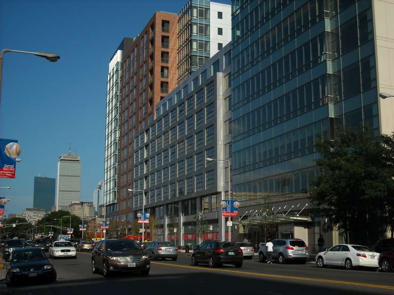
They broke this building up, visually, very well. Always a big fan. As much as I hate forced setbacks I think it might have helped here if only for more sidewalk space.
palindrome
Senior Member
- Joined
- Jun 11, 2006
- Messages
- 2,280
- Reaction score
- 130
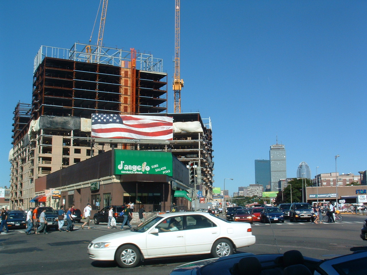
Exciting to see this area start to come together. Still a long way to go, though.
I agree. It amazing to see how much this area has changed just with the addition of trilogy. I am much more enthusiastic about the redevelopment of this area moreso even than the seaport.
Boston02124
Senior Member
- Joined
- Sep 6, 2007
- Messages
- 6,893
- Reaction score
- 6,639
today from Somerville


- Joined
- May 25, 2006
- Messages
- 7,033
- Reaction score
- 1,864
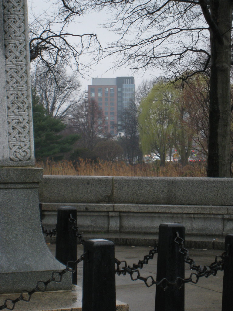
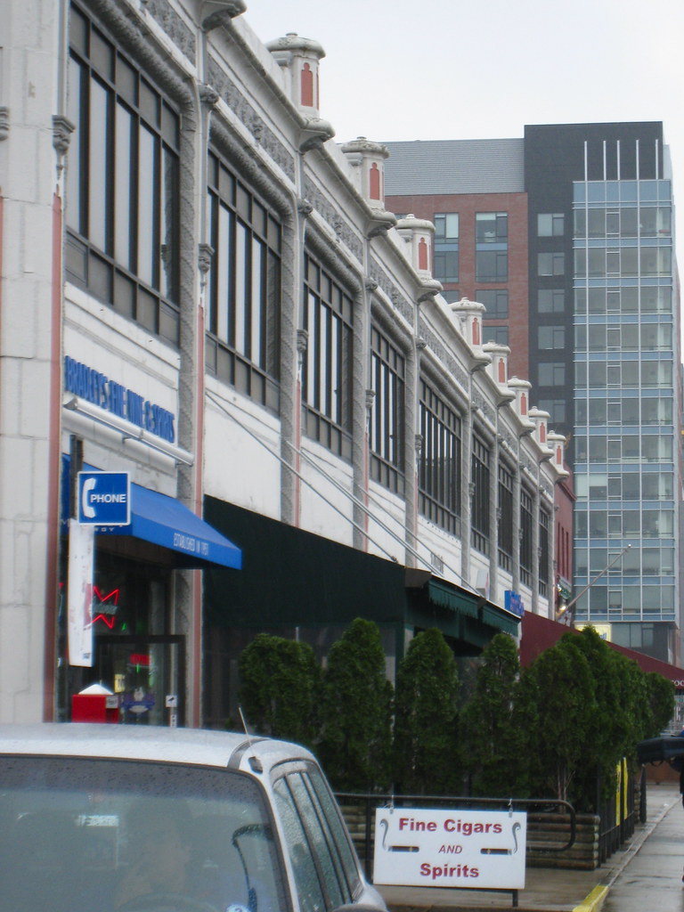
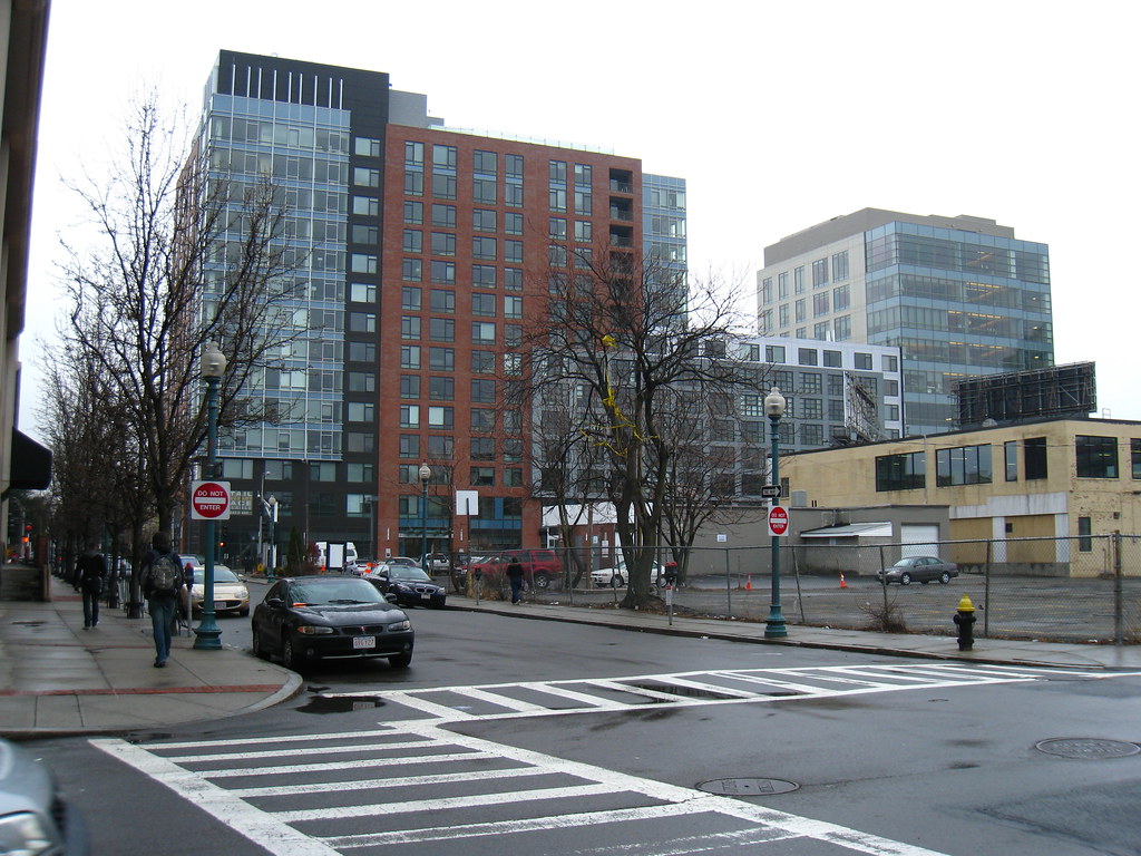
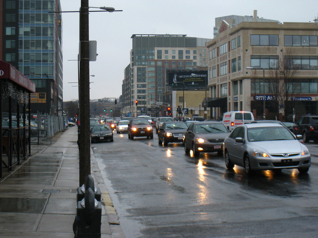
Those first two really illustrate well how boring these glass boxes are with no ornament.
BostonUrbEx
Senior Member
- Joined
- Mar 13, 2010
- Messages
- 4,340
- Reaction score
- 130
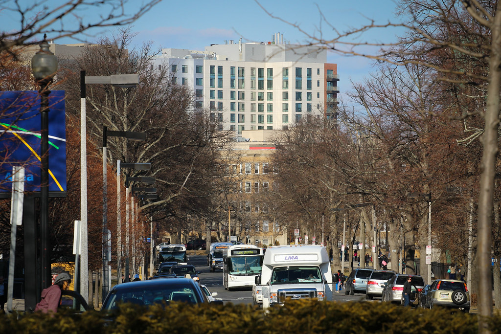
Looks like a stout and stocky 45 Province, except something about the glass structure feels more retro. I even liked it until I paid more attention to the glass.


