New WTC Tower Designs

kz1000ps

Senior Member
Joined
May 28, 2006
Messages
8,802
Reaction score
10,056
you may proceed to either drool or puke. Either way, I expect something to be spilling out of your mouths.

original.jpg


original.jpg


231000-pu.jpg


198000-pu.jpg


199000-pu.jpg


Tower 2, by Norman Foster

212000-pu.jpg


202000-pu.jpg


207000-pu.jpg


204000-pu.jpg


Tower 3, by Richard Rogers

224000-pu.jpg


226000-pu.jpg


220000-pu.jpg


Tower 4, by Fumihiko Maki, the obvious dud of the group

235000-pu.jpg


238000-pu.jpg


Annnnd the grand finale--

http://www.wtc.com/download.aspx?id=197-w
 
Any chess-players out there -- King, Queen, Rook, and Pawn...

Foster's proposal is the coolest, and the only one that retains an element of Libeskind's original proposal with the Ginsu'd top...

Roger's is pretty good, but not a real winner...It looks like a collage of Chicago's John Hancock Center, and Foster's Hong Kong & Shanghai Bank...

Maki's tower wil almost certainly get a re-write -- it's totally inert, Houston, circa 1985...There's half-a-dozen of 'em in Shinjuku...

The Freedom Tower (the name's gotta go) is still white bread, with, perhaps, a smear of gormet mustard -- only enough to excite those who haven't seen better...
 
Wow, it's like they took Shanghai and put it in lower Manhattatn. I kind of like the new building designs, but I still say the "Freedom Tower" is a HORRIBLE design. I hope these get caught up for years.

Wow, I actually CAN see my house from the last one.

Looking at these designs again I have to say that while they are probably the most contemporary designs I can think of, there really needs to be 1 architect with one central design theme. This just looks like they sold off land downtown.
 
I think it's too much. There are 3 distinct towers all next door to each other, making it look like a last minute shmorgesborg (sp?) of buildings. The skyline they create doesn't work well, the towers don't "talk" to eachother. That's why I'm kind of happy that WTC 4 is as bland as it is. If it was as distinct as the others, it would drive me crazy. IMO, they would look a lot better if they were spread out.
 
I think the towers would blend together alot more nicely if fosters tower was gone. The building on its own would be beautiful, but like someone said, there are like 4 signature towers, and all are competeting, not complimenting each other.
 
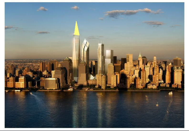
The Freedom Tower is so clunky. The spire makes it look like a hypodermic needle. The rest of it isn't bad thought. To fix it I'd add four more facets above to make a steep pyramid. That would make the tower look something like a cross between a crystal and an obelisk, which I think is a vast improvement. Here's a quick illustration done with MS Paint. The facets would be the same sort of silvery glass, of course. Although at night you might want it lit up so it resembles the illustration.

237379328_d0011083fb_o.jpg


237381755_223b8a8e2b_o.jpg
 
These designs are quite pedestrian, IMO. They look like second tier skyscrapers pulled straight outta Shanghai, Honk Kong, Dubai, or even NY's Times Sq. They also look like they were designed 20 years ago. To be honest, I really wish they'd just end this fiasco and simply rebuild the original towers.

Also, XEC's design is vast improvement...though I do realize this isnt saying very much.
 
I like the two taller of the new towers. The third one sucks.
 
xec said:
The Freedom Tower is so clunky.

Believe it or not, but I was just showing this page to a fellow architectururally minded friend and I used the exact same adjective to describe the FT. I think this is exactly what the Prudential Center would look like if it were designed today.

And Palindrome, I agree with with your comment about the Foster tower being out of place. If it and Rogers' tower were switched, it would look better IMO, but as it is right now, the descending circle theme leftover from the Libeskind days is horribly disjointed, junky even.
 
I like Foster's design the best out of all of them. Its interesting to look at from several different angles, and looks great at night. The Freedom Tower (worst name ever) is poorly designed - impenetrable and aloof from the street level.

Seeing these renderings is getting me excited for Winthrop Square...
 
WTC TOWERS & HUB 'TUB' STARTS TODAY
By TOM TOPOUSIS


January 11, 2007 -- Construction workers at Ground Zero will begin pouring concrete today for the largest foundation built in the city since the excavation of the site of the Twin Towers four decades ago.

Known as the "east bathtub," the 4-foot-thick wall of concrete will descend 70 feet to bedrock and stretch a third of a mile to surround the future site of three of the new towers and the massive new transit hub between Church and Greenwich streets.

The original "bathtub" on the west side of the site, built for the Twin Towers, will be the location of the World Trade Center Memorial and the Freedom Tower.

The entire project is set be done in two stages.

A southern section where Towers 3 and 4 will rise, will be done by Dec. 31.

The northern section, for Tower 2 and the transit hub, will be done by June 30, 2008.

* Scientists hoping to identify more Sept. 11 victims have launched a second round of testing of human bones recently found at Ground Zero after initial tests didn't yield strong enough DNA for identifications.

tom.topousis@nypost.com
 
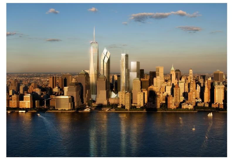
I share most of the sentiments expressed in this thread but I think from this angle it looks pretty amazing.

view1ry66jj.jpg
 
ZenZen said:
You'd have to been in Jersey City to see that.

Which is why I bet all those condo developers in Jersey City are mighty happy to have that rendering!
 
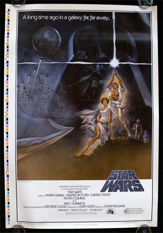
There's something strangely familiar about that latest rendering. Cant...quite...put my finger on it...

view1ry66jj.jpg


swaproof.jpg
 
Oh man, you're right! That's freaky! Except in the NY version, the Death Star seems to be much smaller and in a different position, Perhaps that is the terrorists' main base, waiting to strike...... :?:
 
One more thought...perhaps Osama bin Laden is the FATHER of the Freedom Tower????? Well? It can't be. I've heard that the Freedom Tower has a twin sister hiding somewhere? Alrighty, I've gone off the deep end.
 
The problems with the so-called "plagued design" run much deeper than aesthetics, positioning and engineering.

Simply put, nobody wants to occupy the building(s). Would you want to go to work every day on the 125th floor of the World Trade Center? What is the point in risking you and your employees' lives to work in this superstructure. The engineers can put forward safety features but it in no way assures that the building won't be targeted again.. and again.. .and again.

As time goes on memories fade, as do people's fear of what happened on 9/11. The longer they wait, the more people will be willing to move back into the complex and pay more to establish a long-term lease. (I can only imagine what kind of covenants are in the leases for the new WTC).

This is somewhat a conspiracy theory to drive up the rents and justify a construction cost that will easily top 4 billion for the whole complex.
 

Back
Top