You are using an out of date browser. It may not display this or other websites correctly.
You should upgrade or use an alternative browser.
You should upgrade or use an alternative browser.
Ode to Brutalism
- Thread starter armpitsOFmight
- Start date
Beton Brut
Senior Member
- Joined
- May 25, 2006
- Messages
- 4,382
- Reaction score
- 338
Charlie_mta
Senior Member
- Joined
- Jul 15, 2006
- Messages
- 4,571
- Reaction score
- 6,506
Thanks for this. I've always loved mid-century modern, represented by this house and others in this vein from the 1940's thru 1960s.
Blackbird
Senior Member
- Joined
- Feb 2, 2014
- Messages
- 1,207
- Reaction score
- 1,721
1975 rendering of the Lahey Hospital's new campus out in Burlington... sharing not so much because the architecture is noteworthy but more for the mood that a black and white rendering of an institutional behemoth as filtered through a gritty, faded newspaper print can create. IMO it doesn't get much more big, bad brutalist seventies than this

From Burlington Retro
Why would you want a hospital of all things to look so menacing and uninviting?
Government buildings I can understand, but not this.
Why would you want a hospital of all things to look so menacing and uninviting?
Government buildings I can understand, but not this.
Maybe that's why it wasn't approved the first time it was brought up at Town Meeting in the early 70s (though a lot of opposition at the time was due to local support for Woburn's Choate Hospital and Winchester Hospital.. In the end, it didn't end up looking a whole like that. It was a just as bland, but turned out to be a somewhat symmetrical, less menacing building built into the hillside (a good change from many hospitals which are the result of add-ons and end up with very confusing floor plans. When it was expanded in the 90s, the extension built-the third segment, closest to 128 with the void underneath and signage- looked like it was built with the original two segment building). Burlington Retro, by the way, is one of the better local history sites I've seen.
BTW, the newly elected Mayor of Boston loves City Hall. Let her know if you want a tour...

I still think the plaza is the major offender and the building would be better complemented by a well-designed one, and I love Sasaki's work, but fear we won't see something that helps the building.
I still think the plaza is the major offender and the building would be better complemented by a well-designed one, and I love Sasaki's work, but fear we won't see something that helps the building.
Beton Brut
Senior Member
- Joined
- May 25, 2006
- Messages
- 4,382
- Reaction score
- 338
OMG!!! HE'S ALIVE! The article is by none other than "Mr. Soaring Tower" himself, Scott Van Voorhis. It's been ages since I've come across his name and I'd given up all hope that his name would ever grace the pages of aB again. Glad to learn he's still out there and appears to be doing well.
For anyone interested in hard modernism while scratching their SvV itch…
Hm, that's an oddly reasonable, informative, and engaging piece by him--at least, as compared to the snarky, bile-drenched nothingburgers, strewn with gratuitous potshots,* he spewed out while at B&T.
To be fair, his targets at that time--the BPDA/Menino Administration/exasperatingly NIMBYite suburban zoning boards--were immensely deserving of the criticism. But the way he did it was so vapidly "hot take", devoid of informed research/argumentation, as to make the pieces hate-reads and perfect examples of how "not to do it."
*(almost as bad as Howie Carr in that regard, perhaps)
Charlie_mta
Senior Member
- Joined
- Jul 15, 2006
- Messages
- 4,571
- Reaction score
- 6,506
As has been said by several on AB before, brutalism took a bad rap in Boston because of its accidental association with the carpet-bombing 1960s urban renewal Government Center project. It's necessary to separate out City Hall from its unfortunate setting in a vast empty plaza gouged out of a once vibrant city core area.
Beton Brut
Senior Member
- Joined
- May 25, 2006
- Messages
- 4,382
- Reaction score
- 338
Apparently it’s a library and event center by the mostly brilliant David Adjaye.Winter Park FL (north of downtown Orlando) is constructing a very neo-butralist library:
View attachment 10362View attachment 10363
And a nod to another library not far away in downtown Orlando (especially that sweeping interior staircase), designed by none other than "Harvard Five" John Johansen:
Orlando Public Library
Orlando Public Library - street view
Last edited:
Blackbird
Senior Member
- Joined
- Feb 2, 2014
- Messages
- 1,207
- Reaction score
- 1,721
Bird’s Eye Brutalism
View attachment 13587
Today's rendition of "questions I've never thought to ask before": What's the deal with those brick bump-outs on the north(?) side of City Hall? Are there rooms there? If so, why couldn't they fit into the building proper?
stick n move
Superstar
- Joined
- Oct 14, 2009
- Messages
- 12,148
- Reaction score
- 19,081
Beer Sheva, Israel
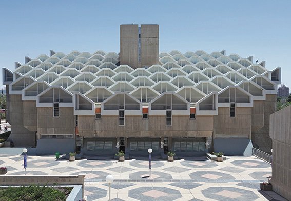
Madison park high school, Boston.
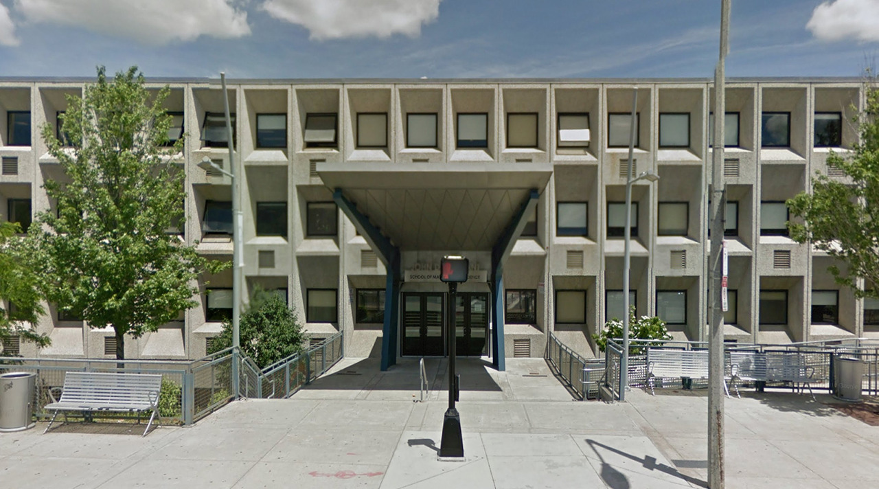

https://www.artstreetecture.com/streetview/post/777-madison-park-high-school-boston-marcel-breuer
Frank sedita court, Buffalo.

https://commons.m.wikimedia.org/wiki/File:Frank_A_Sedita_court_building.jpg

Madison park high school, Boston.


https://www.artstreetecture.com/streetview/post/777-madison-park-high-school-boston-marcel-breuer
Frank sedita court, Buffalo.

https://commons.m.wikimedia.org/wiki/File:Frank_A_Sedita_court_building.jpg
On Miami's Marine Stadium: https://www.washingtonpost.com/lifestyle/2022/02/24/miami-marine-stadium/
BeyondRevenue
Active Member
- Joined
- Mar 13, 2020
- Messages
- 550
- Reaction score
- 1,148
I saw an exceptional futurist film with brutalist architecture arguably the most pivotal player in the story.
BeyondRevenue
Active Member
- Joined
- Mar 13, 2020
- Messages
- 550
- Reaction score
- 1,148
Sedita Court… it’s a missile platform, right? Come on. You can tell me. Cold war crazy too big to move? Gotta be.Beer Sheva, Israel

Madison park high school, Boston.


https://www.artstreetecture.com/streetview/post/777-madison-park-high-school-boston-marcel-breuer
Frank sedita court, Buffalo.

https://commons.m.wikimedia.org/wiki/File:Frank_A_Sedita_court_building.jpg
- Joined
- Dec 10, 2011
- Messages
- 5,599
- Reaction score
- 2,717
St Paul's Lutheran, Route 2 Hilltop, Arlington has this little brutalist/modernist gem on the original "Concord Turnpike" street which nobody sees ever since the expressway Route 2 cut through the hilltop and the old street became an access road
(on the North/Arlington side of Rt 2, opposite the Mormon Temple; map linked below)
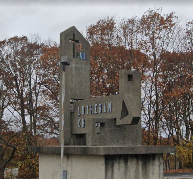
(from Google Streetview)

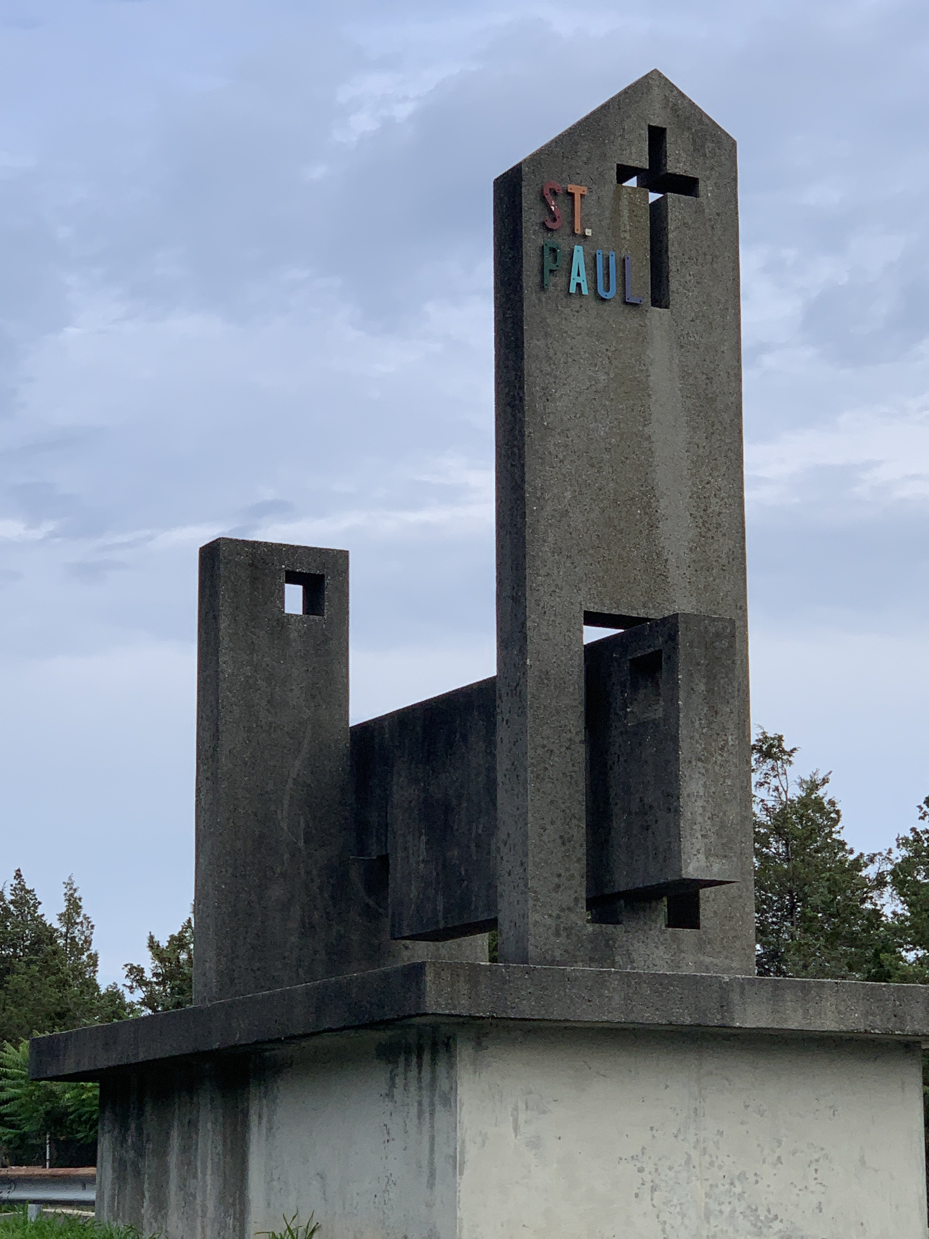
(on the North/Arlington side of Rt 2, opposite the Mormon Temple; map linked below)
(from Google Streetview)
Charlie_mta
Senior Member
- Joined
- Jul 15, 2006
- Messages
- 4,571
- Reaction score
- 6,506
Concrete ages horribly in this climate, with a lot of drainage related staining. Painting old concrete has worked well on the remaining section of the GC Garage. I'd recommend it on St Paul's Lutheran as well but with a lighter color. Here's the painted portion of the GC Garage (photo by Beeline):St Paul's Lutheran, Route 2 Hilltop, Arlington has this little brutalist/modernist gem on the original "Concord Turnpike" street which nobody sees ever since the expressway Route 2 cut through the hilltop and the old street became an access road (on the North/Arlington side of Rt 2, opposite the Mormon Temple; map linked below)

Last edited:

