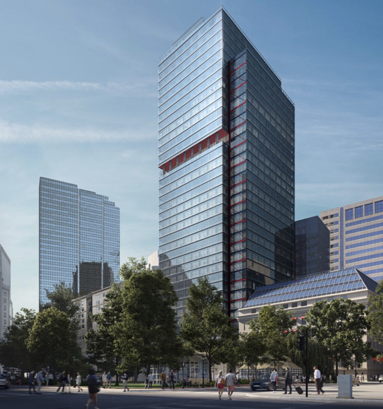
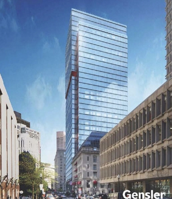
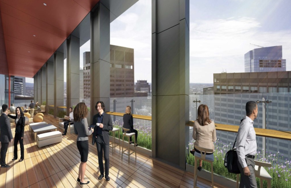
One Post Office Square Makeover and Expansion | Financial District

Lazy. Uninspired. Typical. (That the "torch" element is the center of discussion here speaks volumes - what else is there to discuss?)

Mr Golden at the BCDC notches another bland addition to our cherished city. He continues to nibble destructively at the fabric of our urban realm.

Did I love this building? No. But like it or not, the current building is an attempt (arguable, okay, if you insist) at design and, equally important, a place-marker for a period in time. These markers are important for historical cities. Not every marker needs to be of our colonial era. Or an icon of design.

No city survives without growth, without change. And not everything can be saved, it's true. But what is lost is lost forever. Maybe this loss is not a seminal loss - agreed - but it is a symptom of a greater ailment. A lack of vision.

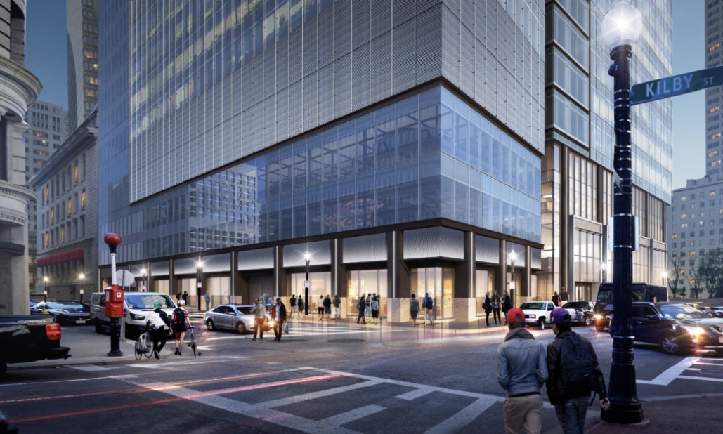
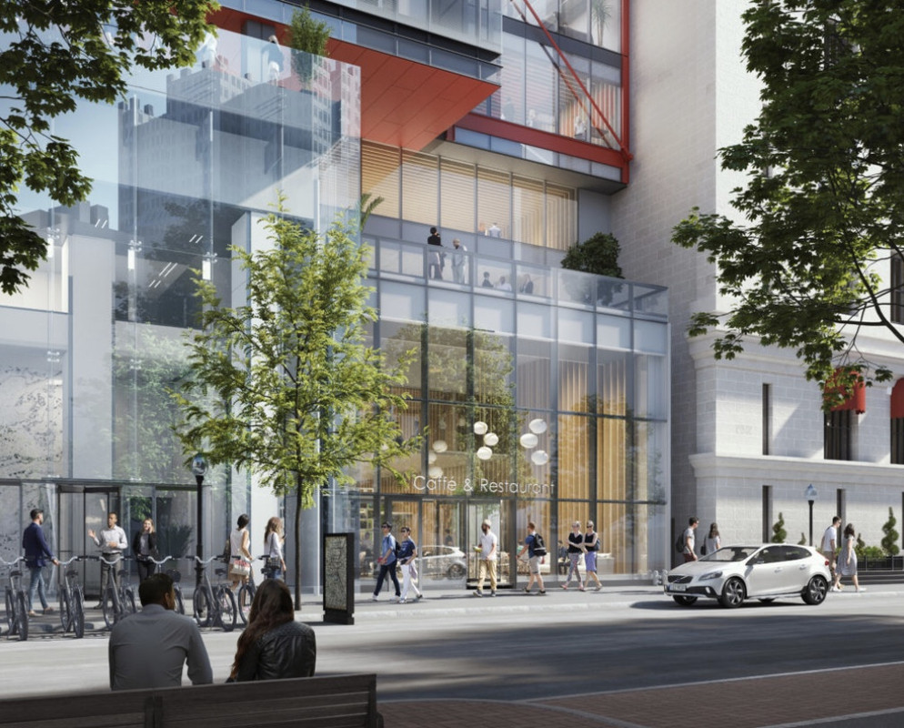
I dont think its being destructive to fix one of the crappiest buildings of any city. I agree that older buildings from the different architectural periods need to be kept. Thats why I think we must keep 1 Boston place. It clearly fits in the Chicago Hancock era. The Pru, federal reserve, 1 financial, 1IP, 60 State street- my favorite tower, even the state street bank do this well and should be kept as is. The thing is our entire skyline is buildings from past periods and many arent great, so fixing only one of them is not a big deal, especially when its soo crappy. We have an entire skyline of old towers, well be fine. This and 1 devonshire should get a reclad, then add new towers and keep the rest and well be sitting well. Theres no space in the main core so recladding 1-2 of the crappiest towers there is great. Look at the street level for this too nobody has really been talking about it but its light years better than whats there. Its a real high quality interaction with the street and adds retail where there were drab concrete walls. Huge win, this tower looks great where a shitter was before. In the core we have only 3 blue glass towers Mt, exchange pl, 33 arch and 33 arch and mt are on the outskirts this and Exchange place will be in the middle of the core where there isnt much glass.
 
This and 1 devonshire should get a reclad....

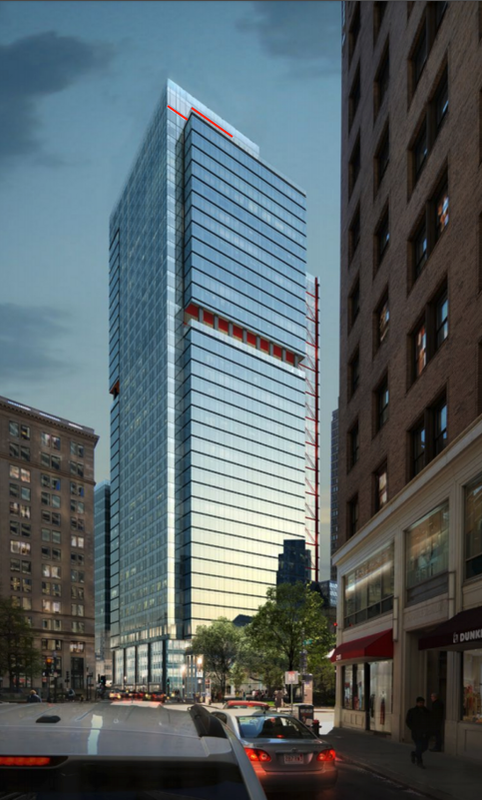
There's a difference between a straight reclad and a wholesale revision on a tower's shape itself. The overhangs of this building make it interesting, particularly in silhouette on the skyline. The remake will remove this feature, make the entire building wider, and it honestly looks like they're lopping off the very top section (I scrutinized the other links posted and still believe this). So a fatter, shorter, hulking mass with more generic blue glass. Too much blue glass is not a good thing and we already having existing buildings that do it better, plus the upcoming Winthrop Square, Congress Street, South Station, and 1000 Boylston Street towers which all look superior to this.

I absolutely hate this proposal and nominate it for worst proposal of the millennium.
 
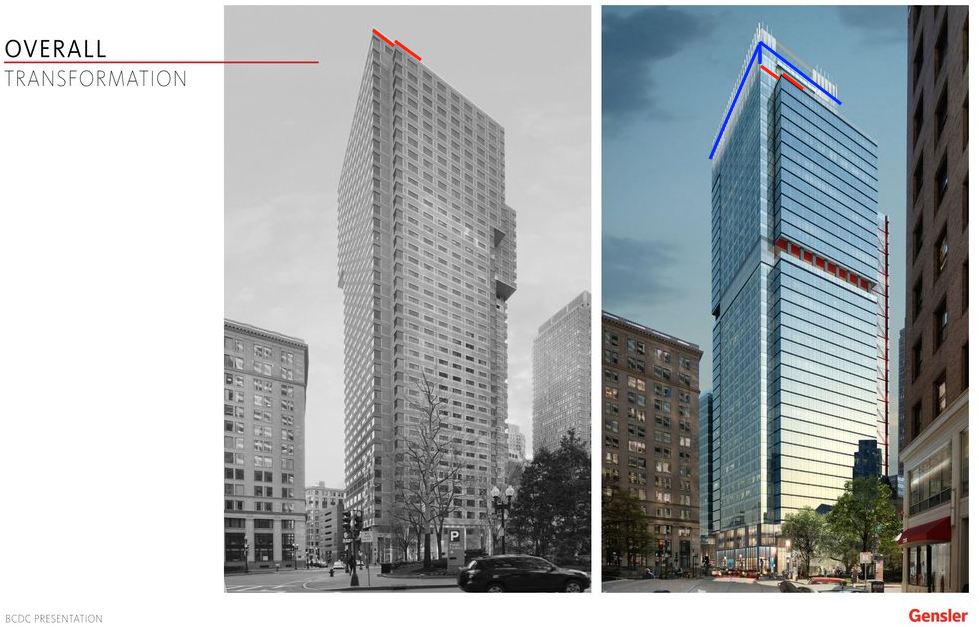
The render showing how the shape will change showed it was a little taller and now is the same height. I personally dont care for the top heavy design now with the corners knocked out but to each their own. To me the ground level is a billion times better and the tower overall is much better. I always hated this tower and thought its shape was horrible. Everyone has differibg opinions but better get used to the new look because its coming. I bet when this wraps up people will be praising it. Its definitely not a hulking mass at all theyre only filling in the small corners as seen below. The only substantial addition is a few floors on top of the garage. The mass of the tower is the same the bottom is just going to evenly match the top.

2nd picture down

http://www.bostonplans.org/getattachment/5d46991a-5f85-4789-80d9-636bbc2bea09
 
Stick, respect your opinion. But our definitions of "crap" are clearly different.

What I feel is dated and underwhelming now, I believe will only seem more so in five years. And I believe many of you enthusiasts will come around and feel the same antipathy at that time. (Especially after better glass examples are completed.)

I would add this: That a lackluster proposal like this gets the modest acclaim that it has is an indication of the paucity of good design in our city and the hunger that exists for it.

Our tastes may differ, but we all want the same thing. Quality.
 
Aside from the little spiky things on the top of the lantern, I'm not convinced that they ever actually showed this getting taller. What they did do is take the partial glass crown and expand it out so it would be the total width of the building. However, they didn't expand it upward. If they cut it back now, they are cutting it to the height of the current tower WITHOUT the glass penthouse thing on top, so about 505'.

Edit: I'm further confused because the link you posted with the missing lantern is from March 9, 2018. Is this really the newest version and why didn't we see it until 8 months later? Plus, what is the far right render on page 4? It shows a crown type thing that isn't in the rest of them. Could it be they are just keeping it the same general height?
 
To me the ground level is a billion times better and the tower overall is much better. I always hated this tower and thought its shape was horrible. Everyone has differibg opinions but better get used to the new look because its coming. I bet when this wraps up people will be praising it.

Yes: A totally fantastic update.

The glass looks cheap in the render.

That's why it's called a render.

It's getting slightly fatter.

So what: it's a fine trade to rid it of its hideous massing.

The actual building is going to look gorgeous

as opposed to its current pile of dog puke status.....

Trade every one of these brick shit towers for glass.

Get Harbor Garage, SST, and Winthrop up.... That's 4 towers!

Get 1 Boston Place a ringed shaped crown.... Light it....
 
Stick, respect your opinion. But our definitions of "crap" are clearly different.

What I feel is dated and underwhelming now, I believe will only seem more so in five years. And I believe many of you enthusiasts will come around and feel the same antipathy at that time. (Especially after better glass examples are completed.)

I would add this: That a lackluster proposal like this gets the modest acclaim that it has is an indication of the paucity of good design in our city and the hunger that exists for it.

Our tastes may differ, but we all want the same thing. Quality.

Im definitely not an enthusiast of this. I dont think this looks that great by any stretch, its nothing special at all. Im just saying to me I hate the tower there now and I believe this is an upgrade.
 
Yes: A totally fantastic update.

The glass looks cheap in the render.

That's why it's called a render.

It's getting slightly fatter.

So what: it's a fine trade to rid it of its hideous massing.

The actual building is going to look gorgeous

as opposed to its current pile of dog puke status.....

Trade every one of these brick shit towers for glass.

Get Harbor Garage, SST, and Winthrop up.... That's 4 towers!

Get 1 Boston Place a ringed shaped crown.... Light it....

I dont agree, but different strokes. I would only want to see this and 1 devonshire reclad, keep everything else its important for not having a London or Dubai skyline. Even Toronto or Vancouver, all glass skylines are boring. 1 Boston place is very important to keep its our Chicago Hancock era designed tower its important to have this.
 
Surveyors were out in full force yesterday from every street and corner within a 2 block radius of 1PO. I asked one of the surveyors if this was for the reclad and confirmed yes. Nice guy, talked to him for a bit. He said they have a lot of work of ahead of them, but they are ready to go and need to get the whole thing done quickly.
 
Thanks. i inquired about this a moment ago on project x,

only to see the thread bump.

how do you re-clad the tower while minimizing the disruption to the tenants?

nights/weekends?
/
 
Last edited:
"but they are ready to go and need to get the whole thing done quickly."

Question- for a project like this- what is a realistic time frame to re-clad this thing?

And looking at all the renders this project is Boston Mediocre IMO but I really don't care because I feel like this is going to act look and feel when this is done like nothing was there before and now we have this glass tower.
 
Not sure how I feel about the red accents


OPOS_Exterior_Pearl_Street_Detail.0.jpg


Gensler.
 
Last edited:

The tower's new architectural height will be

516'


I saw this on the FAA documents too. Interestingly, on the website the transformation pictures showing the top don't show it losing any apparent height. If anything, it almost looks like it gains a small amount. Maybe it was really 516' to begin with?


Not sure how I feel about the red accents

that red pin striping isn't good at all.

Without the overhangs of the current building, the red is the only thing that keeps the redo from being a completely plain glass box. It helps differentiate itself slightly from Exchange Place which is barely a block away. Frankly, the diagonal pieces of red should be a bit thicker.
 
I saw this on the FAA documents too. Interestingly, on the website the transformation pictures showing the top don't show it losing any apparent height. If anything, it almost looks like it gains a small amount. Maybe it was really 516' to begin with?


Without the overhangs of the current building, the red is the only thing that keeps the redo from being a completely plain glass box. It helps differentiate itself slightly from Exchange Place which is barely a block away. Frankly, the diagonal pieces of red should be a bit thicker.

I think this picture shows it best.
L3gCLrah.png


I outlined the glass part that sticks up now, and above that you can see the old "lighthouse" thats been removed. The red is the old roofline.


Screen-Shot-2018-11-05-at-4-37-46-PM.png


Red is the old roof line
 
So the glass top of the old tower gets pulled out to the corner. It may gain a tinyy bit idk but its essentially the same height, but losing the top of the lighthouse that added a floor before.

521193-Large-fullheightview-elevated-view-from-the-east.jpg
 

Back
Top