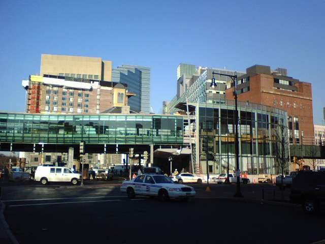
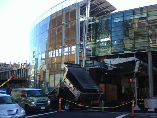
Red Line Construction

Hmm, interesting. The only thing I was basing my analysis on was when I work at the South County (Rhode Island) Hospital ER, we airlifted all the cases we couldn't handle to MGH.

But that isn't the first time I've heard that about BMC. My only experience with BMC is that that is where we send all the alcohol vomitters here at NU


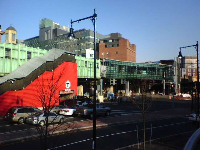
The red REALLY stands out, for the better or worse


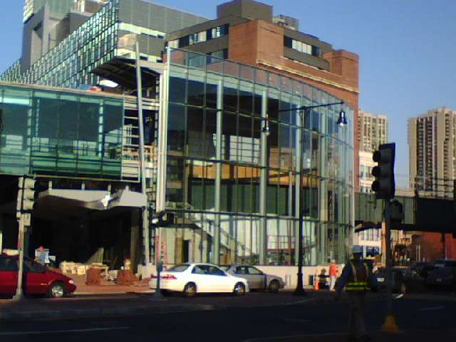
and the other (north) side

 
The red wall is for the current temporary stairway. It will go away after the new station opens.
 
This circle is as chaotic as ever. If anything, the new station aggravates the chaos (visually, at least). At least the old station had a spindly and temporary look.

I've tried to like the new station from an urbanistic standpoint, but I just can't. Its principal virtue is newness, and that will rub off. Then we'll be left with just the visual chaos.
 
ablarc said:
This circle is as chaotic as ever. If anything, the new station aggravates the chaos (visually, at least). At least the old station had a spindly and temporary look.

I've tried to like the new station from an urbanistic standpoint, but I just can't. Its principal virtue is newness, and that will rub off. Then we'll be left with just the visual chaos.

I would tend to agree with you. It may be because of the level of construction going on there, but it's almost as if the designer was trying to confuse everyone when he made this monster. Like the ICA, once the newness wears thin, it will be another eyesore. It's a damn platform for god's sake, why do you need all that glass for a platform
 
BAH! It's a nice station, 10 times better than it was and it will help relieve the chaos below that is going to get 10 times worse when they start digging up Storrow Drive.
 
And let's not forget that it makes a subway stop next to a major hospital fully accessible. That's more important to me than the station's appearance.

Even for the fully able-bodied, getting in and out of the old station was an exhausting task.
 
justin said:
Is chaos not quintessentially urban?
Haussmann didn't think so. And he left us an eloquent treatise on urban order.

Sounds like an opinion from the Seventies.

Like the jungle, the suburb, politics, human affairs or business, the city can be chaotic or not.
 
Pretty though they are, I find Hausmanns' boulevards a touch sterile compared with the medieval warrens they enclose. And what of Istanbul, Cairo, New York? No, chaos is urban; which is not to say that every good city has to be chaotic.

I'm not crazy about the new station, but nor do I hate it. The design is clumsy, but in practical terms it's a vast improvement over the moated bunker that preceded it. Charles circle was always going to be chaotic. At least one may hope that the increased pedestrian presence at ground level will tame it a bit.

justin
 
ablarc said:
This circle is as chaotic as ever. If anything, the new station aggravates the chaos (visually, at least). At least the old station had a spindly and temporary look.

I've tried to like the new station from an urbanistic standpoint, but I just can't. Its principal virtue is newness, and that will rub off. Then we'll be left with just the visual chaos.

ablarc when did you last step foot in Boston? Have you walked around the MGH T stop yourself or are your profoundly insightful criticisms of Boston's development projects derived solely from looking at a few of the lousy pictures we take?

I don't go around bashing blandly designed bible belt faux-churches surrounded by nothing but parking lots before I actually see them for myself.
 
I don't go around bashing blandly designed bible belt faux-churches surrounded by nothing but parking lots before I actually see them for myself.

HA! I would!
 
Merper said:
]
I don't go around bashing blandly designed bible belt faux-churches surrounded by nothing but parking lots before I actually see them for myself.

HA! I would!
So would I. They're abominable, like everything in autosuburbia. The pictures tell the story, and they tell it true. Folks aren't often surprised visiting places they've seen pictured.

When I lived on Cedar Lane Way, the T stop was Charles. It wasn't great then, but it had a kind of neglected, raffish charm that recalled the old West End. It looks like the new station will be clean and up-to-date by comparison until it gets old and neglected. Then few will find in it raffishness or charm. (All that dirty glass.)

Mistaking cleanness and up-to-dateness for architectural quality is an error more common in suburbia than among city folks; it's ubiquitous among my clients, but they live in Suburbia and have often never seen a city.
 
...

In time, the most redeeming quality about the new station will be whatever's left of the original copper siding...
 
The most redeeming quality of the new station will be the escalators and elevators, which make it usable by people who could never have used the old one.
 
Ron Newman said:
The most redeeming quality of the new station will be the escalators and elevators, which make it usable by people who could never have used the old one.
Amen, functionally.

Merper probably got it aesthetically.
 
Ron Newman said:
The most redeeming quality of the new station will be the escalators and elevators, which make it usable by people who could never have used the old one.
Though of course, having been deposited at street level by all that newfangled technology, the hospital patrons will then have to play Frogger in the circle to get to their final destination, no pun intended.
 
It looks to me like the circle has been reconfigured so there will only be two lanes of one-way traffic separating the station exit from the MGH sidewalk. I assume there will be a signal at that crosswalk once all the construction is over.
 
charles

While I am not in love with the new design, I think it will age better than many here have suggested. Nonetheless, the MBTA maintenance record is reason for concern.

And though I have only driven through the area lately, I think the new street configuration is a drastic improvement. The unbroken and intimidating swath of pavement surrounding the station has been broken down into pedestrian friendly geometry. The materials used on the street-level improvements are also excellent. In sum, I think this is a very significant enhancement to the area.
 
I commute on the Red Line and enjoy watching the Charles station's progress as I go by every day. I think the hybrid look is fascinating.

My one worry is the large wooden panels they've placed up on either side of the elevated tracks between the Charles platform and the portal to Park Street. I surely hope these are temporary panels, either to block construction noise or welding sparks or otherwise, because they completely ruin a lovely view. I feel like we're driving down a highway surrounded by the 50-foot NIMBY walls. Does anyone have any knowledge of these panels and whether or not they'll be removed once construction is finished?
 

Back
Top