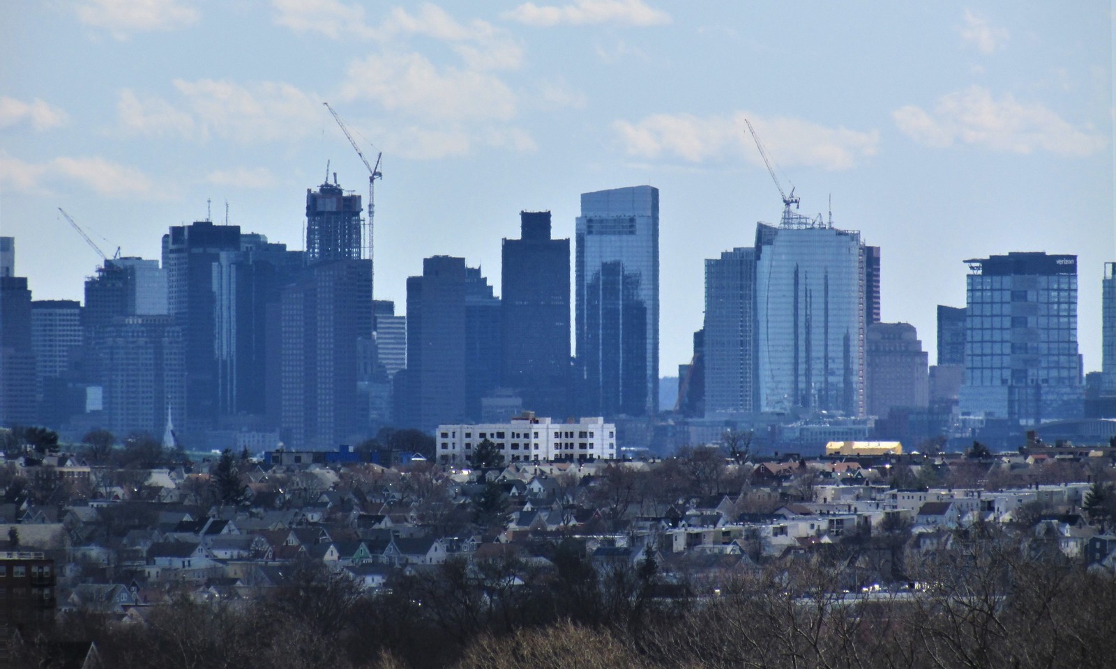
State Street HQ | One Congress | Bulfinch Crossing | West End

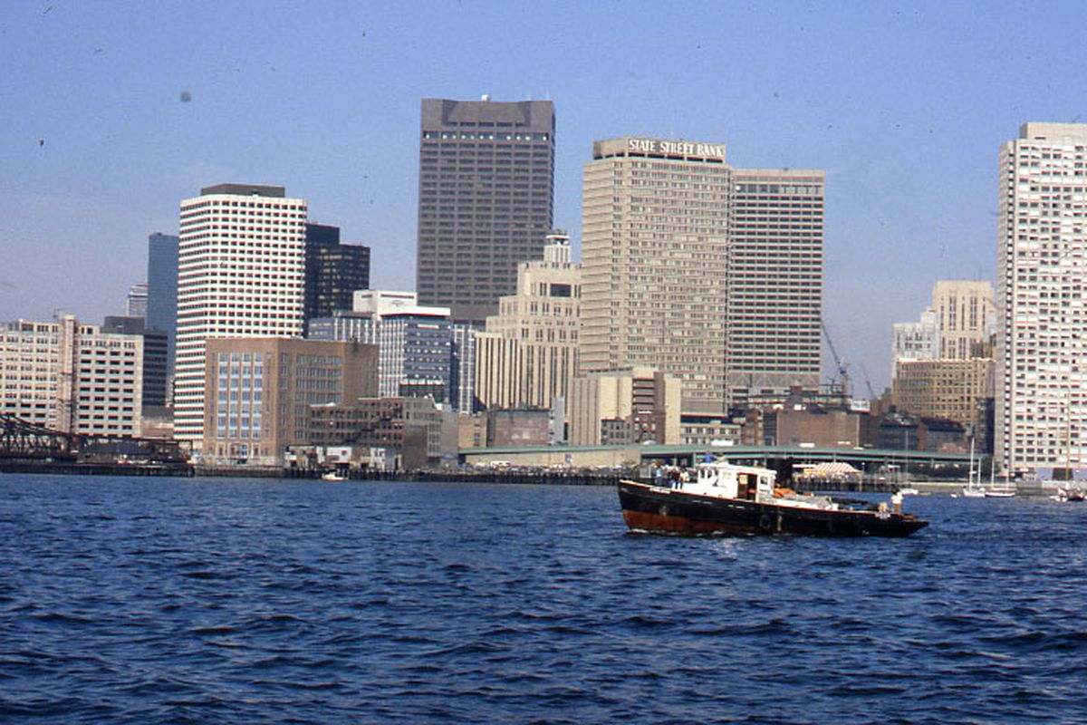
It's a lot harder to find pictures of this building than I thought it would be. The font is extremely close other than the "R." Note the little "feet" for each letter, the turndowns on the T, the way the middle section of the E's go up and down... It's very close. The S's were made bigger than the rest of it on the new sign but that's likely due to the constraints of where each sign was located.

State Street Bank by Boston City Archives, on Flickr
1648181814756.png


Here it is finishing construction, as a fairly dominant 2nd tallest building for downtown at the time. Funny how this one has never seemed tall to me, yet was so prominent before my time.

Boston skyline, including Custom House Tower and State Street Bank Building by Boston City Archives, on Flickr
 
It's a lot harder to find pictures of this building than I thought it would be. The font is extremely close other than the "R." Note the little "feet" for each letter, the turndowns on the T, the way the middle section of the E's go up and down... It's very close. The S's were made bigger than the rest of it on the new sign but that's likely due to the constraints of where each sign was located.

It's definitely not the same font. The curved-up leg of the "R" is the biggest giveaway, but there are a number of other differences. The serifs (that's the little "feet" and similar details) are much thicker ("slab" serifs in font jargon) than the current font, and a lot of the letterforms are different even accounting for the fact that the old one is all-caps and the current is small-caps. At full zoom on Flickr it's also clear that the serifs on the "S"s don't match those of the new version. I can't identify the exact font (and it could well be a custom, though it bears resemblance to the Century and Clarendon families) but it's definitely not the same as the current one (which appears to be a customized version of Rotis, a typeface originally created in the late 1980s).

You weren't kidding about how difficult it is to find pictures of the building with the sign, but you managed it. Thank you for the quality finds.
 
I like the all-caps version (the 3rd photo) better. It looks bolder and cleaner. The first two (especially the top one) look kind of faux-sophisticated and a pretentious.

The top 2 strike me as being exactly the same. It just fits better on 1 Lincoln than it does on this new tower.
 
The top 2 strike me as being exactly the same. It just fits better on 1 Lincoln than it does on this new tower.

They are the same, that's State Street's current corporate font. It absolutely looks better on One Lincoln than on One Congress, where it looks like an afterthought.
 
225 Franklin Street version should get as much love as the others
 
They are the same, that's State Street's current corporate font. It absolutely looks better on One Lincoln than on One Congress, where it looks like an afterthought.

that was my orig point - it’s completely incongruous on the new tower. It’s a fine logo (I guess. I have no skin in that game), but doesn’t play well with one congress AT ALL. It’s like putting an elaborate moving LED display on the custom house tower - a perfectly fine decorative element, but total mismatch of aesthetics.
 
It's a lot harder to find pictures of this building than I thought it would be. The font is extremely close other than the "R." Note the little "feet" for each letter, the turndowns on the T, the way the middle section of the E's go up and down... It's very close. The S's were made bigger than the rest of it on the new sign but that's likely due to the constraints of where each sign was located.

State Street Bank by Boston City Archives, on Flickr

View attachment 22656

Here it is finishing construction, as a fairly dominant 2nd tallest building for downtown at the time. Funny how this one has never seemed tall to me, yet was so prominent before my time.

Boston skyline, including Custom House Tower and State Street Bank Building by Boston City Archives, on Flickr
Amazing pics. I remember now that in Building a New Boston by Thomas O'Connor (a must read for anyone who's a real deal aB nerd), the later chapters deal with the building of State St Bank as ushering in a new wave of construction in a previously dead area. These photos really highlight what a big deal that building was.
 
NewsCenter 5's Emily Maher, who was in the North End reporting on a different story, said she saw multiple floors of the parking garage come crashing down.

Crews at the scene told Maher that a crane collapsed on top of the parking garage, causing multiple floors of the garage to come down.

One man who witnessed the collapse told Maher that he could hear the sound of jackhammers just moments before he saw some of the floors of the parking garage collapse.

A woman who heard the collapse said it sounded like continuous thunder.
 

Back
Top