stick n move
Superstar
- Joined
- Oct 14, 2009
- Messages
- 11,026
- Reaction score
- 14,557
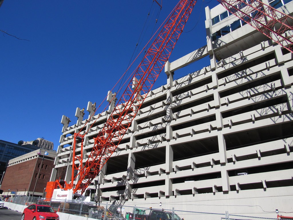
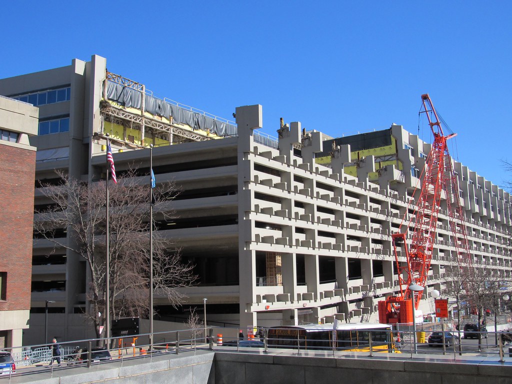
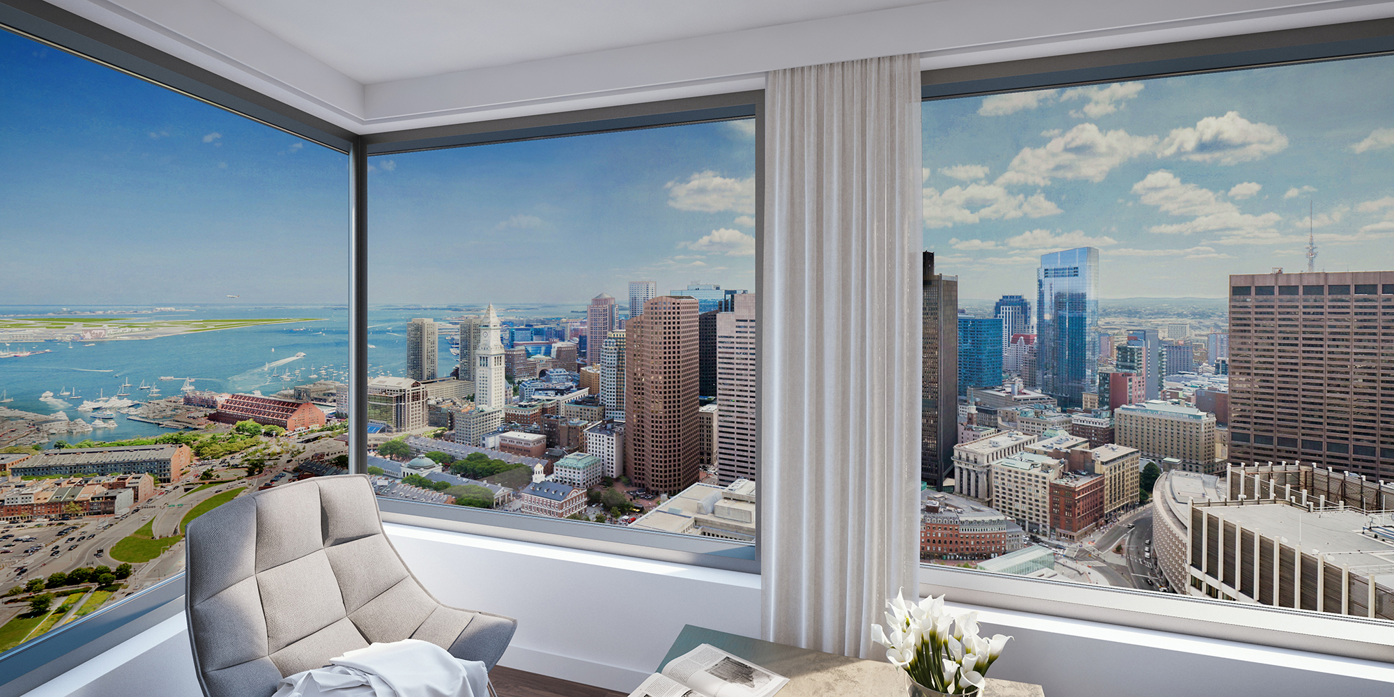
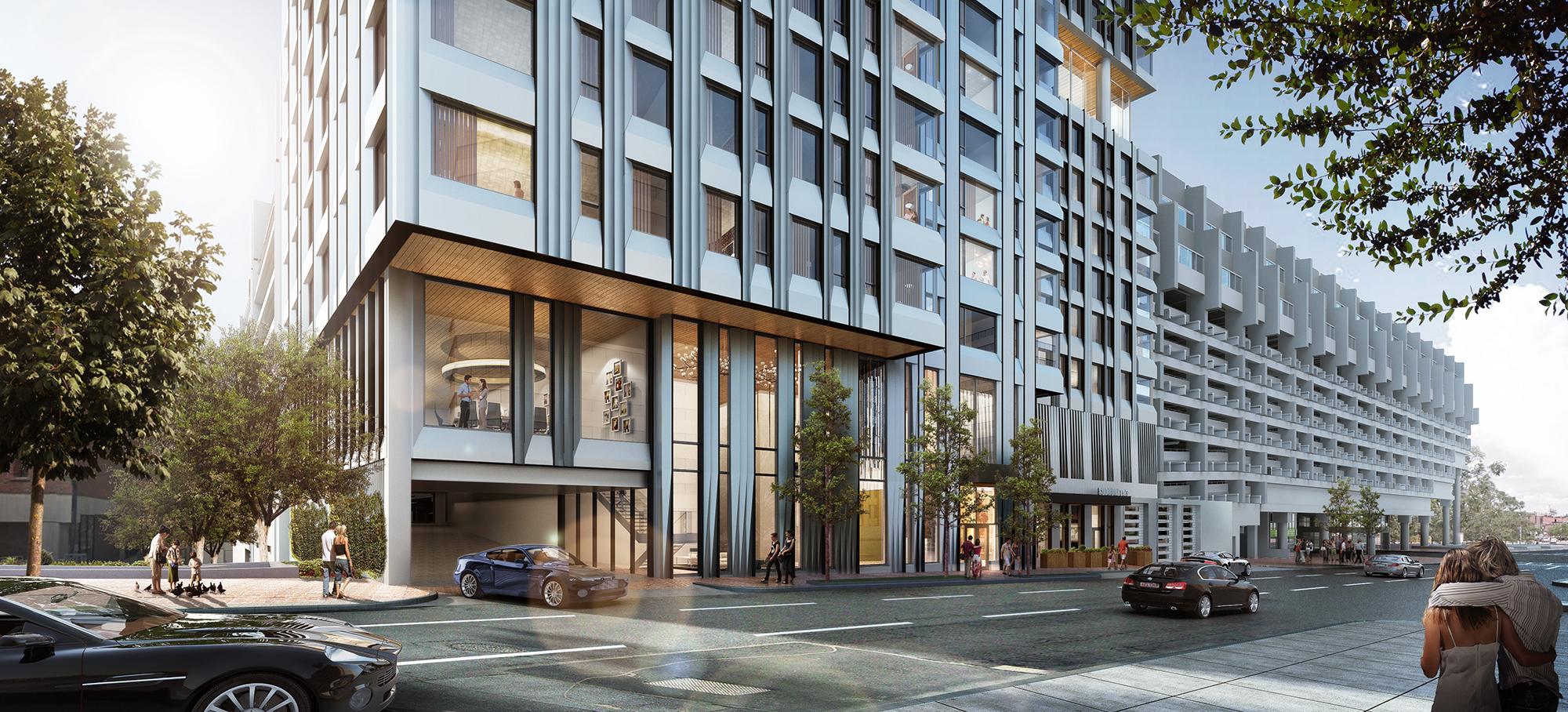
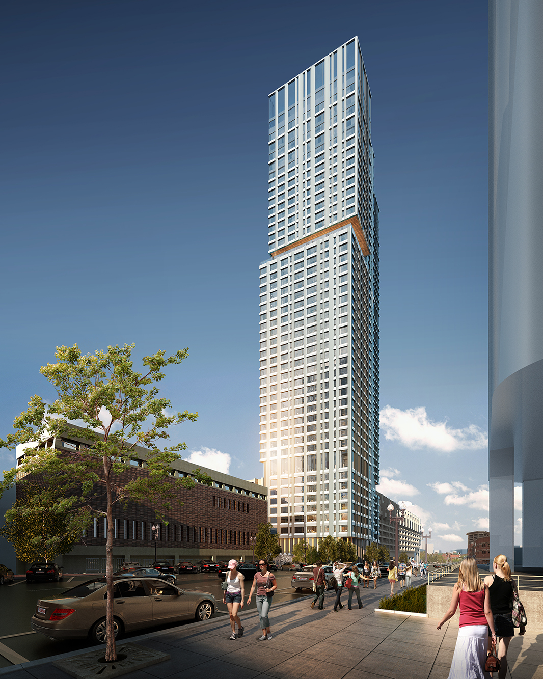
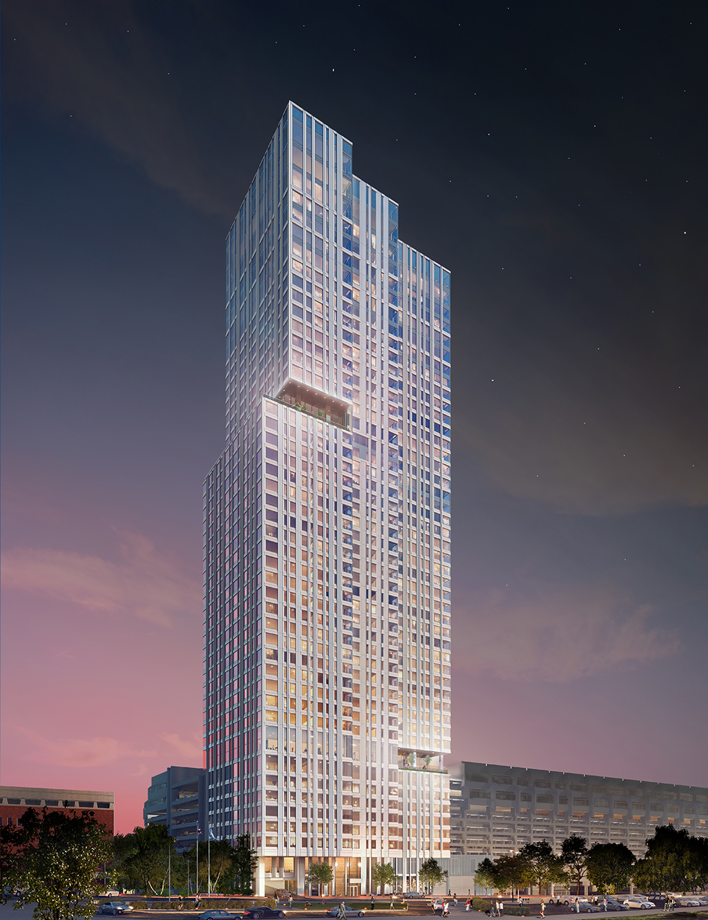
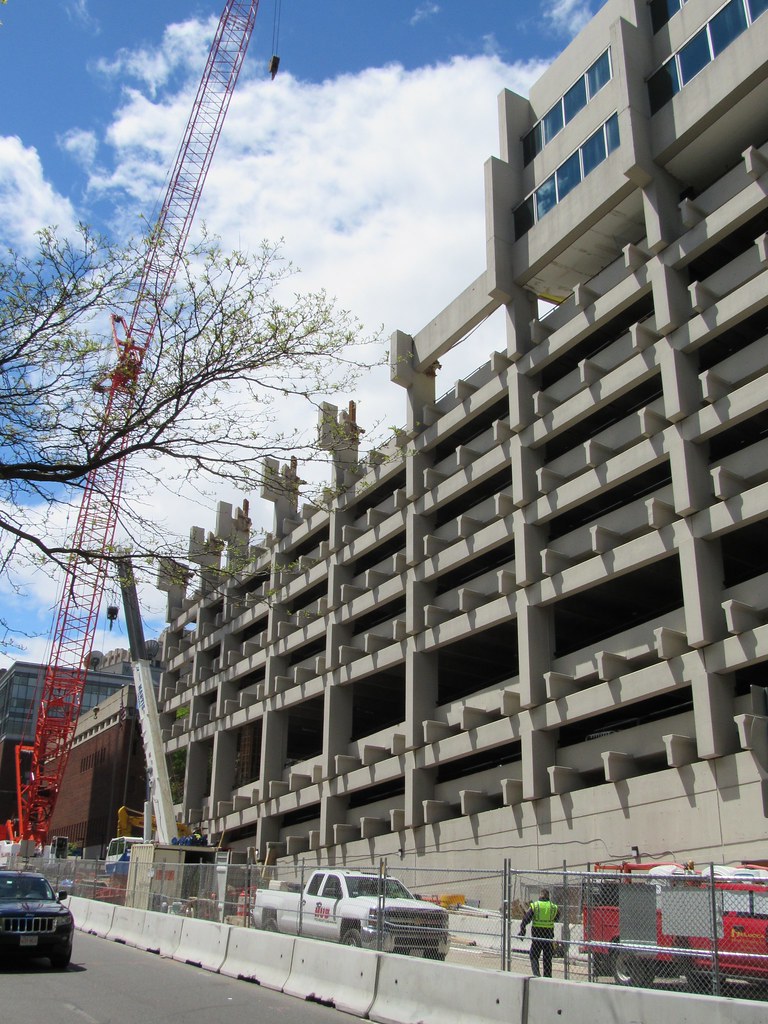
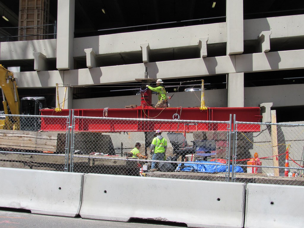
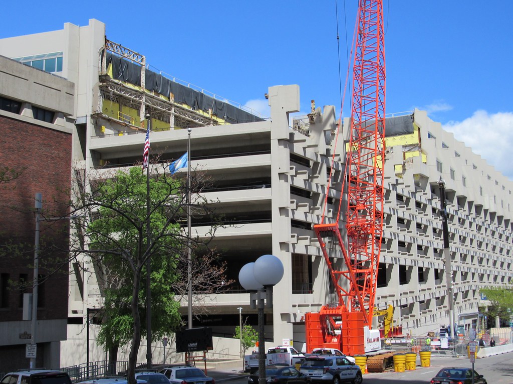
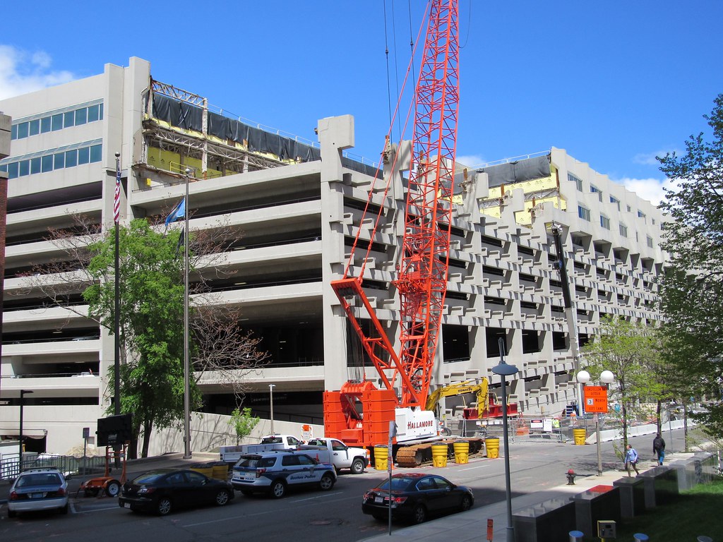
This is probably the most important project u/c right now and also above previous developments. That garage absolutely demolishes the quality of street life in that section and its a huge eye sore. This will allow a corridor view to the custom house tower, great architecture planned, retaining many parking spots...but in a modern iteration.
This whole area of the city is really coming around and its going to be something we are proud of. Im glad they went out on a limb and came back with some break the mold architecture in a centrally located area. The city is getting better and better by the year and I'm so happy that we are retaining the old fabric as well. Not if we can just really start moving forward on many transit projects that are long overdue its going to be a totally different city. Honestly in the 90's Boston was much a mis match of run down bildings, terrible 1970s box architecture, and gridlock traffic. As much as we complain about the pace of development were really doing a lot to improve the city smartly. Looking forward to what the future hgolds.
Looking at London is a perfect example of how filler background buildings as annoying as they are are actually a critical part of having a cohesive skyline. London is full of 1 offs trying to be the "one" and be the star of the show. Were actually lucky to have a very good base of filler so when we build the stand outs they stand out. Just look at how good the skyline looks after MT. Your eye is naturally sent to the focal point and thats what this is. Then the unassuming buildings surround it give you a reason to notice MT vs a bunch of wild dubai/london towers. I think were going in the exact right direction and Boston is becoming better because of it.


