I've just tried to generate a map of "population densities within 10 minute walking distance of an R/R crossing" by testing what happens if Teban54's population map is overlaid on top of the map, and the map cuts off North Beverly Station by 200px (oh no).
In any case I probably would need to change the colors of my own RR crossing map anyways.
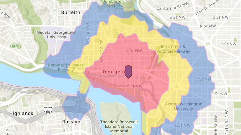
View attachment 50352
I don't think there's anything too surprising or brand new from overlaying my RR crossings map onto Teban54's population map. The same underserved areas show up as usual mostly. In any case, it still shows how any westward expansion of rapid transit, should still aim to hit the Watertown <---> Waltham Center corridor. The Waverley <---> Waltham corridor is worse performing than it is from Watertown.
The biggest takeaways I see is that Boston Medical Center and Longwood Medical Area are horrendously underserved by the ROWs given their exceptional densities. Same with the hill on the B branch towards the west.
Northside Orange Line, especially in Charlestown, is also notoriously empty and devoid of housing in close proximity to the ROWs, especially in Charlestown's floodplains; save for some commercial areas near Assembly and Malden Center. Charlestown is especially criminally underserved compared to East Boston. The giant parking lots near Cambridge Crossing and Thompson Sq., really eats away at potential density.
I've leaving these as screenshots in the paint editor program, since if there's a better map in the future, it may be better to overlay it on that map instead.
View attachment 50354
Yea, that map and the urbanization maps have been my primary maps I've used to get useful data for underlying demand. I'm not aware of any exact values the T used for their underlying demand maps, so reverse engineering would probably be needed. The PDFs as far as I know only have some "weighted propensity" for population demand, but getting that data, I'm not sure how that would work out.