165 Park Drive | Fenway

stick n move

Superstar
Joined
Oct 14, 2009
Messages
11,119
Reaction score
15,029
-Approved

165 Park Drive
1692733727928.jpeg


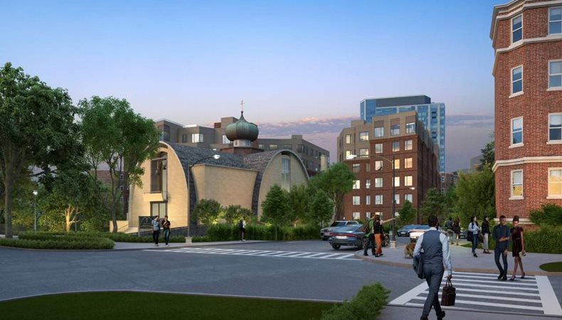
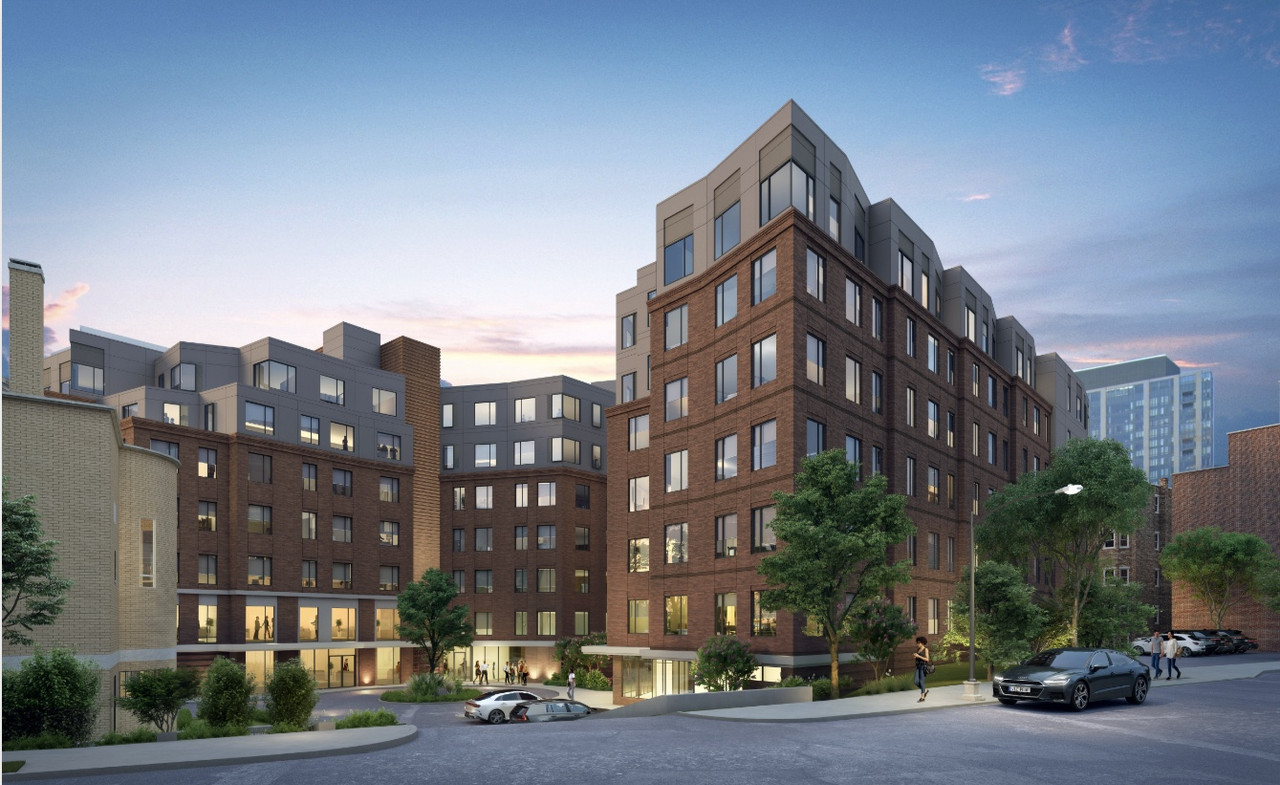
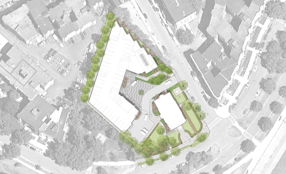
“The Project includes construction of two 7-story residential buildings in the rear of the Project Site, adjacent to the existing Holy Trinity Orthodox Cathedral. The buildings will be approximately 130,221 SF and include approximately 117 residential units. Building 1 will contain 48 residential home ownership units, 100 percent of which will be affordable units. Building 2 will contain 69 market rate residential apartments. Covered parking will be included in the ground floor level of both buildings. Additionally, the Project includes landscape features designed to solidify and reestablish the prominence of the existing cathedral in the neighborhood for future generations.”




https://bpda.app.box.com/s/2nop8m2nbkdpw75j9z5wzw1t24jsxiq4

https://www.bostonplans.org/projects/development-projects/165-park-drive
 
I really hate this game architects play these days where they hope we won't notice the top floor or two because they make it gray. You are not fooling anyone! I would actually just prefer that they make it the same color as the rest of the building, and don't even step it back. Just be honest!
 
I really hate this game architects play these days where they hope we won't notice the top floor or two because they make it gray. You are not fooling anyone! I would actually just prefer that they make it the same color as the rest of the building, and don't even step it back. Just be honest!

I think more often than not setbacks are incentivized by zoning, if not required in some cases. Agree about not needing to change the color haha
 
Yeah before the top floors were seen as a crown made to stand out. I think the weird top gray floors will be a defining point in this period of architecture.
 
This is one of those cases where I wish one of the several quiet professional architects on here would chime in with wisdom : )
I do empathetically get why people are sometimes professionally reticent online these days, though. Yet, as an incentive I will point out that us armchair architects would probably contribute fewer of our BS guesses if/when they could chime in ; )

To my underinformed eyes, I think this trend has to do with trying to minimize the visual mass (yes sometimes the setbacks are required; even when not, sometime done to appease community when the renderings are shared pre-build). I definitely see this all the time these days too, where upper floors or penthouses or mechanical levels are set back and are a color I'd describe as "average cloud cover color / please-please-blend-in-with-the-sky color."

But what I don't get is that, in cases where not required by zoning, why do we always have to visually minimize buildings? If the building has/needs actual volume, why can't we just make that volume beautiful instead of constantly trying to trick they eye. It's analogous to the double-height and offset window patterns, which try to make buildings look shorter. Why does everything need to be a trick, aimed at diminishing/minimizing/hiding the building? I do get that excessive mass of buildings is aesthetically displeasing, and so there's good theory behind massing efforts architects work out, but all of this hiding, hiding, hiding gets tedeous when everyone is drawing from the same bag of tricks.
 
My guess has been that this trend is an attempt to evoke the aura of an older structure which has added height at some point in its life. It could be a nod to new buildings which have preserved the facade of the previous building. The other possibility I imagined was that it could be an attempt to preserve the appearance of certain height width ratios while not giving up space needed to serve the client's needs. That's just an uneducated guess. I don't mind the effort. It says something about the time period.
 
I'm confident the rationale is two part:

1- The public always asks to reduce the height/visual massing. This is so ubiquitous that it's codified in zoning (setbacks) and design guidelines (change up materials to break up street wall). Architects and developers respond by including the different crown materials by default. They can say during public meetings "see, we broke up the massing by stepping back the top floor" and politicians and planning staff can point to that when the neighbors still complain anyway. Most architects and developers don't have the fee or budget to pay for the delays and revisions if the design team doesn't take an approach of appeasement.
2- Creating a unique crown along with a similarly accented base creates a classic tripartite facade that is reminiscent of traditional buildings, in particular the ones adjacent to this site. This form is familiar and attractive. The reason the architects don't do something more subtle to accent the top is because 1- brick is way more expensive so using metal panels creates the same effect for less money 2- using forgettable materials like metal panels does not draw the eye upwards to the crown, unlike traditional cornices.

Individually, these strategies have a certain logic to them. Together, they create this uncanny valley of contemporary multifamily architecture.

Personally, I think many of the multifamily architects just don't care about making the composition look good. Nobody is asking them to, either. At this level, architecture is just another professional services industry, not an art. Do what is asked of them, not what is good.
 
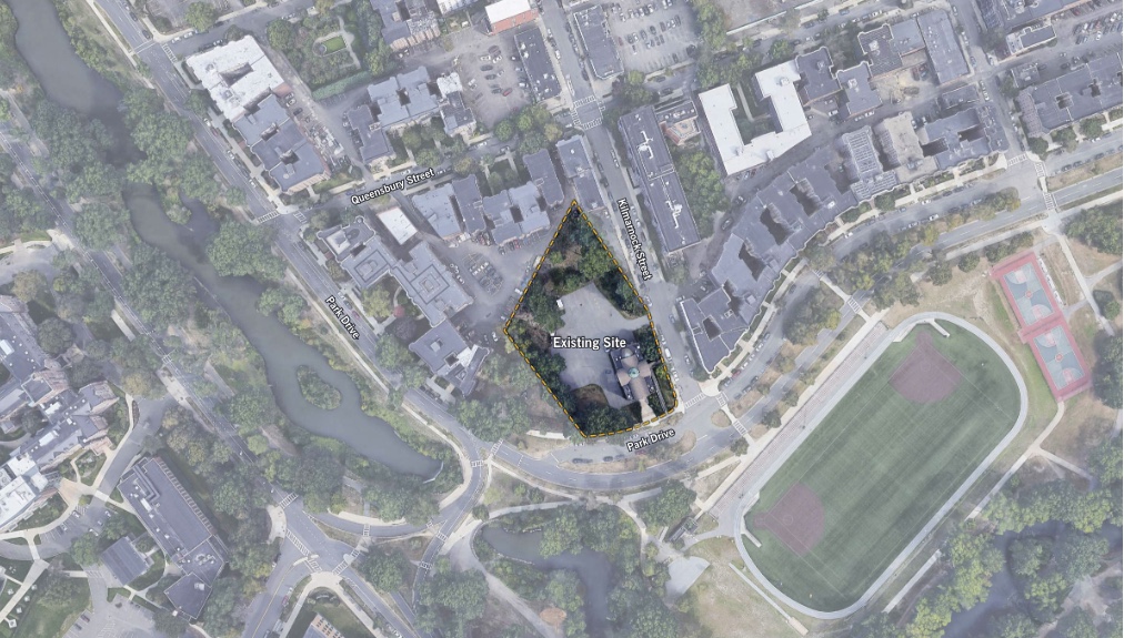
What bothers me most with this proposal is entirely out of their control: that stupid skinny triangular lot fronting Kilmarnock Street, being used for about a dozen parking spaces. The site conditions make a good urban street wall impossible.
 
What bothers me most with this proposal is entirely out of their control: that stupid skinny triangular lot fronting Kilmarnock Street, being used for about a dozen parking spaces. The site conditions make a good urban street wall impossible.
A progressive government would simply seize this property (and many other parking lots) and develop them for housing.
 

Back
Top