Equilibria
Senior Member
- Joined
- May 6, 2007
- Messages
- 7,087
- Reaction score
- 8,325
Oh no.
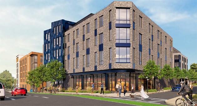
It was only a matter of time, another mid-century gem goes down. It would be contextual and appropriate if a folded plate canopy was in some way designed into the front elevation.
I'm confused... are you being sarcastic? Losing a Santander Bank with a big parking lot? Is that the something with character?? And you're complaining about the design of a housing project (which is generic but certainly not unattractive) that also contains a very needed little market on the ground level? I'm just checking what's going on with these comments. It's hard to read sarcasm sometimes coupled with the fact that some people on here complain about every proposal.I didn't really mean the bank, I meant the new design. But losing something with character makes it worse.
I'm confused... are you being sarcastic? Losing a Santander Bank with a big parking lot? Is that the something with character?? And you're complaining about the design of a housing project (which is generic but certainly not unattractive) that also contains a very needed little market on the ground level? I'm just checking what's going on with these comments. It's hard to read sarcasm sometimes coupled with the fact that some people on here complain about every proposal.
I love mid-century design and this, a classic with a very rare in this area folded plate roof, will soon disappear. I understand that those who don't care for MCM will just shrug and I'm not going to chain myself to it and dare the bulldozer. The proposed housing is certainly the greater good. What the sweetest, never gonna happen, win-win would be though is this being relocated and repurposed as a small Googie coffee shop or cafe or some such....Losing a Santander Bank with a big parking lot? Is that the something with character?? ....
Aside from its aesthetics, how is the building architecturally notable? Is the architect/firm a name worth preserving?I'm not being sarcastic. I support replacing a bank with housing, and I care more about that than aesthetics. But this bank is architecturally notable, and this proposal is aesthetically awful.
 30leo by Bos Beeline, on Flickr
 leolook by Bos Beeline, on Flickr
Ok, style is subjective. My friends used to live right around the corner from here and I walked by this hundreds of times and always thought it was super ugly and extremely dated, like out of the '50s or something. For me it just hasn't aged well and doesn't look "timeless". But as others have said, if it could be moved to another location (presumably suburban, maybe Watertown or Newton if there's space) I could see it getting cleaned up and being a retro-styled cafe or gourmet donut shop or something.I'm not being sarcastic. I support replacing a bank with housing, and I care more about that than aesthetics. But this bank is architecturally notable, and this proposal is aesthetically awful.
I walked by this hundreds of times and always thought it was super ugly and extremely dated, like out of the '50s or something. For me it just hasn't aged well and doesn't look "timeless".
I agree about it being out of context. But there is less and less mid-century architecture remaining. The ones of some merit, such as this one, that are still standing should be moved to another site and reused instead of just demolished. Of course the funding question comes up but maybe the city or some foundation could pay the cost.To my taste, the bank structure is actually the interloper. It was dropped into this neighborhood at a time when there was no respect for urban context. It is a decidedly suburban structure in an urban neighborhood.
It reminds me of the totally out of context, similar era fire stations in the South End.
That solution I agree with. Maybe one of the architectural preservation foundations could be coaxed into action.I agree about it being out of context. But there is less and less mid-century architecture remaining. The ones of some merit, such as this one, that are still standing should be moved to another site and reused instead of just demolished. Of course the funding question comes up but maybe the city or some foundation could pay the cost.
