691 Mass Ave | South End

briv

Senior Member
Joined
May 25, 2006
Messages
2,083
Reaction score
3
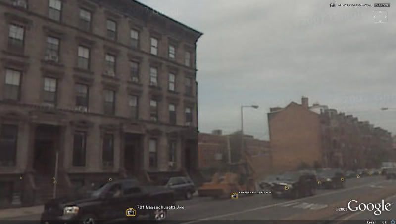
691 Mass Ave today:

691_mass_ave_google_streetview.jpg


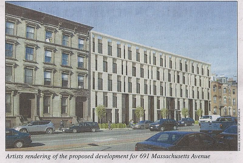
From this week's Courant:

691_mass_ave_studio_luz.jpg


The Boston Courant said:
City Says Project Is Too Monolithic

by Jeb Bobseine
Courant News Writer


The South End Landmark District Commission (SELDC) has sent developers of a 37-unit condo building at 691 Massachusetts Avenue back to the drawing board.

Urbanica Boston, which hopes to fill in the vacant South End lot with a five-Story, 40,OOO-square-foot structure, met resistance to its proposal at a meeting last week.

"It can't look like a huge, chunky building in the middle of the block" said Commissioner Catherine Hunt.

"It's going to need substantial changes to become approveable," Commissioner John Freeman added.

As a designated Landmark District, any development in the South End is subject to city regulations meant to protect the neighborhood's historic character. Urbanica, or any developer hoping to build in the neighborhood, must receive approval from the SELDC before obtaining building permits.

Tuesday's meeting, an advisory session, was intended so Urbanica could receive initial feedback from the commissioners before tweaking its design ahead of a formal hearing in front of SELDC.

Commissioners stressed that they understood the difficult task posed for the project's architects, Studio Luz, by the contrasting architectural styles abutting the vacant lot on either side. On one side is a strip of pale-stone Renaissance-styIe structures; on the other side is a line of red-brick Beaux-Arts-style row houses.

"We were trying to mediate the two," said Hansy Better Barraza, principal at Studio Luz.

"A lot of your effort is apparent. We're going to do our best to advise you on how to get an approveable building," Freeman said.

A subcommittee was formed to work closely with Studio Luz and Urbanica to adjust the design.

According to Urbanica President Kamran Zahedi, he was "very happy" with the SELDC comments. Commissioners supported the "modern approach" of the architecture, but wanted it "less monolithic," he pointed out.

"We are hoping at their next meeting we can finalize the details and make the building less monolithic as they requested and get their final approval," Zahedi said.

Zahedi, whose company is also behind the project to turn the former D-4 police station on Warren Avenue into 25 condo units, hopes to break ground on the Massachusetts Avenue project by late summer.

"We really feel strongly about the neighborhood and all that's happening there," Zahedi said. They look at the Massachusetts Avenue property as "a last piece of undeveloped land in a great neighborhood," Zahedi said.

According to Commissioner Peter Sanborn, the Worcester Square Area Neighborhood Association had offered a "generally favorable reception', to the design at a recent meeting, while expressing concerns over parking and trash.
 
Re: 691 Mass Ave

Looks like someone mistook museum board for an exterior finish! :rolleyes:

Not really terrible for a contemporary block, however the addition of an interpretive cornice would make this a much stronger project contextually.
 
Re: 691 Mass Ave

The random window fenestration thing is already beyond dated, but other than that I think the design could work with a bit of tweaking. Like Lurker said, it needs something else to make it more contextual and less monotonous.
 
Re: 691 Mass Ave

Yeah, I'll third what's already been said. Very nice on it's own, but needs just a little something to, for lack of better words, finish it. Looks very empty and hungry as is.

On a side note, I've finally figured out which to characteristics I like the best in architecture: many layers and many varied textures. If anyone would care to, perhaps, tell me what actual style this is...it'd be appreciated.
 
Re: 691 Mass Ave

NorthPoint comes to the South End. Focus the details, and it'll be fine.

If anyone would care to, perhaps, tell me what actual style this is...

Not sure if it has a proper name, but the gestures and grammar of this proposal find their origins in Mid-Century Modernism, in particular the work of A. Quincy Jones in Southern California. The white material (I assume it's masonry or enamel) seems tropical, in the vein of Oskar Niemeyer. And perhaps a bit of Edward Durell Stone's decorated boxes.
 
Re: 691 Mass Ave

I like the design. It's a small touch of modern architecture that stands out but isn't offensive, much like what you can find in Paris. Some people are just a little too quick to criticize, it's pretty much a forum tradition for every new development design unveiled.
 
Re: 691 Mass Ave

Some people are just a little too quick to criticize, it's pretty much a forum tradition for every new development design unveiled.

Are you sure that you're just not hearing the apathy? I don't think it's a great design. I don't think it's terrible, either. Given my sheer "eh" about it, I'm not the type to contribute unless I have a strong opinion. Maybe others who feel as I do, do the same?
 
Re: 691 Mass Ave

BarbaricManchurian said:
Some people are just a little too quick to criticize, it's pretty much a forum tradition for every new development design unveiled.

There's an underlying tone of dismissiveness to what you said here, so I have to ask: Does that mean my/our criticisms are to be ignored because they came early on in the process? Is there no basis to what we said? Is criticizing designs -- regardless of how long ago they were released to the public -- not one of the most basic reasons why sites like this exist?

I see plenty that could be improved upon here, so when exactly is it the right time to chime in?

PS. I'm not angry, just perplexed, and I figured sharp wording would get my points across best.
 
Re: 691 Mass Ave

NorthPoint comes to the South End. Focus the details, and it'll be fine.[/QUOTE[


...Mid-Century Modernism, in particular the work of A. Quincy Jones in Southern California. The white material (I assume it's masonry or enamel) seems tropical, in the vein of Oskar Niemeyer. And perhaps a bit of Edward Durell Stone's decorated boxes.

I, personally, like A. Quincy Jones' work. Sort of similar to John Lautner? However, in my own sketches for school and pleasure, the buildings are a lot...cleaner? Sharper? Thanks for the info, though.

691 Mass Ave., though, isn't my favorite. I do really like NorthPoint, but like you said, this needs to refine the details first. White doesn't work well in Boston, I thought?
 
Re: 691 Mass Ave

One more thought: another reason why I see plenty to criticize with this project is that it seems like a cut-rate version of this project in NYC:

25 Bond Street, by BKSK architects, completed 2008
deal3-650.jpg


One guy on the Wired New York thread for 25 bond said the following which echoes my feelings exactly concerning the asymmetrical window treatment on the Boston proposal: "but still, what a shame when architects insist on the asymmetrical in a sea of classical... as if simple symmetry is somehow not entertaining enough."
 
Re: 691 Mass Ave

DAMN YOU KZ! I was about to post that. I will say that 25 Bond is one of my favorite new buildings in the city. 691 Mass Ave is a clear rip off.
 
Re: 691 Mass Ave

I, personally, like A. Quincy Jones' work. Sort of similar to John Lautner?

Peers separated bt a common influence. Lautner spent six years with Frank Lloyd Wright. Jones surely admired Wright. Lautner used Wright's idea of "breaking the box" as a point of departure for his best work. Jones was influenced by the way Wright organized his buildings, on a grid. There's a lot to be learned from both.

25 Bond Street, by BKSK architects, completed 2008
deal3-650.jpg

Good catch, kz.

Can you play shortstop?
 
Re: 691 Mass Ave

Better than Julio Lugo, that's for sure!

Of course that ain't sayin' much.
 
Re: 691 Mass Ave

I was trying to think of the building that this was a rip-off of, thanks for the pic.

That said, I'm not sure that I agree that this would be a lesser building. So what if it "copies", so did brownstones, and certainly so did the beaux-arts re-clads that are really lovely.

For this building to succeed in this location, it really has to do with the quality of the materials (cough, limestone, cough). It could be equally as nice, but I agree that something most be done with the roof/cornice line.

I think I could make a compelling argument that there are plenty of brick-clad row-houses along Mass Ave that are equally as monotonous given their respective architectural style.

See how Bond St. looks so interesting with its mix of Italinate, Victorian, "modern", and other early 20th C Americana :)
 
Re: 691 Mass Ave

There's an underlying tone of dismissiveness to what you said here, so I have to ask: Does that mean my/our criticisms are to be ignored because they came early on in the process? Is there no basis to what we said? Is criticizing designs -- regardless of how long ago they were released to the public -- not one of the most basic reasons why sites like this exist?

I see plenty that could be improved upon here, so when exactly is it the right time to chime in?

PS. I'm not angry, just perplexed, and I figured sharp wording would get my points across best.

Every new development unveiled gets the customary forum treatment of members saying "typical Boston mediocrety", "terrible design, would work better in Houston", and the like, when this design actually doesn't look bad. I'm not saying that it can't be improved; it can, but I doubt that the developer's 2nd design will look better based on experience. It's just that people always criticize everything, even when there's not much to criticize! The time the criticism came during the process wasn't something that I thought of, it's just that sometimes we are acting like NIMBYs when we are criticizing even good architecture, maybe driving away those from Boston who want to design good architecture, who fear that it can never be good enough for us (yeah, I'm sort of overestimating this forum's power here, hehe)
 
Re: 691 Mass Ave

I almost really like it. Is the "monolithic" criticism a product of the project's width, as compared to the narrower 25 Bond Street?

The buildings to its left are neglected little gems, something out of mid-Victorian Edinburgh or Glasgow.
 
Re: 691 Mass Ave

Is the "monolithic" criticism a product of the project's width, as compared to the narrower 25 Bond Street?

Exactly. The footprint is a much bigger problem than the style. Developers in New York can afford to build buildings with small footprints. Boston developers don't seem to have that luxury.
 
Re: 691 Mass Ave

Perhaps some bolder segmentation might help. I also notice 25 Bond St has what looks like old fashioned Jacobean chimney stacks too. That might help a bit too?
 
Re: 691 Mass Ave

This is a good project for following the same geometric rules as its neighborhoods, with the exception of the window alignment. The roof line, fenestration, floor to floor heights, and even the string courses have been aligned properly.

The monotony isn't as big of an issue as raised, given that the 19th century neighbors are carbon developer copies of one another.

What this project does need is a decent quality cladding material, like limestone, and a few details which add the same richness of scale or texture as the neighbors at critical points of interest. The punched openings in the skin for the windows require some sort of fin at the edges to add to the enrich effect of depth and not make the current effort feel cheap. The same is true for the location of lintels and sills, nonexistent in the skin due to a lack of functional requirements, but something figurative would be contextual. A reveal at the sill and some sort of screen at the lintel would work wonders.

This project is essentially the 3.0 of this:

1410061509.jpg
 

Back
Top