You are using an out of date browser. It may not display this or other websites correctly.
You should upgrade or use an alternative browser.
You should upgrade or use an alternative browser.
83 Middle St | CHOM Affordable Housing | Portland
- Thread starter Cosakita18
- Start date
P
Portlander
Guest
Cosakita18
Senior Member
- Joined
- Jun 14, 2016
- Messages
- 1,154
- Reaction score
- 2,307
DanielPWM19
Active Member
- Joined
- Aug 21, 2020
- Messages
- 511
- Reaction score
- 806
Disappointing.
P
Portlander
Guest
lunardinosaur
New member
- Joined
- Oct 10, 2022
- Messages
- 94
- Reaction score
- 298
Perhaps they were trying to tie the look of the building into the concept of the working waterfront, by designing it to look like a big shipping container.
"Shipping Container Chic" seems to be the design que du jour for a good majority of recent developments throughout the country.Perhaps they were trying to tie the look of the building into the concept of the working waterfront, by designing it to look like a big shipping container.
"Shipping Container Chic" seems to be the design que du jour for a good majority of recent developments throughout the country.
Polar Park
Cosakita18
Senior Member
- Joined
- Jun 14, 2016
- Messages
- 1,154
- Reaction score
- 2,307
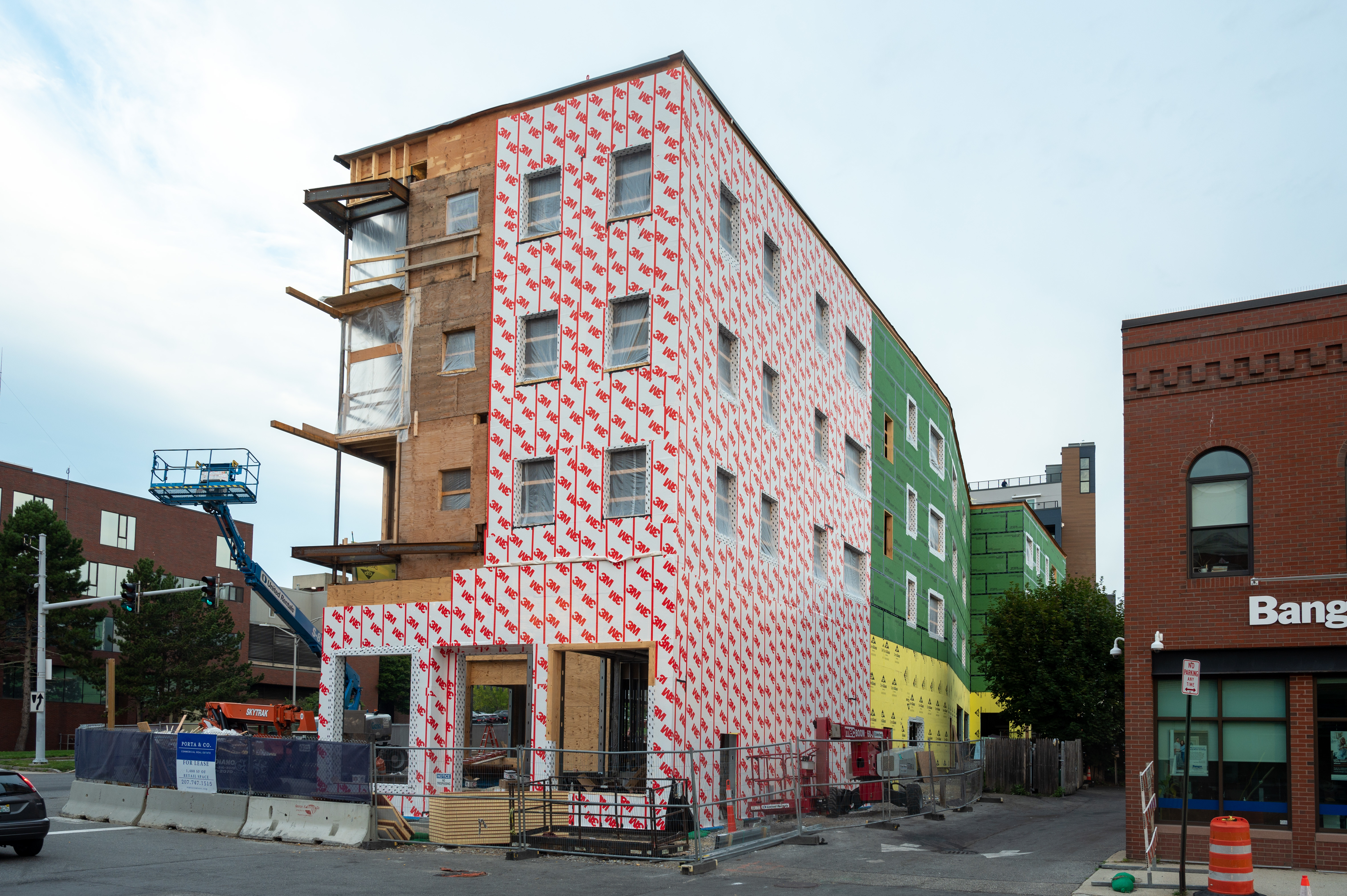
I do my best to understand that this is a senior affordable housing project and CHOM is operating on razor thin margins and a very tight budget in an inflationary economy....but that facade truly looks terrible, especially when you compare and contrast it with surrounding buildings. Maybe the brick facade on Middle St. and some architectural accents will help but... what's that expression about lipstick and pigs???
Last edited:
DanielPWM19
Active Member
- Joined
- Aug 21, 2020
- Messages
- 511
- Reaction score
- 806
This won't age well. And it looks like crap facing Franklin.
If they ever realign Franklin and open space for development, maybe they can plant some trees to mask this ugly folly.
They should have made the facade face Franklin instead.
If they ever realign Franklin and open space for development, maybe they can plant some trees to mask this ugly folly.
They should have made the facade face Franklin instead.
Last edited:
It looks like the Bissell warehouse.It looks like it belongs in a warehouse district.
It looks like the whole Hampshire St side is brick too, which is just annoying. Brick accents, ok, but one side is a shipping container, the other side is brick because why??I do my best to understand that this is a senior affordable housing project and CHOM is operating on razor thin margins and a very tight budget in an inflationary economy....but that facade truly looks terrible, especially when you compare and contrast it with surrounding buildings. Maybe the brick facade on Middle St. and some architectural accents will help but... what's that expression about lipstick and pigs???
Also not loving the Franklin Street side of this one. It's not that much different from CWS's (https://www.cwsarch.com/) other housing development nearby like 409 Cumberland and 58 Boyd Street but at least those had a tiny bit more visual interest.
J. Wrighten
New member
- Joined
- Mar 15, 2023
- Messages
- 1
- Reaction score
- 0
New here, so I'll apologize if I err in forum protocol. Renderings and limited photographs I have seen make it appear that a tenant of Phoenix Flats, on the right floor, could reach out the window, if they opened, and do bank business. Is that your impression? As it is, I find the building design to be without soul; an unfair assessment without being on site.I think in pretty much any instance, retrofitting new levels onto an inhabited building would be more costly than building it in one phase, even if building materials were substantially cheaper.
I think we're left with a 4 story building unfortunately.
This building is an embarrassment, especially in such a high profile location. We get exactly as much as we demand.New here, so I'll apologize if I err in forum protocol. Renderings and limited photographs I have seen make it appear that a tenant of Phoenix Flats, on the right floor, could reach out the window, if they opened, and do bank business. Is that your impression? As it is, I find the building design to be without soul; an unfair assessment without being on site.

 Phoenix Flats 83 Middle Street Community Housing of Maine Under Construction
 Phoenix Flats Middle and Franklin Streets Under Construction