TomOfBoston
Senior Member
- Joined
- Mar 29, 2007
- Messages
- 1,241
- Reaction score
- 465
The Douglass Park and 1065 Tremont buildings are relatively new and well maintained. The rest are dumps.
Didn’t the ceiling recently collapse in one of the LPs on Huntington Avenue?And let me tell you as someone who has been in several of those "Leased Properties", they are the absolute roughest of Northeasterns housing stock, no students will be missing them. They are dark, dingy, and several of them are directly above restaurants which means smelling bad and rats. Thankfully never lived in them but go through them regularly, not a great pic but here's a hallway in 313 Huntington, it's not terrible but it's still crazy expensive and far below the standards students expect from University housing.
View attachment 1405

BCDC presentation:

20200303 BCDC Presentation 840 Columbus Ave.pdf | Powered by Box
bpda.app.box.com
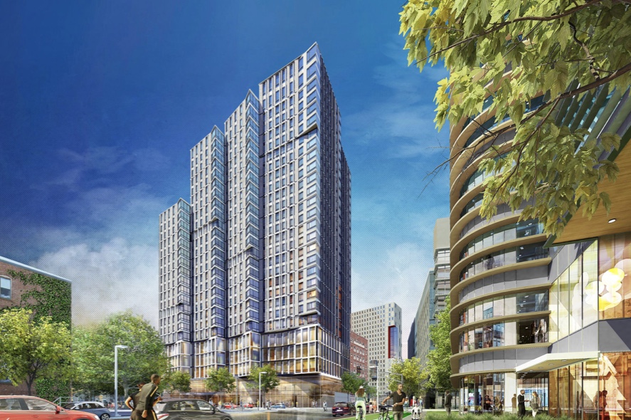
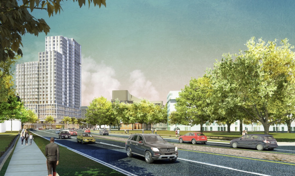
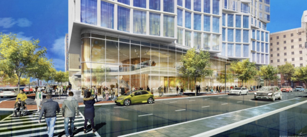

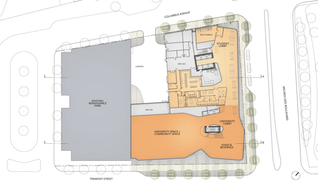
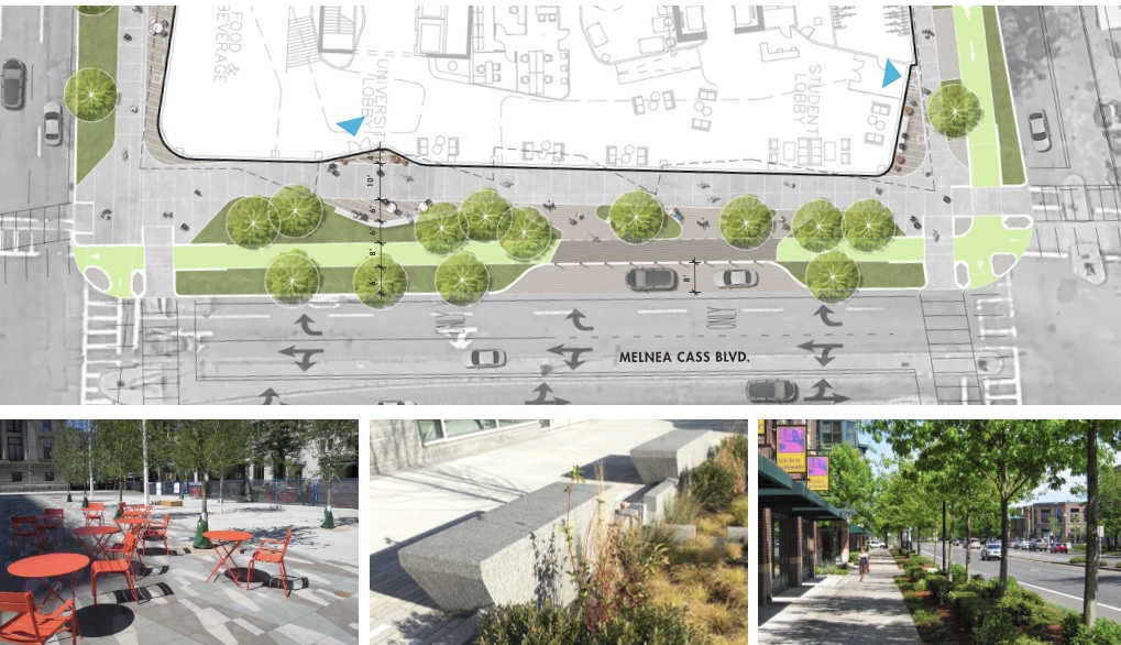
The whole building literally fronts onto Tremont? The corner of Melnea/Tremont is the primary entrance? What more could you ask for? The side facing Columbus is literally dead streetwall? The corner of Melnea/Tremont is literally a small retail store surrounded by community space? Did you even look at the screenshots? I'm confused by your entire comment here... Note Tremont at the bottom of this screenshotThe fins motif along Melnea Cass remind me of a taller Millennium Place. I mostly dig the project *except* for how it interacts with Tremont Street (i.e. it doesn't).
For 10 years, Roxbury residents have said time and again how International Village's entire Tremont Street facade at ground level--a block-long window with no permeability to enter (even the old Pete's Coffee/Jamba Juice couldn't be entered from Tremont)--looked like a physical barrier to the community that said, "You're not welcome here." I mentioned that critique to Elkus-Manfredi when they were designing American Campus Communities' Lightview Residence Hall at Columbus & Burke Streets because--along Burke--it did the exact same thing. At the time (and to their credit), they noted the criticism and changed their design to reflect more permeability. But 2+ years later, any semblance of a ground level that improved the street experience was lost/forgotten.
The intersection of Tremont Street & Melnea Cass is a gateway for thousands to the University. As such, there's an opportunity to integrate community needs with the built space at this property. Developers and University officials should really take a walk among some other urban campuses to see how much more productive real estate assets can become when you integrate smaller ground-level restaurants and boutiques into residence halls. The Little Building at Emerson will become a great example; the 'Berklee Block' along Boylston between Mass Ave. & Hemenway/Ipswich is a great one, too. Even Northeastern's own White Hall and Marino Center do a great job with activating the street wall commercially. They can (and should) strive to do the same thing here.

The whole building literally fronts onto Tremont? The corner of Melnea/Tremont is the primary entrance? What more could you ask for? The side facing Columbus is literally dead streetwall? The corner of Melnea/Tremont is literally a small retail store surrounded by community space? Did you even look at the screenshots? I'm confused by your entire comment here... Note Tremont at the bottom of this screenshot

As for Burke St/LightView, the ground floor retail is still yet to open so I'm holding judgment just yet. And international Village does have entrances to the community space from Tremont, it's not a pure wall.
Sorry I may have come on a bit strong earlier, I'm also hopeful they do this one right especially as that area of Tremont becomes more of a pedestrian filled area over the next 10 years or so, and I certainly think the layout they're showing at this point is an improvement over something like the previous Burke St/LightView where the only entrance was tucked away deep on Columbus Ave with just a blank wall facing the outside community.I hope you're right!
The fins motif along Melnea Cass remind me of a taller Millennium Place. I mostly dig the project *except* for how it interacts with Tremont Street (i.e. it doesn't).
For 10 years, Roxbury residents have said time and again how International Village's entire Tremont Street facade at ground level--a block-long window with no permeability to enter (even the old Pete's Coffee/Jamba Juice couldn't be entered from Tremont)--looked like a physical barrier to the community that said, "You're not welcome here." I mentioned that critique to Elkus-Manfredi when they were designing American Campus Communities' Lightview Residence Hall at Columbus & Burke Streets because--along Burke--it did the exact same thing. At the time (and to their credit), they noted the criticism and changed their design to reflect more permeability. But 2+ years later, any semblance of a ground level that improved the street experience was lost/forgotten.
The intersection of Tremont Street & Melnea Cass is a gateway for thousands to the University. As such, there's an opportunity to integrate community needs with the built space at this property. Developers and University officials should really take a walk among some other urban campuses to see how much more productive real estate assets can become when you integrate smaller ground-level restaurants and boutiques into residence halls. The Little Building at Emerson will become a great example; the 'Berklee Block' along Boylston between Mass Ave. & Hemenway/Ipswich is a great one, too. Even Northeastern's own White Hall and Marino Center do a great job with activating the street wall commercially. They can (and should) strive to do the same thing here.
Heres the comparable new render:Wow - - that's a HUGE architectural detail revision from this in March! The ground level doesn't look as dramatic as the earlier render (one story glass vs. earlier, two+ story glass). Overall looks a bit smaller too.
Heres the comparable new render:
View attachment 7273
