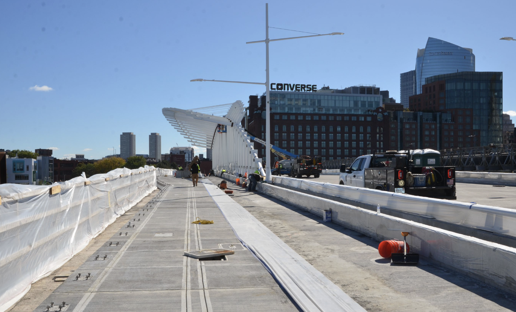
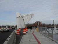
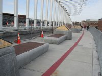
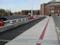
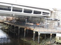
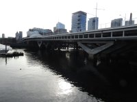
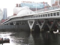
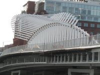
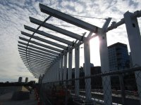
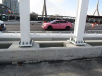
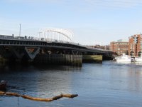
Boston is harsh on plants, and this bridge is in an area exposed to high winds and also one that really isn't that attractive to walk over (the harbor is wide open here and the waterfront is sort of post-industrial and po-mo condo. It's not cozy or nice, and given the fact that half the year the plants will be leafless anyway, I would suggest...
... installations with fake plants or plant-like structures. This could fill in the space a lot better, make the pedestrian experience feel more closed in all days of the year, and also reduce wind effects. Why are we bending over backwards for trees on a bridge in a northern city like this?
If we were Europe, I think we'd be more likely to go with a fun color for the fishbone, too. How about green? It would look a lot better. The white just doesnt look great to me... Boston is not a very colorful city especially in the winter, and a bright color would break up the monotony. Whereas in some cityscapes, the bright white would contrast with the surroundings, here it just reinforces the blandness of them.

