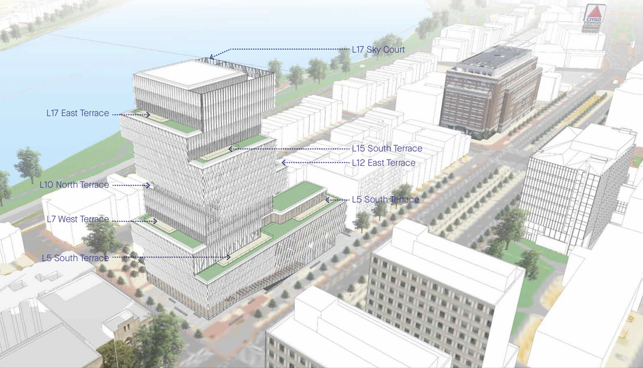
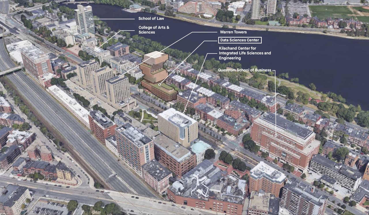
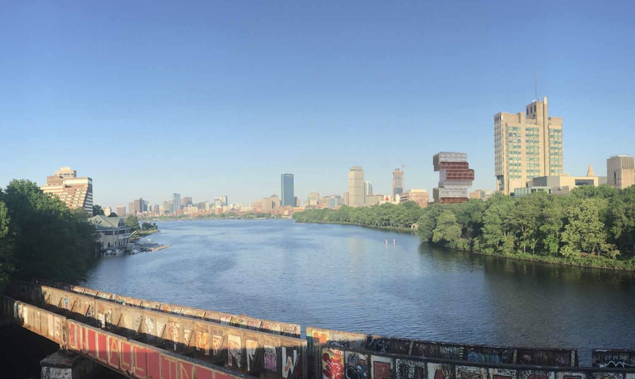
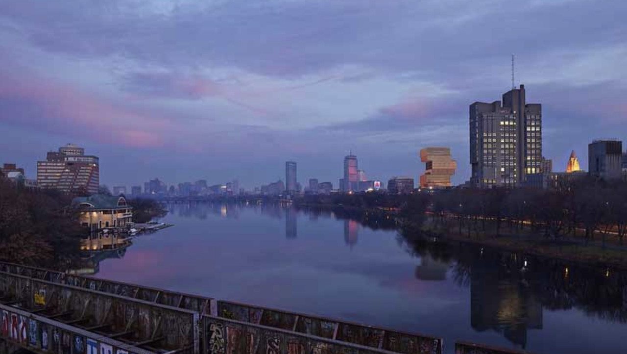
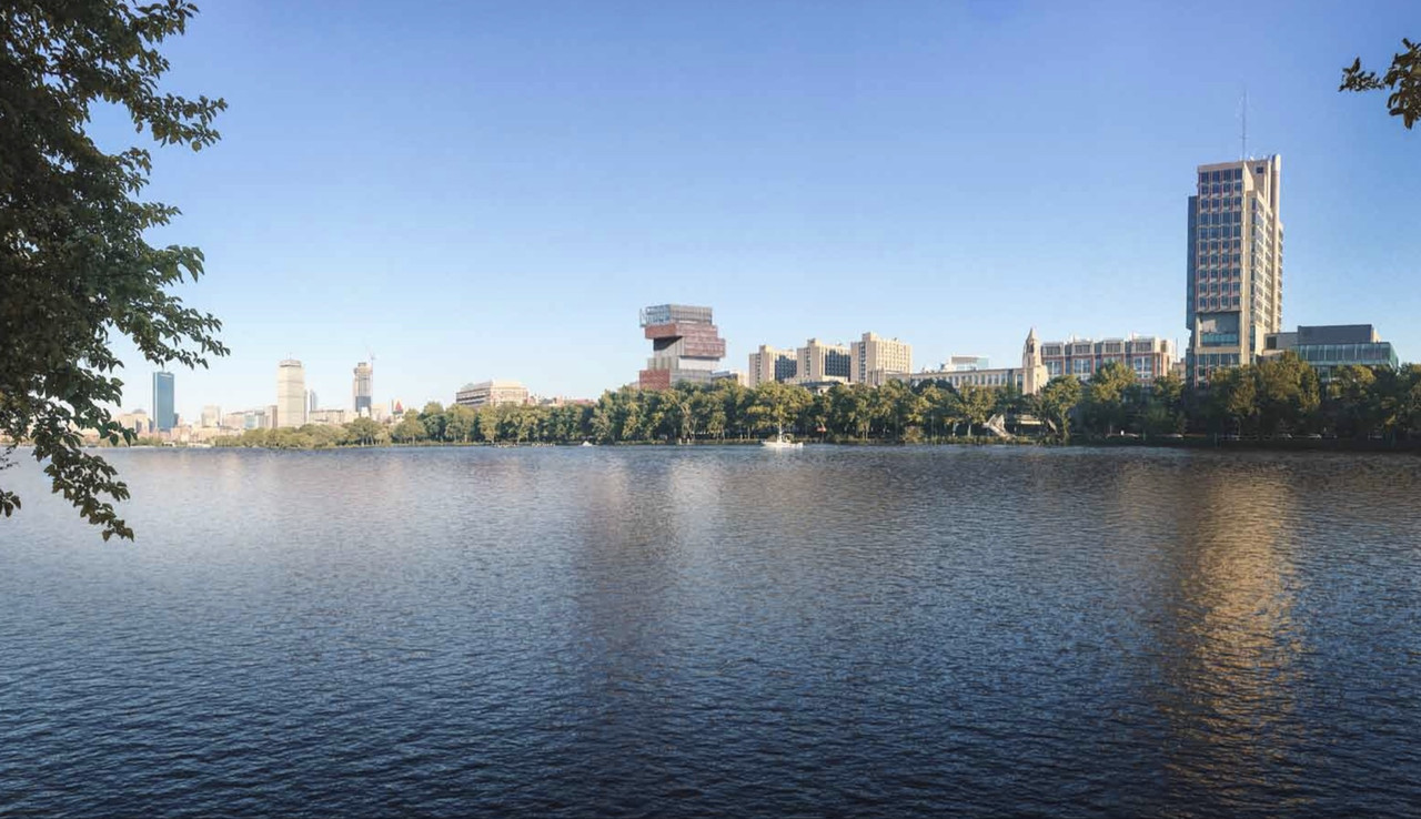
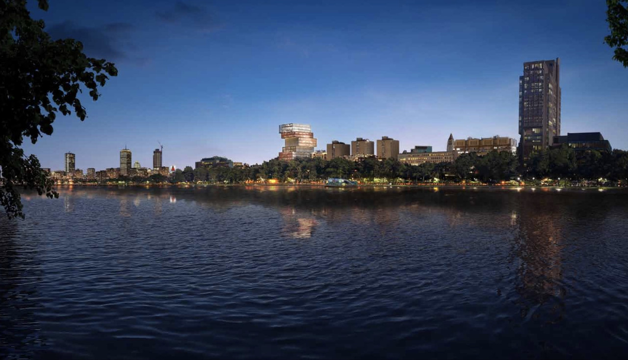
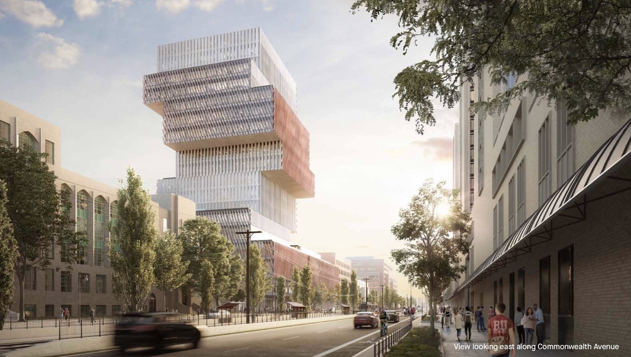
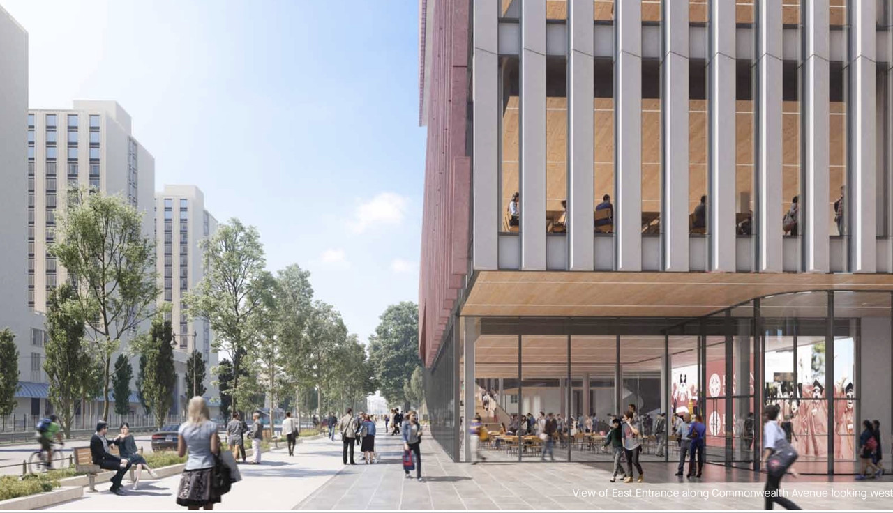
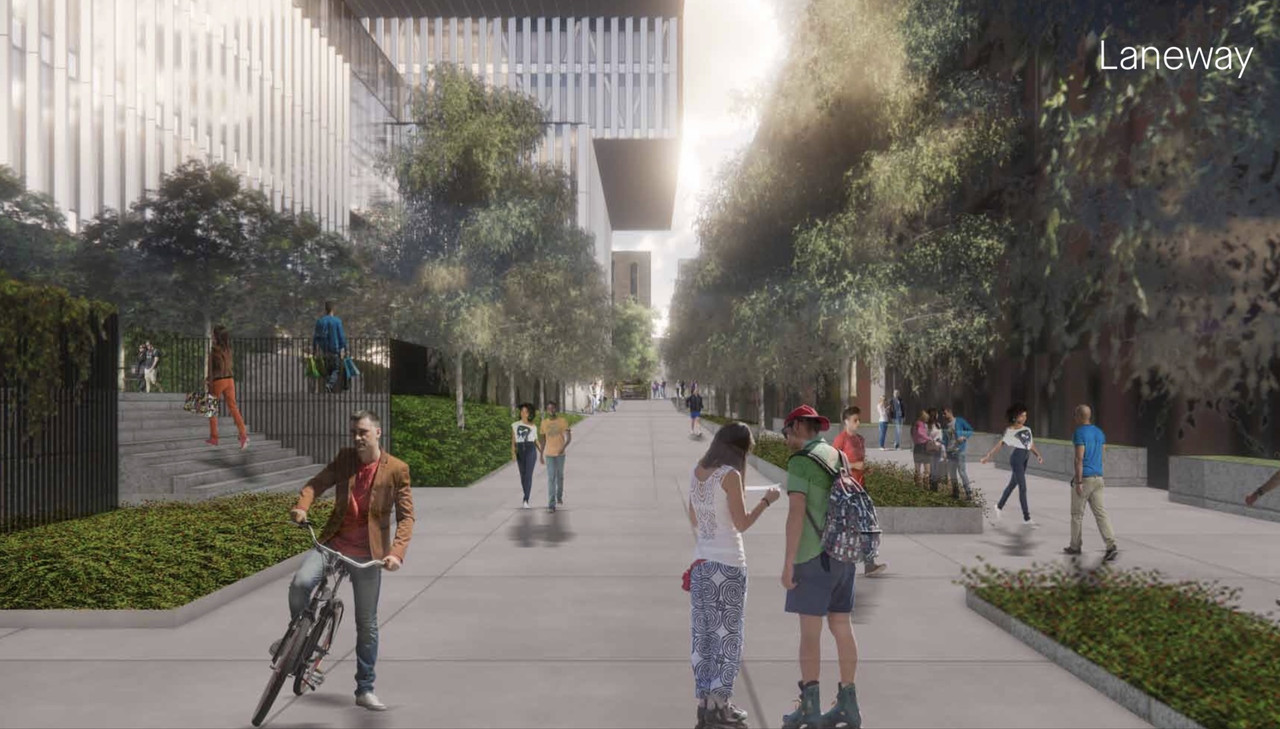
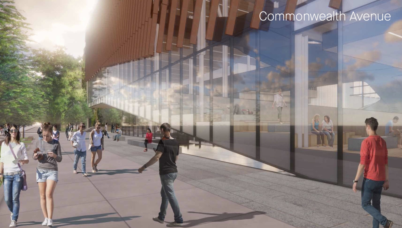
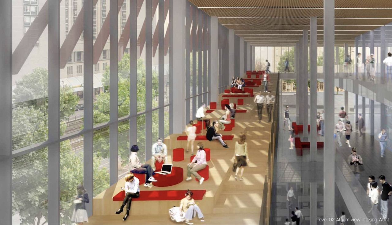
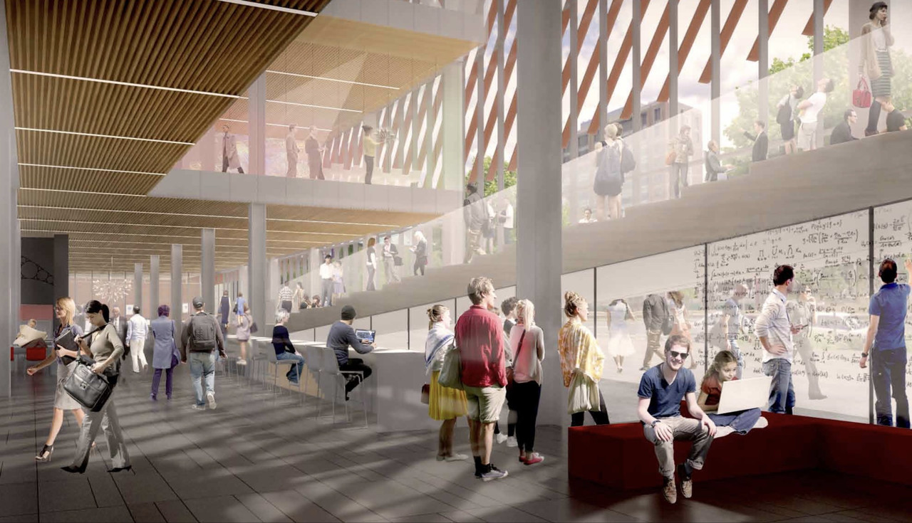
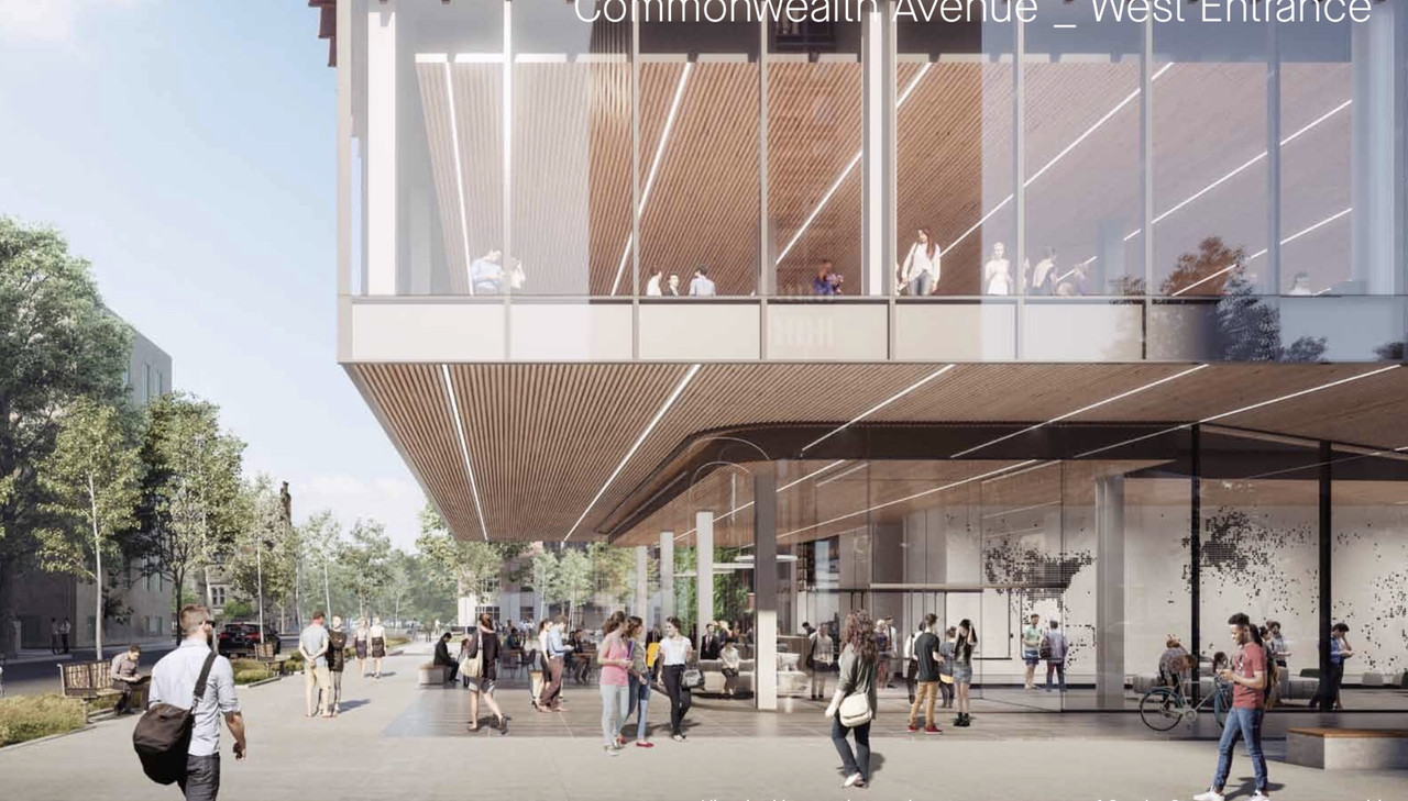
BU Data Sciences Center | 665 Commonwealth Avenue | BU Central

Sad that people still feel the need to get upset at daring to say good things about New York. Especially on an architecture and urbanism forum...

Also, I didn't compare the two, but allow me:

The picture is awesome because it shows a bunch of old, handsome buildings that are, by New York standards, just average, run of the mill and dingy things. Nothing special. In Boston, at that level of density of old buildings you're gonna be looking at in almost all cases a high degree of gentrification. Not so here... just one more random block of old stuff (dingy and unrenovated, no less) in Chinatown, an awesome ultramodern architectural piece in the middle of all of (and not even a big deal), and some random, very non-gentrified businesses at ground level.

Basically Chelsea, MA with underground power lines...ny is a great place to visit .
 
^^vs Boston's obsession to enforcing 'order' in planning for some implied 'greater good.'

Boston will benefit from a steady infusion of 'disorder.'
 
sorry, but the BU DSC proposal appears to me somewhat like a rip-off of SANAA's Museum of Contemporary arts in NYC but in brick....


stringio.jpg

In general, the BU proposal seems pretty derivative of a bunch of much better buildings and doesn't have a solid idea define it. It's volume in search of a parti.
 
^ That's a fair-minded assessment.

I'm drawn to the tension of the composition, the uneven stacking of orthogonal volumes traversed by the diagonal "vectors," a gesture that I read as a subtle allusion to the graphical elements of data science.

Using interstitial space to catalyze interaction between different disciplines was a guiding principal for Gehry in his design of the Stata Center, and some of the same ideas are present here.

I'm not sure if either of my observations/assumptions are substantive enough to qualify as parti.
 
^^How about a more attractive building with a snazy design/gismo running up one of the sides,

or floating above a patio or setback roof?

This thing is so unnecessarily rude and ugly.

i forgot; is it already approved?
 
^ That's a fair-minded assessment.

I'm drawn to the tension of the composition, the uneven stacking of orthogonal volumes traversed by the diagonal "vectors," a gesture that I read as a subtle allusion to the graphical elements of data science.

Using interstitial space to catalyze interaction between different disciplines was a guiding principal for Gehry in his design of the Stata Center, and some of the same ideas are present here.

I'm not sure if either of my observations/assumptions are substantive enough to qualify as parti.
50 years ago I am sure architectural critics were using the same fancy words to describe the new Boston City Hall. How did that work out for Boston?
 
How did that work out for Boston?

I'm not sure I understand the point of your question. Are you suggesting that the quality of life in Boston has been marred by the presence of a building you find unattractive?

I'll ask a better question: how did 20 years of Tom Menino's disinterested stewardship work out for City Hall?
 
^ That's a fair-minded assessment.

I'm drawn to the tension of the composition, the uneven stacking of orthogonal volumes traversed by the diagonal "vectors," a gesture that I read as a subtle allusion to the graphical elements of data science.

Using interstitial space to catalyze interaction between different disciplines was a guiding principal for Gehry in his design of the Stata Center, and some of the same ideas are present here.

I'm not sure if either of my observations/assumptions are substantive enough to qualify as parti.

The more I've thought about it, the more I realize that my dissatisfaction with the building is the disconnect between the tower and base. There seems to be a physical idea about the tower--the spiraling volumes. I don't love it as a form in the city, but I understand it as an idea. But then the base is a big box. If the tower expression came down to the ground and adapted to the larger space there I can imagine this being much more of a complete idea, and therefore more satisfying as a design. It's almost that the architects are being too conservative. If they were bolder about the base and how the idea of spiraling volumes and interstitial spaces worked from the ground to the top it could be a really exciting building.

And it could be part of the conversation with various other stacked volume buildings we've referenced in this thread, instead of feeling so derivative.
 
The more I've thought about it, the more I realize that my dissatisfaction with the building is the disconnect between the tower and base. There seems to be a physical idea about the tower--the spiraling volumes. I don't love it as a form in the city, but I understand it as an idea. But then the base is a big box. If the tower expression came down to the ground and adapted to the larger space there I can imagine this being much more of a complete idea, and therefore more satisfying as a design. It's almost that the architects are being too conservative. If they were bolder about the base and how the idea of spiraling volumes and interstitial spaces worked from the ground to the top it could be a really exciting building.

Sort of agree, it does appear they had an idea for the tower and then the base is just filling up the block because it had to.

A Hub on Causeway approach could have worked a bit better here I think
 
Is this rubbish really getting built? If so,

i'm ____ing pissed the watchdogs (BCDC) and BPDA will allow this crazy garbage to be built.
 
very thorough. the new renders are fantastic. this thing is growing on me (and i never hated it in the first place).
 
I wish there were stronger color accents on each box but I frankly love it.
 
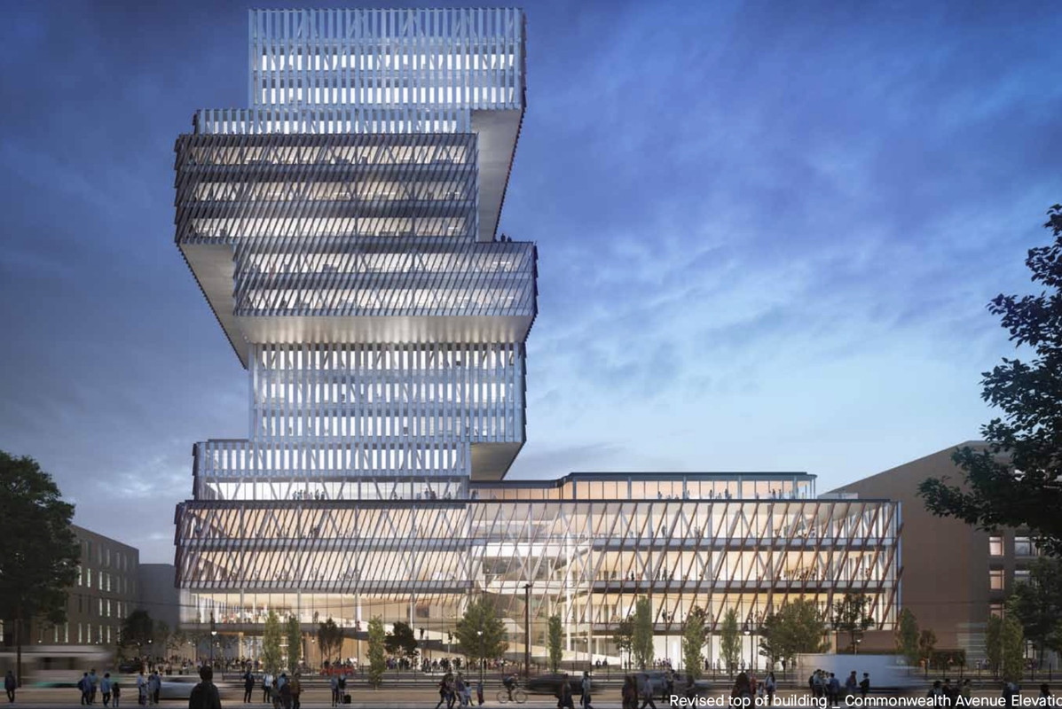
They seem to have adjusted the facade treatment of the podium so that it appears less monolithic which is really helping the tower and the podium relationship to work better than before. At least for me.
 
The treatment on the top floors was also changed from having the heavier red louvres encase it in exchange for a translucent appearance. That really helps to avoid the appearance of being top heavy.
 
Still looks like a parking garage to me
 
i like it.

daring, distinctive, memorable -- exactly the type of proposal that, were it being planned for another city, ABers would whine, "why can't we get designs this exciting in boston?!!?" (and yet, when we do, those same people find some other reasons to hate it).
 

Back
Top