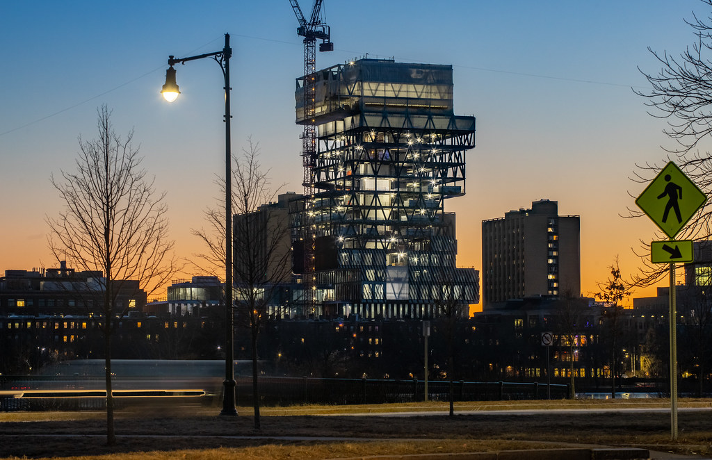
BU Data Sciences Center | 665 Commonwealth Avenue | BU Central

Just now:

D33FF86F-678F-4432-965F-333E5E1562BB.jpeg
1C2C7C0A-AF98-4B38-815D-EAECB1F42890.jpeg
D29DD108-12C2-4E7B-8CE7-5FE92F937A5B.jpeg
E742D91B-531A-4957-A60D-C40D49EFC0B1.jpeg
4A938138-169F-43A3-9C50-FE1A7804494D.jpeg
 
Great shots ^^^. This thing is the antidote for all the "Boston's present-day architecture is always so boring" complaints (largely legit complaints, don't get me wrong).
 
It will be important for BU to properly maintain the facade of this building. The Law Tower was an impressive building in its day. Prior to the gut rehab a few years ago its facade had been allowed to deteriorate. The painted panels were peeling and the windows had not been washed in years. Hopefully BU does better with this building.
 
all buildings get old and need a refurb eventually. check out the JHT up close lately? see what's goin on atop the pru at the moment? but, yes - hopefully it's maintained well.
 
Looks like the BIG brother of the pavilion that was proposed for the Seaport park. Wonder whatever happened to that. It looked pretty cool and a great place to hang out in good weather...

Isn't that District Hall / The Innovation Center now?
 
Isn't that District Hall / The Innovation Center now?

Opposite side. The pavilion is proposed for the side of the park thats still unbuilt, directly behind the unbuilt fan pier parcel H. You can actually see the innovation center in the bottom render above, rendered in gray at the base of the tower in the left of the render (88 seaport).
 

This is an amazing project. Like anything in life theres good and bad examples of everything. I dont think the stack of books design is inherently bad. Its bad when its forced, slapped on, or used as a gimmick.

This is a perfect example of doing the stack of books style right. The combination of its location on the river, the height that makes it appear to match roofs with the back bay towers, the view of it from kenmore... all really let this building shine and I truly believe this is going to become a Boston landmark when finished.

- A lot of ppl complain about boring Boston architecture. I really think this is a stand out tower and a wonderful addition to the skyline.

Much of the early criticism of this building is how it would not match its surroundings and that is what it does best. I'm impressed by how it interacts with the roof lines of the adjacent buildings, especially how the roof line of the podium aligns with CAS next door. The red brise soleil of the podium also compliments the entire block of red brick from Granby Street to SMG.
 

Back
Top