stellarfun
Senior Member
- Joined
- Dec 28, 2006
- Messages
- 5,711
- Reaction score
- 1,544
I guess she doesn't like it.


http://www.philly.com/inquirer/magazine/20071026_Changing_Skyline___Nightmare_on_Broad_Street.htmlChanging Skyline | Nightmare on Broad Street
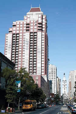
Symphony House, so successful in concept and as condos, is horrifying aesthetically.
By Inga Saffron
Inquirer Architecture Critic
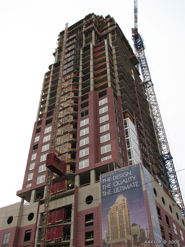
Except to those who resolutely averted their eyes during construction, it won't come as news that Symphony House is the ugliest new condo building in Philadelphia. The 32-story mixed-use tower flounces onto venerable South Broad Street like a sequined and over-rouged strumpet. Sheathed in a sickly shade of pink concrete, the building resembles, as one blogger wittily observed, a giant Pepto-Bismol bottle. If only it were possible to look away!
When architecture is this bad, it's all too easy to pile on, or move on. But the lessons Philadelphia takes away from Symphony House will determine what shape this aspiring "Next Great City" assumes in the 21st century.
The Dranoff Properties project, designed by Philadelphia's Bower Lewis Thrower Architects (BLT), was chosen in a city-run competition and was meant to serve as a flagship for a newly revived, and increasingly residential, Avenue of the Arts. As a business proposition, the Symphony House condos are such a runaway success that owner Carl Dranoff is developing three more housing concepts for Broad Street.
If Symphony House is the flagship, dare we imagine what the rest of the flotilla will look like?
Judging by the flock of city boosters who bleated praises to Symphony House at a recent ribbon-cutting, there will be a mad rush to champion the project's virtues. Partisans will point out Symphony House's positives: It replaced a gas station and a surface parking lot. It provides a lavish new home for a growing theater company. It behaves in a proper urban way in that it includes two ground-floor spaces for restaurants.
While that's all true enough, Symphony House's defenders operate on the belief that any new construction in Philadelphia is good construction.
But after a vigorous real estate boom, Philadelphia can't be satisfied anymore just to build new. The city needs to build well, with taste, integrity, creativity, and, whenever possible, real aesthetic ambition. Looks matter, especially as the city comes to depend on tourism for its livelihood.
Yet when the Philadelphia Industrial Development Corp. solicited proposals in 2002 for the 36,000-square-foot lot between Pine and Lombard Streets, it focused on site planning, not aesthetics. PIDC, which sold the land for $6 million, never instituted a professional design-review process or vetted Dranoff's material choices. It's the same story with too many publicly initiated projects around the city, from waterfront casinos to the South Street Bridge. If city agencies are calling the shots, the city should ensure that the public gets a worthy design.
Symphony House's architecture actually grew worse after April 2003, when the initial competition rendering by BLT's Michael Ytterberg was accepted. In that version, the tower was a benign buff color with a green mansard cap. Squared-off bays projected on the north and south facades, but the crucial Broad Street wall maintained a dignified calm.
Then Dranoff and his architects started piling on the doodads. Dranoff's design philosophy seemed to be "too much is never enough."
The team pasted huge silver-colored bay windows on the Broad Street facade. They punched terrace openings between the side bays. The facade went from buff to a blushing red that was intended - depending on who is talking - to evoke either brick or sandstone. In keeping with the general reddening, the cap morphed to burgundy.
Ytterberg says he took his inspiration from Philadelphia's early-20th-century skyscrapers, like Ritter & Shay's Drake Hotel and Trumbauer's Chateau Crillon on the west side of Rittenhouse Square, now a Korman Suites. Dranoff, who was pitching Symphony House to an affluent baby-boomer demographic, said he wanted a "timeless building."
Timeless is a word that should set off alarms when uttered by developers and architects. Only the hype is timeless.
If you love historical architecture, then you will probably hate Symphony House. Philadelphia's old buildings were assembled by expert designers and craftsmen, who used natural materials and were fluent in a well-established design language.
Symphony House speaks gibberish. It is a Frankenstein mix of historical elements, from Palladian arches to art deco porthole windows, that have been rendered meaningless by modern times, materials and construction methods. The mansard crown was stolen outright from the Chateau Crillon and reproduced in fiberglass instead of copper, with four pointless hatpins poking up at the corners.
Our brains immediately intuit such deceptions. When we describe a brick rowhouse, we may say that it is red. But we understand that it is actually red and gray because about 30 percent of the surface is mortar. We appreciate the color and texture variations, even if we never articulate the reason.
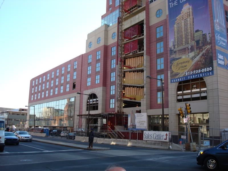
You can, theoretically, create a good replica of a historic building, but it will cost far more today than the $125 million Dranoff spent on Symphony House. So when we look at the tower, set on a six-story garage, we instinctively know something is wrong with its covering of lightweight, carbon-fiber-reinforced precast concrete panels. They lack heft. The color is too uniform, too unnatural. BLT used the latest materials and methods, but betrayed their purpose.
It's not just cladding that gives Symphony House away as a clumsy, contemporary fake. It's the hodgepodge of aluminum applique. You're not supposed to notice a building's window frames, but here the silver-colored casings become an overpowering decorative element. You can't miss those silver bays because they're plastered on the tower like spangles.
Meanwhile, the architects used champagne-colored frames for the six-story base. Because the darker color is more recessive, it works better against the pink concrete. But your eye rebels at the abrupt change to silver. The garishness doesn't end with the dueling window frames. On the lower level, Dranoff clipped bronze-colored sconces between the champagne-trimmed windows. And the terraces are secured with black metal railings that look like park fencing.
Not surprisingly, the materials that lavishly decorate the interior are significantly better. That's what people are buying. But the lobby and common spaces have been decorated with the padded-shoulder pomposity of the Reagan era, a look BLT has repeated in Philadelphia's courthouse and Dranoff's Left Bank and Victor apartment buildings. Don't they know it's 2007?
Unlike Chicago and New York, Philadelphia is not known for its dazzling, iconic architecture. The city's strength has always been its sober, finely crafted designs. Philadelphia buildings take you in slowly. They are rarely vulgar, even if they seldom set the world on fire.
In some respects, Symphony House is typical of the flimsy false-front architecture going up in cities around the country. Architecture, like the fashion industry, has figured out how to mass-produce a stylish product for an affordable price. Just don't expect it to stand up to close inspection.
Because Philadelphia hasn't built many new residential high-rises until recently, it has been spared the move to schlock. Unfortunately, Symphony House looks like a harbinger of what is to come.


