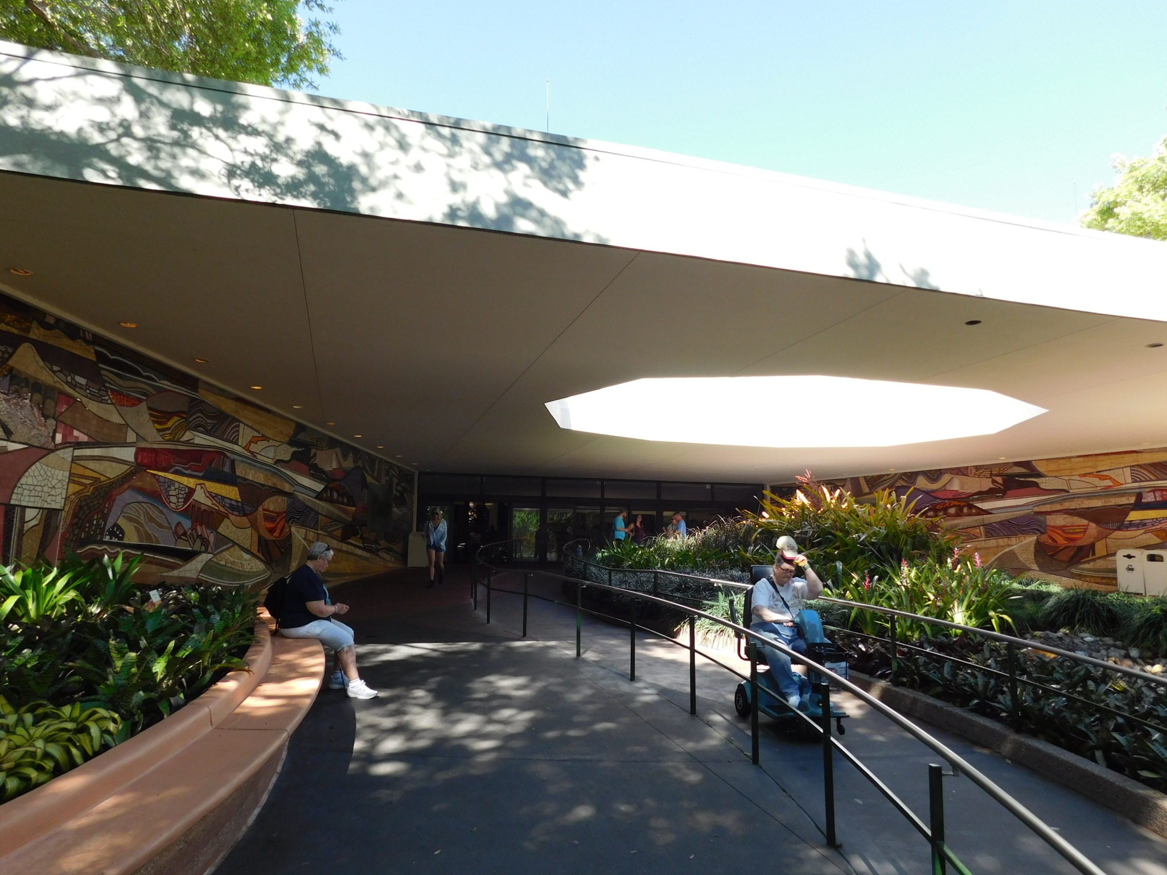
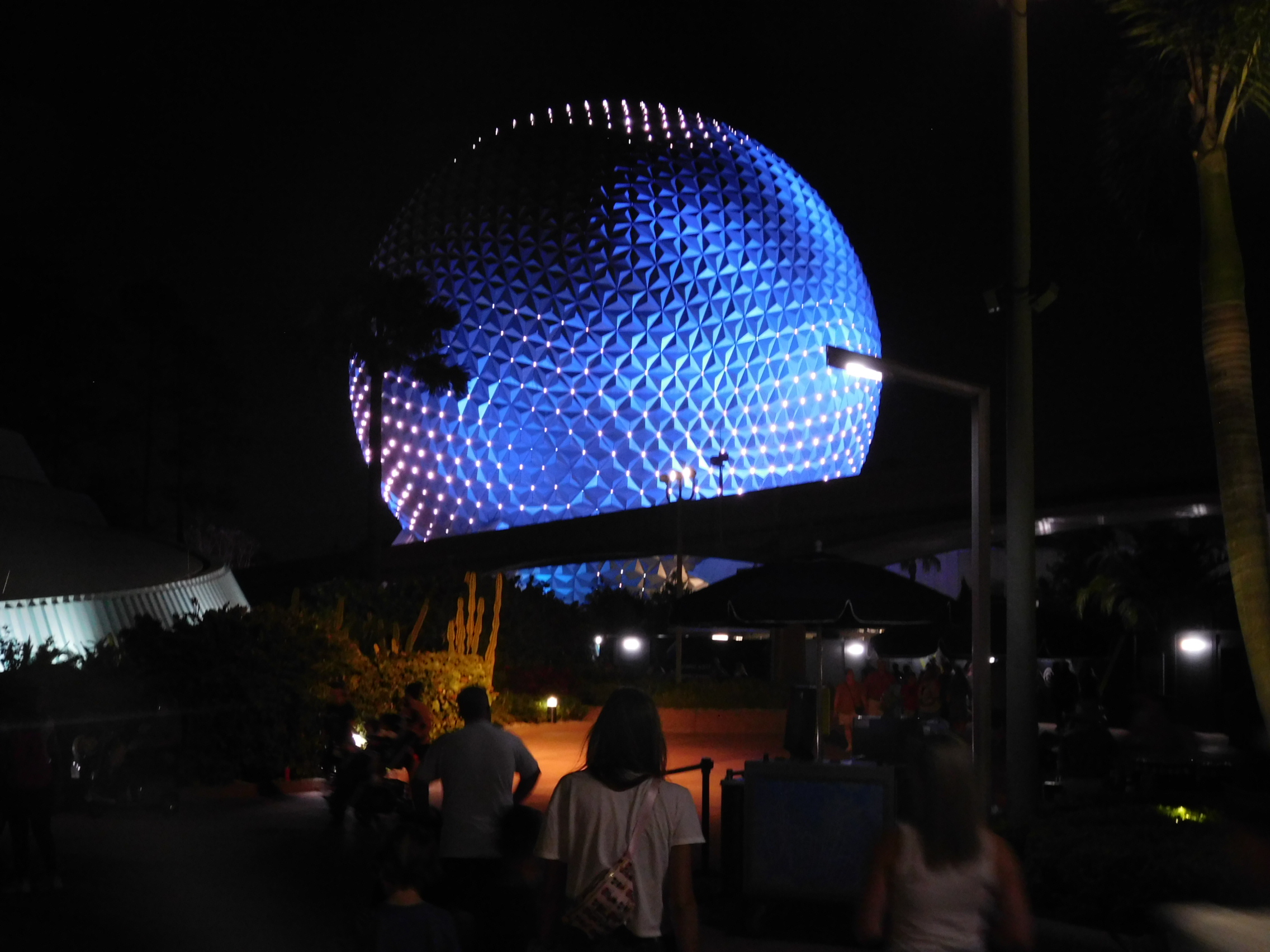
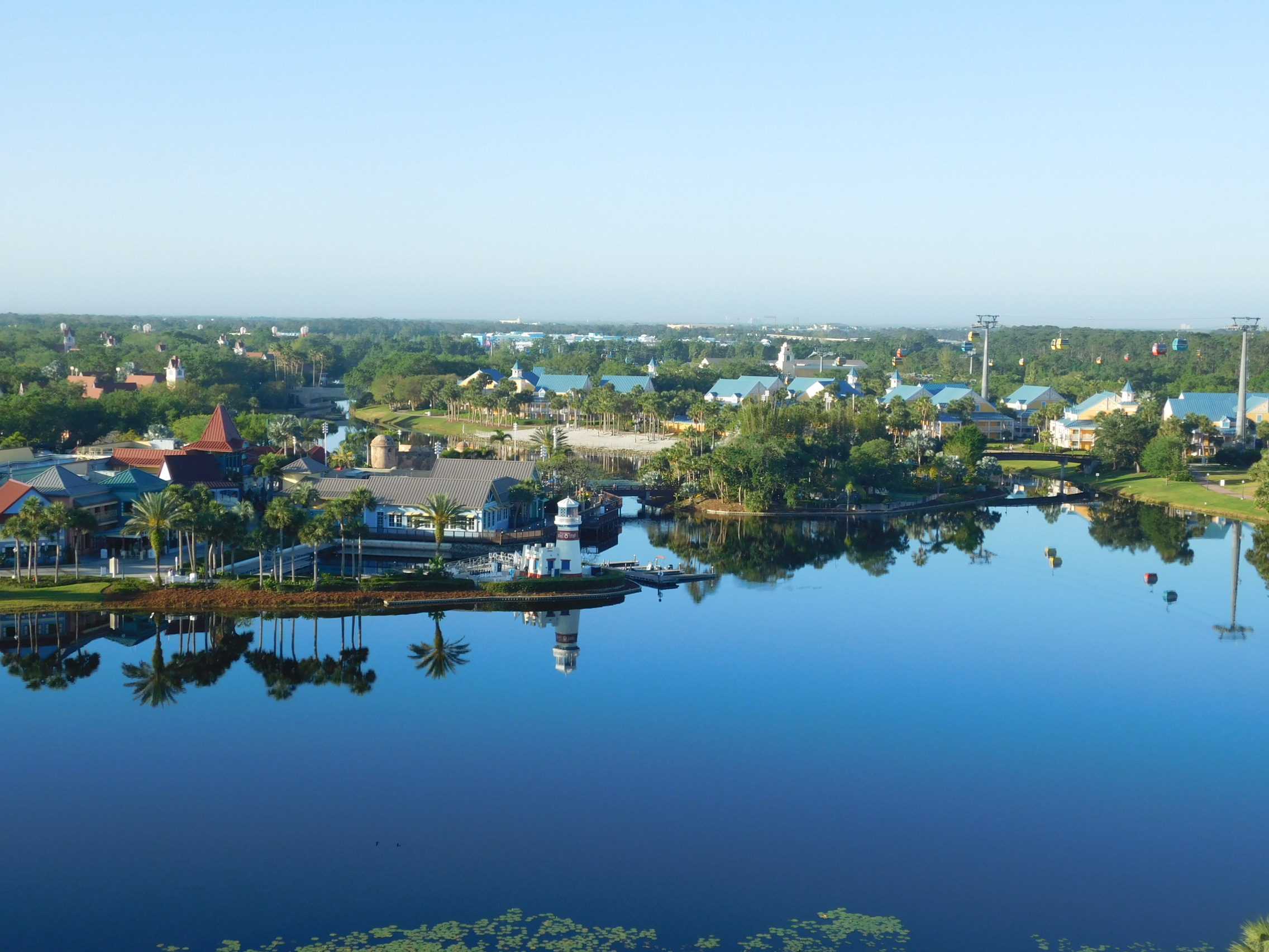
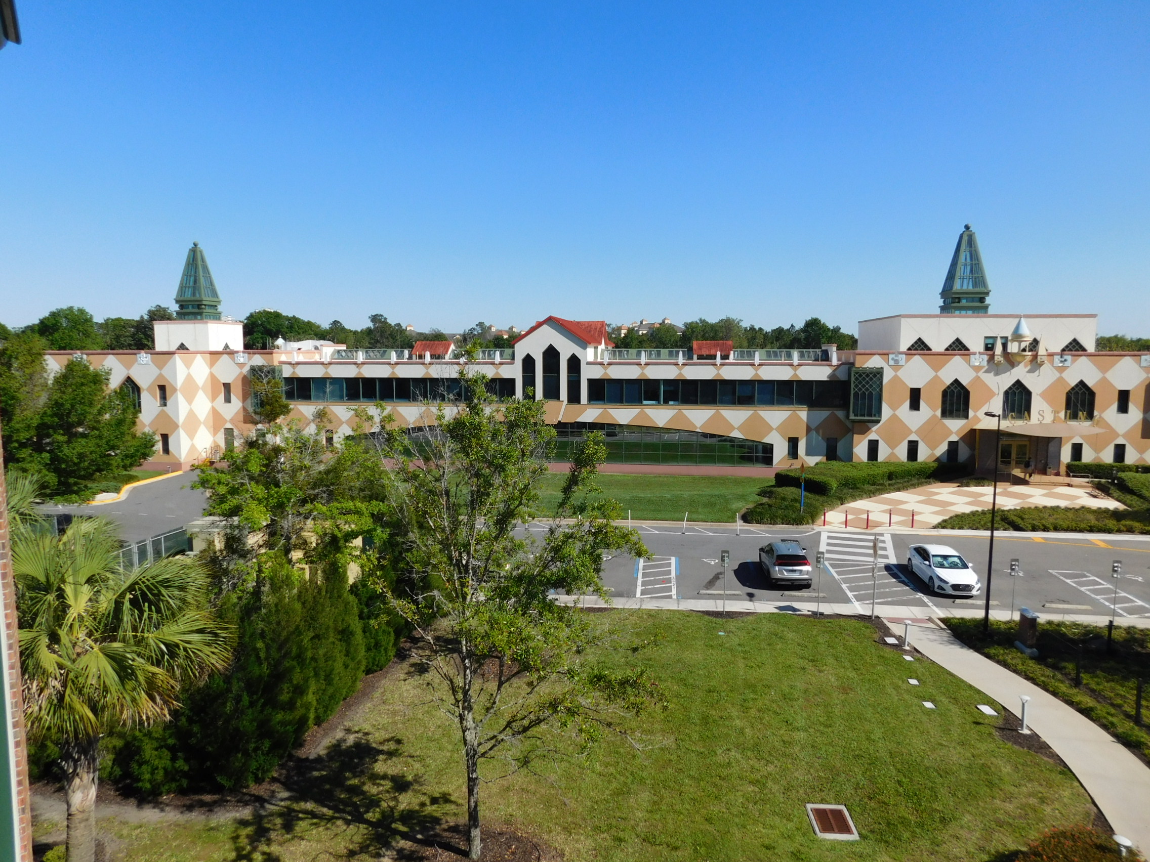
"Disney" gets thrown around as a pejorative in these types of circles. The idea that a piece of architecture is inauthentic or too grandiose, or maybe too cheap and corporate. After seeing WDW with fresh eyes after last being there 20 years ago, I'm now inclined to say that this usage is an insult to Disney. Yes, Disney World - the parks, resorts, and even the outdoor madhou-I mean, shopping mall - is an illusion, a visage of something that doesn't exist. But the illusion their architects and engineers create is simply unparalleled. No detail is overlooked, nothing that might break the suspension of disbelief. Every single potentiality is thought of and planned out. I feel like too much of what today is derided as "too Disney" actually falls far short of Disney in the execution.
We went to Sea World later in the week and it really drove home just how good Disney is from an architecture standpoint. It's horrific urbanism, but the absolute pinnacle of how to create a themed land to immerse people in while still providing all the amenities they expect. I'm not saying Disney as a company is perfect or that there's not something corporate about it (though I personally have no issues with things being "too corporate"), but it deserves credit for what it is.
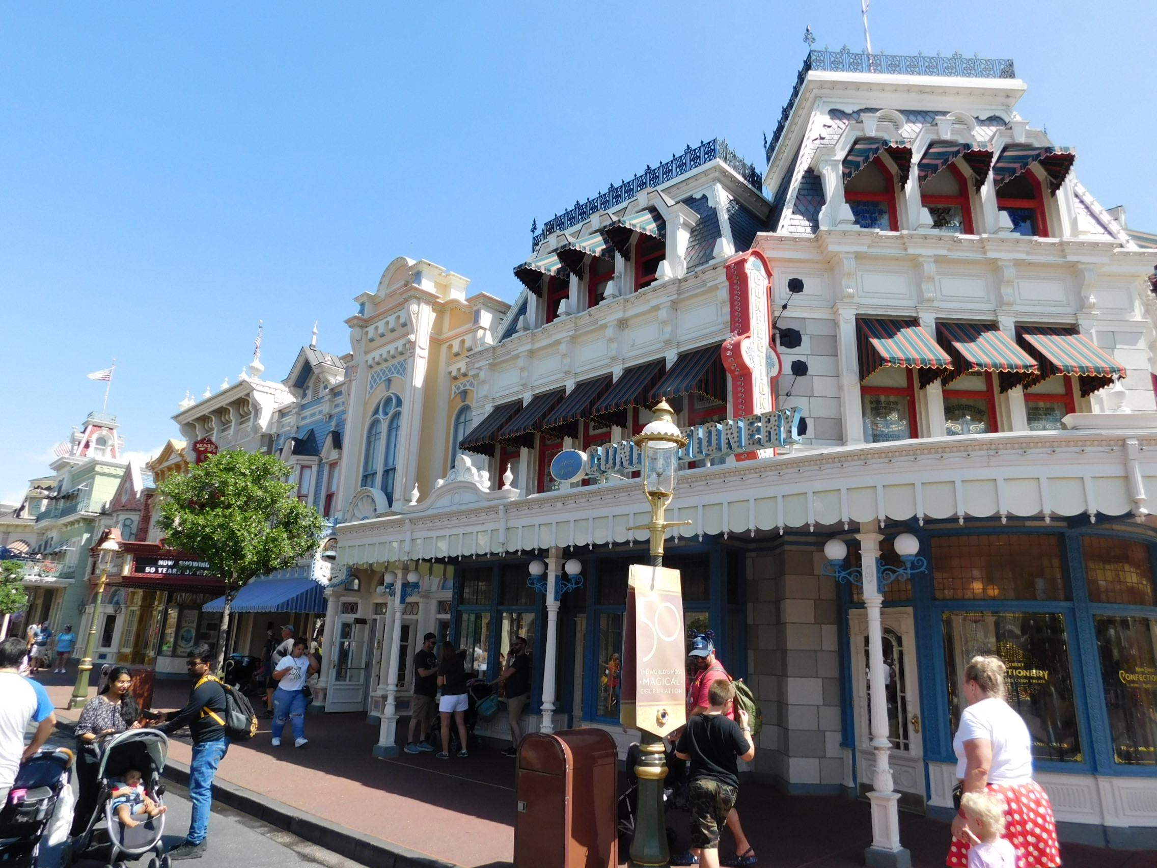
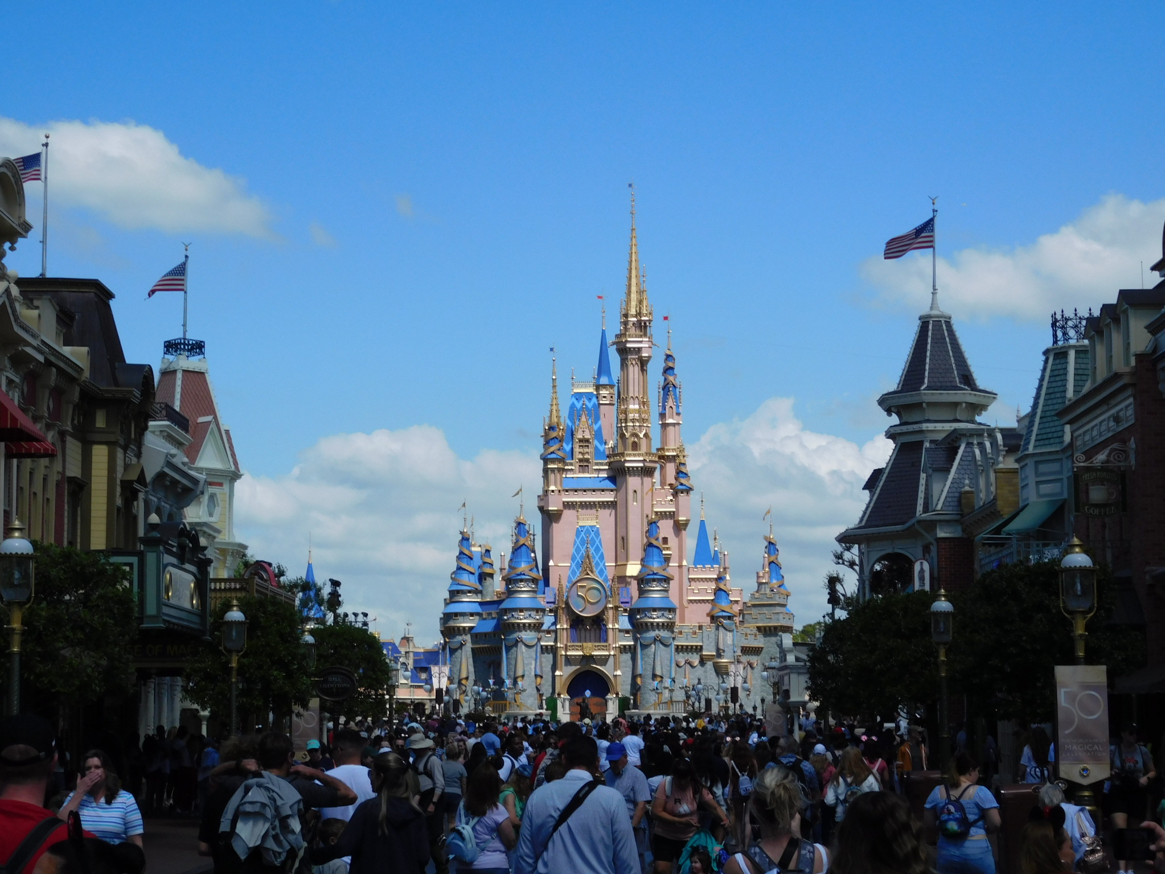
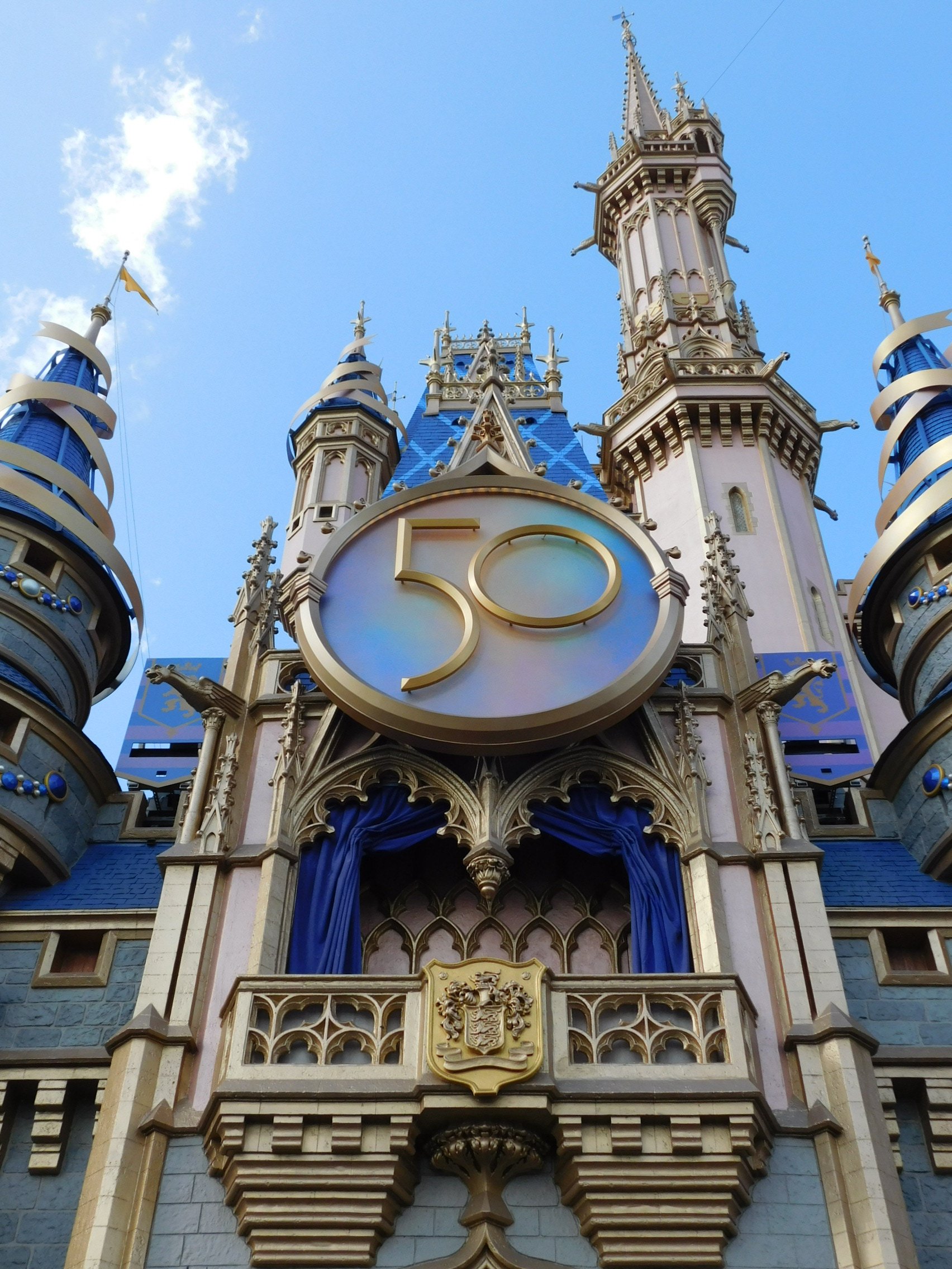
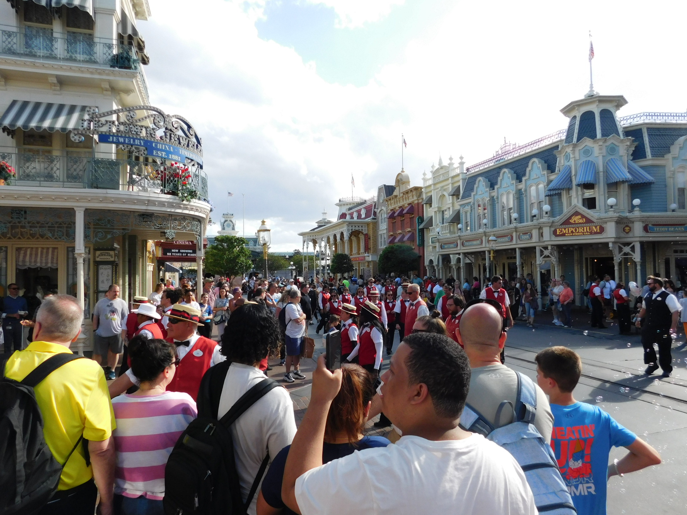
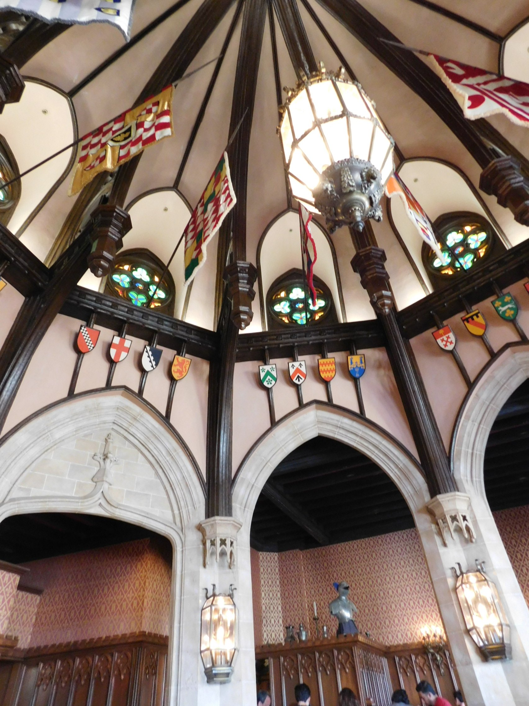
We went to Sea World later in the week and it really drove home just how good Disney is from an architecture standpoint. It's horrific urbanism, but the absolute pinnacle of how to create a themed land to immerse people in while still providing all the amenities they expect. I'm not saying Disney as a company is perfect or that there's not something corporate about it (though I personally have no issues with things being "too corporate"), but it deserves credit for what it is.
