Frank Gehry is the worst

fattony

Senior Member
Joined
Jan 28, 2013
Messages
2,099
Reaction score
480
In the interest of not derailing the Jacob Wirth thread any further, I'll bring my thought here.

The title makes by position clear, though I would listen patiently to a counter argument. I didn't go to architecture school, so I never had a professor tell me why I'm supposed to like Gehry.

I think Frank Gehry is the worst and I cannot understand why he is revered in any way, shape, or form. His architecture is the epitome of gimmickry. He's the shock jock of architecture. Build it because it is weird and it makes people stare, but they are staring for the wrong reason. And when the roof made of of crumpled tin foil leaks - don't complain because it's a GEHRY! So much of his work is all variations the same themes - crumples or piles or piles of crumples - there isn't even anything "creative" or shocking about it anymore.
 
I never had a professor tell me why I'm supposed to like Gehry.

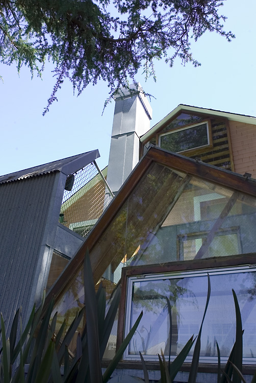
Professors don't tell you why to like Gehry. I never had a single professor tell me his work was good and something to learn from. Most chided him. At most, in my History of Arch II course when we were talking about Earthship Biotecture communities in the southwest using found objects (glass bottles, tires, etc) to construct zero energy homes, we alluded to Gehry's earlier works (late 70s) with praise, as he actually recycled materials into tangible architecture, most notably in his own residence in Santa Monica in 1978.

0002.jpg

Gehry Residence, Frank Gehry, 1978

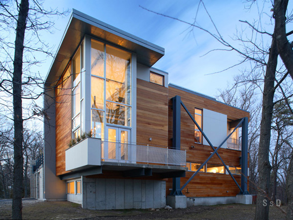
A house that was definitely inspired by the Gehry Residence is Lexington's very own Big Dig House, made from recycled materials from the Central Artery.

bigdighouse_southeast_dusk.jpg

Big Dig House, SsD Architecture, 2006
 
Fondation Louis Vuitton and 8 Spruce St are gorgeous.

I'll grant you that Foundation Louis Vuitton - while a pile of stuff much like his other piles of stuff - is actually an attractive building.

It is hard to argue aesthetics, but on 8 Spruce I have to wholeheartedly disagree. To me that is shock jock architecture at its worst.

Holy cow - it's wavy!

Why is it wavy?

Because it can be wavy!

Should it be wavy?

Didn't you hear me - it CAN be wavy!

Agreed on both counts. I was swayed into liking Foundation Louis Vuitton after reading through the feature in last month's Architectural Record.

In regard to 8 Spruce, I also agree with you that it's wavy just to be wavy. It looks nice, but offers minimal function. It's purely aesthetic compared to say, Marina City by Goldberg in Chicago where the shape of the floorplates actually dictates the radial arrangement of the interior spaces as well as the units themselves (see below). I also have the same problem with Studio Gang's Aqua, also in Chicago, which has purely superficial wave balconies tacked onto what is a fairly normal boxy building.

Marina-city-plan1.jpg

Marina City, Bertrand Goldberg, 1964

---
Notice how if you take away the wavy facade on these next 2 examples, you have a plain boxy building with typical plans:
1881.jpg

Aqua, Studio Gang Architects, 2010

440-8SpruceStreet.jpg

8 Spruce St, Frank Gehry, 2010
 
To me, the craziest part of 8 Spruce is that unless you know exactly what to look for, you won't find it at street level. It's as if the towers are meant purely as skyline sculpture - for the city, but not of the city.
 
To me, the craziest part of 8 Spruce is that unless you know exactly what to look for, you won't find it at street level. It's as if the towers are meant purely as skyline sculpture - for the city, but not of the city.

That, I think, is the essence of Gehry: It's sculpture, not architecture.

Wavy, creative buildings can be quite beautiful, and some of Gehry's are. The problem is that when other starchitects phone something in, you just get something derivative (see Cesar Pelli and his traveling IFC show). When Gehry phones it in, the nature of his style is such that you get something downright hideous, like the Stata Center at MIT.

Given that not one of his buildings is ever designed to be pleasant to use or easy to maintain, that's a very real problem. All those IFC clones are perfectly functional buildings, but Gehry's table scraps aren't.
 
I'm perfectly okay with the notion of architecture as art. Good architecture should engage the imagination, inspire the observer, try to evoke some sort of reaction. Of course unlike other forms of art it also needs to be functional. If Gehry's designs not functional then that is not good.

I think 8 Spruce is visually striking (and functional so far as I know) and Marina City is an eyesore, so I prefer 8 Spruce. While "form follows function" as a principle is admirable, at the end of the day it all comes down to how the observer responds to the aesthetic. I love Sullivan and Burnham not because of any lofty design principles but because their buildings are gorgeous.

Foundation Louis Vuitton looks like a giant squashed bug.
 
I'm perfectly okay with the notion of architecture as art.

Art up to a certain point. I have the same problem with Zaha Hadid... some architects are trying to build living sculptures rather than good buildings that integrate into their surroundings properly.
 
I'll grant you that Foundation Louis Vuitton - while a pile of stuff much like his other piles of stuff - is actually an attractive building.

It is hard to argue aesthetics, but on 8 Spruce I have to wholeheartedly disagree. To me that is shock jock architecture at its worst.

Holy cow - it's wavy!

Why is it wavy?

Because it can be wavy!

Should it be wavy?

Didn't you hear me - it CAN be wavy!

you are basically arguing the merits of Post-Modern Architecture. Show there be ornamentation or not? This argument could be said of any ornamented structure change "wavy" to "a dome" for the state house, "tall" for the Eiffel tower, "a cantilever" for the ICA. The "wavy" or crumpled look of Frank Gehry's, or really any Post-Modern, architecture is the desire to find a new form or ornament. If it works or not purely a matter of aesthetics.
 
you are basically arguing the merits of Post-Modern Architecture. Show there be ornamentation or not? This argument could be said of any ornamented structure change "wavy" to "a dome" for the state house, "tall" for the Eiffel tower, "a cantilever" for the ICA. The "wavy" or crumpled look of Frank Gehry's, or really any Post-Modern, architecture is the desire to find a new form or ornament. If it works or not purely a matter of aesthetics.

I guess to me the difference between real architecture and pure kitsch/gimmickery is to retain at least some purpose to what the building looks like. A dome creates a space that cannot be created without a dome. The Eiffel Tower was tall in order to be an effective observation deck. I don't even see Art Deco as garish because they chose cladding to highlight lines and corners on the internal structure of the building. At least there is a relation between the decoration and the rest of the building.

I want there to be some remote purpose to ornamentation. Maybe "the point" of 8 Spruce is to mock the internal structure of the building by making it look fluid instead of solid. I prefer my architecture sans mockery.
 
My unexamined opinion:

I think some of Gehry's buildings are exciting. In particular, I like Dancing House, the tower in Hanover, and Disney Concert Hall. I don't like the Stata Center. I feel like Cambridge end up with one of Gehry's least interesting buildings.
 
But you know what? That's kind of missing the point entirely. You don't see the CVS, the bland residential building, or the invisible apartment buildings. It fades and doesn't matter. Maybe it doesn't even last. Gehry stuff just smacks you in the face with its awfulness. Probably for your entire life. All while he basically never has to look at it again.

Pretty much how I feel about some of the brutalist wonders in Boston. That first impression of "wow, that is different" is little comfort for subsequent decades of enduring an oppressive in-your-face eyesore.
 

Back
Top