MIT has released plans for its next dorm project on Vassar St: PB371 - City of Cambridge, MA
You are using an out of date browser. It may not display this or other websites correctly.
You should upgrade or use an alternative browser.
You should upgrade or use an alternative browser.
Graduate Junction (MIT West Campus) | 269-301 Vassar St | Cambridge
- Thread starter sm89
- Start date
Gameguy326
Active Member
- Joined
- Aug 18, 2015
- Messages
- 390
- Reaction score
- 98
I think this might be the ugliest set of buildings MIT has proposed in a long time. That, or these renderings are not doing it justice. It looks like a housing project from the 1970s.
Massachoicetts
Active Member
- Joined
- Jun 4, 2019
- Messages
- 573
- Reaction score
- 713
I just am confused how a top engineering and architecture school with the #1 Urban Planning program in the country continually produces subpar and mediocre designs.
RandomWalk
Senior Member
- Joined
- Feb 2, 2014
- Messages
- 3,334
- Reaction score
- 5,268
It’s like an architecture student put Baker House in a rolling press and called it done.
Gameguy326
Active Member
- Joined
- Aug 18, 2015
- Messages
- 390
- Reaction score
- 98
This looks wayyyy worse than the orange building IMO. The orange building is...more boring that it could have/should have been, but at least it has personality and isn't dreary to look at.Can’t be worse than the orange building, right?
Bananarama
Active Member
- Joined
- Mar 18, 2020
- Messages
- 585
- Reaction score
- 1,189
Man, that's pretty drab. Disappointing since KieranTimberlake usually does pretty nice work.
If anything, it blends in really well. If I were overseeing this project, I'm not sure if I would want something competing with Simmons Hall, complementing it, or blending in the background, like this is. Regardless, it's not the best...
Here are the current renders/plans:
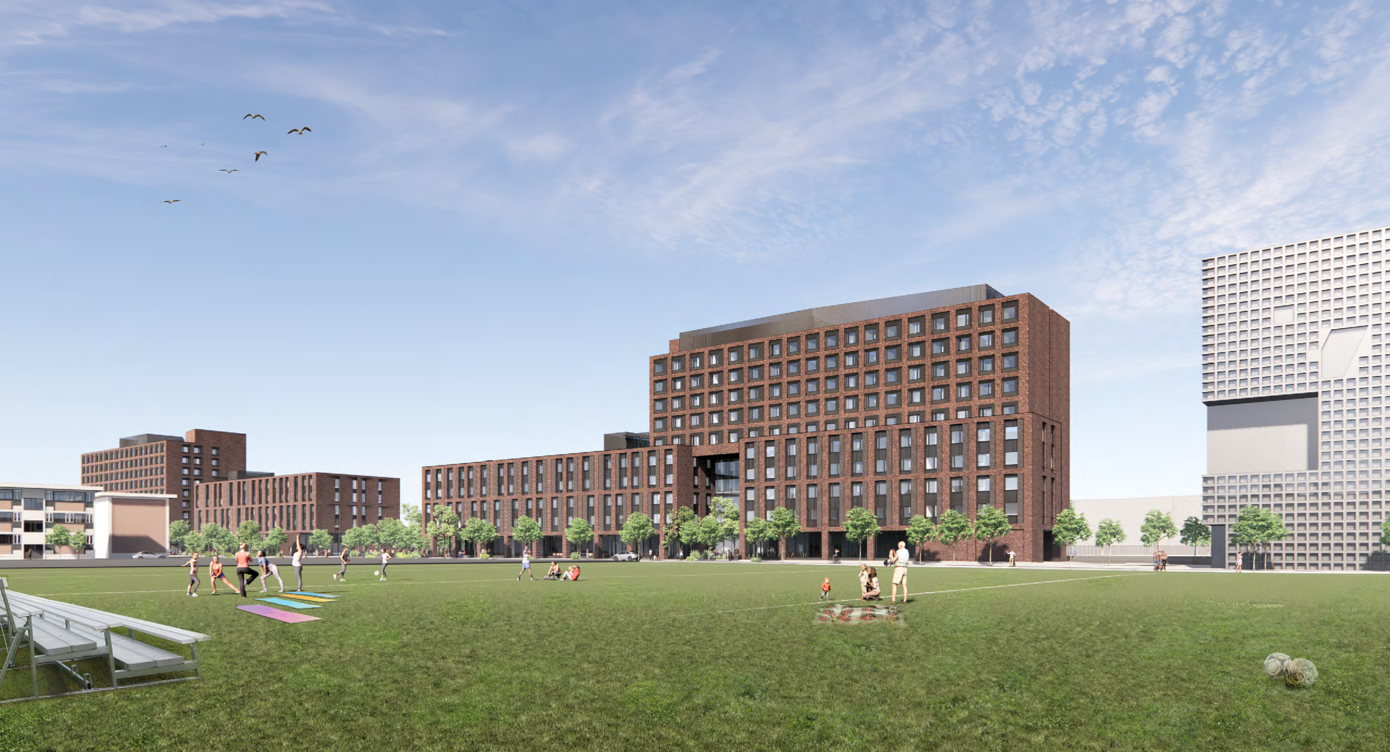
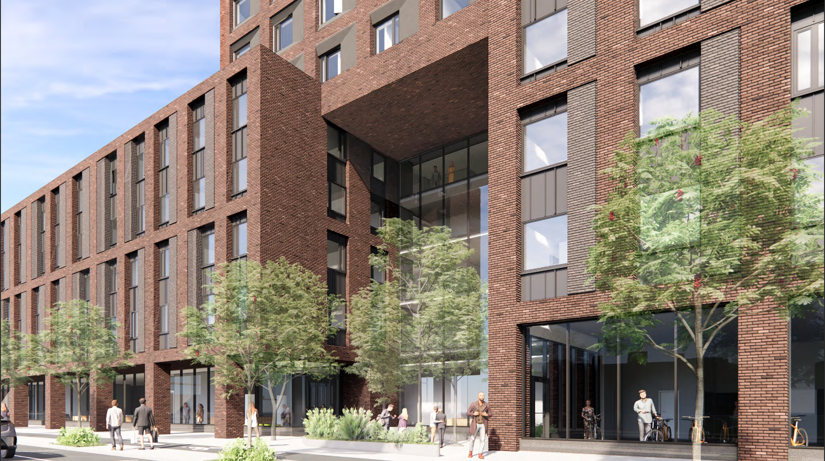
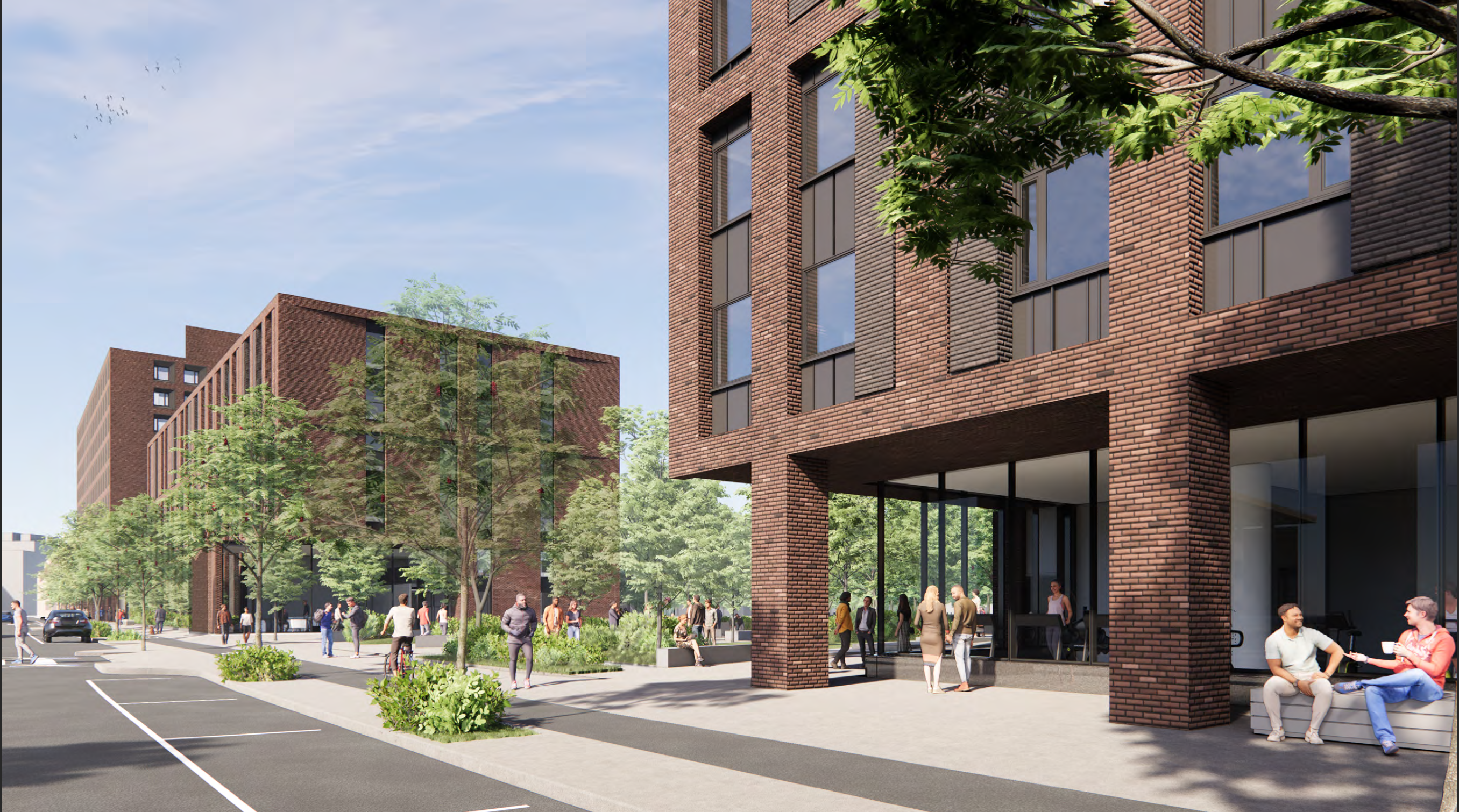
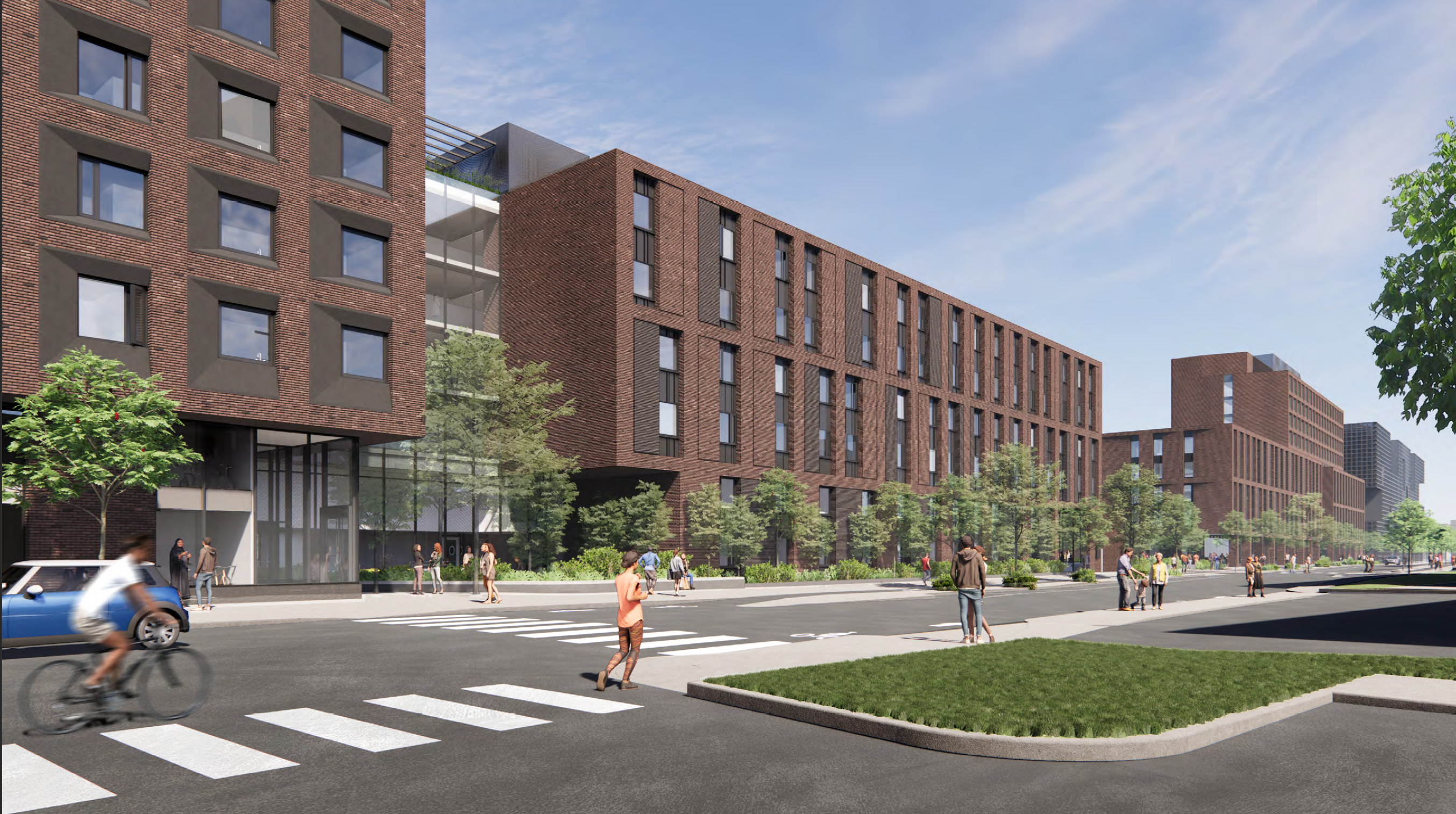
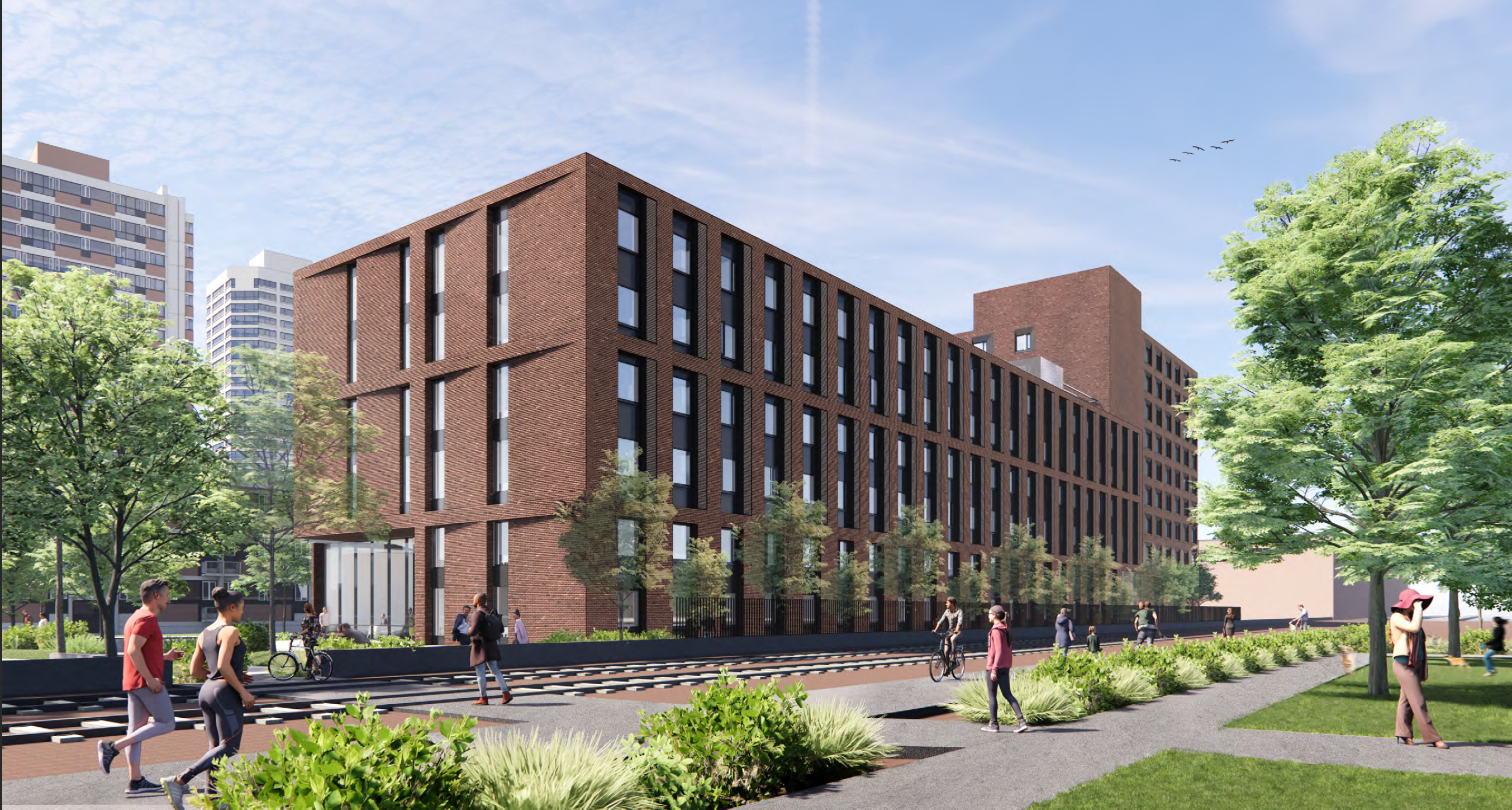
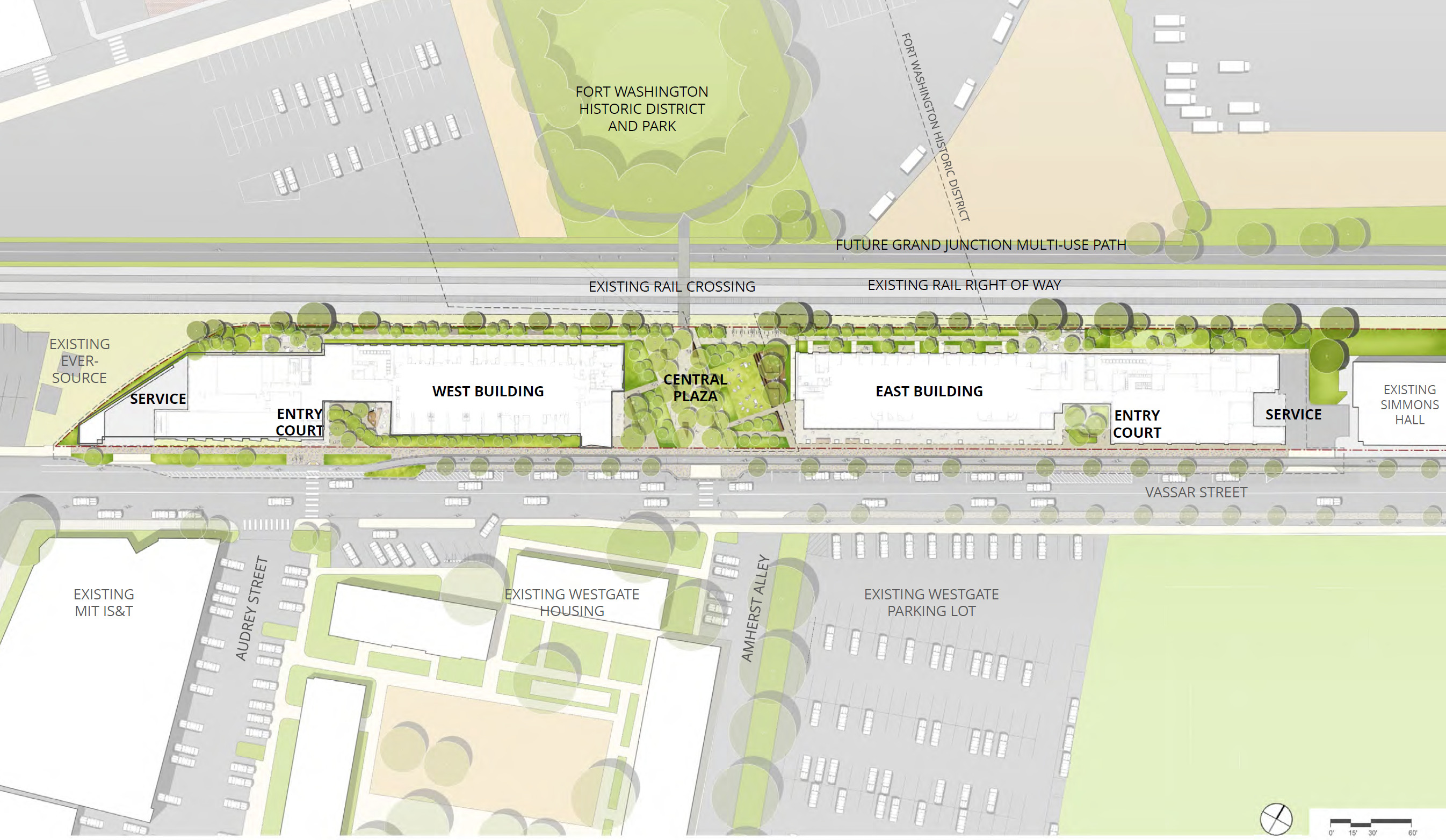
Here are the current renders/plans:
stick n move
Superstar
- Joined
- Oct 14, 2009
- Messages
- 12,160
- Reaction score
- 19,149
These look pretty good to me.
RandomWalk
Senior Member
- Joined
- Feb 2, 2014
- Messages
- 3,334
- Reaction score
- 5,268
The problem is that MIT has shown that it can build interesting buildings (Baker House, Kresge, the Chapel). However, it has stopped trying. It’s not for lack of funds.
Gameguy326
Active Member
- Joined
- Aug 18, 2015
- Messages
- 390
- Reaction score
- 98
If anything, it blends in really well. If I were overseeing this project, I'm not sure if I would want something competing with Simmons Hall, complementing it, or blending in the background, like this is. Regardless, it's not the best...
Disagree; it blends in with everything to the west of it, but it clashes heavily with Simmons. Not that it's easy to mesh with Simmons, but some commonality in appearance or building materials (some metal/chrome on the facade?) could have gone a long way.
Disagree; it blends in with everything to the west of it, but it clashes heavily with Simmons. Not that it's easy to mesh with Simmons, but some commonality in appearance or building materials (some metal/chrome on the facade?) could have gone a long way.
I suppose it does clash with Simmons, looking at it a little more. I like the chrome/metal idea, perhaps in the window bays, instead of the brown metal, which could be doing a good amount of the work that's currently dating it back to the 70's as you alluded to earlier .
Gameguy326
Active Member
- Joined
- Aug 18, 2015
- Messages
- 390
- Reaction score
- 98
I agree, I was actually going to say in my last post that it's the window bays that cause me to dislike it, upon further inspection.I suppose it does clash with Simmons, looking at it a little more. I like the chrome/metal idea, perhaps in the window bays, instead of the brown metal, which could be doing a good amount of the work that's currently dating it back to the 70's as you alluded to earlier .
bigpicture7
Senior Member
- Joined
- May 5, 2016
- Messages
- 3,909
- Reaction score
- 9,568
I am convinced at this point that they are intentionally trying to make the west end of Vassar nondescript and purely functional. Simmons is an enigma relative to this, but probably predates this strategy given it was designed over 20 yrs ago at this point.
I think we're overthinking this on aB.
I think we're overthinking this on aB.
I’m a Brandeis grad, so I’ve experienced a school that doesn’t respect architecture and landscaped beauty. MIT has money and a great location. Evidently, they simply don’t care.
Red brick pillars? I haven’t seen that since the 1970s.
Red brick pillars? I haven’t seen that since the 1970s.
Last edited:
Gameguy326
Active Member
- Joined
- Aug 18, 2015
- Messages
- 390
- Reaction score
- 98
Disagree. Simmons, the daycare center, the metro warehouse, the new undergraduate dorms, the theater arts building, the Hyatt, the athletics buildings, and even Tang are all colorful, varied, and somewhat geometrically interesting. It's just the cluster of this, Westgate, and a few other old brick buildings far west that are...bleh.I am convinced at this point that they are intentionally trying to make the west end of Vassar nondescript and purely functional. Simmons is an enigma relative to this, but probably predates this strategy given it was designed over 20 yrs ago at this point.
I think we're overthinking this on aB.
