Holyoke Center Renovation | Harvard Square | Cambridge

Hopefully Harvard mindful of Sert's primary design goals during this rehab. It would be a shame for Harvard to modernize Holyoke Center at the expense of the legacy of one of the most important modernist designers.
 
^^ Agree. Holyoke Center is among Sert's most successful designs, and an object lesson on how a forthrightly modern building can successfully integrate with an existing urban fabric.
 
It successfully interacted with the surrounding streets only after Au Bon Pain opened. The building was widely hated before then, and I don't even remember who the previous (retail, not restaurant) tenant was of that storefront.
 
It successfully interacted with the surrounding streets only after Au Bon Pain opened. The building was widely hated before then, and I don't even remember who the previous (retail, not restaurant) tenant was of that storefront.

Ron ==the typical Moderne Style [now quite old but hardly venerable] -- the form of the building was all about pleasing academics with geometry and "truth" -- The result is typically giving the virtual digit to the people on the sidewalk level.

In a lot of those buildings if you were walking across the street and if there wasn't a constant flow of people in/out -- you'd be hard pressed to find the entrance.

For those of you who were around here circa 1970's, 80's -- before the glass-streets at the Pru were installed in the early 1990's -- Try to remember the misery of December [with apologies to the 1960 musical "The Fantasticks" {music by Harvey Schmidt and lyrics by Tom Jones}] -- the utterly miserable pedestrian experience of walking to/from the shops to/from the T as hurricane force winds ducted down the essentially frictionless facade of the Pru tower drove freezing rain, sleet and snow into your face

That was the Moderne Building in action -- good riddance!
 
Whatever Holyoke Center's other faults may be, the entrance is quite obvious (on both the Mass Ave and Mt Auburn St sides)
 
I work in this building. The first floor, as many of you know, is retail and some Harvard uses (visitor center, pharmacy). The second floor is not accessible by the central elevators (mostly because the central arcade is two stories high). The third floor is occupied by offices of the Graduate School of Arts and Sciences.

One thing just about all people who work in this building can agree on is that there are some simple aesthetic improvements that would make whatever future uses it has much more enjoyable. Foremost of these is the numerous frosted windows. The "frosting" has cracked and decayed over the years. Add to that--it ruins dozens of views throughout the building. You will go into an office that should have a million dollar view of downtown or Harvard Square--but instead it just has frosted glass.
 
For several years, the Mount Auburn-side elevators have been broken and out of service.
 
Sert still has at least two other Harvard buildings, one of which recently underwent a significant renovation without a new facade.

From the article in the Harvard mag, it seems the donor had a say in selecting the British architect. And as I noted, it would seem unusual to hire a British architect to simply fashion new interiors.
 
Ron ==the typical Moderne Style


Its modern, contemporary, or modernism. Moderne (as in Streamline Moderne or Art Moderne) is something altogether different, like so:
Cleveland_Greyhound.jpg


Anyway, regarding the Hoyloke Center, one of my professors worked on the other building they just renovated. The glazing has started to fail, the colors had faded, and the performance of the single pane windows was terrible. Basically they worked to freshen it up and add it a bit of noninvasive new technology. I know he talked about the Hoyloke Center being next in line for a similar treatment, so I imagine that's whats going on. It was a year or two ago though, so the plan may have changed.
 
Last edited:
sorry for the dumb question but what city is that greyhound terminal in?
 
The image is named "Cleveland_Greyhound.jpg" and if you zoom in, those are RTA bus signs, so I would assume it's Cleveland.
 
Yeah, that's the main bus terminal on Chester Ave in Cleveland
 
That's an outstanding example of Moderne, and Cleveland is surprisingly rich in the style although the majority are much more demure than the terminal. Still, it's one of the few things I take pleasure in as I spend two months of each year in that debbie downer of a city.
 
A variant in Washington DC was saved with a facadectomy that kept the front third, and put an office in the rear. The common areas, lobby and through corridor on the ground floor are evocative of the original. Otherwise, the new building is crap.

greyhound-dc-900_0.jpg

_________________________

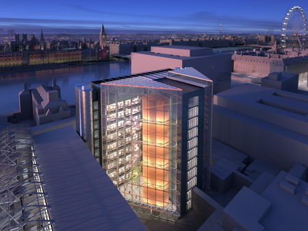
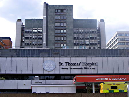
The lead architect for Holyoke was/is also the lead architect for this recladding of a hospital in London.

After
1290616012_80.177.117.97.jpg


Only pic of renderings that definitively is from Hopkins. There was quite a competition, and a bunch of renderings are identified by letter, e.g., Team B, not the name of the architect.

Before
1281368159_80.177.117.97.jpg


Construction only just started a few months ago.
http://www.theconstructionindex.co.uk/news/view/tommys-cladding-finally-set-to-start
 
Its modern, contemporary, or modernism. Moderne (as in Streamline Moderne or Art Moderne) is something altogether different, like so:


Anyway, regarding the Hoyloke Center, one of my professors worked on the other building they just renovated. The glazing has started to fail, the colors had faded, and the performance of the single pane windows was terrible. Basically they worked to freshen it up and add it a bit of noninvasive new technology. I know he talked about the Hoyloke Center being next in line for a similar treatment, so I imagine that's whats going on. It was a year or two ago though, so the plan may have changed.

Davem -- The use of Moderne was my intent to point out the fact that the Corbu, Sert, Van der Rohe, Johnson, Bauhaus -- Pastiche is now ancient history -- this aggregation of ideas -- not any sort of coherent philosophy -- began in the early 20th Century with European Socialist Intellectuals; Peaked in the 50's and 60's in the U.S. [when there were some nice edifices created] and is still around to a certain extent

In one sense they proved their point -- modern construction technology allows anything to be hung on a steel frame -- OK --- But just like an interior wall which you can cover with many types of woods, plasters, fabrics and then hang or mount fine painting and sculpture -- Why not use the steel frame and curtain wall to show off the best

it's time to move on to something new or renewed which relates to the larger context of the surrounding buildings and also the smaller context of the person just passing by or using the building
 
The Oggi Gourmet space is being renovated. Looks like it will still be Oggi though when done.
 
  • Like
Reactions: FK4
Davem -- The use of Moderne was my intent to point out the fact that the Corbu, Sert, Van der Rohe, Johnson, Bauhaus -- Pastiche is now ancient history -- this aggregation of ideas -- not any sort of coherent philosophy -- began in the early 20th Century with European Socialist Intellectuals; Peaked in the 50's and 60's in the U.S. [when there were some nice edifices created] and is still around to a certain extent

In one sense they proved their point -- modern construction technology allows anything to be hung on a steel frame -- OK --- But just like an interior wall which you can cover with many types of woods, plasters, fabrics and then hang or mount fine painting and sculpture -- Why not use the steel frame and curtain wall to show off the best

it's time to move on to something new or renewed which relates to the larger context of the surrounding buildings and also the smaller context of the person just passing by or using the building
Man, the second to last post is by whighlander. What happened to him?
 

Back
Top