This baby needs a new thread, so here's Campbel's apercu from today's Globe:

In any case, I can't wait to see it finished. It already exceeds Boston's quota of great architecture for the 21st century.
justin
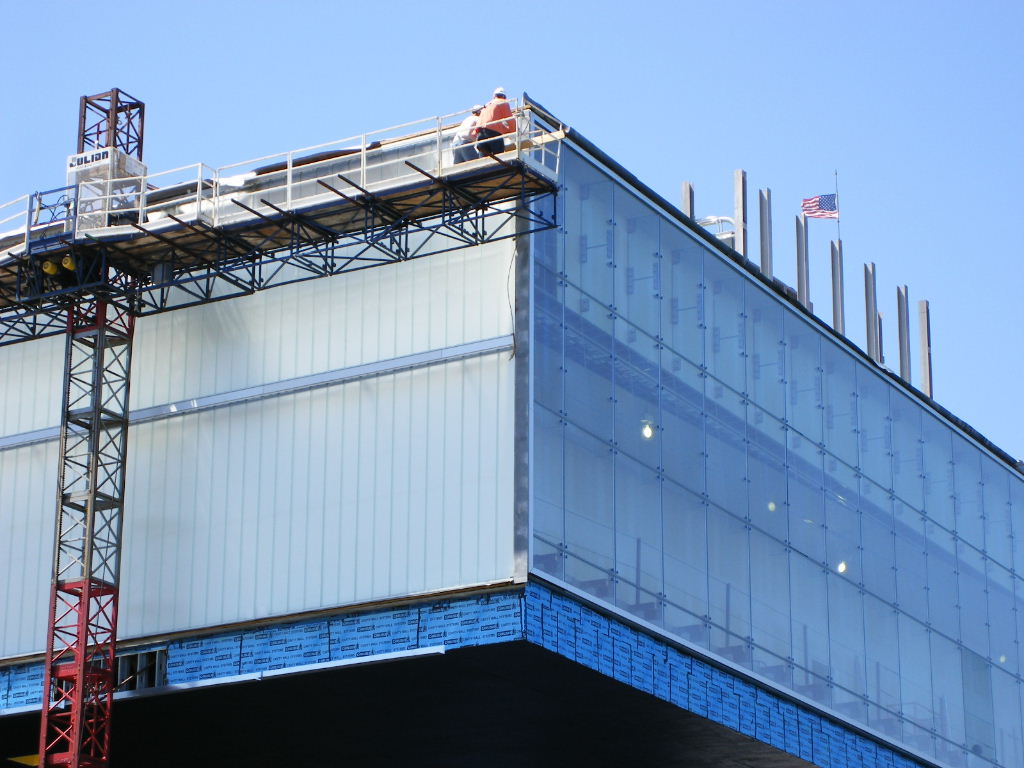
I'm sorry to see that lenticular wall gone (the glass did look transparent in the last update on the late forum); it sounded like a cool idea. On the other hand, it might have been frustrating to go up there and not be able to take in the whole view. Maybe they could have made it opaque on the sides and transparent in the middle, or switchable?The Boston Globe
ARCHITECTURE
Alone on the waterfront in South Boston, the unfinished ICA is a bold presence
Museum, slated to open in Sept., dominates its site
By Robert Campbell, Globe Correspondent | May 28, 2006
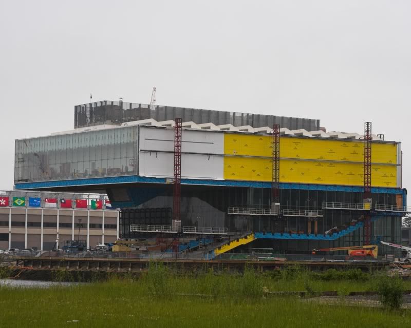
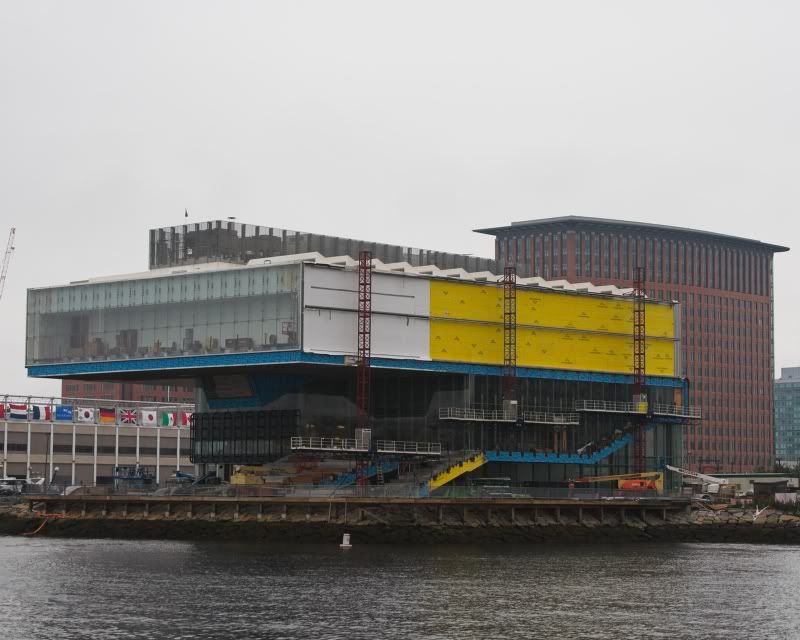
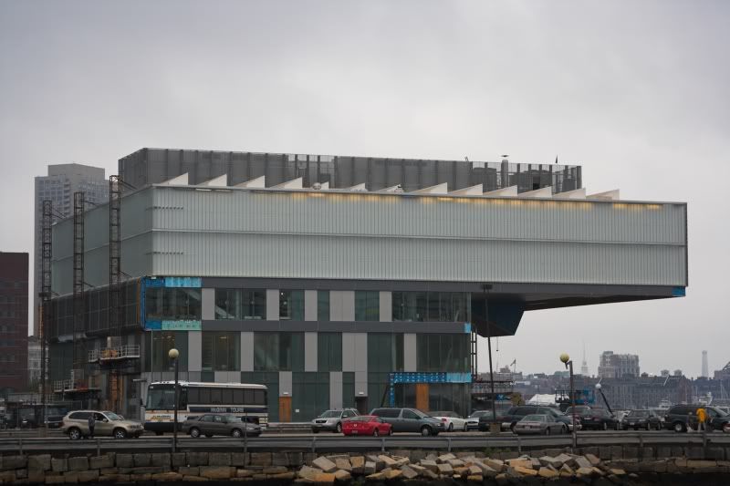
Sometimes a building looks best while it's still in the process of being built. A bold construction of steel and concrete can possess a sculptural power that sometimes fades when smoother, more polite finishes are applied.
It's a legend in the world of architecture that today's best known American architect, Frank Gehry of Los Angeles, who designed MIT's dramatic Stata Center, long ago looked at one of his buildings under construction and suddenly decided it looked great that way. He responded by attacking his conventional pink stucco house in Santa Monica, wrapping it with what appeared to be unfinished construction, much of it junk materials. Chain-link fencing was used for skylights, driveway asphalt paved the dining room floor, and exposed metal and glass erupted at crazy angles.
The resulting house was a delight. Daylight fell in patterns through the chain link. It was fascinating to see the demure pink dwelling surrounded by apparent chaos. Visiting was like finding your grandmother in a madman's cage. The house made Gehry famous.
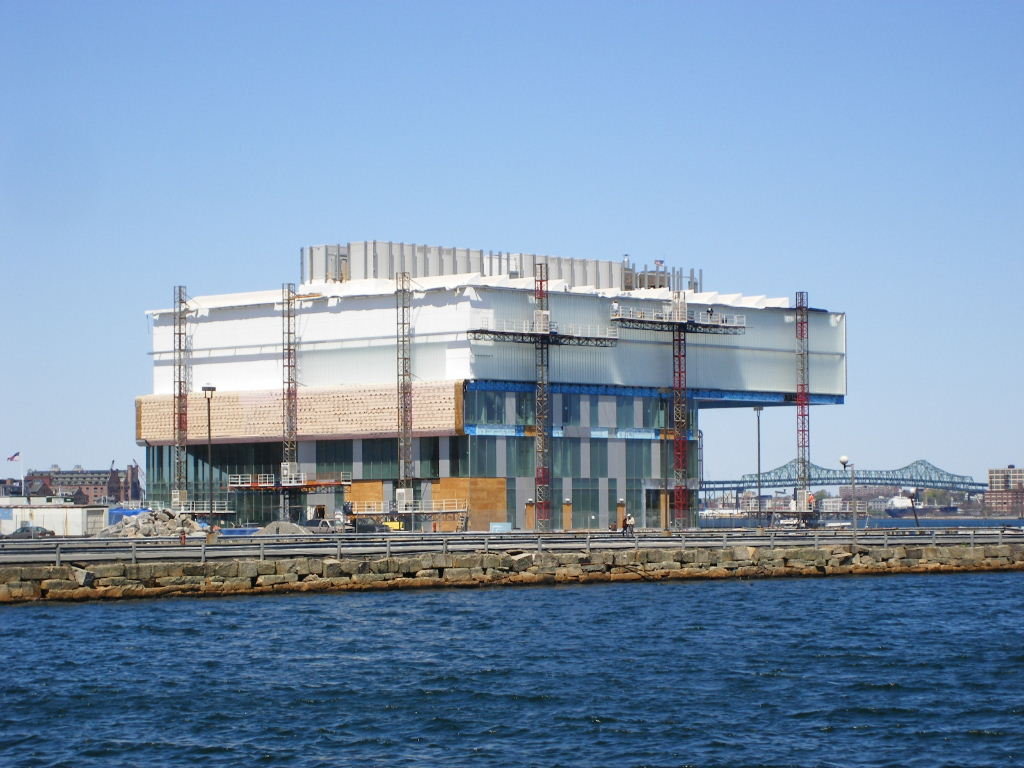
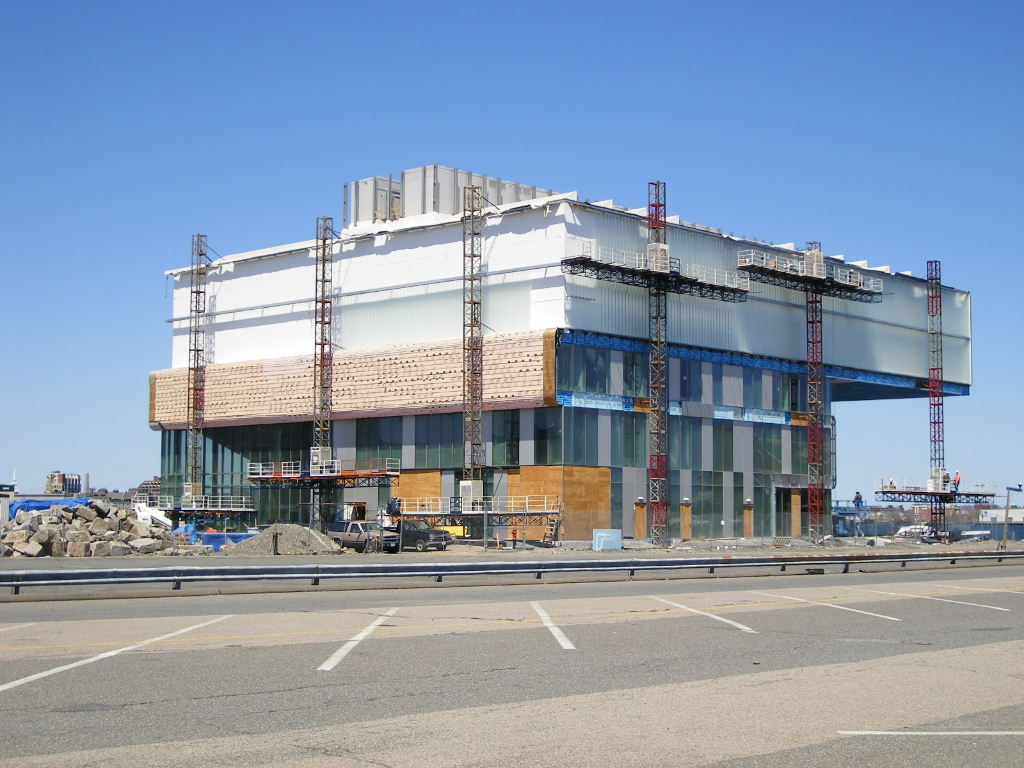
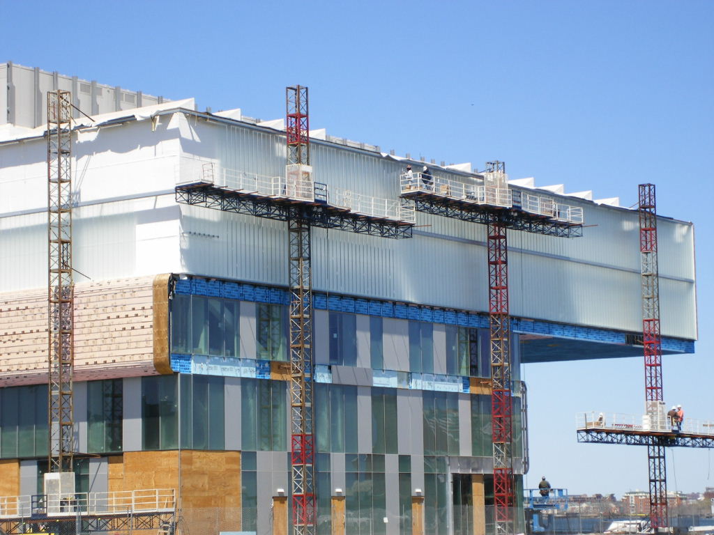
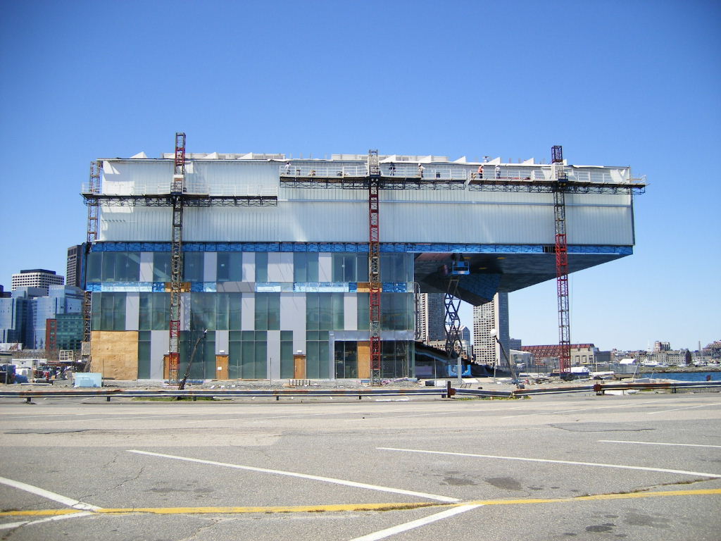
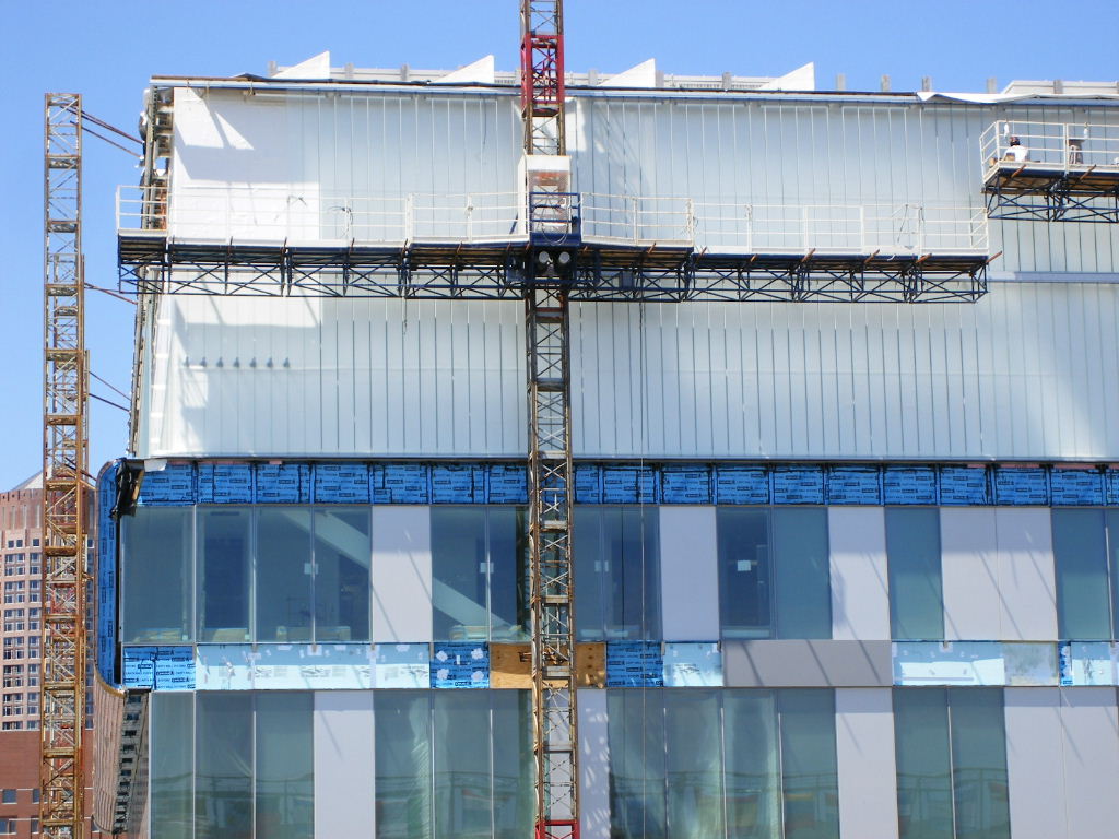
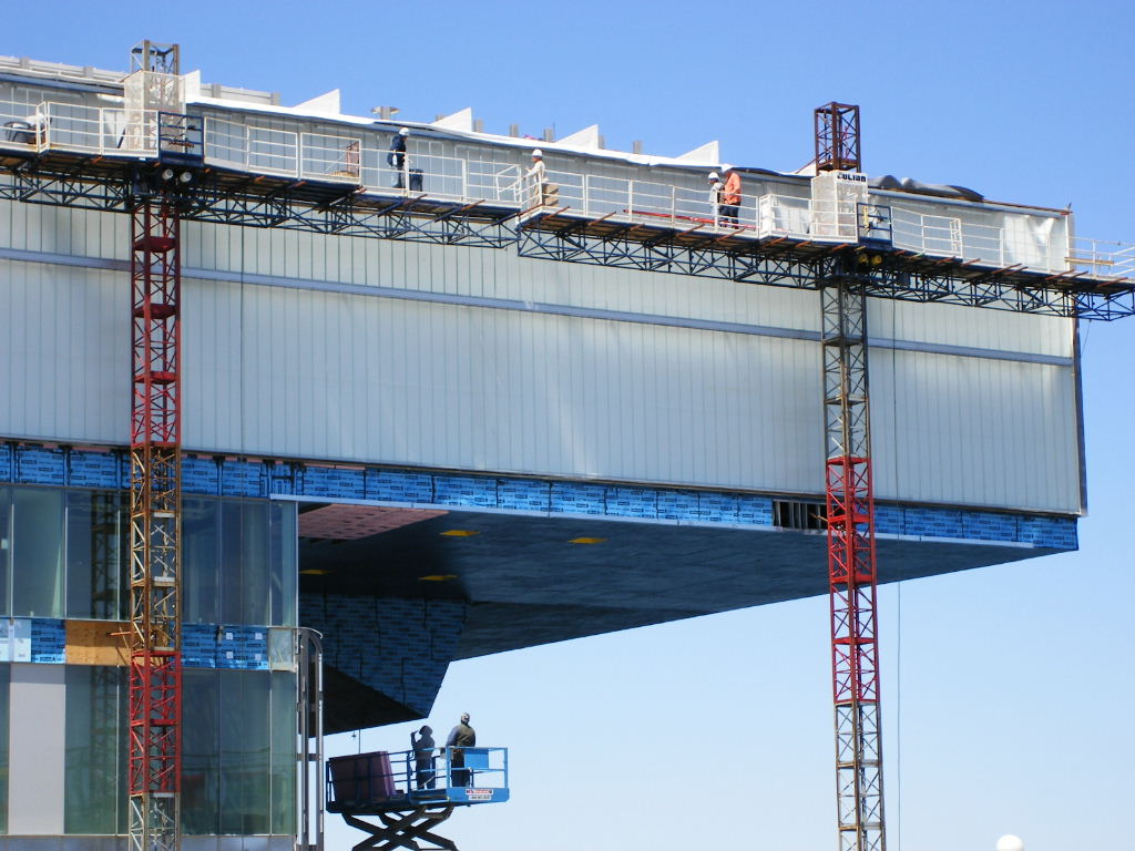
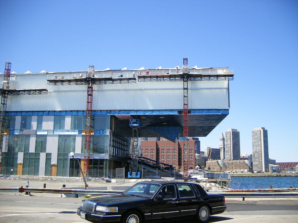
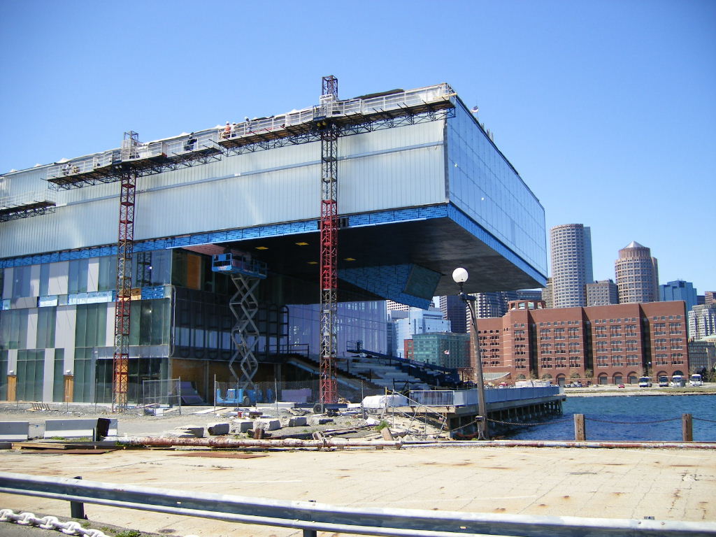
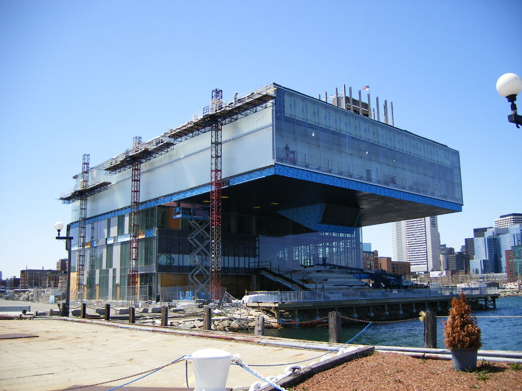
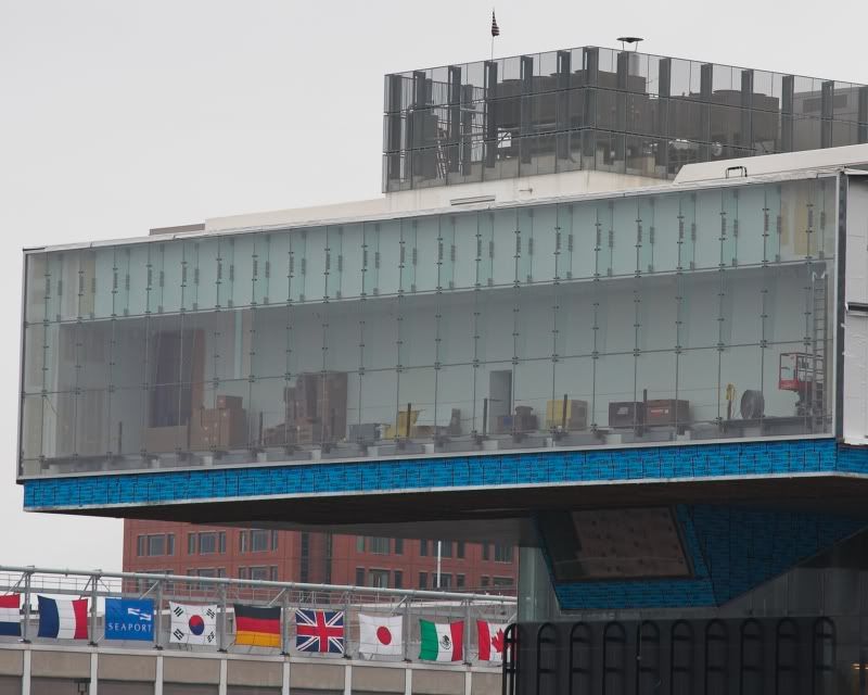
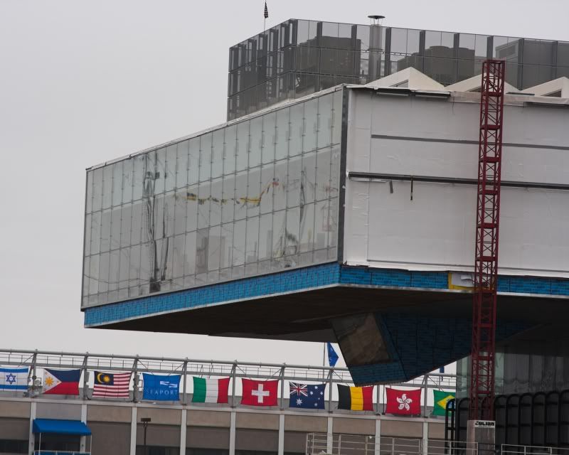
These thoughts came to mind on a recent tour of the new Institute of Contemporary Art, being built on the South Boston Waterfront. I'm not saying the ICA looks better now than it will when it opens Sept. 17. But it looks and feels great, even -- maybe especially -- when enveloped by wind-driven rain and choppy seas.
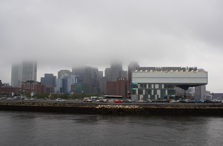
For one thing, in all the recent bad weather, it felt big and strong, breasting the elements with ease. A lot of people were worried that the ICA, on an edge of Boston Harbor with nothing much around it, would look exposed, isolated, and lonely. Not so. The building dominates its site in a way I hadn't predicted, nor had Jill Medvedow , the ICA's director, who gave me the tour.
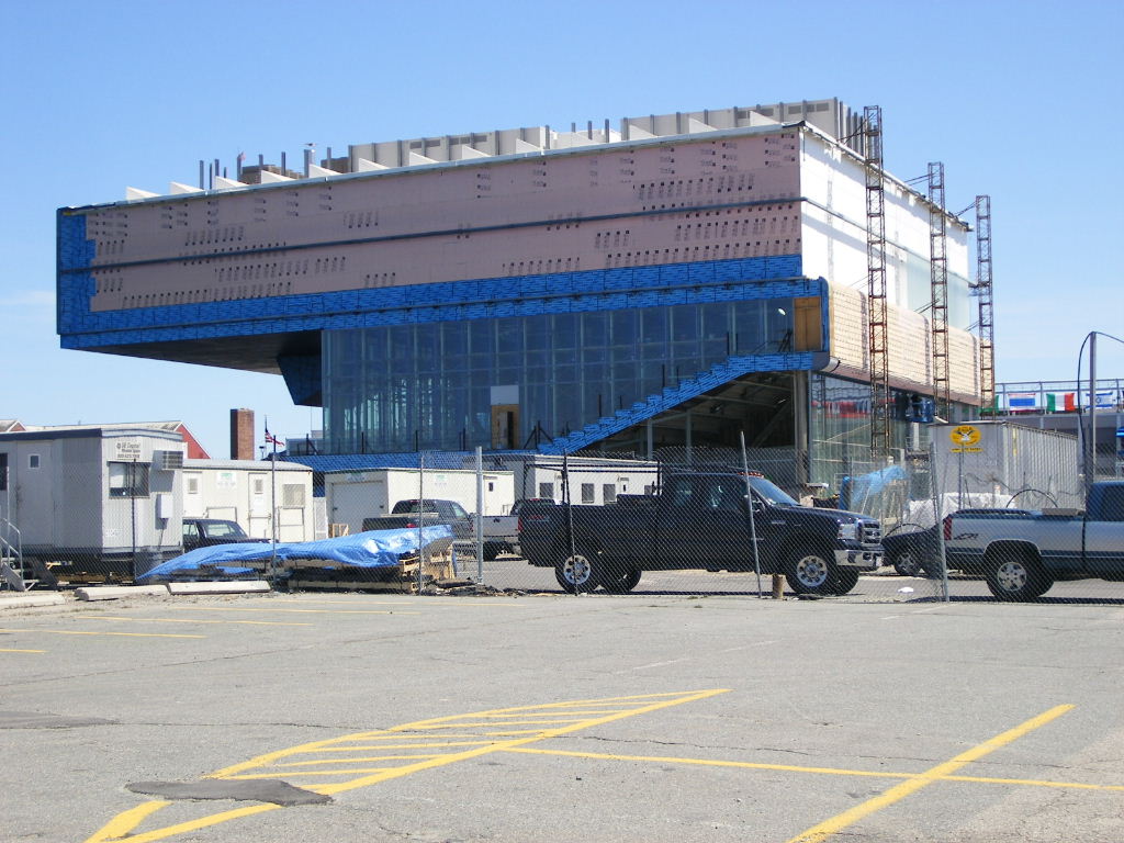
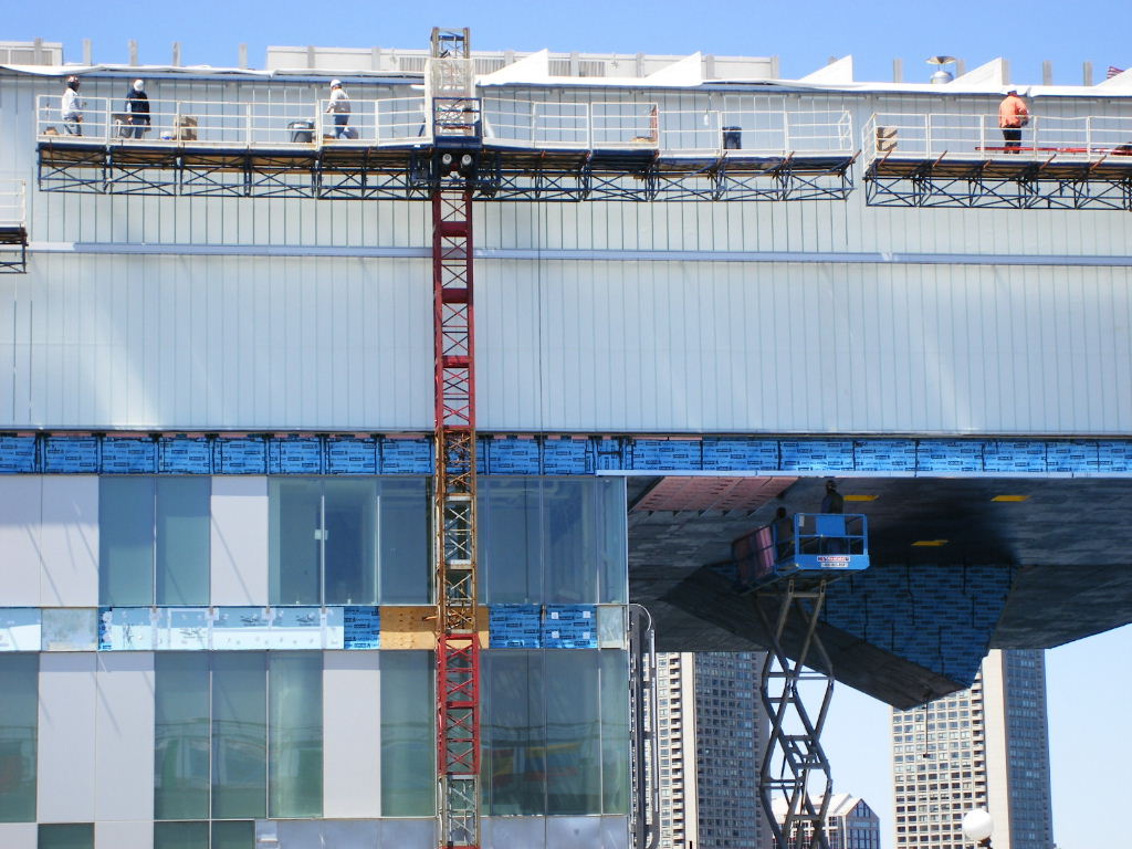
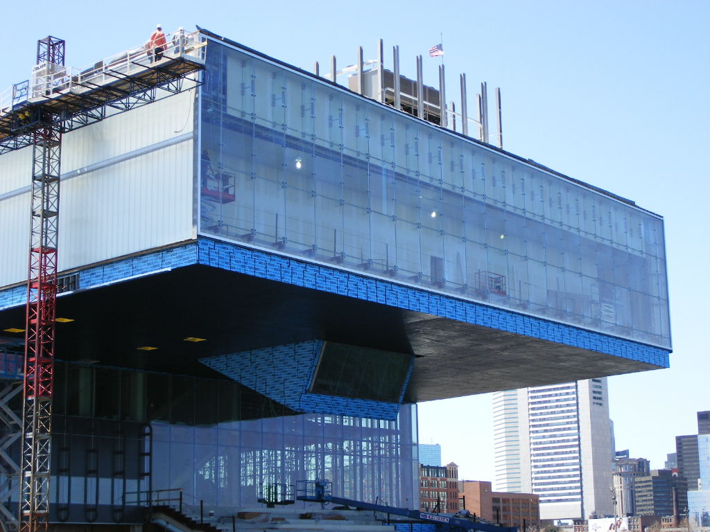
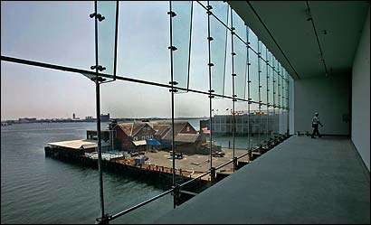
The upper floor, which contains the main gallery space, thrusts out above the Harbor Walk and the water, with nothing to hold it up except its structural muscle of steel trusses. It's a bold gesture that enables the building to take command of its site.
To get factual, the ICA has about the same floor area as three floors of a typical downtown office building. The only people who don't think it looks big are the architects, Diller Scofidio + Renfro, a New York firm long known for innovative art projects, and more recently for innovative architecture.
Liz Diller, on the phone, sounds amazed. ``The ICA will be dwarfed by the new buildings that will be built around it," she says. She seems to think of her building as a pet: ``You can sort of hold it in your hand." But she doesn't want it gentle, either. ``We want it to remain rough and tough," she says. A pet iguana, maybe.
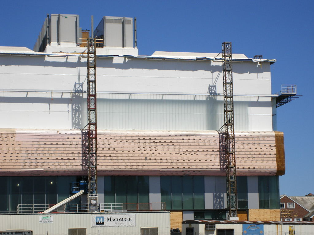
The building will never again look quite so bold as it does now. The wood-paved Harbor Walk, when it reaches the ICA, will widen out and tilt up to form a seating slope -- ``the grandstand," the architects call it -- where visitors, perhaps picnicking, will sit outdoors, sheltered by the galleries above, to enjoy the view of boats and harbor. White-painted drywall will cover the columns and beams and the great steel trusses. But the point of the building, of course, is to show art, not to show off itself.
One detail has been controversial. On the seaward side of those top-floor galleries, the architects proposed a lenticular glass wall. Such a wall would be clear and transparent when you looked straight at it, but at both sides, where you'd be seeing it at an angle, the view would gradually blur. The view would thus follow you as you walked along the wall, clearing and fading.
Diller says that everywhere in the building, she tried to frame the view in different ways and sizes. ``The
building calibrates the view; it serves it up in small doses," she says. She thinks looking at the whole harbor all the time might be boring. The lenticular wall would unfold the view gradually. The building would not be passive, but would actively respond to the view.
The ICA's leaders killed the lenticular wall, not for reasons of cost but because they couldn't resist opening up the whole seascape panorama at once. But the lenticular wall was basic to the architectural concept. The panoramic view is great, to be sure, but something has been lost. Visitors to an art museum don't want to become passive oglers of scenery.
The new building is a huge step for the ICA. It is triple the size of the converted police station the organization long occupied on Boylston Street in the Back Bay. There's space for classrooms, a computer room, a generous lobby, a store, a small theater. Almost the entire construction cost of $40 million has been raised, although more will surely be needed to endow maintenance and operations. The museum has also begun to build the permanent collection it has never had. It hopes to become, says Medvedow, `` a museum of the 21st century."
Someday the new ICA will have an architectural context. It will cease to stand all by itself. Developer Steve Karp has gained government approval for the redevelopment of Pier 4, just across a narrow slip of water from the ICA. Karp says he'll develop a new park where Anthony Athanas's landmark restaurant, Anthony's Pier 4, now stands. Farther in on the pier, opposite the ICA, will be a hotel, offices, restaurants, shops, and condos, for a total of a little more than a million square feet of floor area -- as compared with the ICA's 65,000. On the ICA's other side, the long-delayed Fan Pier project is moving forward under developer Joseph Fallon.
When all that architecture (yeah right -- justin) is in place, the ICA's bold, memorable shape will be needed to keep it visible. The building will become a brand logo for the museum. In the meantime, the September opening promises to be, certainly, the architectural event of the year in Boston.
Robert Campbell, the Globe's architecture critic, can be reached at camglobe@aol.com.

In any case, I can't wait to see it finished. It already exceeds Boston's quota of great architecture for the 21st century.
justin

