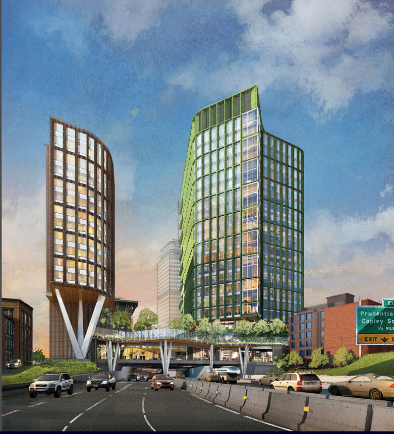
Lyrik Back Bay | 1001 Boylston Street (Parcel 12) | Back Bay

So gorgeous, kudos to the team on this! Only complaint is the bus shelter is waaay too small.

They actually mention that in the slides as a community comment. I'd expect it to get bigger still.
 
This just became the best project in the city.

Absolutely. I love the way this looks. The cynic in me, however, feels like this cycle will come to an end and doom this to be scrapped.
 
This just became the best project in the city.

Absolutely. I love the prominent stilts. I love the color. I love the lighting of the T access. I love the way this way this turns a shitty overpass into an active urban block. I even love the plaza.

Is the green tower a nod to Fenway Park?

Given that the commenting public is always clamoring for open space, putting open plaza space on the deck makes so much sense. In the end, the mass of both towers sit on terra firma, and the decked portion is mostly plaza and one floor of retail. That'll greatly cut down on cost and make this whole thing more feasible.

Maybe this project can be proof of concept that buildings-over-Commuter Rail and plaza-over-Pike works? If this project shows that in can be done effectively, I'd be happy with that combo the whole length of the I-90 trench.
 
Note the protected bike lane as well. I agree the park is a huge win, the retail is a huge win, the towers are a huge win, the view over the pike is badass, the new pike entrance is great, new T entrance-wonderful.... stitching the massive scar through the back bay-awesome, what a huge W this is.

Our new architecture is starting to become phenominal. Then when combined with our tight windy streets, unique neighborhoods, and old buildings it creates a city unlike any other in America. If we can get our mass transit expanded, nsrl, electrify commuter rail etc.. thats going to make our streets a huge unique asset vs a traffic nightmare and Boston will be one of the densest most walkable cities in the US and completely unique in layout. Almost every city in the US is some form of a grid. Boston is going to really stand on its own as truely its own great thing going on up here and really separate itself from everything else. The future is looking very bright.

We dont need supertalls to stand out... and actually if everyone is getting them it will be unique to not, itll keep the city human scale. Plus mid 700 footers is still tall. Our dense, walkable, human scaled city is really going to be an American gem.
 
Last edited:
Move over Custom House. This could be greatest thing I have ever seen.
 
They should follow the "plaza over pike" formula with buildings on either side all the way to Kenmore Square, at least.
 
Am I missing something? Its a nice project and a welcome addition but what are people blown away by? The colorful renderings?
 
To each his own.. as with everything. In my opinion this is incredible. It just checks every box and not only stitches the back bay together but vastly improves it in every way. When you add in 1000 Boylston and Viola across the street stitching it together even more and adding more office/retail this corner goes from a dead zone to THE place to be. This has to be one of the most dramatic improvements of any project in the city...ever.

The projects going up


Parcel-13-Hynes-Station-Developer-January-6-2014.jpg


2018_07_25_03_58_29_2018-03-12-1000-boylston-image-3_0.jpg
 
Last edited:
Samuels has to be one of the greatest contributors to Boston's urbanism in our time. Continuum, all the Fenway projects, Dot Block, and now this? Fucking awesome.
 
Am I missing something? Its a nice project and a welcome addition but what are people blown away by? The colorful renderings?

The before/after in this location is more dramatic than almost anywhere else in the city, because it is an ugly busy intersection over the Pike. Even a mediocre project would be great here. But they massively improved it from that.
 
I like how the angles of the buildings seem to open up toward the Pike, almost welcoming the driver to Boston, rather than it being the obvious back of the building.
 
The protected bike lane needs a better design at the intersection of Boylston St. If it isn't marked clearly, pedestrians are going to stand in it while waiting for the walk signal to cross Mass Ave.
 
The before/after in this location is more dramatic than almost anywhere else in the city, because it is an ugly busy intersection over the Pike. Even a mediocre project would be great here. But they massively improved it from that.

https://www.google.com/maps/@42.3478694,-71.0879926,3a,61.8y,235.74h,97.52t/data=!3m6!1e1!3m4!1s_7S3TGyDqhBIIkIeVdWjnw!2e0!7i16384!8i8192 I'm sure anyone who is a pedestrian here can agree thats its a *loud* and ugly area right now, and the bus shelter is just depressing. It bridges two high pedestrian areas (Newbury St and Berklee College area) and this is an awesome improvement for pedestrians
 
Before


After


How drastic of an improvement this is, combined with how prominent this location is, and how important this location is, and how unfortunate it is that an area this important is as crappy as it is... all combine to make this one of the best projects ever and one of the most important towards improving a major intersection. Its on Boylston st.... this is so incredibly needed and theyre doing such a good job its almost too good to be true.

To have what may be the most important street in Boston, start off its back bay stretch with fences, highway noise, huge holes etc... is a huge mark on the city. When your in this area its clear that many failures occurred here. These projects not only erase the blemish but actually turn this area from an eyesore to one of the nicer areas in the city. This is huge.
 
Last edited:
Anyone else having a hard time imagining the green as depicted? It's very much a part of our vernacular to see patinated metal panels, but that's much bluer sort of aquamarine color. Is that what's intended here? I'm not sure how much I would like this if it were just Fenway green aluminum composite paneling for the cladding. I'm happy to see color but I want to see a mockup.
 
This is absolutely outstanding!! Talk about a grand entrance to Boston on the Pike. What a beautiful job - I hope this starts ASAP.
 
i post about adding some color in the City, like if Longfellow and HT's redone in coral or dull pink + blue, navy or dark green.

Well! Not quite the shade of green i'd have chosen, but wow!! An informal tribute to Fenway Park/ Central Artery/ Turnpike? Holy shytte i love this. The projects from Kenmore to Copley Sq can't happen soon enough.
 

Back
Top