Marketplace Center | Quincy Market | Downtown

Equilibria

Senior Member
Joined
May 6, 2007
Messages
6,959
Reaction score
8,038
PNF: https://bpda.app.box.com/s/apsc6h4i7qbj513vpgla4pgnq3ygtnir

Recommend that we merge the prior thread with a non-standard title:


Globe: https://www.bostonglobe.com/2021/12...ce-building-between-historic-market-greenway/
1639511057346.png

1639511097289.png

1639511116751.png
 
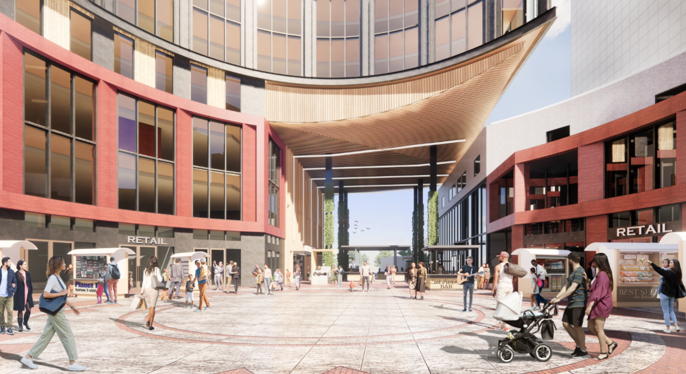
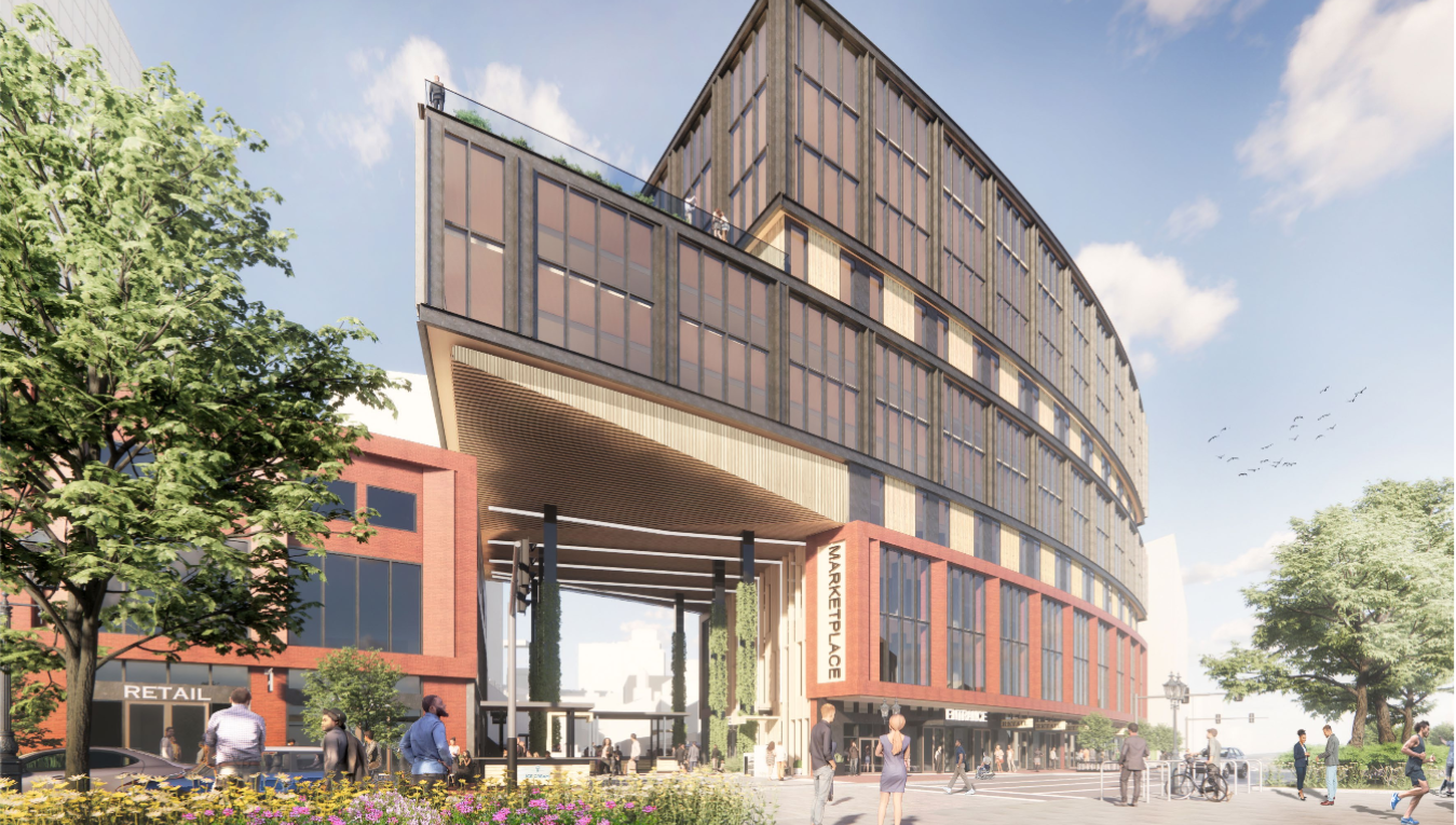
After WHOOPS, that brick work terrifies me...but perhaps it will be of better quality. All in all I don't love the pedestrian level experience, though it's obviously much better on the Greenway side than it is now.
 
One of the better things about the existing building is the covered portico on the side facing Quincy Market. Don't see that here and looks like they flipped it to the Greenway side? Wish they'd offer both. That space back there is pretty pleasant and protected-feeling as is.
 
One of the better things about the existing building is the covered portico on the side facing Quincy Market. Don't see that here and looks like they flipped it to the Greenway side? Wish they'd offer both. That space back there is pretty pleasant and protected-feeling as is.

Gotta say, the ground floor doesn't blow me away here, which is odd because it's supposed to be the whole point. Do a covered arcade or something.
 
Here’s a situation where blowing up what’s there now and starting from scratch would probably result in a better product than reskinning and building on top of the current structure. The 1980s shopping mall bones aren’t worth saving.
 
If this is what it takes to activate Surface Rd, I'm all for it!
 
The ground level changes on Surface St here basically amount to knocking out windows. The footprint isn't proposed to change:

ACDDALYSCBFFLBSGWBRD3FLYSQ.jpeg

1639518648735.png


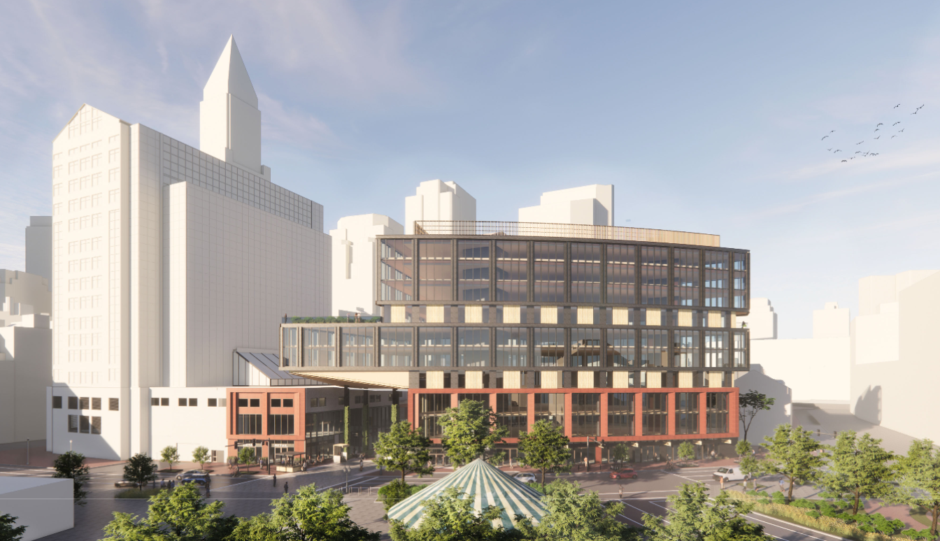
And the addition will make the building much more (for lack of a better word) imposing from the Faneuil Hall / Quincy Market side.

5J354PEQYFAFRIFUYSTMPW3BFA.jpeg

1639519285386.png


All this for seven measly stories of offices labs.
 
I read this thread title too fast earlier and thought it was about something in Quincy Center, so I didn't prioritize looking at it (no offense Quincy). But then 10 people quickly replied and I was like, WTF, do that many people care about Quincy? Alas...
 
I am all here for a replacement but I hope this isn't it. I think this site is so prime they either really have to push the boat out for some bold modern (but thoughtful) design or go a more tasteful traditionalist route. This looks like a badly massed10 Farnsworth got infected with cantilevers and offset windows.
 
Looks fine. Better than what is there and activates that space. Build it.
 
There's something terribly off-kilter about the whole thing as proposed. It's imbalanced and lacking a sense of "place" as Robert Stern might say. The new section's materials, colors are off-putting...too much black steel and blank-staring glass. It looks as if they said: "Let's put 7 expensive office floors on top of what's there, make it look "moderne", and forget that this is a marketplace. It's as anonymous and boring as its tall glass neighbor on the other side. Rather than really opening up the archway toward the Greenway and ocean, the opening screams, "There was an earthquake and all that we could salvage were these upright girders."

The only thing that has given this end of QM any kind of warmth and feeling (aside from the Christmas tree) was the horses and carriages, now gone. At least the smell of horse urine lent an air of reality to the ever-changing and boring retail windows flanking the ground floor. Which begs the question, who is going to be able to afford retail rents? More chain stores/restaurants? So far I see it as an opportunity missed; just what is the program? What is the primary goal here?
 
Why not connect the overhang to the other building? It's like a sibling sticking a finger in your face and saying, "I'm not touching you!" So awkward.

I always liked the way the existing building, especially the glass atrium, looked as I was riding by it on the old Central Artery. Like a nice piece of scenery setpiece in a PS1 racing game. It's time for a change but it would be nice if they proposed something that interacted more with the rest of Quincy Market, rather than just generic looming office space.
AP_03032905747.jpg
 
This thing towers over the plaza and is no longer proportional to the amount of open space it encloses. The opening to the Greenway is too large as well. The whole design fails to achieve any sense of a human scale, at least from squinting at the renderings.
 
People said the same thing about 200 State back in the 80s... except this time it's even worse, since the new building is directly in the center.
 

Back
Top