There's nothing wonderful around there, but there's a small park and dog park immediately adjacent to The Mason next door. The Mason also has a grassy courtyard and pool in the open space in the middle of the building - I'd imagine The Maxwell will have something similar. You can see the dog park and The Mason's pool/courtyard overhead in Google Maps. It's a short distance from Carter Park which has ballfields, a playground, etc. It would be great for this new neighborhood to have a larger central public park, however.The top level of the gigantic garage in the center of the complex would have been perfect as a park/playground/garden for adults and kids living there. As it is, I see no open space or parks nearby.
You are using an out of date browser. It may not display this or other websites correctly.
You should upgrade or use an alternative browser.
You should upgrade or use an alternative browser.
Maxwell | 35 Garvey Street | Everett
- Thread starter Equilibria
- Start date
It would be great for this new neighborhood to have a larger central public park, however.
It would be great if they built something that doesn't look terrible.
stick n move
Superstar
- Joined
- Oct 14, 2009
- Messages
- 12,066
- Reaction score
- 18,807
I think it would go a long way towards making these 5 over 1-tropolises look a lot better if they took a page out of Hoboken’s book and broke the area up into a regular street grid of equal sized lots and had every building built to fit these lots. You get a much more cohesive feel to the neighborhood and if the lots are not so huge it also makes each individual development smaller or broken up into multiple buildings. The way it is shaping up in this part of Everett and also in many other cities especially in places like Texas you get these massive buildings with such weird shapes in order to fit these massive and awkwardly shaped lots that it just ends up kind of wonky.
Just looking up at the picture shared above on the left side of the pic are two massive sprawling and zig zagging buildings which only take up two lots. On the right side of the picture are two rectangular shaped buildings which are appropriately sized with space for another in between them. If you fit one more in between of the same shape you’d have a street wall with 3 different facades breaking up the monotony.
Back in the day when they were designing nyc or Washington DC the first thing they did was lay out the street grid. They knew that if you get the streets right a great city will grow up on top of them. Hell in many cases that’s basically all they did. As long as there was a cohesive street grid that could be expanded out as the city grew they knew that over time a nice city will organically grow on top of it. I feel like these days we kind of just let the streets form however they end up after everybody adds different developments over time. I think we need to get back to designing the street grids first and then letting the lots develop on top of that as time goes on.
North Hoboken. Looks like a pretty standard nyc neighborhood.
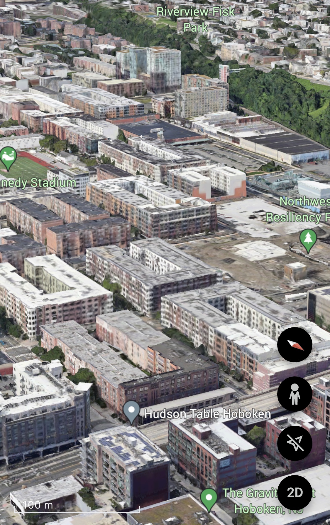
From the street looks like any other neighborhood in nyc/new jersey
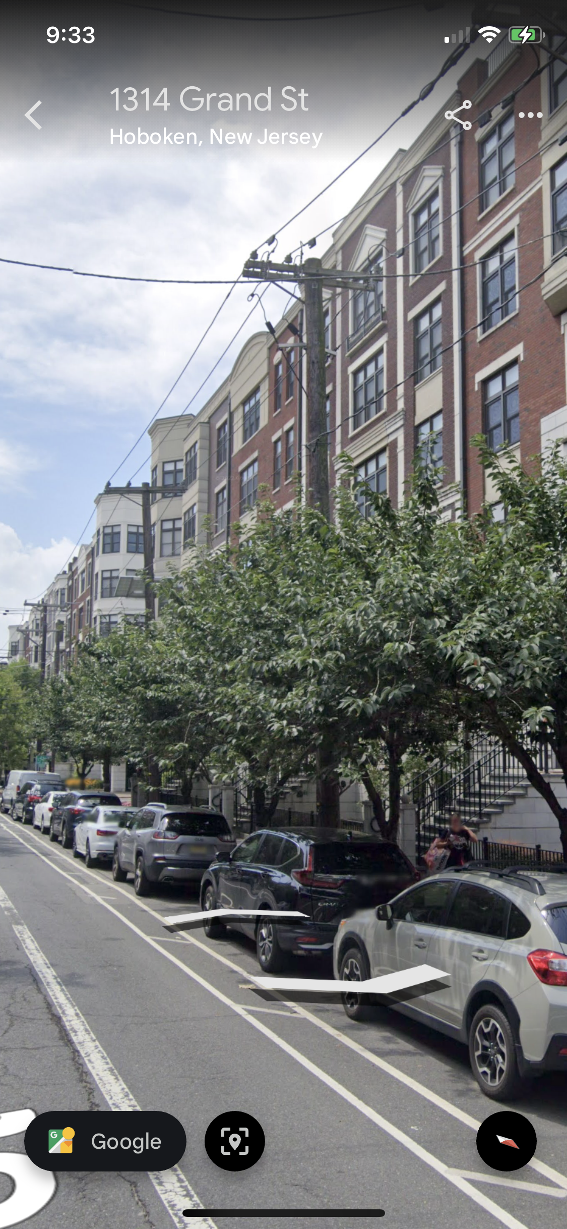
From the air tells the whole story. To the left and top of the picture is the existing housing stock that had been around for decades. On the right of the pic you can see that all of the new development is actually just 5 over 1’s but they have to conform to the street grid and with the addition of some decent materials, some street trees, some front stoops and bay windows it blends in to the existing neighborhood almost seamlessly.
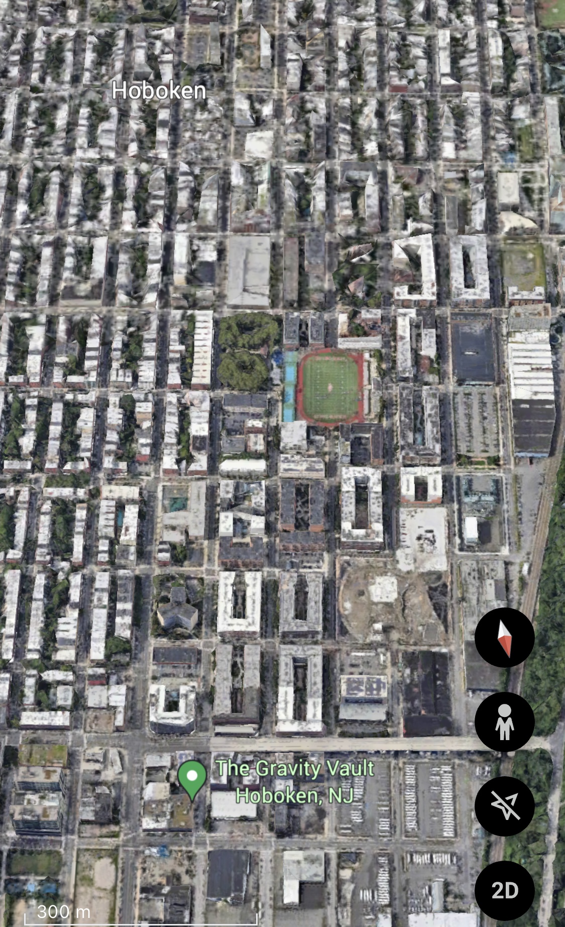
Just looking up at the picture shared above on the left side of the pic are two massive sprawling and zig zagging buildings which only take up two lots. On the right side of the picture are two rectangular shaped buildings which are appropriately sized with space for another in between them. If you fit one more in between of the same shape you’d have a street wall with 3 different facades breaking up the monotony.
Back in the day when they were designing nyc or Washington DC the first thing they did was lay out the street grid. They knew that if you get the streets right a great city will grow up on top of them. Hell in many cases that’s basically all they did. As long as there was a cohesive street grid that could be expanded out as the city grew they knew that over time a nice city will organically grow on top of it. I feel like these days we kind of just let the streets form however they end up after everybody adds different developments over time. I think we need to get back to designing the street grids first and then letting the lots develop on top of that as time goes on.
North Hoboken. Looks like a pretty standard nyc neighborhood.
From the street looks like any other neighborhood in nyc/new jersey
From the air tells the whole story. To the left and top of the picture is the existing housing stock that had been around for decades. On the right of the pic you can see that all of the new development is actually just 5 over 1’s but they have to conform to the street grid and with the addition of some decent materials, some street trees, some front stoops and bay windows it blends in to the existing neighborhood almost seamlessly.
Charlie_mta
Senior Member
- Joined
- Jul 15, 2006
- Messages
- 4,554
- Reaction score
- 6,472
I've always hated super blocks. A traditional street grid with normal sized blocks and narrow streets goes a long way to establishing a sense of urbanity. Superblocks like the one for this Greystar development look way too much like a soulless suburb, or even worse, a prison complex.I think it would go a long way towards making these 5 over 1-tropolises look a lot better if they took a page out of Hoboken’s book and broke the area up into a regular street grid of equal sized lots and had every building built to fit these lots. You get a much more cohesive feel to the neighborhood and if the lots are not so huge it also makes each individual development smaller or broken up into multiple buildings. The way it is shaping up in this part of Everett and also in many other cities especially in places like Texas you get these massive buildings with such weird shapes in order to fit these massive and awkwardly shaped lots that it just ends up kind of wonky.
Just looking up at the picture shared above on the left side of the pic are two massive sprawling and zig zagging buildings which only take up two lots. On the right side of the picture are two rectangular shaped buildings which are appropriately sized with space for another in between them. If you fit one more in between of the same shape you’d have a street wall with 3 different facades breaking up the monotony.
Back in the day when they were designing nyc or Washington DC the first thing they did was lay out the street grid. They knew that if you get the streets right a great city will grow up on top of them. Hell in many cases that’s basically all they did. As long as there was a cohesive street grid that could be expanded out as the city grew they knew that over time a nice city will organically grow on top of it. I feel like these days we kind of just let the streets form however they end up after everybody adds different developments over time. I think we need to get back to designing the street grids first and then letting the lots develop on top of that as time goes on.
North Hoboken. Looks like a pretty standard nyc neighborhood.
View attachment 47054
From the street looks like any other neighborhood in nyc/new jersey
View attachment 47055
From the air tells the whole story. To the left and top of the picture is the existing housing stock that had been around for decades. On the right of the pic you can see that all of the new development is actually just 5 over 1’s but they have to conform to the street grid and with the addition of some decent materials, some street trees, some front stoops and bay windows it blends in to the existing neighborhood almost seamlessly. View attachment 47056
thanks for the photos Javier, appreiciated.
I drove by here yesterday hoping it might look a bit better in person. It doesnt.
I cant believe how bad this whole thing looks.
I think if there was a competition to design a terrible residential development, this could win.
The only redeeming feature is that greater Boston is getting more residential.
LexSEDotVille
Active Member
- Joined
- Apr 23, 2022
- Messages
- 157
- Reaction score
- 832
Sooo flat! The main facade depth element is scattered vents. 
atlantaden
Senior Member
- Joined
- May 31, 2006
- Messages
- 2,603
- Reaction score
- 2,731
Construct the most amazingly beautiful apartments ever built and surround them by a sea of wooden telephone poles connecting spaghetti clusters of electrical wires straight out of developing 3rd world city, and throw into that mix a freakin car wash, crap low rise buildings and the most run down, ugly strip malls ever seen as shown in these pics, (and in previous pics) and you would almost completely lose sight of the beauty of the apartments. Granted, the present apartments may not be a thing of beauty, but seriously, they never had a chance in this fucked up location.
stick n move
Superstar
- Joined
- Oct 14, 2009
- Messages
- 12,066
- Reaction score
- 18,807
Architects should really go by the “do no harm” philosophy of doctors imo. Instead of tossing a bunch of harsh colors and clashing shapes onto this massive structure that make it stick out like a sore thumb, they should have tried to make it blend in to the existing neighborhood. How about some soft blues, greys, and whites?
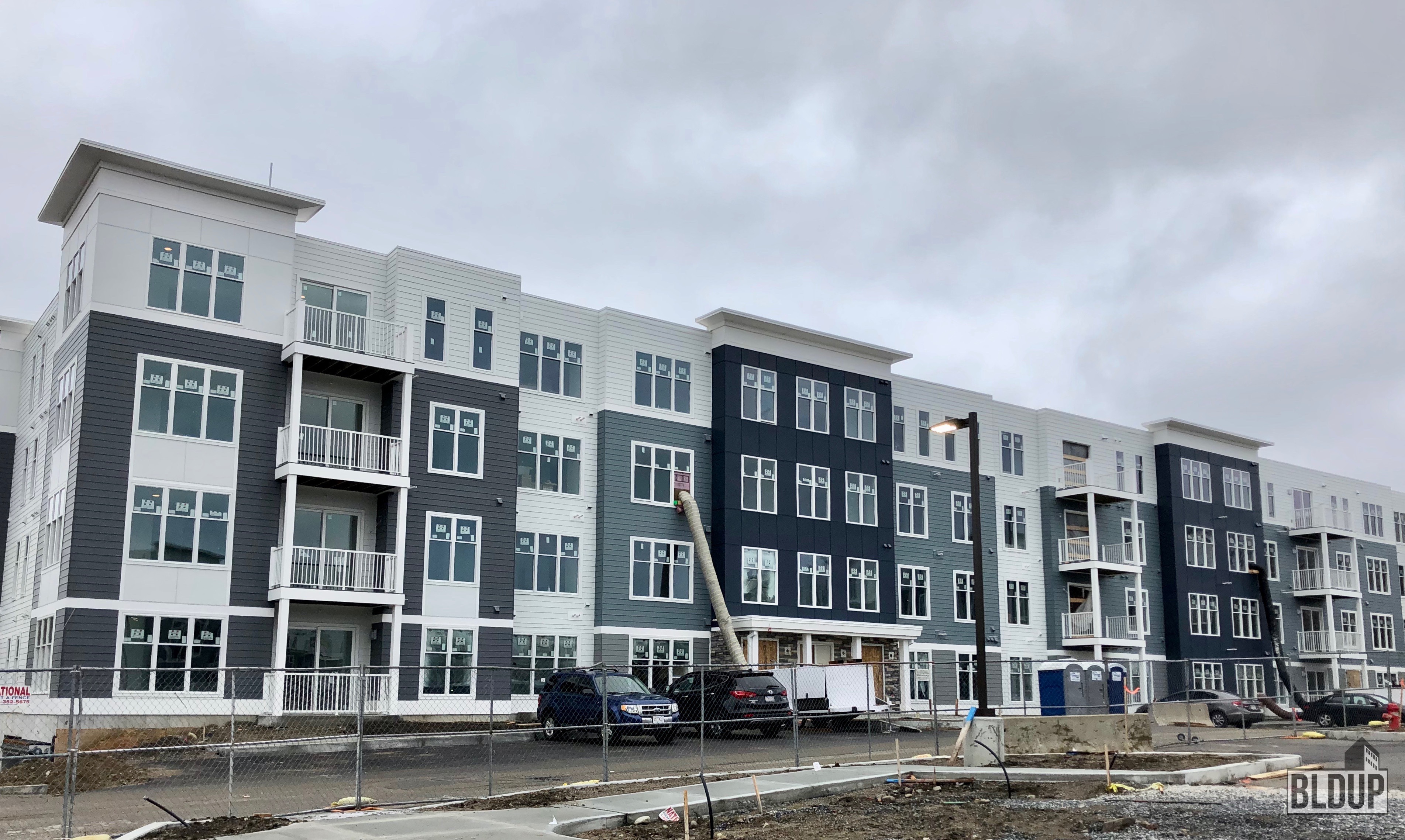
Something like the buckley in framingham isnt going to win any awards, but its easy on the eyes and blends in with the existing housing stock nearby. The massing is still huge, but its broken up by familiar shapes to triple deckers, apartments, and houses.
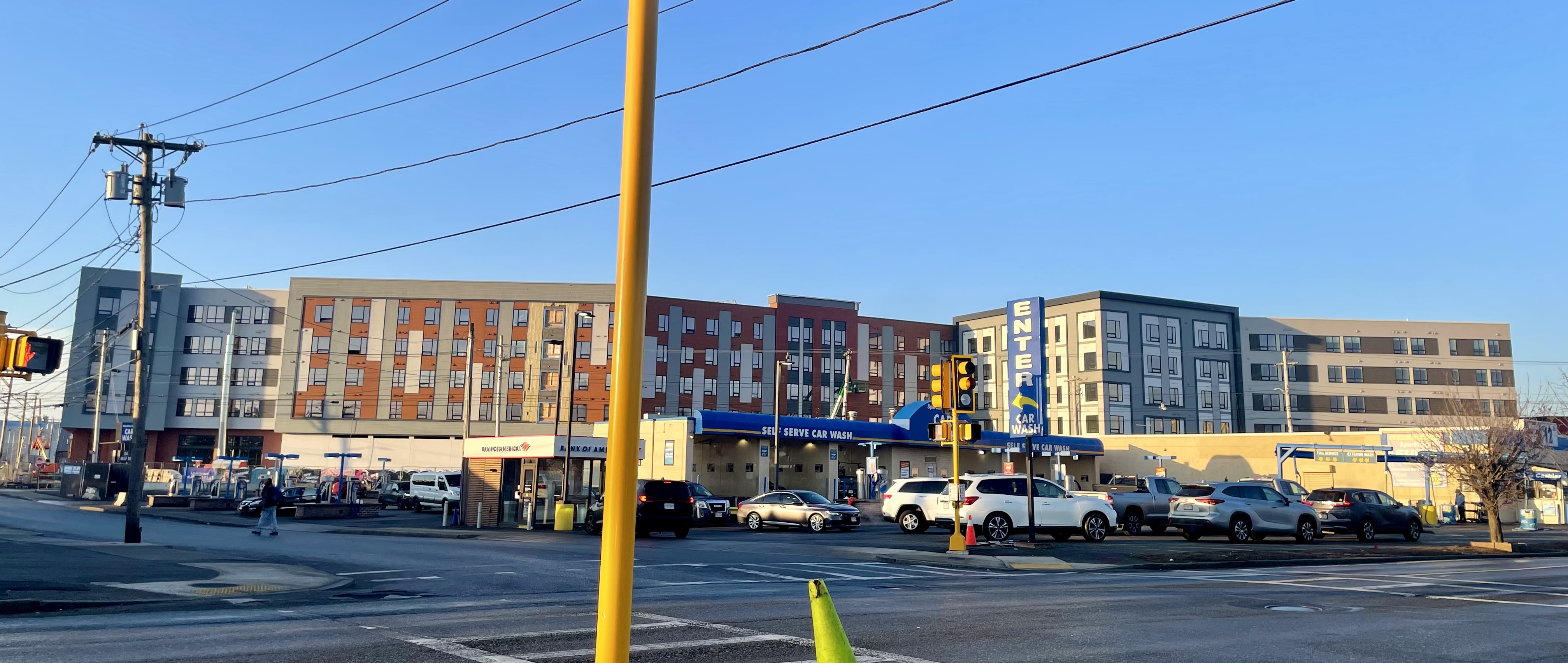
Compare that to this abomination whos massing zig zags which buildings almost never do, then you have broken up vertical lines on the red part, checkerboards flanking that, and horizontal lines on the outer grey part. If someone was told to design an apartment building and make it look very cheap and very very ugly how much different would the end product be compared to this?
Something like the buckley in framingham isnt going to win any awards, but its easy on the eyes and blends in with the existing housing stock nearby. The massing is still huge, but its broken up by familiar shapes to triple deckers, apartments, and houses.
Compare that to this abomination whos massing zig zags which buildings almost never do, then you have broken up vertical lines on the red part, checkerboards flanking that, and horizontal lines on the outer grey part. If someone was told to design an apartment building and make it look very cheap and very very ugly how much different would the end product be compared to this?
Longfellow
Active Member
- Joined
- Dec 12, 2023
- Messages
- 289
- Reaction score
- 711
Architects should really go by the “do no harm” philosophy of doctors imo. Instead of tossing a bunch of harsh colors and clashing shapes onto this massive structure that make it stick out like a sore thumb, they should have tried to make it blend in to the existing neighborhood. How about some soft blues, greys, and whites?
Something like the buckley in framingham isnt going to win any awards, but its easy on the eyes and blends in with the existing housing stock nearby. The massing is still huge, but its broken up by familiar shapes to triple deckers, apartments, and houses.
View attachment 47455
Compare that to this abomination whos massing zig zags which buildings almost never do, then you have broken up vertical lines on the red part, checkerboards flanking that, and horizontal lines on the outer grey part. If someone was told to design an apartment building and make it look very cheap and very very ugly how much different would the end product be compared to this?
View attachment 47456
Some people have bad taste in music, and generally having bad taste in music prevents you from becoming a good musician. Having bad taste in architecture does not prevent you from being employed as an architect. I assume most architects are boring middle class professionals like me and generally they are inspired to clock in and out of work rather than to create some beauty in the world, and find that any moments of inspiration they might have at work are crushed by the reality of the people with money not thinking it worth it to build pretty buildings... nobody's at fault really.
Charlie_mta
Senior Member
- Joined
- Jul 15, 2006
- Messages
- 4,554
- Reaction score
- 6,472
As a road designer/project manager for National Parks and other Federal lands, I learned the value and importance of context sensitive design. That doesn't mean that new projects are to be Disneyesque museum pieces mimicking historical structures, but it does mean that a new project should not overly clash with, or diminish the historical/aesthetic character of, it's surroundings. Seems simple to me.Architects should really go by the “do no harm” philosophy of doctors imo. Instead of tossing a bunch of harsh colors and clashing shapes onto this massive structure that make it stick out like a sore thumb, they should have tried to make it blend in to the existing neighborhood. How about some soft blues, greys, and whites?
stick n move
Superstar
- Joined
- Oct 14, 2009
- Messages
- 12,066
- Reaction score
- 18,807
Some people have bad taste in music, and generally having bad taste in music prevents you from becoming a good musician. Having bad taste in architecture does not prevent you from being employed as an architect. I assume most architects are boring middle class professionals like me and generally they are inspired to clock in and out of work rather than to create some beauty in the world, and find that any moments of inspiration they might have at work are crushed by the reality of the people with money not thinking it worth it to build pretty buildings... nobody's at fault really.
My post wasnt even suggesting to build pretty buildings, just buildings that blend in to the surroundings and dont clash with the neighborhood around them.
or if you want to build a whole new community, do it better.My post wasnt even suggesting to build pretty buildings, just buildings that blend in to the surroundings and dont clash with the neighborhood around them.
As a road designer/project manager for National Parks and other Federal lands, I learned the value and importance of context sensitive design. That doesn't mean that new projects are to be Disneyesque museum pieces mimicking historical structures, but it does mean that a new project should not overly clash with, or diminish the historical/aesthetic character of, it's surroundings. Seems simple to me.
I'm agog about so many (not just this one) posts about the awful aesthetics of this project.
It's.....Freaking.....Everett. The sentence ".....a new project should not overly clash with, or diminish the historical/aesthetic character of, it's surroundings." in this context, to me, interprets to "this should be smokestacks surrounded by used tire stores and junkyards"
This project is SAVING the Boston area - - it's the best, most productive add-on of housing units in an area that is being choked off by lack of housing. More of this please in these places. It can be improved in abou 40-50 years, but for now, save the freaking Eastern Massachusetts economy from choking itself.
This ain't Beacon Hill or Longwood, folks.
I'm not sure anyone is complaining about the amount of residential being built,I'm agog about so many (not just this one) posts about the awful aesthetics of this project.
It's.....Freaking.....Everett. The sentence ".....a new project should not overly clash with, or diminish the historical/aesthetic character of, it's surroundings." in this context, to me, interprets to "this should be smokestacks surrounded by used tire stores and junkyards"
This project is SAVING the Boston area - - it's the best, most productive add-on of housing units in an area that is being choked off by lack of housing. More of this please in these places. It can be improved in abou 40-50 years, but for now, save the freaking Eastern Massachusetts economy from choking itself.
This ain't Beacon Hill or Longwood, folks.
It's clear that it's needed and will be a welcome additio.
People are complaining about the aesthetic, how it looks.
I think it looks terrible.
And yeah, maybe a bit of a nod to Everetts industrial past/present could have helped break up those bland walls.
Charlie_mta
Senior Member
- Joined
- Jul 15, 2006
- Messages
- 4,554
- Reaction score
- 6,472
I hear you about the housing shortage. But in the case of this particular project, context sensitive design would apply to the street grid layout of the site as well as to the style of the buildings. The residential areas of Everett have (more or less) conventionally sized city blocks, and it would've been great to extend that type of street grid to this new area of residential development.I'm agog about so many (not just this one) posts about the awful aesthetics of this project.
It's.....Freaking.....Everett. The sentence ".....a new project should not overly clash with, or diminish the historical/aesthetic character of, it's surroundings." in this context, to me, interprets to "this should be smokestacks surrounded by used tire stores and junkyards"
This project is SAVING the Boston area - - it's the best, most productive add-on of housing units in an area that is being choked off by lack of housing. More of this please in these places. It can be improved in abou 40-50 years, but for now, save the freaking Eastern Massachusetts economy from choking itself.
This ain't Beacon Hill or Longwood, folks.
As the old industrial areas are reclaimed for residential, Everett needs to develop a system of small streets and normal-sized blocks to continue the rest of residential Everett. That is what context sensitive design entails in this case. Plus, of course, it would be nice to have some decent looking buildings.
HenryAlan
Senior Member
- Joined
- Dec 15, 2009
- Messages
- 4,184
- Reaction score
- 4,450
Yes, I agree with this. I think I was taking the criticisms above as mostly aimed at the developer, whereas your critique is pointed at the city. The developer is going to build on the footprint that is available, but the city could certainly implement a different scaled grid pattern.As the old industrial areas are reclaimed for residential, Everett needs to develop a system of small streets and normal-sized blocks to continue the rest of residential Everett. That is what context sensitive design entails in this case. Plus, of course, it would be nice to have some decent looking buildings.
dshoost88
Senior Member
- Joined
- Apr 14, 2008
- Messages
- 2,167
- Reaction score
- 2,589
Yes, I agree with this. I think I was taking the criticisms above as mostly aimed at the developer, whereas your critique is pointed at the city. The developer is going to build on the footprint that is available, but the city could certainly implement a different scaled grid pattern.
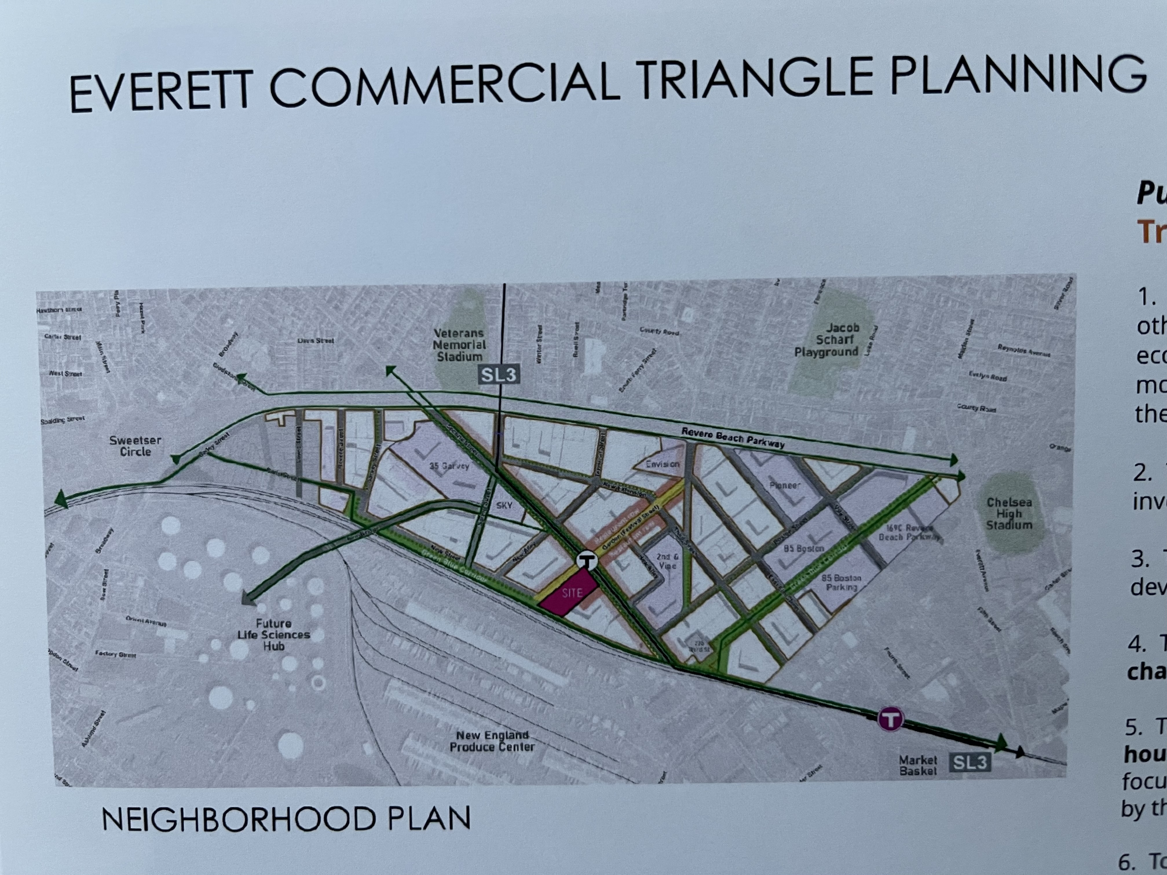
I shared this on the Sofia Everett thread a year+ ago... the city has implemented a different scaled grid pattern for the Commercial Triangle. And it is comparable to the block sizes of residential development north of Rt. 16. Rome wasn't built in a day folks, although if Everett's Planning Department had their way they'd come pretty damn close.
JeffDowntown
Senior Member
- Joined
- May 28, 2007
- Messages
- 4,790
- Reaction score
- 3,647
It just doesn't seem to be a grid from Route 16, but clearly they are trying to create a reasonable grid pattern for the area.I shared this on the Sofia Everett thread a year+ ago... the city has implemented a different scaled grid pattern for the Commercial Triangle. And it is comparable to the block sizes of residential development north of Rt. 16. Rome wasn't built in a day folks, although if Everett's Planning Department had their way they'd come pretty damn close.
