You are using an out of date browser. It may not display this or other websites correctly.
You should upgrade or use an alternative browser.
You should upgrade or use an alternative browser.
Middlesex County Courthouse Redevelopment | 40 Thorndike St | East Cambridge
- Thread starter timsox6
- Start date
bigpicture7
Senior Member
- Joined
- May 5, 2016
- Messages
- 3,896
- Reaction score
- 9,518
6/16 From Chelsea.
Damn, DZ, if one can make out individual steel beams atop 40 Thorndike in Cambridge from Chelsea, you have one hell of a camera. (And, yes, I know I've given you crap for your penchant for obscure distance shots in the past ; )...but, what can I say, whatever your new setup deserves some props. Credit where it's due!).
Damn, DZ, if one can make out individual steel beams atop 40 Thorndike in Cambridge from Chelsea, you have one hell of a camera. (And, yes, I know I've given you crap for your penchant for obscure distance shots in the past ; )...but, what can I say, whatever your new setup deserves some props. Credit where it's due!).
It's not a great camera, but suits my purposes very well for the far-away landscape shots. It's basically just a better/newer/not-yet-ruined version of my prior camera.
6/25 From the Madonna Shrine
 IMG_0135 by David Z, on Flickr
Dr. Rosen Rosen
Senior Member
- Joined
- Jul 19, 2021
- Messages
- 1,164
- Reaction score
- 6,722
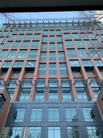
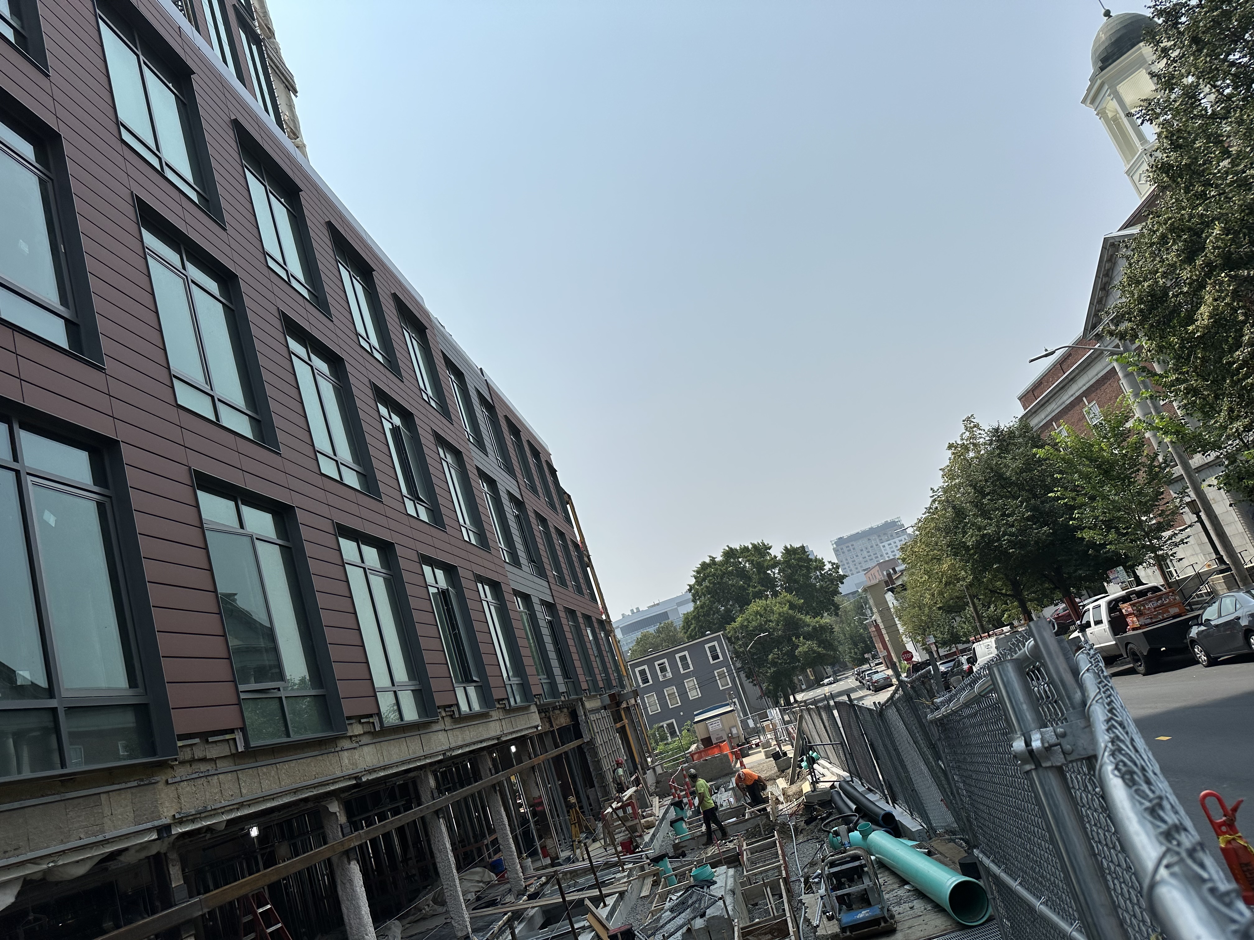
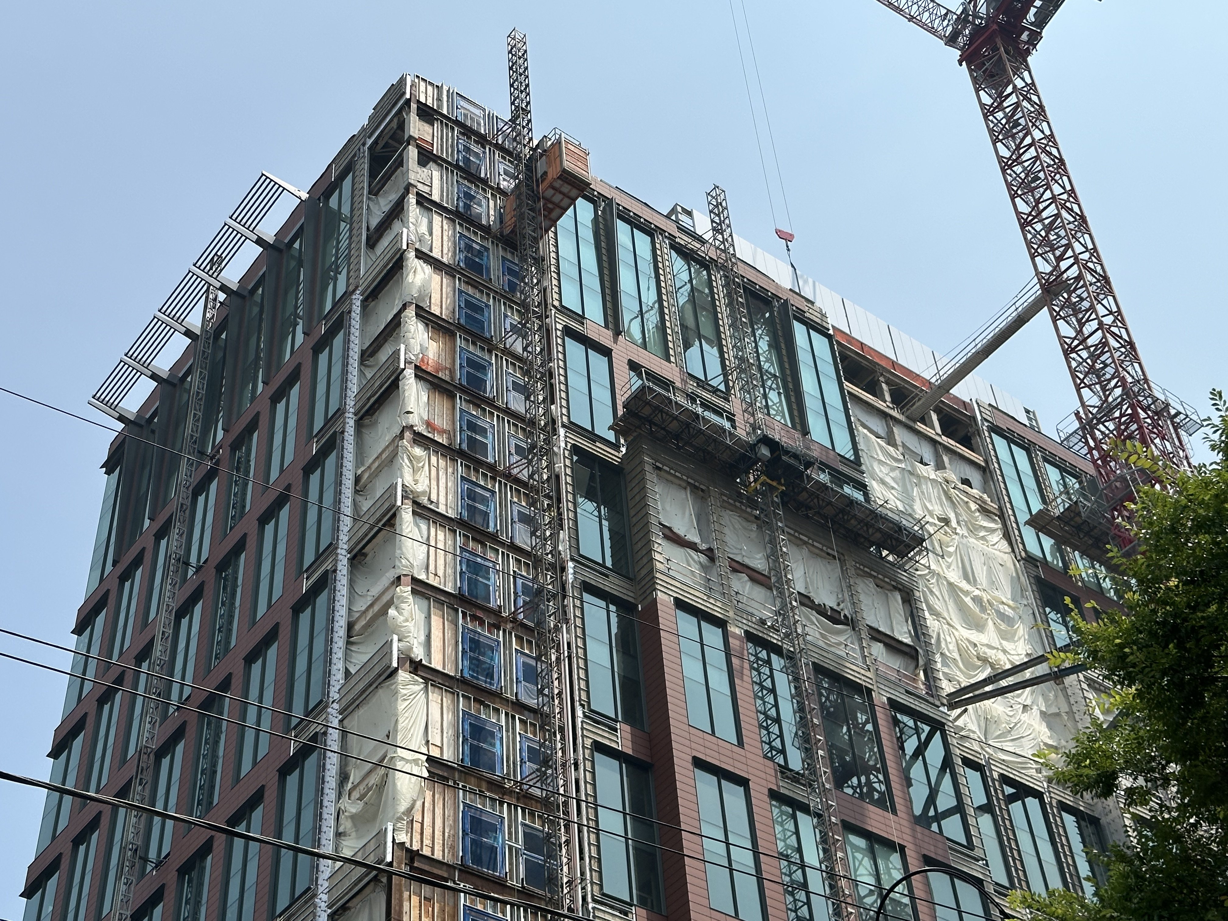
I’m liking the vertical fins at the top right beneath the louvres
bigpicture7
Senior Member
- Joined
- May 5, 2016
- Messages
- 3,896
- Reaction score
- 9,518
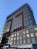
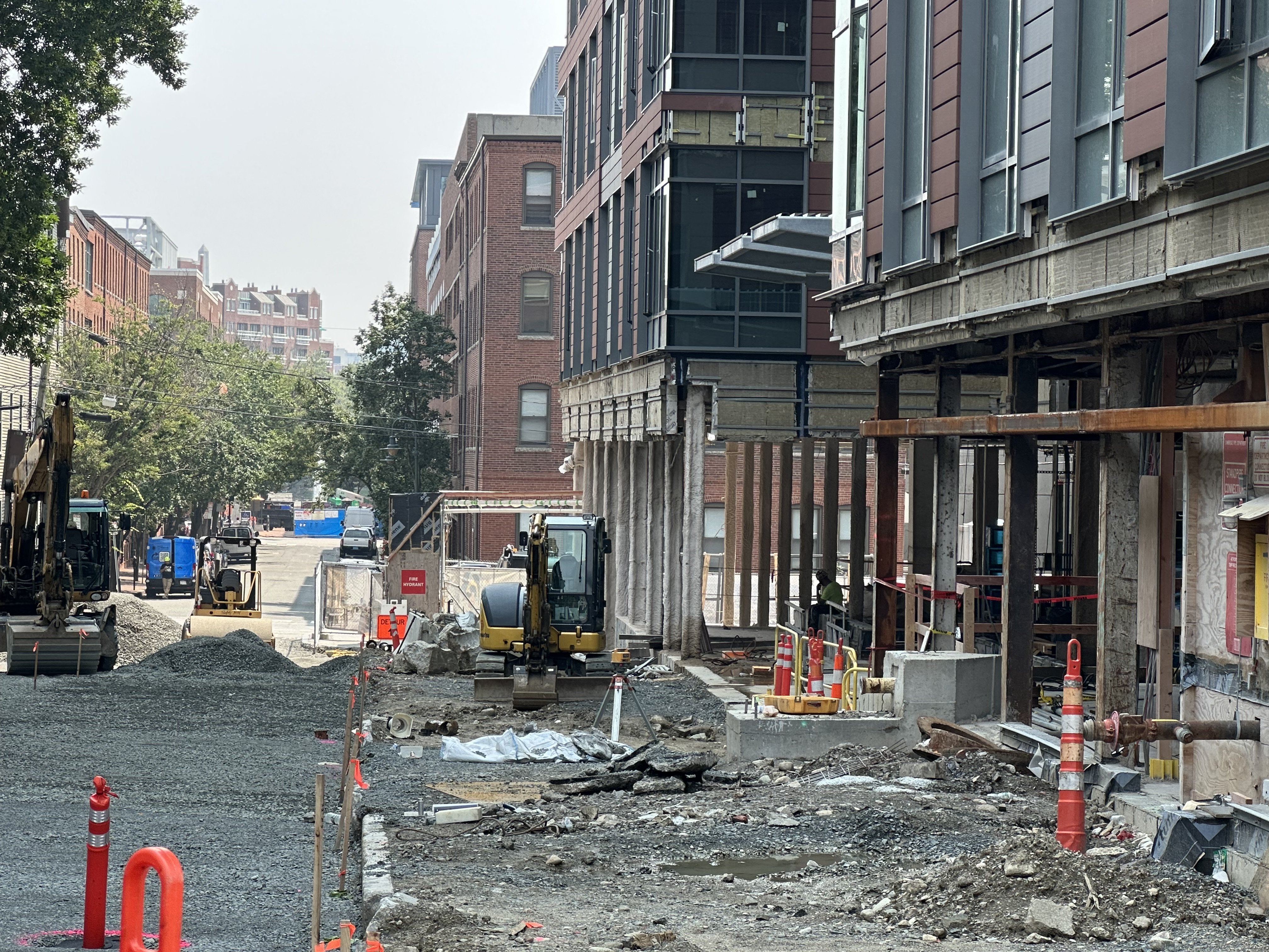
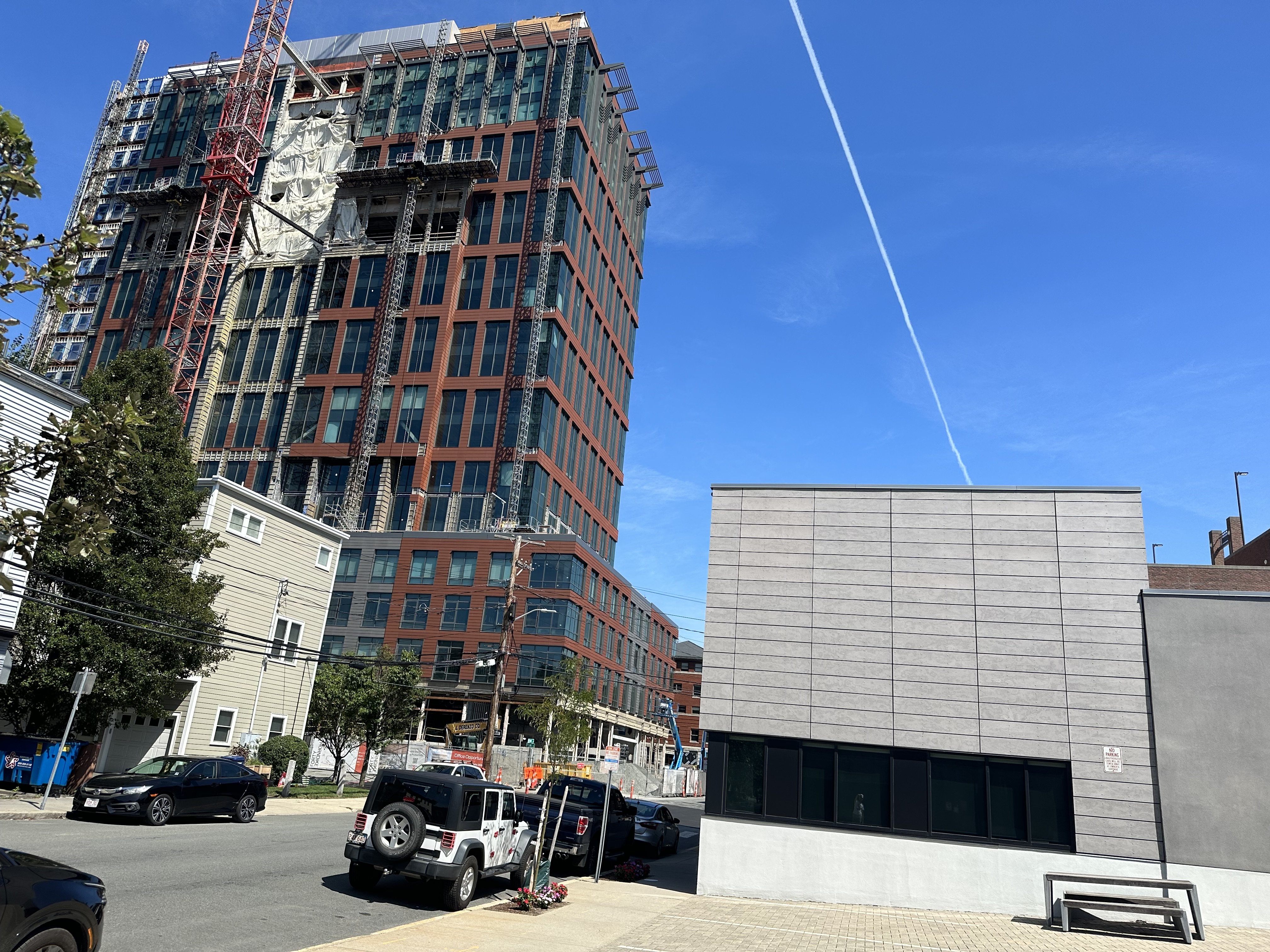
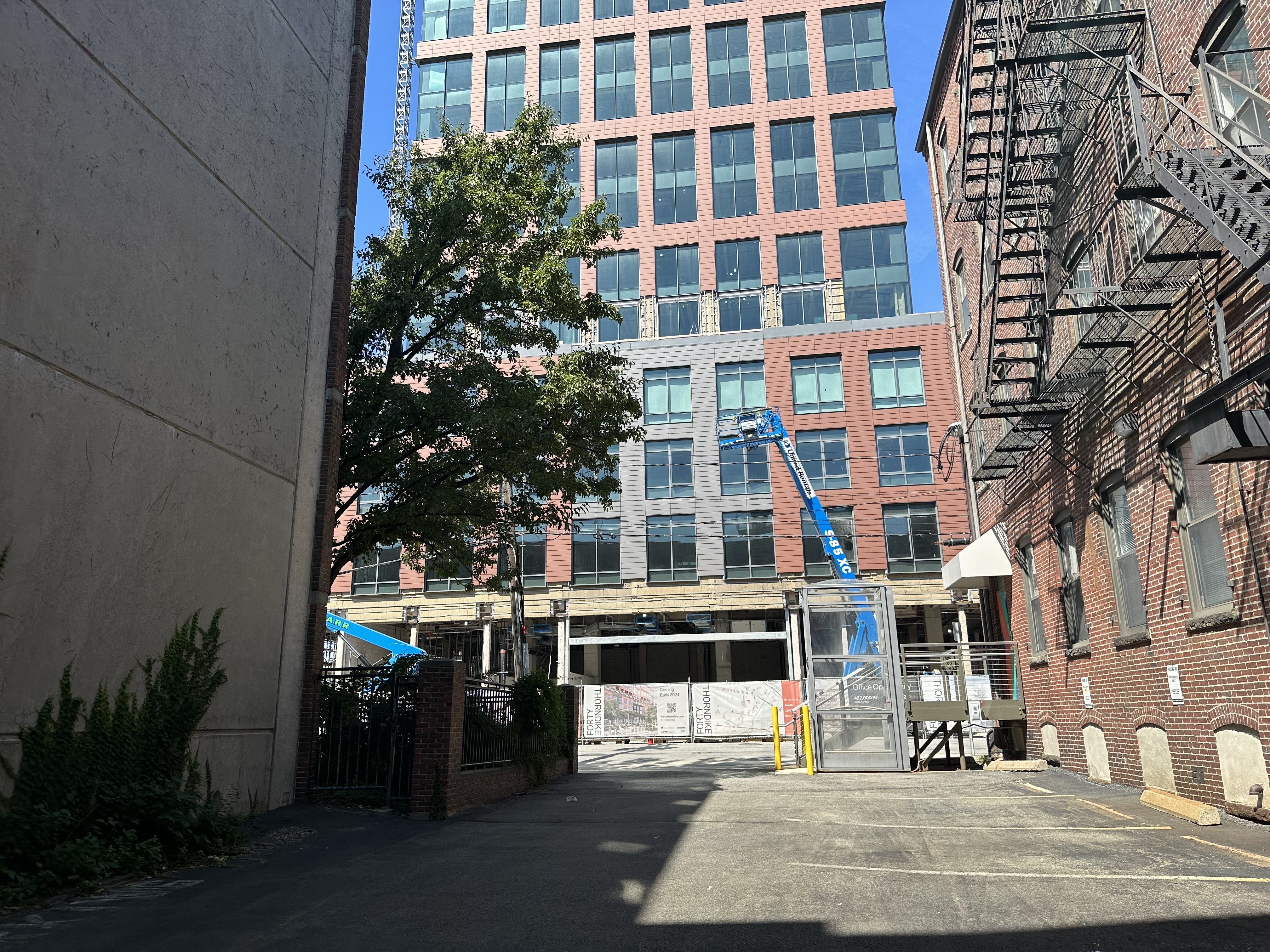
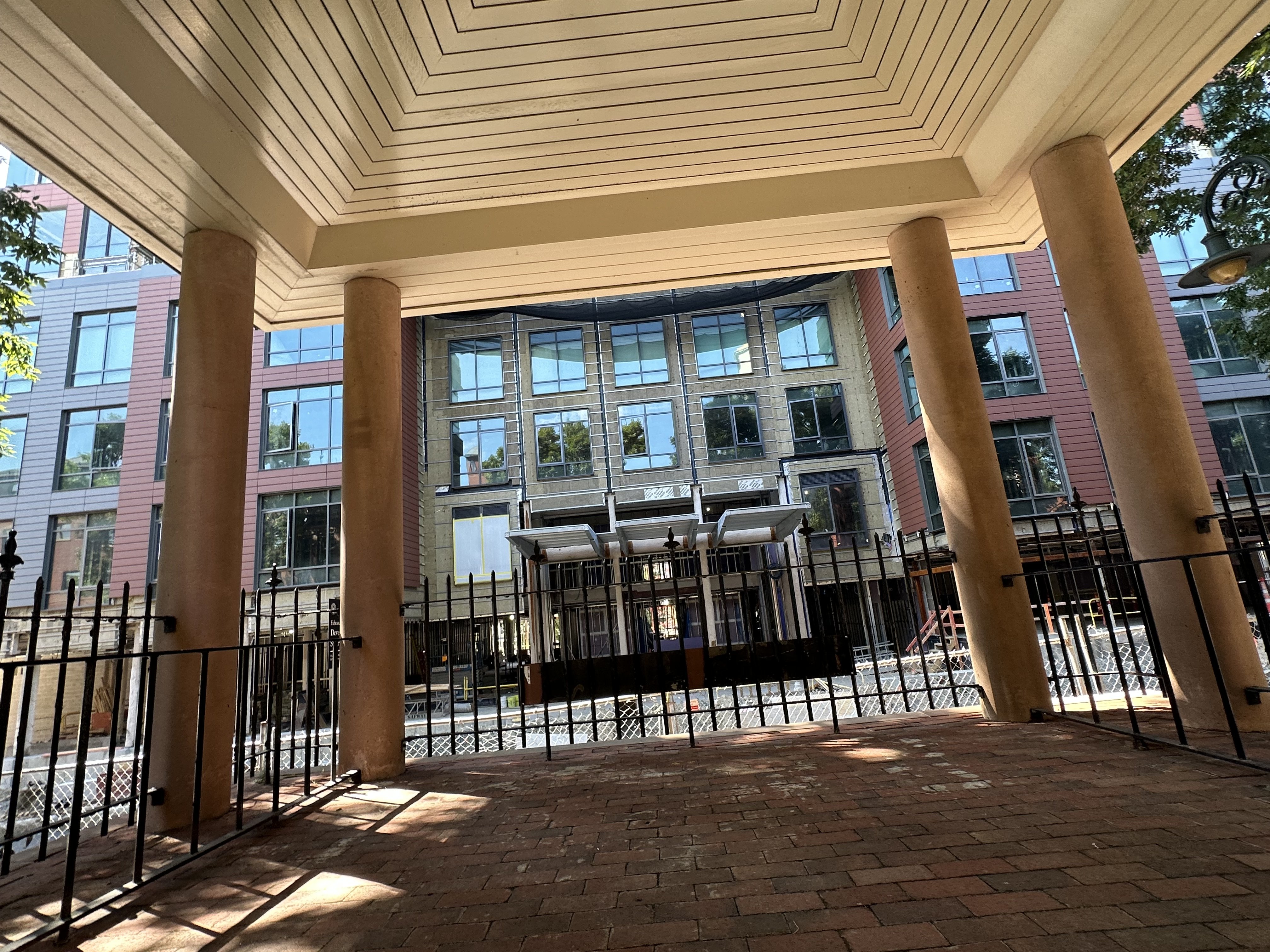
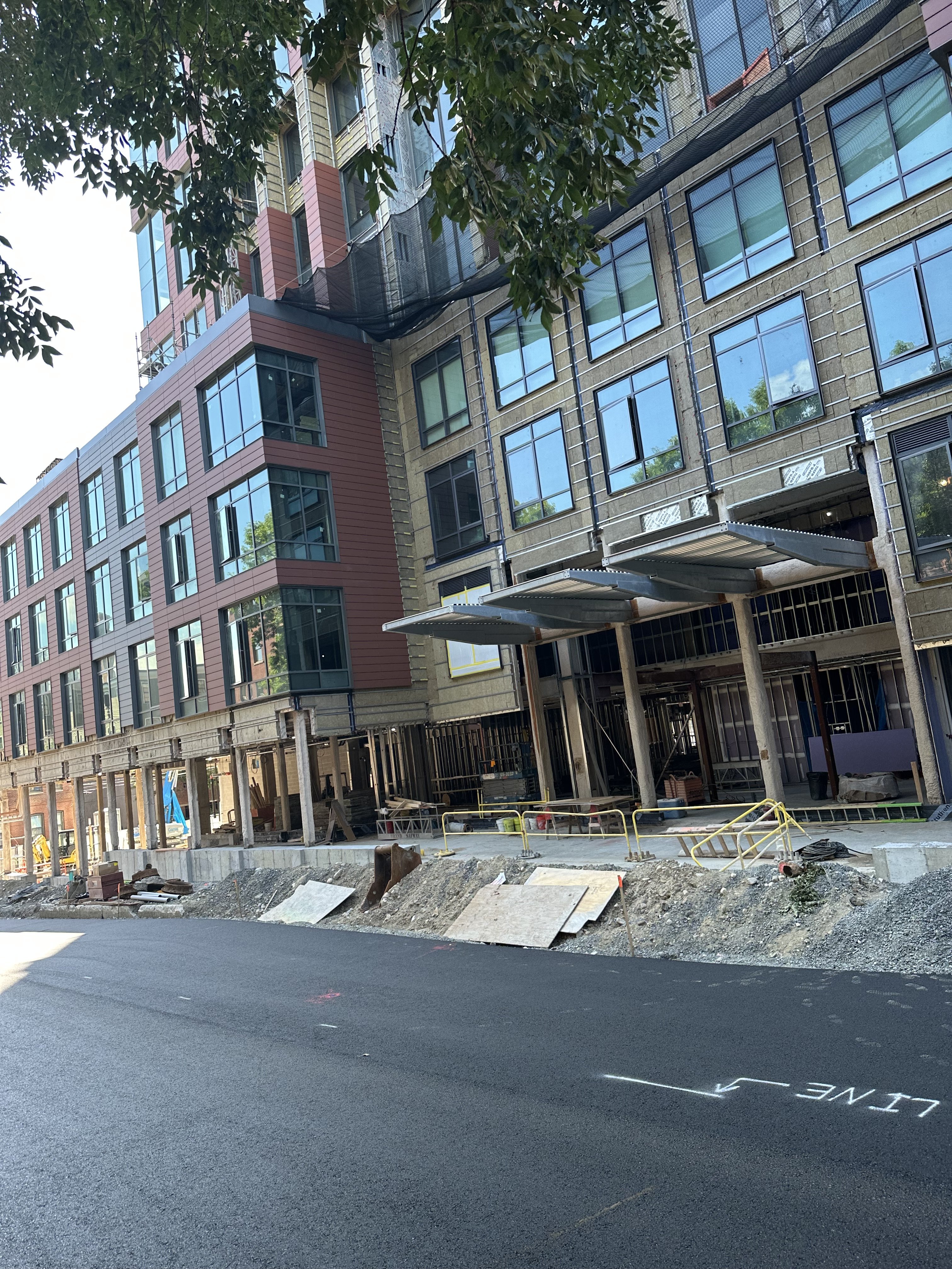
So far, I really like this building and the cladding. LEAP years ahead of what was the Middlesex Courthouse where I did Jury Duty several times in the past.
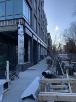
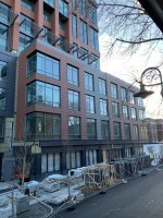
A lot of forumers were really crapping on this cladding when the renders were first released (see far upthread). I too was skeptical at that time. But, while this isn't my favorite building aesthetically, count me as one who is pleased with how it came out. I walk around here quite often, as my posts likely imply. My thoughts are that there is SO much red brick in the area, that the cladding seems to have been chosen to help integrate with that. I think people were concerned that it would be too pale/pink-ish colored, but it has turned out to be a deeper color that jibes quite nicely with the red brick. My second observation is that this is not a 'flat' facade. There's a fair amount of detailing and depth. These latter attributes help mitigate the boring/overdone aesthetic that some were worried would be attributed to (what they thought was) yet another flat terra cotta facade.
I think this building does a decent job with the hand it was dealt.
Dr. Rosen Rosen
Senior Member
- Joined
- Jul 19, 2021
- Messages
- 1,164
- Reaction score
- 6,722
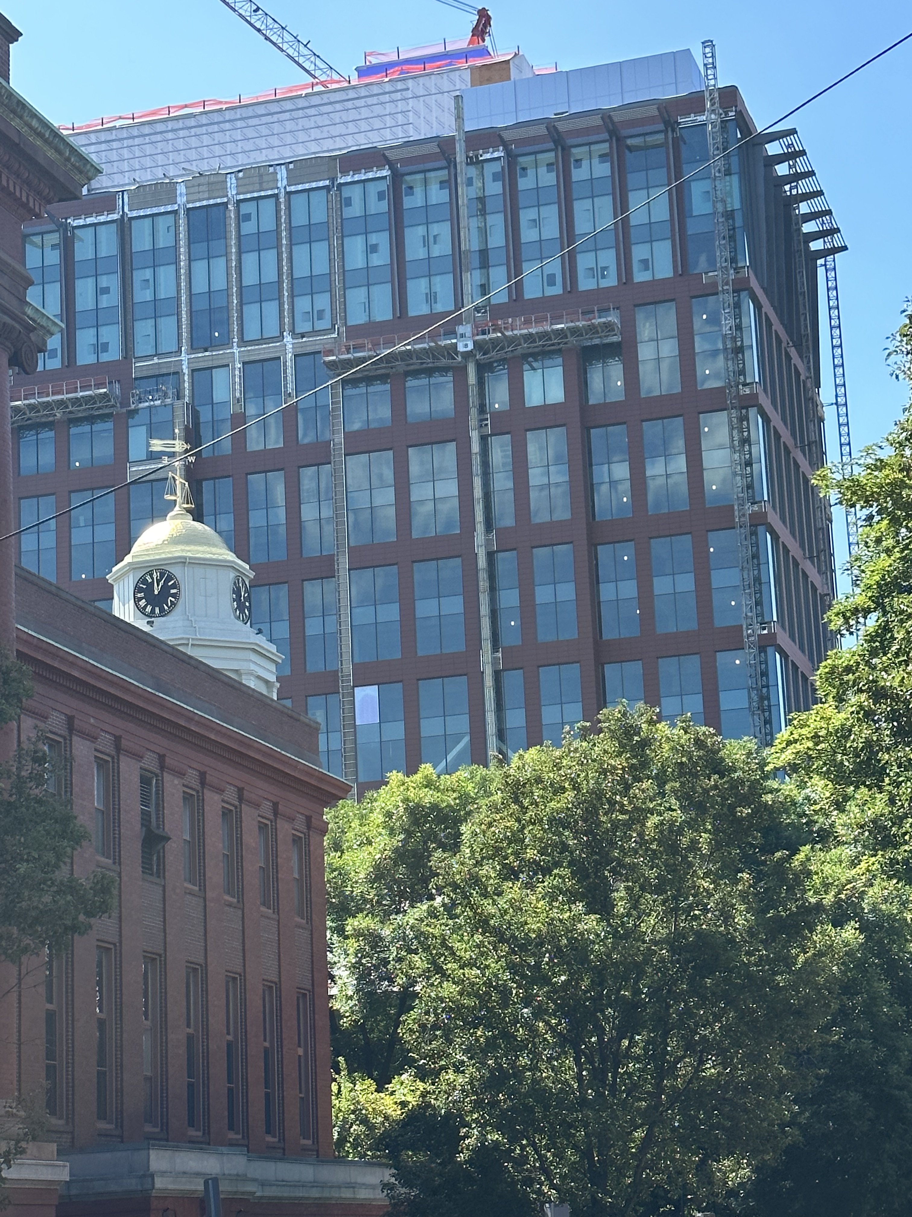
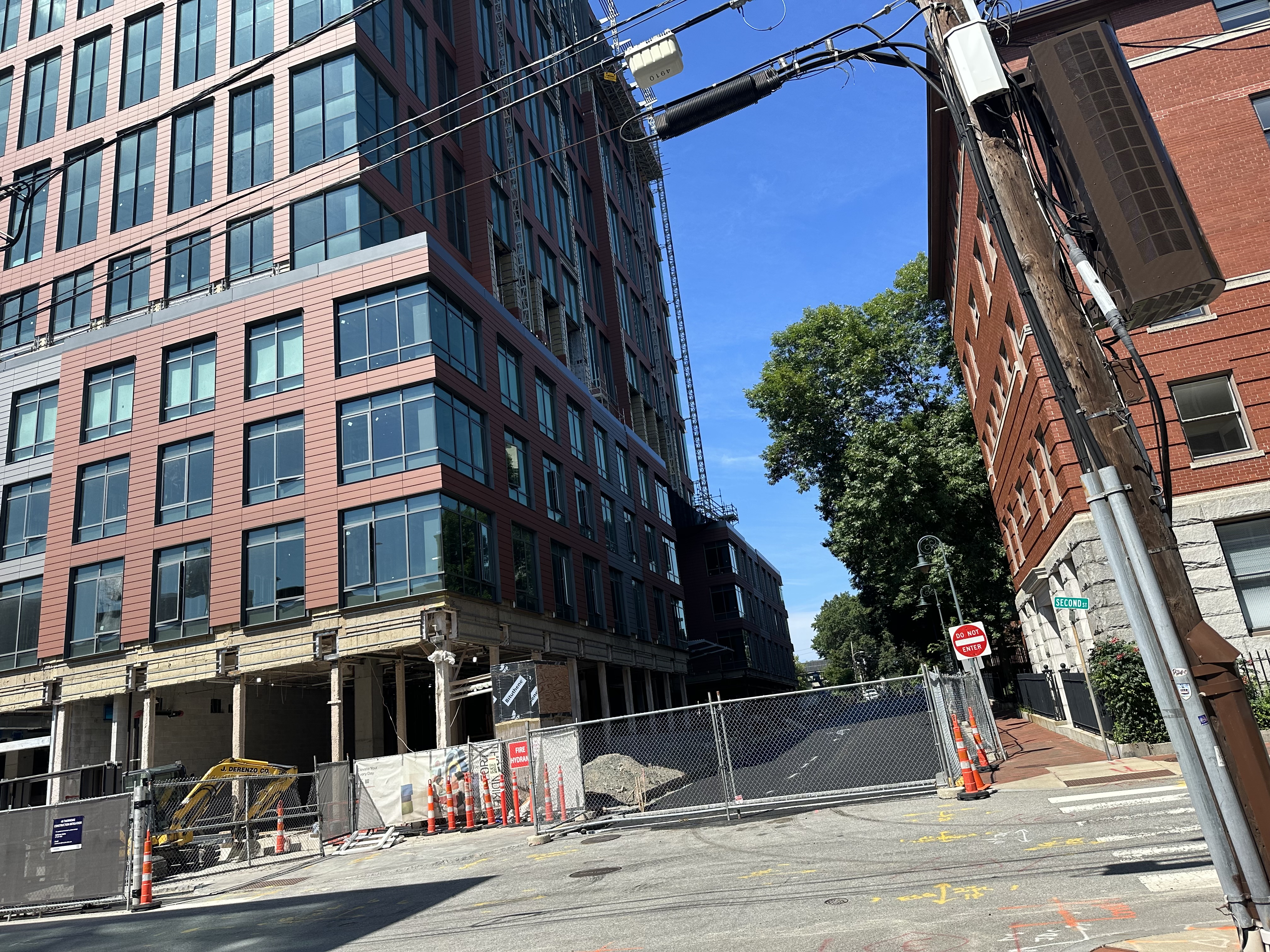
Coming together
bigpicture7
Senior Member
- Joined
- May 5, 2016
- Messages
- 3,896
- Reaction score
- 9,518
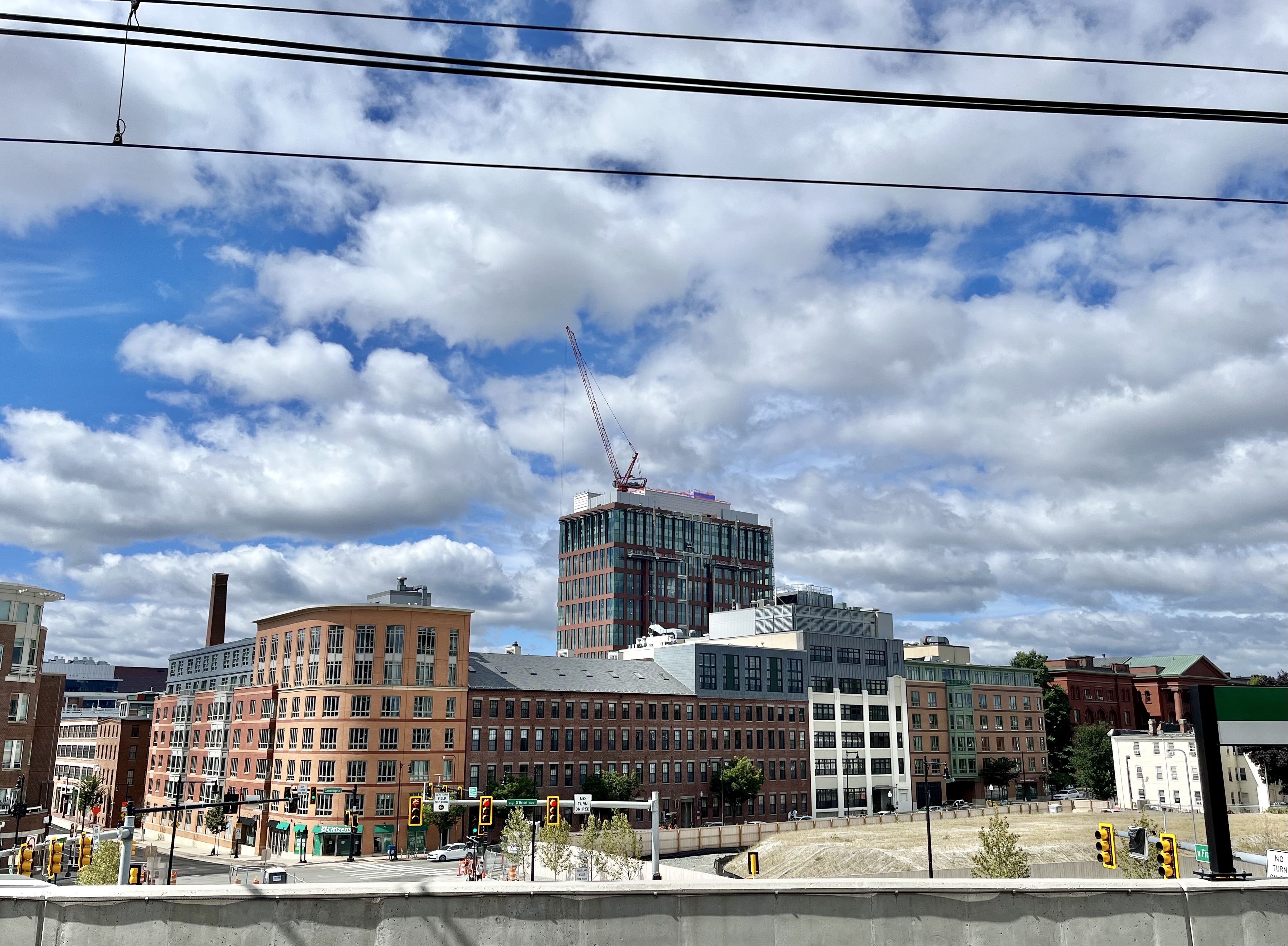
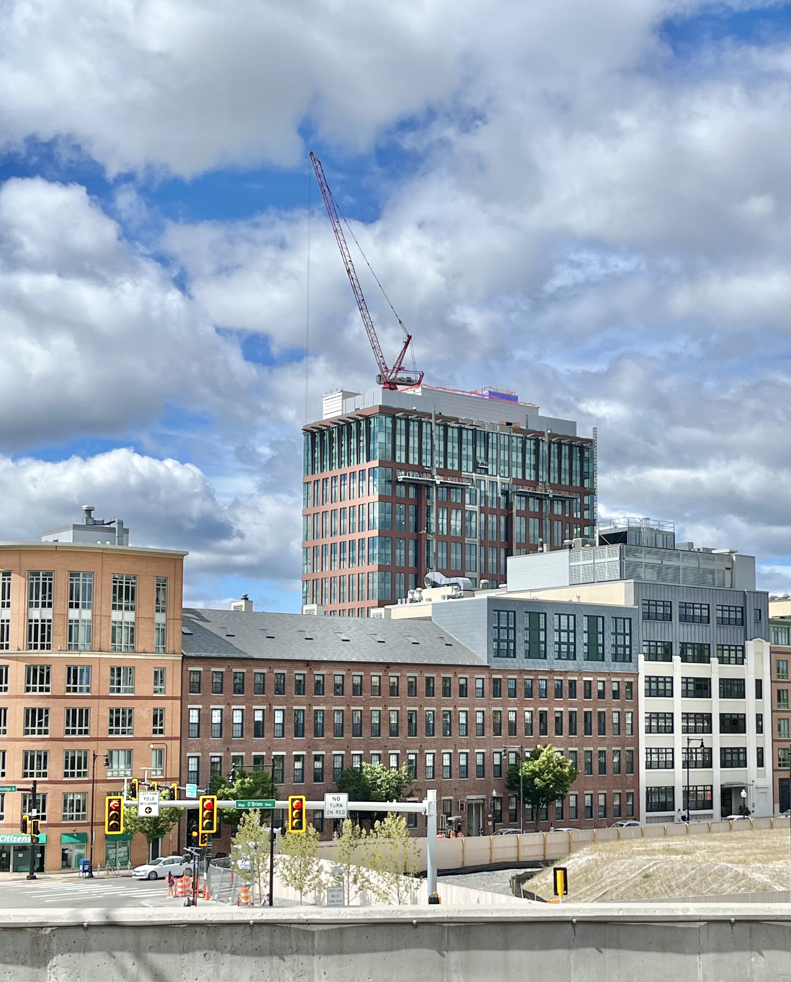
8/19, from Lechmere platform:
RandomWalk
Senior Member
- Joined
- Feb 2, 2014
- Messages
- 3,315
- Reaction score
- 5,182
The crane appeared to be on its way down today.
Guess you haven't seen much of the world? In it's ongoing new form it's -- if not "nice" (that's subjective, as is all of this nonsense) -- perfectly fine and inoffensive.
Top-10 ugliest building in the world?!?!? Hyperbole is your jam, I take it.
Top-10 ugliest building in the world?!?!? Hyperbole is your jam, I take it.
I believe he/she is saying it's now a 7-8 on a scale of 1 to 10. So, greatly improved.Guess you haven't seen much of the world? In it's ongoing new form it's -- if not "nice" (that's subjective, as is all of this nonsense) -- perfectly fine and inoffensive.
Top-10 ugliest building in the world?!?!? Hyperbole is your jam, I take it.
Oh, I got it. I don’t think the original iteration was anywhere near the ugliest in the world is all.I believe he/she is saying it's now a 7-8 on a scale of 1 to 10. So, greatly improved.
I also like Boston City Hall, though, so what do I know.
- Joined
- May 25, 2006
- Messages
- 7,033
- Reaction score
- 1,865
It's wild how much better this is.

 IMG_0069
 IMG_0058