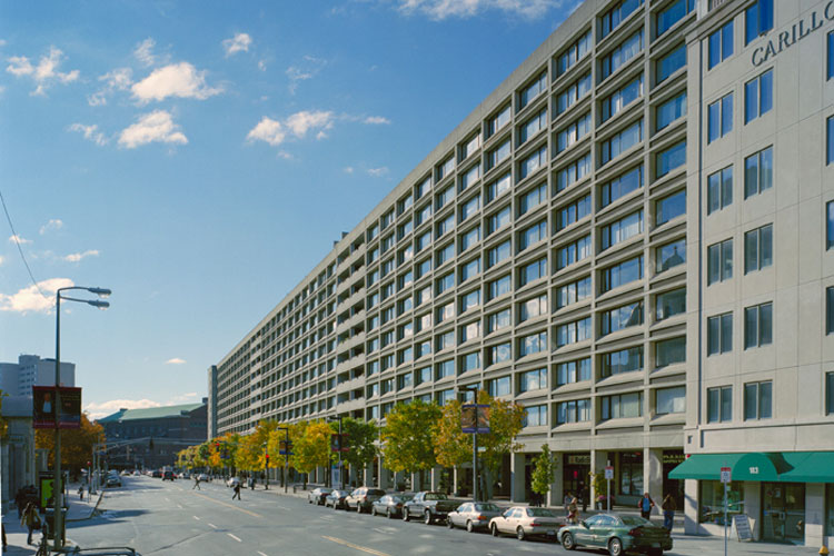
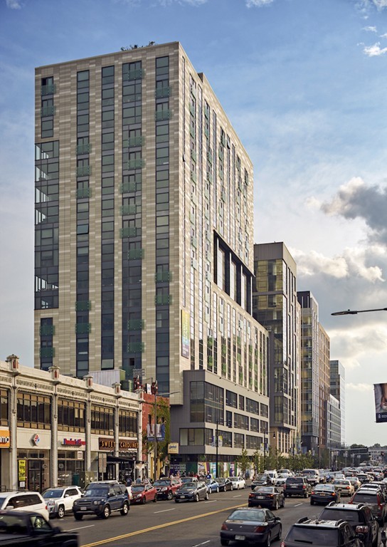
Midtown Hotel Redevelopment | 220 Huntington Avenue | Back Bay

Do wish we could keep 1 Cumberland. Yes, this is the landscaper part of Boston, but would it be such a big deal to keep this? Complexity of Boston's blocks is one of our hallmarks. Otherwise, I like this.
 
I asked this before with no response. Has anyone ever heard how 1 Cumberland managed to survive. Was it an obstinate owner? Did a mob figure own it? Historic preservation wasn't big when the Midtown was built.
 
Wouldn't be surprised if it was just to save money. Same thing with the last tenement house in the West End
 
The Christian Science churched owned all the property in that block during the development of that area in the 1960s, EXCEPT for 1 Cumberland. So when the Midtown Hotel was build, they just built around it. I don't know why there were not able to acquire it though.
 
The Christian Science churched owned all the property in that block during the development of that area in the 1960s, EXCEPT for 1 Cumberland. So when the Midtown Hotel was build, they just built around it. I don't know why there were not able to acquire it though.
Likely the owner wanted too much money, so they simply designed around the parcel. I think something like that happened recently with 45 West Third Street in Southie.
 
Counterpoint: this is a great, dense building with interesting architecture. One Cumberland is smaller, less dense, and a relatively bad version of the exact same architecture of the neighboring square mile.
 
^ Hard to argue this. I'd just say that a diverse block is a Boston hallmark. I worry how we keep dinging that concept with these landscrapers. I like this building too, however, and your points are well taken. Still...
 
^ Hard to argue this. I'd just say that a diverse block is a Boston hallmark. I worry how we keep dinging that concept with these landscrapers. I like this building too, however, and your points are well taken. Still...
I see your point, yet Huntington at this end has gradually been filled with similar height buildings creating a boundary wall of sorts. This new building continues the theme till Mass Ave. I see the same efforts on Boylston Street in the Fenway going down from the Victory Gardens all the way to the Muddy River. If the street activity is appropriate, such heights are not a problem. Unfortunately on Huntington, there is little retail and street life from Copley on down.
 
I think the design looks good, but I much rather would have liked to have seen it broken up into two buildings vs a massive landscraper.

If thats too much to ask theres plenty of ways to mask its bulk. They could design it so from the outside it looks like 2-3 buildings that are built right up against eachother while inside its one building. Hell they dont even need to make it look like 2-3 different looking buildings, theres plenty of examples all over the city of multiple copies of the same building built right up against eachother in a row.

Theres something thats much more visually pleasing and much more relatable to the human scale about the appearance of multiple buildings in a row vs one enormous landscraper, even if the net effect of the amount of space taken up by each is essentially the same.

For example both of these are probably a pretty similar massing overall, with a much different effect.
Church-Park-Gallery-Image-5.jpg


photo.aspx
 
Last edited:
I keep getting stuck on how this proposal is essentially a 2020s reissue of the Church Park Apartments across the street on Mass Ave. The concrete has been swapped out for precast panels, and this is 500’ long vs 750’ long, but in massing and presence I believe they will have a similar monotonous, oppressive effect.
 
I don't care if it's a choad, shadow restrictions and all, but it totally lacks character and has only the most token context. At first glance, it reads like Echelon Seaport's poorer, hustlin' cousin. The copper-colored windows and greenery (the latter being seasonal and taking years to fill in, if fully planted) doesn't offset the monochrome dullness of the facade, which is indistinguishable from the sidewalk and repellent, not inviting. Aside from the 42 on-site affordable units, this is a place to park your money/stuff, and it looks it.

I'm waxing on because I have imagined this site's redevelopment since I was a kid playing with Legos, and what I see is a bland storage complex for rich people, a middle finger with a frat ring on it to the neighborhood. The renders are the most flattering angles/lighting/trickery - rather like grindr pics - and this design just scrapes past 'Eh, ok'.
I have to disagree, in that this is totally in context with the surroundings. The dominant color palette of all the blocks there and the Christian Science Center is limestone beige, either as stone or as bare concrete. Huntington and Mass Ave are both a sequence of landscrapers in these blocks. Even the Christian Science Center has two landscrapers.

I am not a huge fan of the bland urban design that dominates here, but this is fully in keeping with the urban design intent of the Christian Science Center plan.

Also the lack of retail in this area is largely due to the lease restrictions placed on properties by the Christian Science Church (who owns essentially all this land). I honestly don't think they want a vibrant street scene. They want the focus to be on the Mother Church.
 
Matching the surroundings is not always necessarily the best implementation, for example the Hancock tower over old copley sq. The drab grey and brutalism of the surroundings is perfectly fine, but what we would call here the filler or background buildings, perfectly situated to accentuate something more iconic.
 

Back
Top