stellarfun
Senior Member
- Joined
- Dec 28, 2006
- Messages
- 5,711
- Reaction score
- 1,544
It is not as if the architect cannot respect the past, for example, this by the same architect:

Given the quality and presence of the existing stone buildings, does anyone think the the addition as depicted in this rendering is appropriate? Scale and form are up for discussion, but I'm most interested in the materials.
 1455-59 Tremont by Bos Beeline, on Flickr
 IMG_9175 by Bos Beeline, on Flickr
 IMG_9188 by Bos Beeline, on Flickr
 IMG_9189 by Bos Beeline, on Flickr
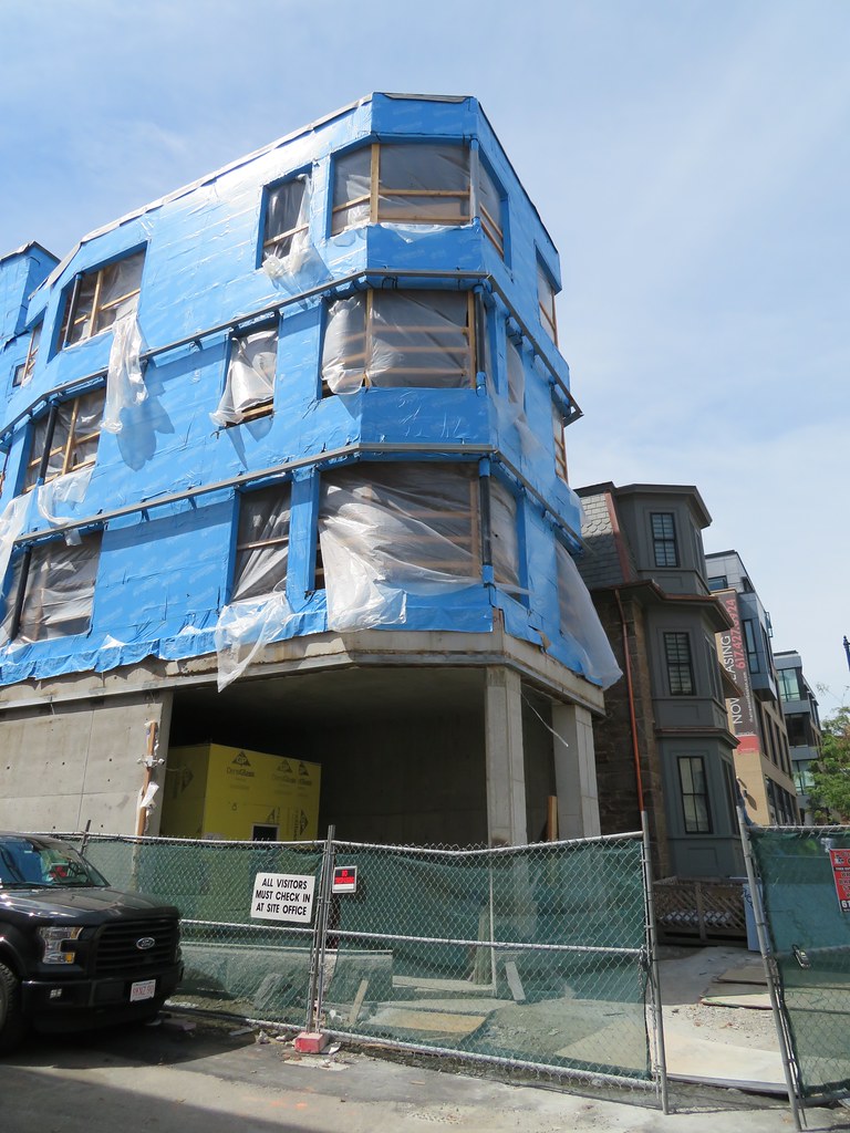 1470 Tremont by Bos Beeline, on Flickr
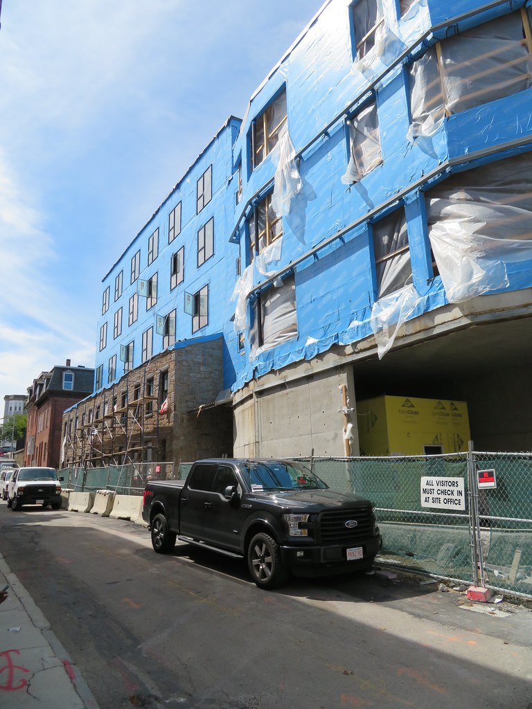 IMG_9178 by Bos Beeline, on Flickr
 IMG_9186 by Bos Beeline, on Flickr
 IMG_9185 by Bos Beeline, on Flickr
 IMG_9182 by Bos Beeline, on Flickr
 IMG_7168 by Bos Beeline, on Flickr
 IMG_7170 by Bos Beeline, on Flickr
 IMG_7172 by Bos Beeline, on Flickr
 IMG_7171 by Bos Beeline, on Flickr
 1455-59 Tremont by Bos Beeline, on Flickr
 IMG_7177 by Bos Beeline, on Flickr
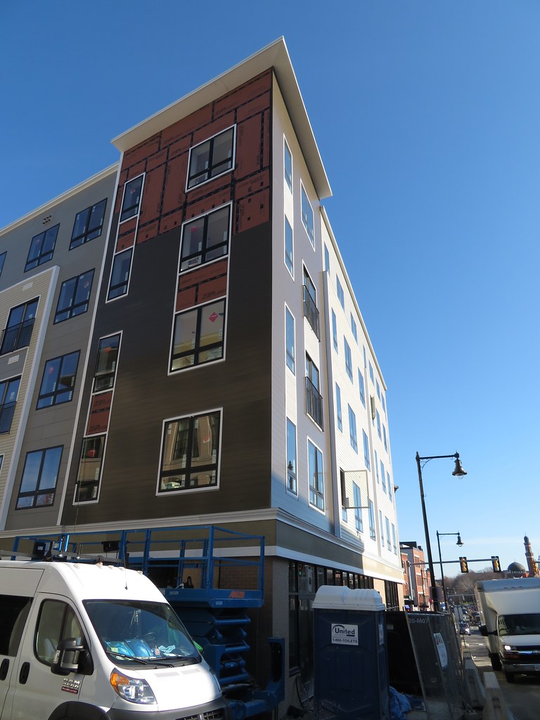 IMG_7174 by Bos Beeline, on Flickr
 IMG_5822 by Bos Beeline, on Flickr
 IMG_5821 by Bos Beeline, on Flickr
 IMG_5823 by Bos Beeline, on Flickr
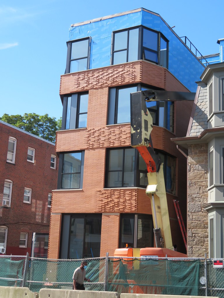 IMG_5824 by Bos Beeline, on Flickr
 IMG_5827 by Bos Beeline, on Flickr
 IMG_5826 by Bos Beeline, on Flickr
 IMG_5833 by Bos Beeline, on Flickr
 IMG_5830 by Bos Beeline, on Flickr
 IMG_5831 by Bos Beeline, on Flickr
 IMG_5829 by Bos Beeline, on Flickr
 1457 Tremont by Bos Beeline, on Flickr
 IMG_5835 by Bos Beeline, on Flickr
 IMG_5836 by Bos Beeline, on Flickr
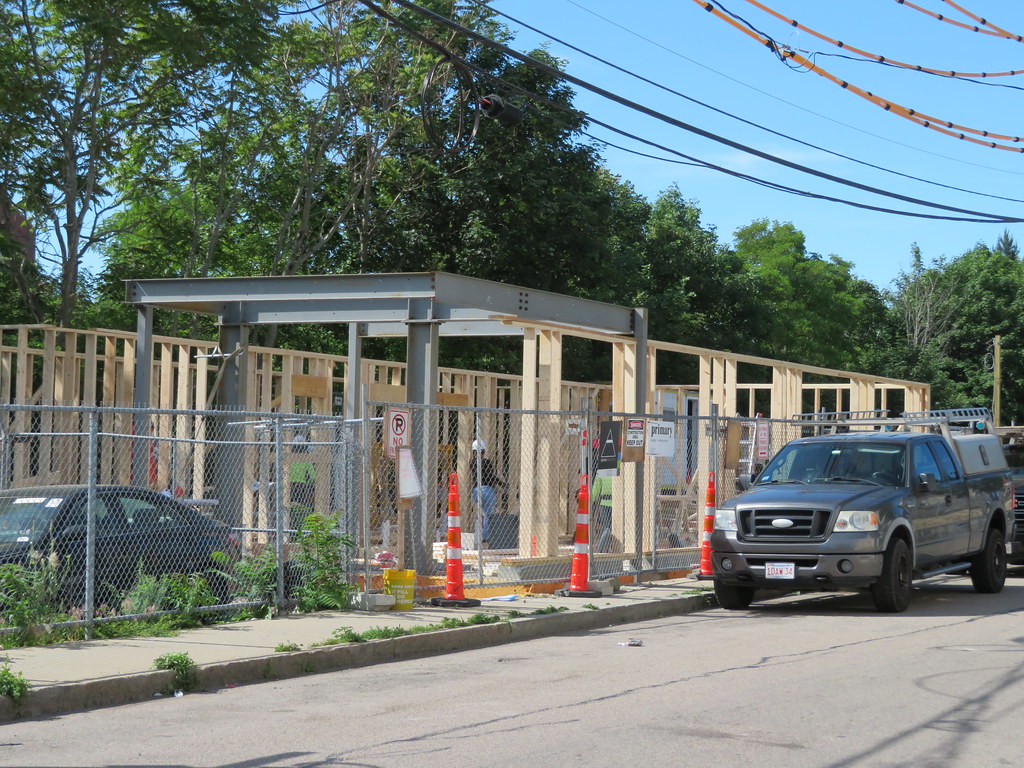 40 Terrace by Bos Beeline, on Flickr
 IMG_5838 by Bos Beeline, on Flickr
 IMG_5839 by Bos Beeline, on Flickr
 80 Terrace by Bos Beeline, on Flickr
 IMG_5840 by Bos Beeline, on Flickr
 IMG_5842 by Bos Beeline, on Flickr