You are using an out of date browser. It may not display this or other websites correctly.
You should upgrade or use an alternative browser.
You should upgrade or use an alternative browser.
Novartis Campus | 181-211 Mass Ave, 22 Windsor Street | Kendall Square | Cambridge
- Thread starter stellarfun
- Start date
TheRifleman
Banned
- Joined
- Sep 25, 2008
- Messages
- 4,431
- Reaction score
- 0
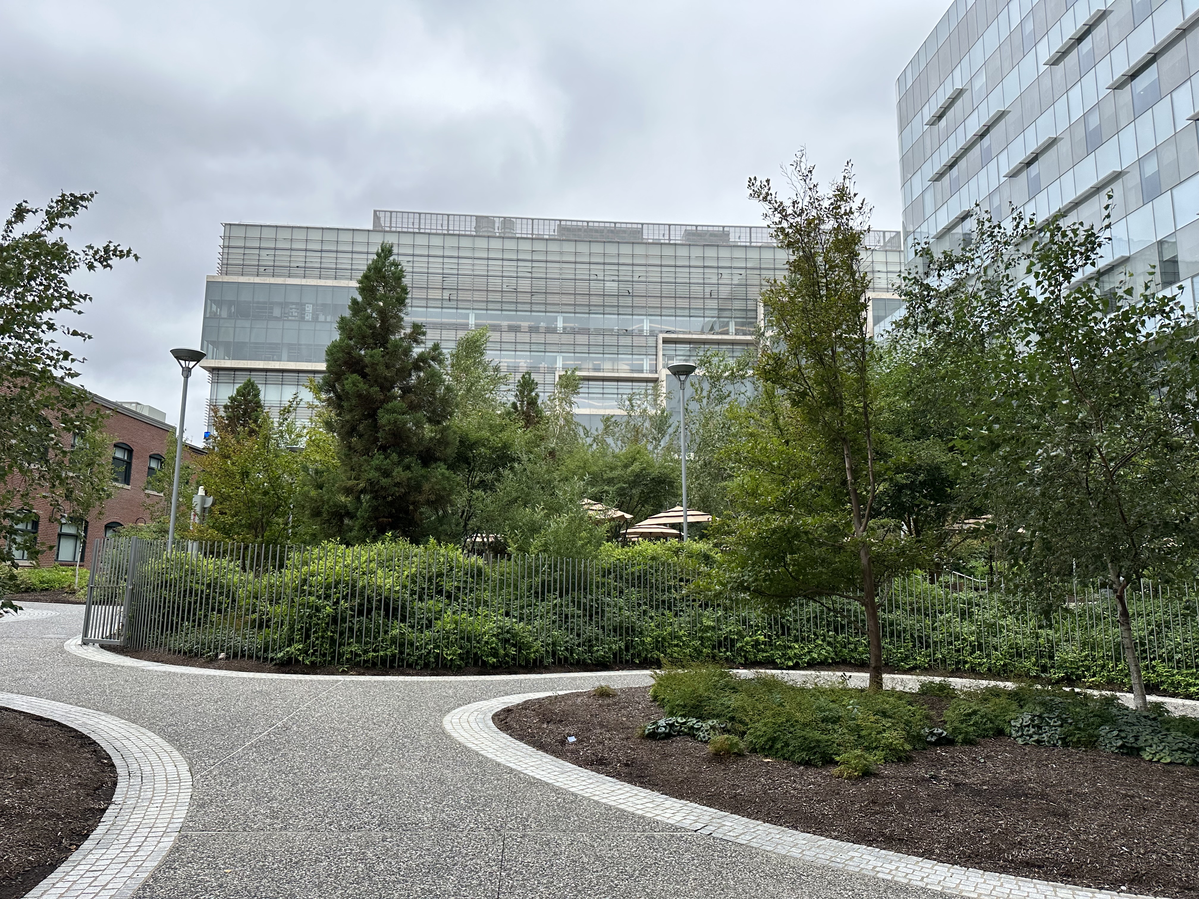
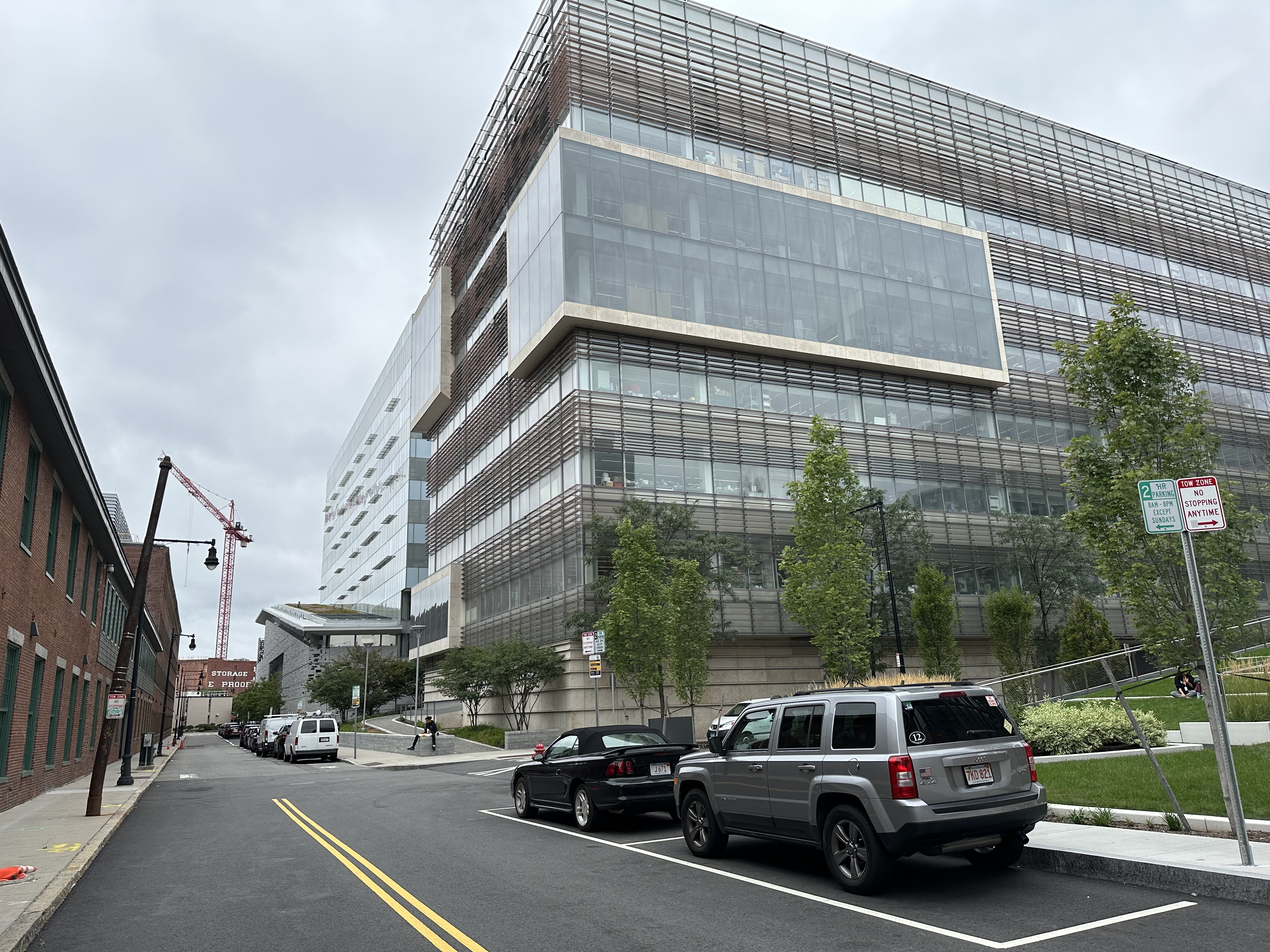
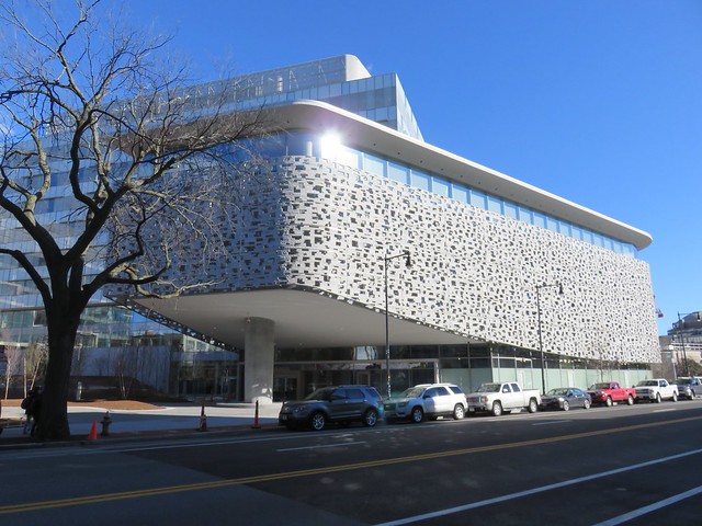
This thing is a real piece of shit. That overhang is massive, dark, and downright threatening. The courtyard is the definition of wasted space and a massive fuck you to our housing problem. If you haven't seen it in person, it is worth a special trip to experience this level of architectural failure firsthand.
+1
lexicon506
Active Member
- Joined
- May 25, 2006
- Messages
- 557
- Reaction score
- 278
This thing is a real piece of shit. That overhang is massive, dark, and downright threatening. The courtyard is the definition of wasted space and a massive fuck you to our housing problem. If you haven't seen it in person, it is worth a special trip to experience this level of architectural failure firsthand.
-1
Come on guys, the negative overreaction on this board lately is really getting annoying. Is this complex perfectly conceived? No. Is it more original and distinctive than 99% of what's gone up in this city recently? Absolutely.
I'll take this over the generic boxes we get in Kendall Sq. and the Seaport any day of the week and twice on Sundays.
Last edited:
fattony
Senior Member
- Joined
- Jan 28, 2013
- Messages
- 2,099
- Reaction score
- 482
-1
Come on guys, the negative overreaction on this board lately is really getting annoying. Is this complex perfectly conceived? No. Is it more original and distinctive than 99% of what's gone up in this city recently? Absolutely.
I'll take this over the generic boxes we get in Kendall Sq. and the Seaport any day of the week and twice on Sundays.
I don't think I'm overreacting. I'm the one who is always being generous and finding the bright side of things when the AB hive mind thinks the world is coming to an end. Come see this building. Yes, it has some fancy shit stapled to the side, but no, it is NOT better than a Seaport box.
This is very institutional, very academic. It is distinctly anti-urban. If MIT built this on an interior parcel I think I could forgive a lot, but this is a prominent intersection on a major urban thoroughfare. It is lacking in almost any context whatsoever and is hostile to pedestrians. There is some chance that the retail storefronts could soften that.
I would trade this for a dozen boxes, which there is nearly enough wasted space on this site to accommodate.
Brad Plaid
Senior Member
- Joined
- Jan 17, 2013
- Messages
- 1,310
- Reaction score
- 1,559
I like the buildings, they're interesting, and the retail will definitely soften things. But the courtyard really is oversized to the point of absurdity. Thank the Cambridge Open Space Mafia for this kind of false environmentalism and the same mistake is surely going to happen at the Volpe site. Guess there's no such thing as too many parks for one to do one's magical purple unicorn riding in.
DigitalSciGuy
Active Member
- Joined
- Apr 14, 2013
- Messages
- 670
- Reaction score
- 421
Tell them about the gate and how it's not really the kind of public-private open space that we need!
This park will be nice for people in the labs to look out at and to go eat lunch, but it's not a particularly nice open space, especially compared to some other outdoor rooms in the area.
This park will be nice for people in the labs to look out at and to go eat lunch, but it's not a particularly nice open space, especially compared to some other outdoor rooms in the area.
Czervik.Construction
Senior Member
- Joined
- Apr 15, 2013
- Messages
- 1,932
- Reaction score
- 1,163
whighlander
Senior Member
- Joined
- Aug 14, 2006
- Messages
- 7,812
- Reaction score
- 647
I like the buildings, they're interesting, and the retail will definitely soften things. But the courtyard really is oversized to the point of absurdity. Thank the Cambridge Open Space Mafia for this kind of false environmentalism and the same mistake is surely going to happen at the Volpe site. Guess there's no such thing as too many parks for one to do one's magical purple unicorn riding in.
Brad & Tonty -- remember this is really an extension of MIT's campus and it incorporates the historic Barta Building once the site of the revolutionary Whirlwind Computer
MIT required the courtyard just all of the MIT academic buildings surround courtyards
The comments about housing Cambridge and Boston and the Cambridge mania for open spaces are utterly irrelevant to the discussion of this project -- this was never going to be housing
Finally the courtyard is s public space not much different than all of the MIT green spaces interleaved between MIT academic buildings
Viewed in the above context -- its way more than a qualified success
JumboBuc
Senior Member
- Joined
- Jun 26, 2013
- Messages
- 2,661
- Reaction score
- 1,559
Brad & Tonty -- remember this is really an extension of MIT's campus and it incorporates the historic Barta Building once the site of the revolutionary Whirlwind Computer
MIT required the courtyard just all of the MIT academic buildings surround courtyards
The comments about housing Cambridge and Boston and the Cambridge mania for open spaces are utterly irrelevant to the discussion of this project -- this was never going to be housing
Finally the courtyard is s public space not much different than all of the MIT green spaces interleaved between MIT academic buildings
Viewed in the above context -- its way more than a qualified success
But take a look at the actual courtyard being discussed. It's all just mounds of dirt and trees and mulch and walkway. Nobody is going to use that space. It's only going to sit empty, taking up square footage and maintenance dollars. How can you seriously say that the Novartis courtyard is "[a] public space not much different than all of the MIT green spaces interleaved between MIT academic buildings"? Killian Court this space is not. And how can you frequent a forum dedicated to design in "Boston's Built Environment" and not understand that all open spaces are not created equal?
If this courtyard incorporated green space along with benches and shade and maybe a fountain or two (think Post Office Square), you could have a point. But in its current form it is nothing but wasted space.
Is it more original and distinctive than 99% of what's gone up in this city recently? Absolutely. I'll take this over the generic boxes we get in Kendall Sq. and the Seaport any day
Agreed
It is distinctly anti-urban. If MIT built this on an interior parcel I think I could forgive a lot, but this is a prominent intersection on a major urban thoroughfare. It is lacking in almost any context whatsoever and is hostile to pedestrians.
Agreed
stellarfun
Senior Member
- Joined
- Dec 28, 2006
- Messages
- 5,711
- Reaction score
- 1,544
With respect to open space, and whether it is a nice park, a mediocre park, a public park, or a private park, that's likely to be a function of Cambridge zoning requirements. I expect that for new construction, there is probably a specification as to how much of the lot must be a yard or open space.
HalcyonEra
Active Member
- Joined
- Mar 6, 2012
- Messages
- 410
- Reaction score
- 8
This thing is a real piece of shit. That overhang is massive, dark, and downright threatening. The courtyard is the definition of wasted space and a massive fuck you to our housing problem. If you haven't seen it in person, it is worth a special trip to experience this level of architectural failure firsthand.
Brutalism 2.0
This monstrosity is not going to age well.
Downburst
Senior Member
- Joined
- Jul 20, 2012
- Messages
- 1,452
- Reaction score
- 347
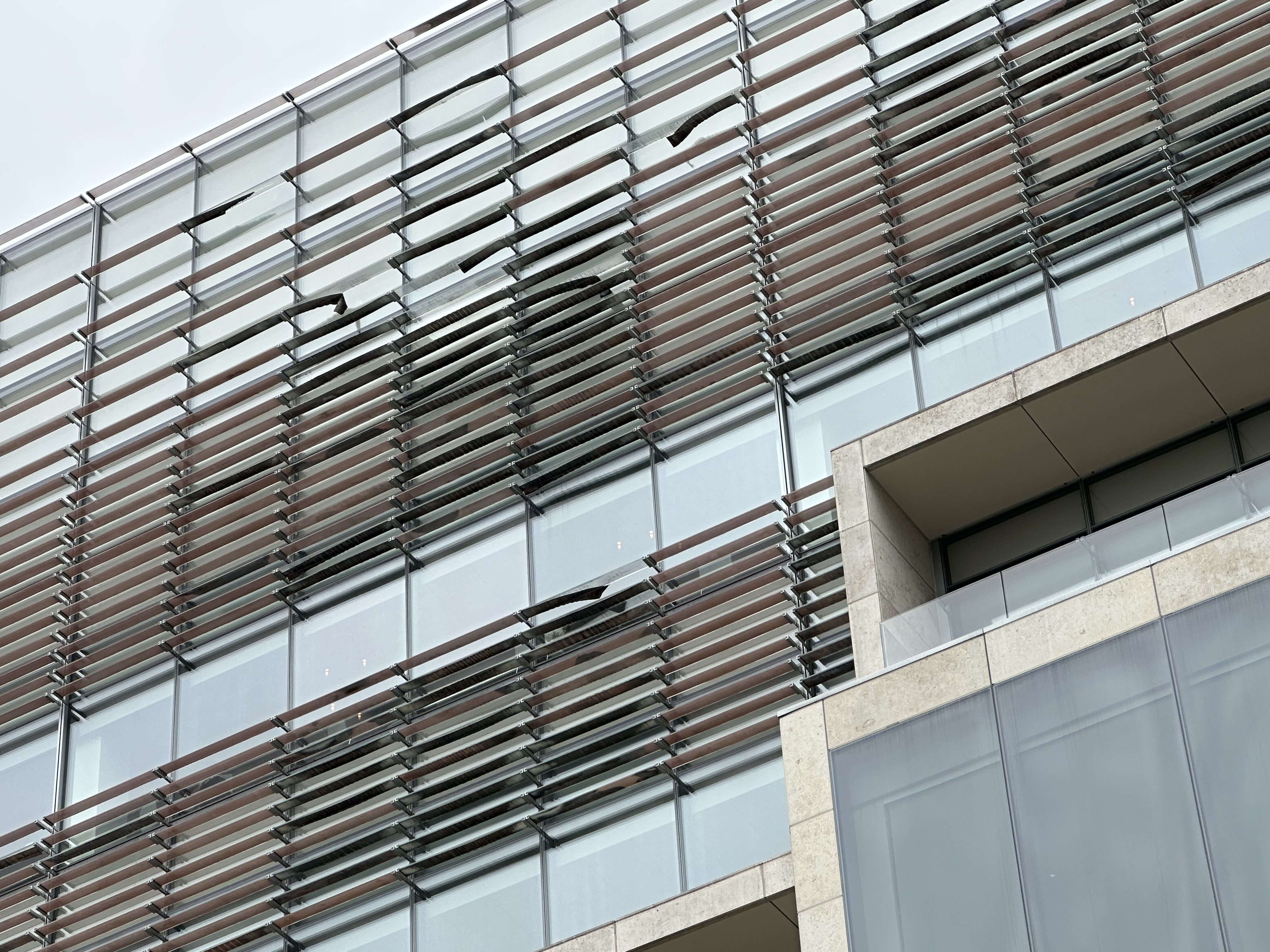
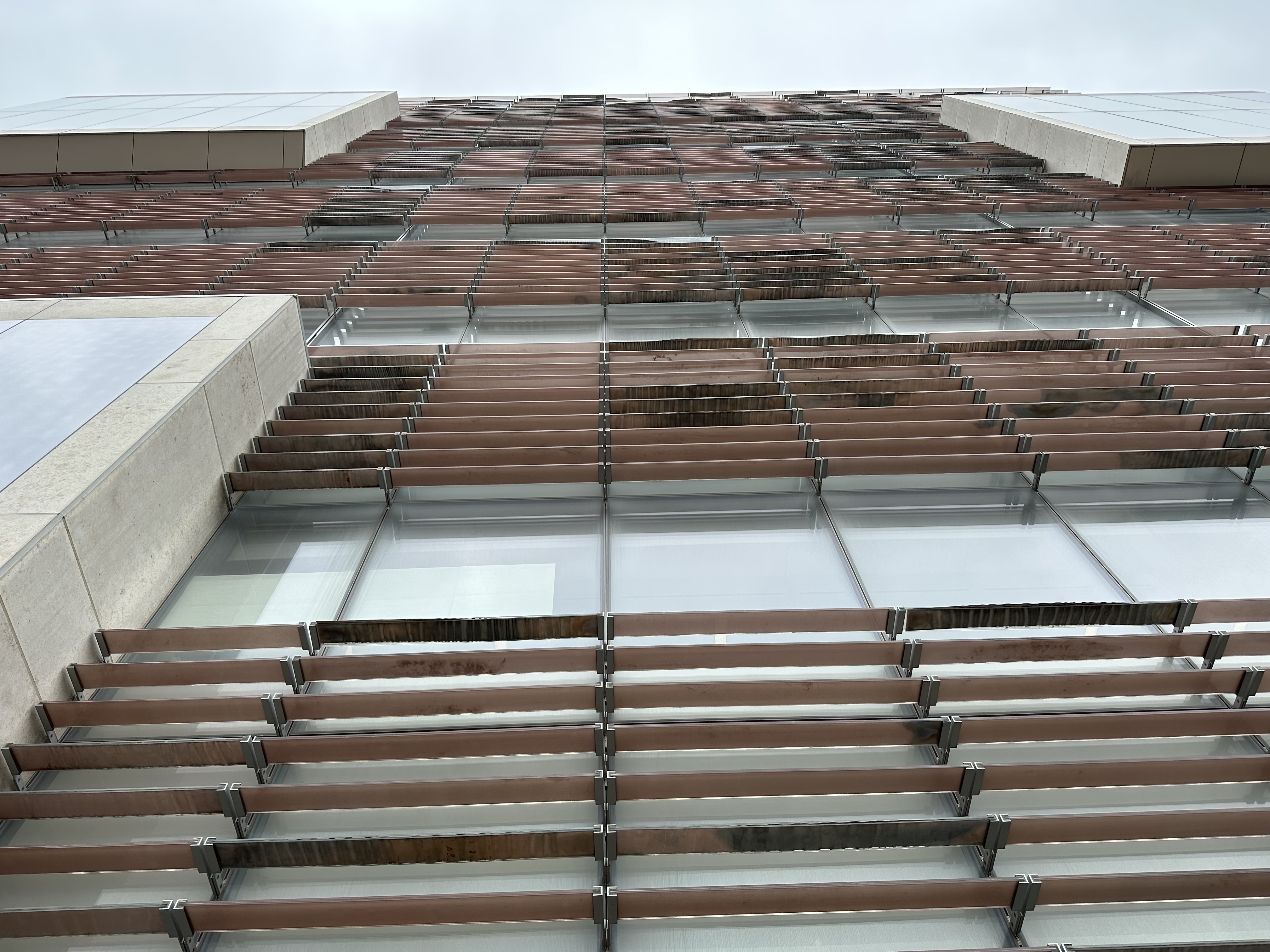
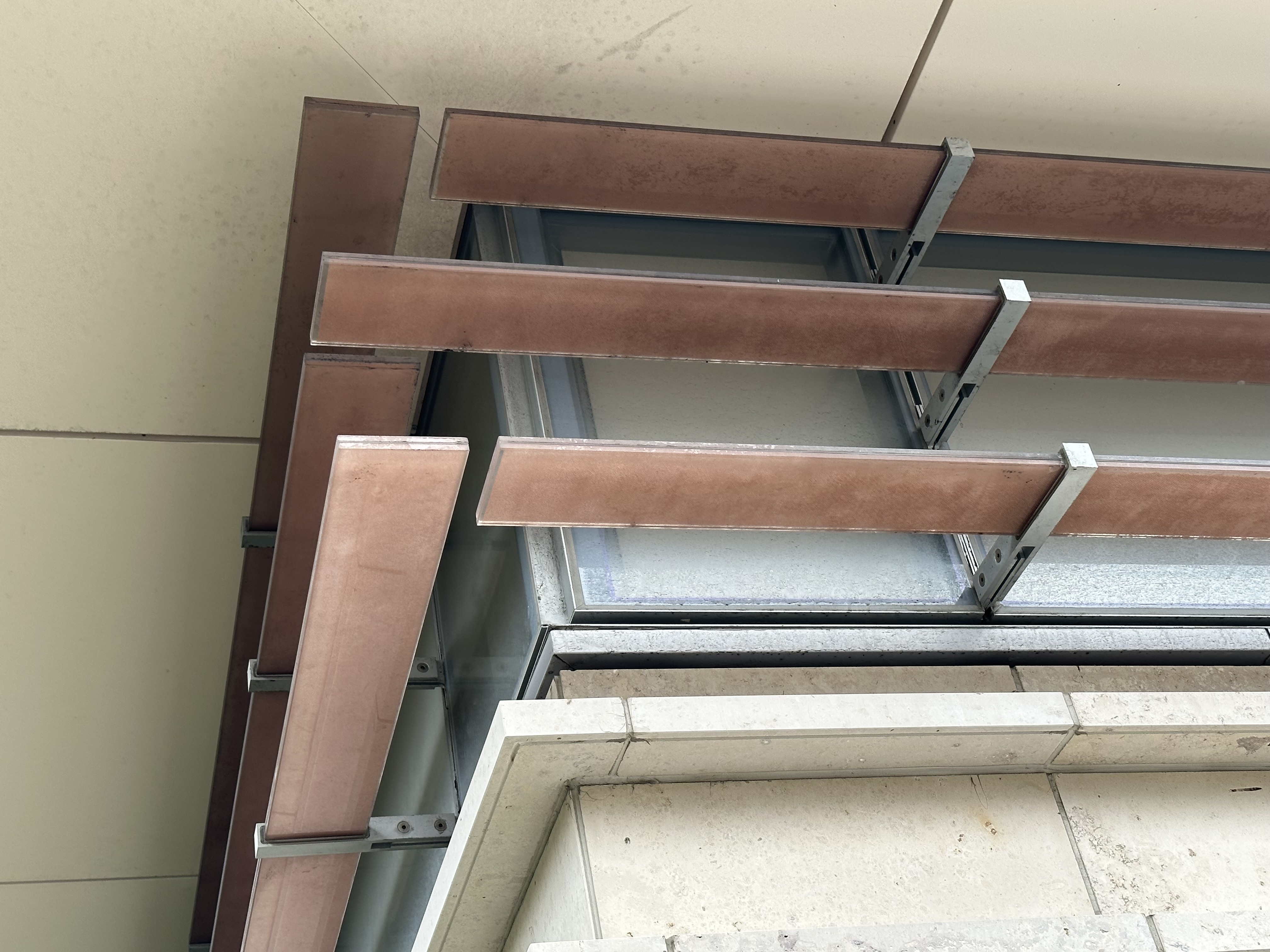
Instagram friend must work inside or something to that effect; he posted a picture of the brise-soleil from within:

http://websta.me/n/bmeeee

http://websta.me/n/bmeeee
Instagram friend must work inside or something to that effect; he posted a picture of the brise-soleil from within:

http://websta.me/n/bmeeee
I would kill someone if I had fucking weird patches of light and dark on my workspace. FUCK. THIS. BUILDING.
whighlander
Senior Member
- Joined
- Aug 14, 2006
- Messages
- 7,812
- Reaction score
- 647
But take a look at the actual courtyard being discussed. It's all just mounds of dirt and trees and mulch and walkway. Nobody is going to use that space. It's only going to sit empty, taking up square footage and maintenance dollars. How can you seriously say that the Novartis courtyard is "[a] public space not much different than all of the MIT green spaces interleaved between MIT academic buildings"? Killian Court this space is not. And how can you frequent a forum dedicated to design in "Boston's Built Environment" and not understand that all open spaces are not created equal?
If this courtyard incorporated green space along with benches and shade and maybe a fountain or two (think Post Office Square), you could have a point. But in its current form it is nothing but wasted space.
JumboBuc -- no one ever said that it was equal or even comparable to Killen Court which is one of the iconic spaces and reciprocal views on the planet.
Standing in Killen Court from up-close you can see the unity of the academics the cornerstone of Wells Bosworth's design. Turn around and look across the Charles and you see one of the best views of Boston. From Across the River its the front lawn for the Dome. And on top of that you can use if for things such as Inaugurating a New President of MIT or celebrating the 150th Anniversary, or just playing frisbee
But there are plenty of other smaller green-ish spaces embedded between building on the MIT Campus - -some work well, some are ignorable and some just didn't work at all
In the midst of that spectrum, what I've seen so far of the Novartis Campus is more than adequate
- Joined
- May 25, 2006
- Messages
- 7,034
- Reaction score
- 1,875
Instagram friend must work inside or something to that effect; he posted a picture of the brise-soleil from within:

http://websta.me/n/bmeeee
Dope. This whole project is the classiest office park in all of Cambridge.
stellarfun
Senior Member
- Joined
- Dec 28, 2006
- Messages
- 5,711
- Reaction score
- 1,544
Robert Campbell reviews it as a work of art.
http://www.bostonglobe.com/arts/art...in-mass-ave/a1ciDJCWbCXe5ikP1aJ8PP/story.html
http://www.bostonglobe.com/arts/art...in-mass-ave/a1ciDJCWbCXe5ikP1aJ8PP/story.html
Dr. Rosen Rosen
Senior Member
- Joined
- Jul 19, 2021
- Messages
- 1,164
- Reaction score
- 6,722
Uhmmm..
