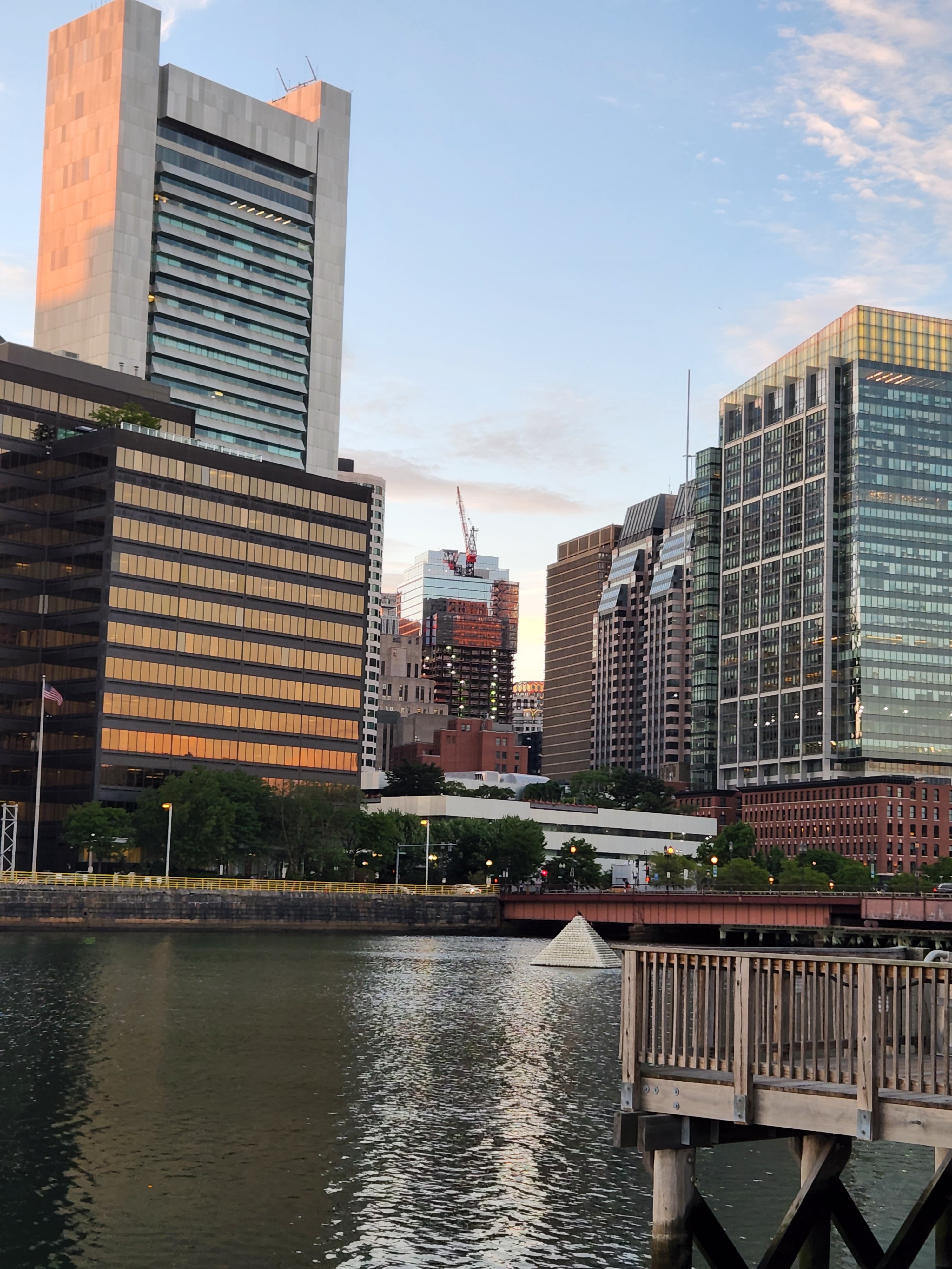
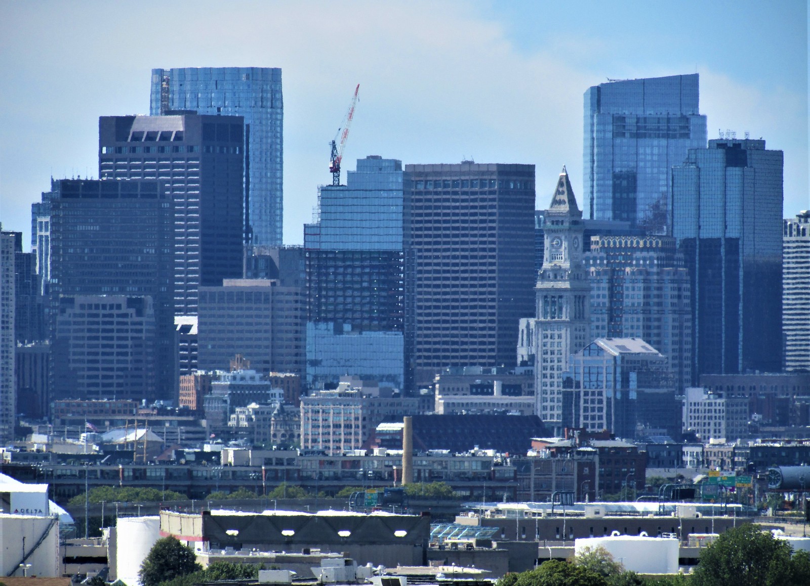
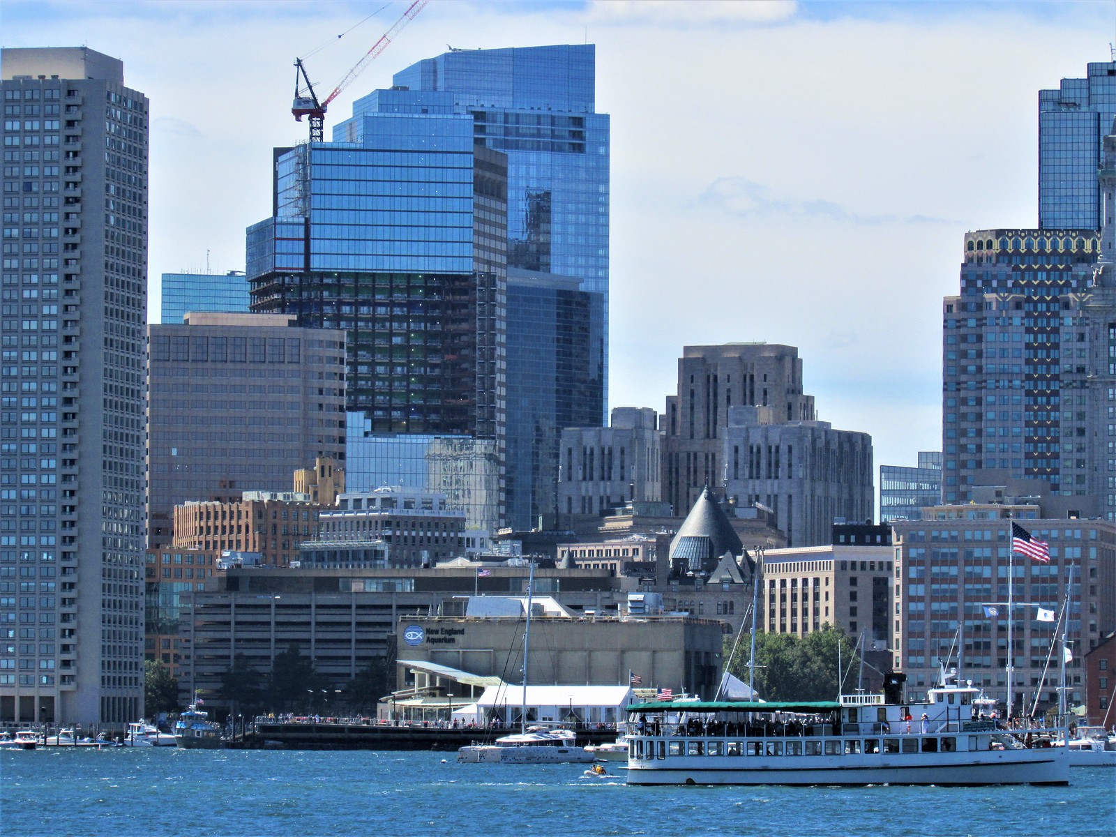
^^^I thought the old facade was pretty awful, but overall this feels like a lateral move at best. Sure the glass is nicer than the 80's beige garbage, but we already have enough blue glass and it's starting to feel like a tipping point in the wrong direction. However, the biggest loss is the cantilevers and general proportions. They're fattening this thing up and the cantilevers were the only standout feature to begin with. The glass wall on Oliver St feels criminal. Overall I didn't expect to be happy with this renovation, and so far I'm not.
You are using an out of date browser. It may not display this or other websites correctly.
You should upgrade or use an alternative browser.
You should upgrade or use an alternative browser.
One Post Office Square Makeover and Expansion | Financial District
- Thread starter JumboBuc
- Start date
citydweller
Active Member
- Joined
- Aug 23, 2019
- Messages
- 479
- Reaction score
- 752
Nice pic @JohnCostello
I've warmed up to the remake. I wish they incorporated more accents to the façade. I did like that red accent on one corner of the building but its hardly noticable.
I've warmed up to the remake. I wish they incorporated more accents to the façade. I did like that red accent on one corner of the building but its hardly noticable.
SlothofDespond
Active Member
- Joined
- Sep 29, 2014
- Messages
- 248
- Reaction score
- 133
It's a huge improvement. It's funny reading the first few pages of this thread. You would think the original facade was in some way not a giant POS.
It's a huge improvement. It's funny reading the first few pages of this thread. You would think the original facade was in some way not a giant POS.
It's not just facade vs facade though. The newer version buffs out the cantilevers (which are surprisingly iconic in many skyline views) and puts that brutally oppressive glass wall addition on Oliver.
SlothofDespond
Active Member
- Joined
- Sep 29, 2014
- Messages
- 248
- Reaction score
- 133
Oh, I forgot about the awful cantilevers. Another huge improvement buffing those out.
Smuttynose
Active Member
- Joined
- May 26, 2006
- Messages
- 741
- Reaction score
- 4,166
9-3-2022

- Joined
- May 25, 2006
- Messages
- 7,062
- Reaction score
- 1,976
Im sorry, aren't you supposed to drop the "r", not the "a"?
JeffDowntown
Senior Member
- Joined
- May 28, 2007
- Messages
- 5,006
- Reaction score
- 4,128
Is anyone placing bets on whether the panels line up when they meet in the middle? There do appear to be two different grids in play.
TomOfBoston
Senior Member
- Joined
- Mar 29, 2007
- Messages
- 1,268
- Reaction score
- 507
Am I the only one who prefers it the way it was?
nope!Am I the only one who prefers it the way it was?
Am I the only one who prefers it the way it was?
I'm with you. This encroaching glassified, detail-free anonymization is horrible and is tragically homogenizing the skyline of Boston.
Nibbles O’Plenty
Active Member
- Joined
- Aug 24, 2020
- Messages
- 213
- Reaction score
- 738
We are getting far too many glass boxes lately. I always liked the original design.
People complain about the gray precast boxes, people complain about the glass boxes. Can't make everyone happy.
"Gray precast boxes" are lousy too, but at least they have windows and you can visually delineate the stories on the buildings. There is still some detail that tell you the viewer people work here and there are separate stories, etc.
These glass shields are Ken Dolls.

 IMG_3660
 IMG_3664
 IMG_3705
 IMG_3729
 IMG_3763
 IMG_3787
 IMG_3788
 IMG_3789