Parcel 12 | 1001 Boylston Street | Back Bay

themissinglink

Active Member
Joined
Jan 13, 2018
Messages
420
Reaction score
1,187
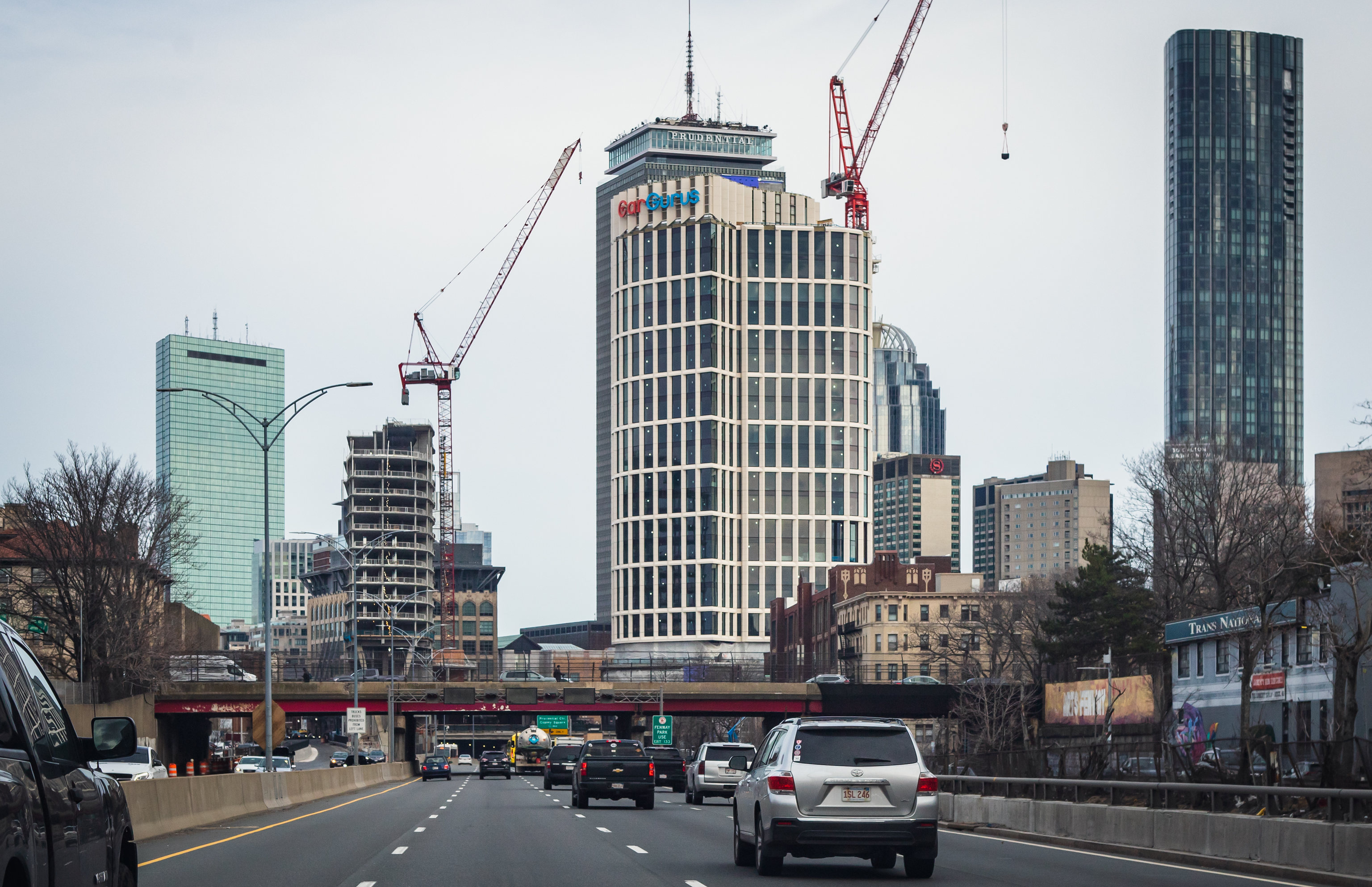
The cargurus logo actually adds a little spice to the crown. On an all white tower the splash of color is nice imo.
Agreed, I was concerned that the logo would look tacky. I expected it to visually mar this outstanding development, but it complements it nicely.
 
Last edited:

shawn

Active Member
Joined
May 26, 2006
Messages
340
Reaction score
398
Everything about that marketing video at that site is weird. From the British narrator who talks very generically about 'making space' and never actually mentions the location of the 'space' (or even the word Boston for that matter), to the circa-1970 black and white graphics. It's like they found some stock narration voice and linked it with a decades-old video that they slightly augmented to include some Boston-specific labels and landmarks.
I've watched this thing three times in a row right now, I can't stop. I'm also baffled at the (pretty sure it's an) Aussie accent never mentioning Boston once, and I too am suspicious this is a mostly recycled assets. The wipe at about 23 seconds looks like it was spliced in. The "a place that unites two thriving districts in the center of our city" beat looks like a simplified Google Earth capture from 2016, which matches the date in the page's footer. I'm guessing this was made really early from cobbled together stock assets and the Google Earth API - hence no real renderings and just a placeholder white block. It's strange that a more polished version hasn't been released.
 

Smuttynose

Active Member
Joined
May 26, 2006
Messages
432
Reaction score
1,333
I've watched this thing three times in a row right now, I can't stop. I'm also baffled at the (pretty sure it's an) Aussie accent never mentioning Boston once, and I too am suspicious this is a mostly recycled assets. The wipe at about 23 seconds looks like it was spliced in. The "a place that unites two thriving districts in the center of our city" beat looks like a simplified Google Earth capture from 2016, which matches the date in the page's footer. I'm guessing this was made really early from cobbled together stock assets and the Google Earth API - hence no real renderings and just a placeholder white block. It's strange that a more polished version hasn't been released.
I can't figure out if it's secretly trendy and I'm not getting it - it does evoke a 'Severance' type theme - or if they just had a $75 budget for the video. You tend to lean toward the latter, but it doesn't make sense with all the money they are pouring into the development.
 

gac108

Active Member
Joined
Jul 22, 2020
Messages
204
Reaction score
392
Love that streetwall ^ that didn't exist not long ago! (even if I do miss the cheesiness that was the Machine)
 

bbfen

Senior Member
Joined
Aug 29, 2006
Messages
1,077
Reaction score
58
They’ve started to jump down the crane (hence its strange position in that pic). Expected to be complete Sunday. This site is just barreling along.
 

Camberville

New member
Joined
May 20, 2013
Messages
39
Reaction score
109
I don't care one way or the other about the inclusion of the logo, but every image I've ever seen of it, it's really hard to make out exactly what it says. Maybe it's something about the way the panels on the mechanical screen are arranged behind it, but the best I make out upon a quick glance (assuming I don't know what it says) is "GarGerus." Oh well, not my problem.

That said, I'm really loving the smaller tower so far. I can't wait to see this whole development up close!
 

cburns

Active Member
Joined
Oct 3, 2013
Messages
190
Reaction score
204
I know Alkami has their logo consisting of orange text in Kendall, but for this generation of towers I think this is the first significant building without a white logo. I wonder if it wouldn't look as plastic/ inexpensive if white?
 

393b40

Senior Member
Joined
Sep 19, 2012
Messages
2,198
Reaction score
1,297
I know Alkami has their logo consisting of orange text in Kendall, but for this generation of towers I think this is the first significant building without a white logo. I wonder if it wouldn't look as plastic/ inexpensive if white?
I think it would be impossible to read if it was white.

@Camberville is totally right that the mech screen behind this is really not helping. I think they needed to put a backboard behind the logo to make this work properly. It will probably work fine at night tho assuming its lit up.
 
  • Like
Reactions: W-4

Smuttynose

Active Member
Joined
May 26, 2006
Messages
432
Reaction score
1,333
I love big logos on buildings: it is exciting to see that we have some great & growing companies populating our downtown.
In general, it doesn't bother me. But it's one of those things that can go off the rails pretty quickly if not properly regulated. Some companies will plaster their logo over every blank surface. The Salesforce issue in Chicago is a bit cautionary --


(Twitter)
Salesforce Sign Atop New Downtown Tower Was Way Too Bright For Neighbors, So Alderman Has It Dimmed
https://blockclubchicago.org/2023/0...ight-for-neighbors-so-alderman-has-it-dimmed/
 

Patrick Winn

Active Member
Joined
Aug 19, 2020
Messages
187
Reaction score
351
In general, it doesn't bother me. But it's one of those things that can go off the rails pretty quickly if not properly regulated. Some companies will plaster their logo over every blank surface. The Salesforce issue in Chicago is a bit cautionary --


(Twitter)
Salesforce Sign Atop New Downtown Tower Was Way Too Bright For Neighbors, So Alderman Has It Dimmed
https://blockclubchicago.org/2023/0...ight-for-neighbors-so-alderman-has-it-dimmed/
I'm not sympathetic to this issue. I have a 10 million watt parking floodlight right outside my bedroom window and I solved the problem with blackout curtains. Why live in the city if you don't want lights.
 

king_vibe

Active Member
Joined
Jun 27, 2019
Messages
479
Reaction score
1,231
I'm not sympathetic to this issue. I have a 10 million watt parking floodlight right outside my bedroom window and I solved the problem with blackout curtains. Why live in the city if you don't want lights.
I will say the same thing whenever this comes up. Wanting to limit ostentatious outdoor light displays is not an anti-urban NIMBY thing. Needlessly bright outdoor lights on tall buildings kill migrating bird and insect populations. All around the country, municipalities are working to decrease - not increase - light pollution, even from skyscrapers in big cities.

In the specific case of Parcel 12, I don’t think we need to blind drivers on the Pike, especially not to advertise for a website that nobody has ever used.
 
Last edited:

Patrick Winn

Active Member
Joined
Aug 19, 2020
Messages
187
Reaction score
351
I will say the same thing whenever this comes up. Wanting to limit ostentatious outdoor light displays is not an anti-urban NIMBY thing. Needlessly bright outdoor lights on tall buildings kill migrating bird and insect populations. All around the country, municipalities are working to decrease - not increase - light pollution, even from skyscrapers in big cities.

In the specific case of Parcel 12, I don’t think we need to blind drivers on the Pike, especially not to advertise for a website that nobody has ever used.
“Ostentatious” and “needless” are totally subjective. The idea that LEDs will “blind“ drivers is absurd. As to birds and insects, I really don’t care.
 

chrisbrat

Senior Member
Joined
Aug 12, 2015
Messages
1,647
Reaction score
2,282
Your take on light pollution has been well documented and noted. I like birds, too. This whole "people who think as I do have 'more power'" thing is... off-putting, at best.
 

king_vibe

Active Member
Joined
Jun 27, 2019
Messages
479
Reaction score
1,231
Your take on light pollution has been well documented and noted. I like birds, too. This whole "people who think as I do have 'more power'" thing is... off-putting, at best.
I think the off-putting thing is actually the idea of committing willful ecocide so that the internet’s 38th most trusted car website can have an illuminated sign on a skyscraper they don’t own to concord with a child’s vision what a city should look like.
 

king_vibe

Active Member
Joined
Jun 27, 2019
Messages
479
Reaction score
1,231
“Ostentatious” and “needless” are totally subjective. The idea that LEDs will “blind“ drivers is absurd. As to birds and insects, I really don’t care.
You are also completely wrong on your notion of subjectivity. If being “ostentatious” is to “flaunt wealth or status” it doesn’t get more objectively ostentatious than putting your logo on the side of a skyscraper. Not exactly understated. Also, it is the very definition of “needless” to hang a sign on the side of tall building because the building literally does not need it.
 

DZH22

Superstar
Joined
Nov 13, 2006
Messages
10,895
Reaction score
25,369
I don't care much one way or the other for the lighting debate, but will agree that the sign on Salesforce here absolutely looks too bright. The old buildings to the left and right side of the shot have the sweet-spot lighting that I would like to see more of, whereas the Salesforce one was ostentatious and needed to be dimmed.
 

Top