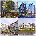
Parcel 5

I think Id probably have to say this one looks the best out of the choices. I would be happy to have this in my own neighborhood.

75412527007-cabot-cabot-forbes-wickenden-and-water-parcel-5-1-3-x.jpg


Theres only one angle to go off of here but I think they did a real good job breaking up the massing, the proportions look good, they used quality materials, and ground level looks like it could have plenty of activation. The black floor plates are also always a wonderful touch. The different ways in which the balconies on the top floor are arranged also give the illusion of differing roof heights which further breaks up the massing of this otherwise very wide building. Overall well done.
 
Last edited:
I like that proposal a lot too. It doesn't look like a landscraper, and I appreciate what they've done at street level. The terraces are pretty neat too.
 
I think Id probably have to say this one looks the best out of the choices. I would be happy to have this in my own neighborhood.

75412527007-cabot-cabot-forbes-wickenden-and-water-parcel-5-1-3-x.jpg


Theres only one angle to go off of here but I think they did a real good job breaking up the massing, the proportions look good, they used quality materials, and ground level looks like it could have plenty of activation. The black floor plates are also always a wonderful touch. The different ways in which the balconies on the top floor are arranged also give the illusion of differing roof heights which further breaks up the massing of this otherwise very wide building. Overall well done.
This is a really nice design and goes well in the area. my only question is, does it look to close to what they already chose for parcel 2, right next store? Maybe something a little different so it doesnt look like one massive compound? IDK.


Four Finalists Selected for Parcel 5.

The Commission selected four developers as finalists for the development of parcel 5. The finalists (proposals are linked) are EQT Exeter, Transom Real Estate, Design Center Partners, and BlueDog Capital Partners. The Commission will hear consultant presentations analyzing the finalist proposals and more detailed presentations from the finalists at a future Commission meeting.
 

Attachments

  • unnamed (1).jpg
    unnamed (1).jpg
    1.3 MB · Views: 81
I think the Design Center Partners and Transom proposals are my favorites out of that bunch. Design Center Partners is fairly unique. Looks almost like something you'd see in a newer development in Amsterdam. It would be a good gateway for people coming off of 195 or walking from Wickendon/Fox Point to the river.

Transom is a bit more generic from an architectural standpoint, but the street level looks good, the massing is broken up a bit, and there is retail in the right places. It would help establish something of a sense of place on the corners of Wickenden and both S. Water and S. Main.

I really don't love Blue Dog's proposal. It looks pretty office parky, and I think the S. Main facade would look better along S. Water (stepping up as you go away from the water, rather than vice versa). I think the "passthrough" is a nice thought, but I doubt it'd be well utilized at that angle and in that location since it really doesn't provide much of an advantage to pedestrians cutting between Wickenden and the ped. bridge.

Exeter's might be my least favorite. It's pretty generic architecturally, and the "plaza" on the corner of Wickenden and S. Water is so unnecessary with the park directly across the street. Nobody is going to want to "gather" on that spot with cars buzzing by on 2 sides when they can walk several steps and have a much nicer view with a more pleasant setting. Maybe some patio seating for a restaurant would work here, but I still think the corner would be better served with sidewalk fronting retail rather than the useless plaza.
 
Couldn’t agree more, the Design Center Partners proposal is my favorite. Unique and pleasing design paired with an interior pedestrian street. Very cool!
 
DCP's proposal has grown on my over time. Its unique and differentiates itself from what has been approved on the next parcel (2). The Transom proposal would look attractive, esp. from a distance. kind of reminds me of "the Smile" in NYC by BIG (maybe my fav arc firm).

Exeter is nice but IMO too close in design to what is approved for parcel two. I don't think you have to diverge too much, but that's a long two blocks to look similar.

I like the idea of most of Blue Dog's, but I don't think its a great fit for the area, looks more appropriate in the capital district, maybe in one of the lots near the citizens bank budling. but any of these four aren't terrible.

This parcel is probably the Commissions best work to date outside of the pedestrian bridge. More innovative architecture in the innovation district please.

Side note, some retail like a CVS etc. might be a necessity in one of these developments. there is grocery already (TJ), it would be nice to see residents in the are have a place they can fulfill their needs without needing a car to go elsewhere.

Thanks for the update!

The Smile:
1731564547553.png
 
Last edited:
I dont understand why “bold” has become the single most important design consideration for architects these days. Theres a lot of things I can think of that should come before bold on the list of things that are most important for a building imo.
 
I dont understand why “bold” has become the single most important design consideration for architects these days. Theres a lot of things I can think of that should come before bold on the list of things that are most important for a building imo.
they're sabotaging us lol, this way communities can more easily say 'project X doesn't fit in', 'it changes the local character too much'

/s
 

Back
Top