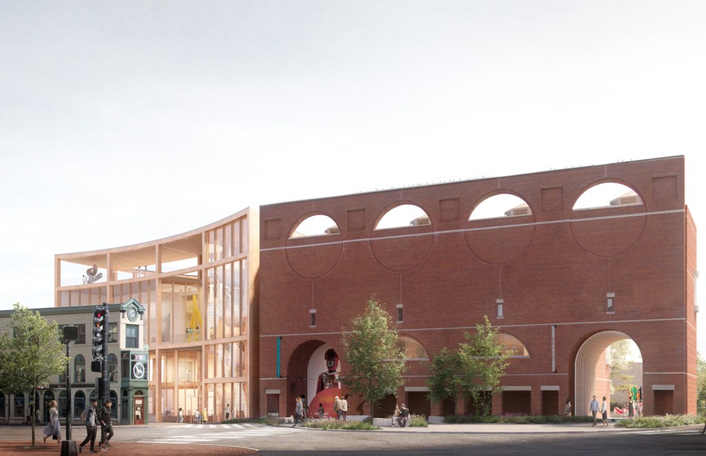
The concept also showed that the event space spills out into a courtyard on High St for indoor/outdoor events.Oh, and Lever should have done some research into the air temperatures for Portland, the East Coast one. Who wants to go outside on a roof, six stories up, in Portland, Maine from mid-November to mid-April? If so, it will be a fast one. Hope it has tall glass sides. Wicked cold. (Put a clear plastic bubble on top.)
You are using an out of date browser. It may not display this or other websites correctly.
You should upgrade or use an alternative browser.
You should upgrade or use an alternative browser.
Portland Museum of Art Expansion | Portland
- Thread starter Portlander
- Start date
Actually the new cut through of the facade brings better balance to the original structure and is a better transition from the side of the museum to the front.This design is "sawing" through the brilliant Henry Cobb facade design from I.M. Pei Architects, one of the most hallowed arch firms in the world (or was). Pei designed the 60 story Hancock Tower in Boston. The PMA facade was on the cover of Architectural Record back in the early 80s! That's impressive. I don't remember seeing this idea, this cutting a hole into the existing building. I guess I missed it. I also think that their tribute to the native peoples of Maine was significant in the decision (not architecture, but politics). The Mori design could have been revised to reduce the "saw tooth" roof, if most or many hated that. And the Mori design had more dynamic use of the interior spaces, in my opinion. But at least something gets built. Oh, and it looks like it removes the fancy front doors that were just installed. Those were quite pricey.
View attachment 32719
TC_zoid
Senior Member
- Joined
- Apr 16, 2014
- Messages
- 1,481
- Reaction score
- 2,300
Yes, but the higher rooftop space is the more dynamic one because of the views. The museum already does events on the outdoor space in the back of the main building now, next to High Street, and even one this past fall on the old YWCA lot across from the Holiday Inn. But these are not dynamic enough spaces. A higher rooftop space with sweeping views of the city and harbor is far more visual and fun. And patrons aren't going up there simply for the view and an outdoor sculpture. That gets old fast. Today's consumer desires food and drink options while they watch sports or look at art or a city/harbor view. They need to fix this design aspect with the Lever design. A high rooftop outdoor space is not a de facto functional space in Maine, or for six months of the year. Enclose it. Cold is cold. But I'm guessing they will figure something out. And Portland, Oregon, their primary design office, is north of Portland, Maine. Ironic, huh? They don't know snow and cold like we know snow and cold.The concept also showed that the event space spills out into a courtyard on High St for indoor/outdoor events.
TC_zoid
Senior Member
- Joined
- Apr 16, 2014
- Messages
- 1,481
- Reaction score
- 2,300
The hole is too big. Reduce it. I'd go with 70-75% of what they've done.Actually the new cut through of the facade brings better balance to the original structure and is a better transition from the side of the museum to the front.
Last edited:
lunardinosaur
New member
- Joined
- Oct 10, 2022
- Messages
- 89
- Reaction score
- 283
It wasn't my first pick, but I liked this design second best so I'm still quite excited for it. It'll be a huge upgrade. I'm all about the punch-out in the existing building, too. It will make moving around the side of the building a much better experience, the current sidewalk there is quite small and too close to the traffic.
TC_zoid
Senior Member
- Joined
- Apr 16, 2014
- Messages
- 1,481
- Reaction score
- 2,300
Agreed. An example of good architecture by a leading international firm and they are blasting a giant hole through it!I still haven't made time to look at the presentation videos, but I do find it ironic (or at least an interesting historical throwback) that we're talking about holes in the Cobb facade).
Last edited:
TC_zoid
Senior Member
- Joined
- Apr 16, 2014
- Messages
- 1,481
- Reaction score
- 2,300
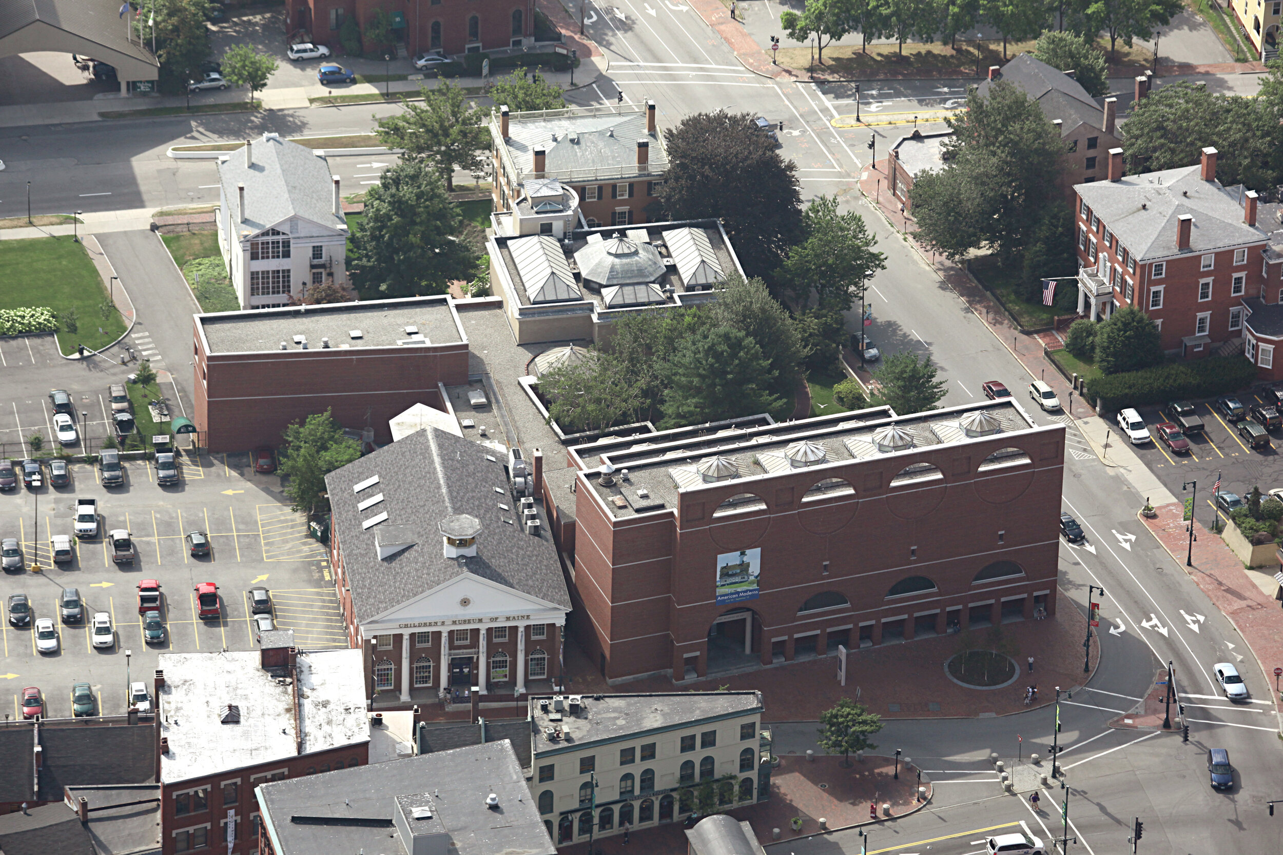
The existing museum designed by Henry Cobb is beautiful. Look at it from this photo perspective. The extensive Architectural Record article published soon after the Cobb design opened (THE publication for architecture in the U.S.) noted and praised the clerestory design on the roof along with the facade integration to its surroundings. The proposed alteration will compromise the facade AND wipe out gallery spaces on the first and second floors with the massive entry hole. Why? To create ingress for an entrance to the High Street side, in which cars race past at up to 50mph when there is a green light. If they made the entrance on the Free Street side, to the left of the Cobb building, there would be more room for special events (and thus saving existing space and the arch integrity of the facade). And, on First Friday they could close Free Street after business hours for outdoor events in the summer. The Lever design is good but could be better with alterations of which they will have to do. All great architecture is done this way up until soon before the build starts. Lever builds nice boxes (the Addidas addition and the college art museum referenced in the Maine Biz article). But that is not a bad thing, a box, but it's really about the inside that counts most (especially in the colder months). But perhaps this "hole" is an intentional metaphor. Read Cobb's background on his Wikipedia page and you will understand. But I don't think compromising a wonderful building justifies it.

Last edited:
Yeah, the proposed cut-through of the Cobb building is definitely clunky, and I'm not sure what the point is.
If you want to draw people in from Congress Square to the sculpture courtyard, a more productive and less destructive approach would be to improve the High Street sidewalk, instead of trying to make this quasi-private alleyway.
It's also sacrificing a lot of interior floor space for the museum's galleries (what's going to happen with that weird leftover space between the arch and High Street?), and I don't think that the historic preservation board is going to love it, either.
Honestly the original design is seriously lacking in any real originality. Just because it came out of a well known firm does NOT necessarily make it quality design.Agreed. An example of good architecture by a leading international firm and they are blasting a giant hole through it!
I'm excited for the expansion and the design chosen. We have a family pass for the museum as it's nice to have a nearby indoor space to utilize on the wintry or rainy days, so this will add more space to enjoy. I respect the grandeur of the Charles Shipman Payson Building but also at the same time it is a big blank wall on Congress Square (not super inviting or inclusive feeling) so am not entirely opposed to cutting a whole through it. As suggested above, I'd also love to see the sidewalk on High Street revamped and such.
PS - the current photographic exhibit comprised of the collection of Judy Glickman Lauder is worth a visit by itself.
PS - the current photographic exhibit comprised of the collection of Judy Glickman Lauder is worth a visit by itself.
lunardinosaur
New member
- Joined
- Oct 10, 2022
- Messages
- 89
- Reaction score
- 283
It's also sacrificing a lot of interior floor space for the museum's galleries (what's going to happen with that weird leftover space between the arch and High Street?)
There is a door there currently, perhaps they could install a glass pane on the inside of the tunnel wall, and use that space as a display window of sorts?
TC_zoid
Senior Member
- Joined
- Apr 16, 2014
- Messages
- 1,481
- Reaction score
- 2,300
The recent front plaza expansion and tree removal (if they do the latter) would fix this. Yes, agree on the Judy Glickman photos. Fantastic.I'm excited for the expansion and the design chosen. We have a family pass for the museum as it's nice to have a nearby indoor space to utilize on the wintry or rainy days, so this will add more space to enjoy. I respect the grandeur of the Charles Shipman Payson Building but also at the same time it is a big blank wall on Congress Square (not super inviting or inclusive feeling) so am not entirely opposed to cutting a whole through it. As suggested above, I'd also love to see the sidewalk on High Street revamped and such.
PS - the current photographic exhibit comprised of the collection of Judy Glickman Lauder is worth a visit by itself.
Last edited:
Dr. StrangeHat
Active Member
- Joined
- Sep 13, 2012
- Messages
- 847
- Reaction score
- 1,017
TC_zoid comin' in hot with the PPH Letter to the Editor:

 www.pressherald.com

Letter to the editor: Proposed Portland Museum addition compromises existing design’s integrity
Creating an entrance on the High Street side of the building will ‘wipe out gallery spaces on the first and second floors with a massive entry hole,’ a reader says.
TC_zoid
Senior Member
- Joined
- Apr 16, 2014
- Messages
- 1,481
- Reaction score
- 2,300
Thanks. No one seemed to get my comment, or maybe they didn't read it, "Good job on that with the metaphorical hole" allusion, of which was the canceling (or blasting through) of the Boston Brahmin architect (lol). And in the editorial, they seemed more focused on my "up to 50mph" description of High Street traffic (of course, it's exaggerated--40mph tops is more like it, except for maybe down the hill). Most had curt opinions, and no one mentioned the highly prestigious Architectural Record review (made the cover too, from 1982, I believe), of which was stellar in numerous ways. That's almost like winning an Oscar and still, everyone says the movie sucks while not having seen it! I still have the issue, or somewhere in the attic. What a fiery group they are. I certainly would never go back and forth with them. They would simply go nuts.TC_zoid comin' in hot with the PPH Letter to the Editor:

Letter to the editor: Proposed Portland Museum addition compromises existing design’s integrity
Creating an entrance on the High Street side of the building will ‘wipe out gallery spaces on the first and second floors with a massive entry hole,’ a reader says.www.pressherald.com
Last edited:
Dr. StrangeHat
Active Member
- Joined
- Sep 13, 2012
- Messages
- 847
- Reaction score
- 1,017
Thanks. No one seemed to get my comment, or maybe they didn't read it, "Good job on that with the metaphorical hole" allusion, of which was the canceling (or blasting through) of the Boston Brahmin architect (lol). And in the editorial, they seemed more focused on my "up to 50mph" description of High Street traffic (of course, it's exaggerated--40mph tops is more like it, except for maybe down the hill).
People tend to have a strong emotional reaction to hyperbole.
In a recent opinion piece for the PPH, Sarah Hansen, the executive director for Greater Portland Landmarks says:
It seems plausible GPL could oppose the demolition of the Children's Museum building - although it seems like her only points are that the structure is almost 200 years old and has an "association" with John Calvin Stevens.
This piece spawned at least one more letter: Letter to the editor: Back to the drawing board, PMA
All of the campus buildings – including the Payson building (1983) – are contributing structures both to Portland’s local Congress Street Historic District and the Spring Street National Register District.
It seems plausible GPL could oppose the demolition of the Children's Museum building - although it seems like her only points are that the structure is almost 200 years old and has an "association" with John Calvin Stevens.
It does not, however, appear that the program gave significant weight to preservation considerations, including how the design should interface with existing buildings and the surrounding community.
Removing that context thus diminishes the Payson building, which is also proposed to be significantly modified with the introduction of an archway leading to a High Street courtyard. This design effectively re-orients the museum away from Congress Square. These changes would dramatically affect the museum’s interactions with a major intersection undergoing significant publicly funded upgrades. The redesigned courtyard itself has the potential to eliminate the beloved, heritage Copper Beech tree that presently graces that space.
This piece spawned at least one more letter: Letter to the editor: Back to the drawing board, PMA
NR2Portland
Active Member
- Joined
- May 18, 2022
- Messages
- 301
- Reaction score
- 852
Digging through the forum looking for updates  anything about the museum expansion? What a project this could be to add even more culture to Portland.
They have submitted an application to demolish the old children's museum.Digging through the forum looking for updatesanything about the museum expansion? What a project this could be to add even more culture to Portland.
