- Joined
- Jan 7, 2012
- Messages
- 14,172
- Reaction score
- 23,677
 IMG_1702 by Bos Beeline, on Flickr
 IMG_1705 by Bos Beeline, on Flickr
 IMG_1708 by Bos Beeline, on Flickr
 IMG_1710 by Bos Beeline, on Flickr
 IMG_1720 by Bos Beeline, on Flickr
 IMG_1702 by Bos Beeline, on Flickr
 IMG_1705 by Bos Beeline, on Flickr
 IMG_1708 by Bos Beeline, on Flickr
 IMG_1710 by Bos Beeline, on Flickr
 IMG_1720 by Bos Beeline, on Flickr
 IMG_3303 by Bos Beeline, on Flickr
 IMG_3304 by Bos Beeline, on Flickr
 IMG_3305 by Bos Beeline, on Flickr
 IMG_3306 by Bos Beeline, on Flickr
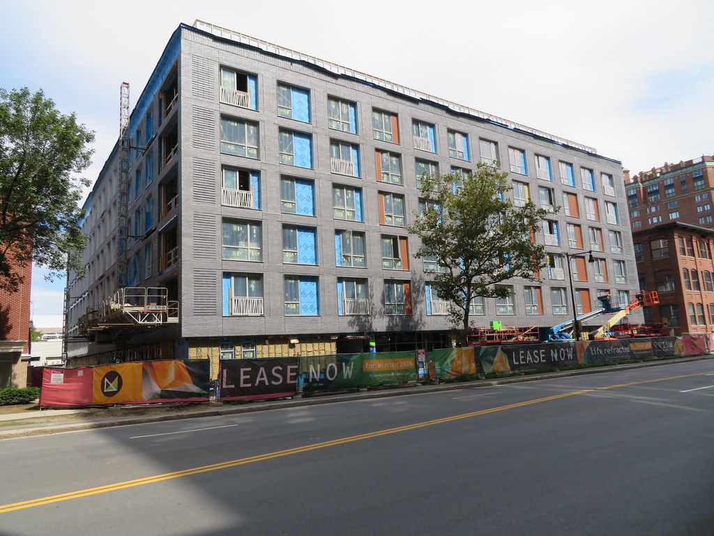
I really love the gray brick building
I don't know why we can just have consistent regular windows. Architects keep trying to make a "statement" by throwing in some asymmetry or random panels. It's really not necessary.
