You are using an out of date browser. It may not display this or other websites correctly.
You should upgrade or use an alternative browser.
You should upgrade or use an alternative browser.
Raffles Boston (40 Trinity Place) | 426 Stuart Street | Back Bay
- Thread starter stellarfun
- Start date
Suffolk 83
Senior Member
- Joined
- Nov 14, 2007
- Messages
- 3,021
- Reaction score
- 2,489
Appreciate it. I joined the site because I love tall buildings, but don't know a lot of the info I would like, so I basically have my opinion and the need for more knowledge about what's going on. If you have helpful tips for me, please feel free to advise.you're right, of course. it's entirely possible -- even for me -- to disagree in a more civil fashion. i'll make an effort to either be a little more polite in the future, or to just keep my opinions about someone else's post/feelings to myself. i apologize for being jerky.
bigpicture7
Senior Member
- Joined
- May 5, 2016
- Messages
- 4,043
- Reaction score
- 10,371
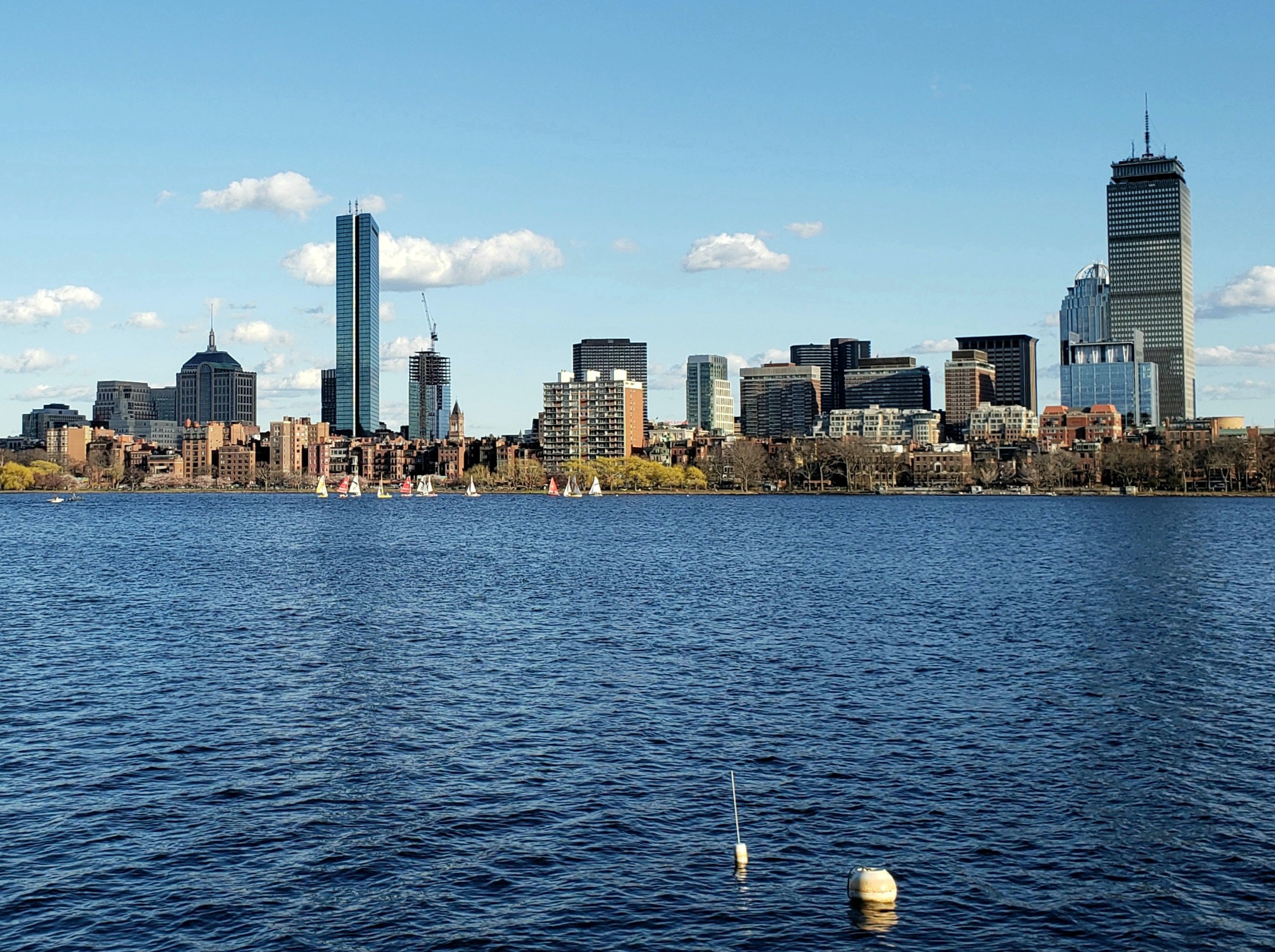
Today (4/12):

tocoto
Active Member
- Joined
- May 25, 2006
- Messages
- 386
- Reaction score
- 88
This is a nice looking building, nothing daring, certainingly not jarring. It does not match the color of the JHT nor does it clash with with the colors of surrounding buildings. The Boston area could use plenty more buildings with this level of architecture and materials quality.
I could be wrong, but this looks "topped out" to me.
They have to add the final steel around the roof for the mechanical crown but that little box on top might be as high as it gets. It just needs to outline the screen that will cover the mechanicals.
stick n move
Superstar
- Joined
- Oct 14, 2009
- Messages
- 13,361
- Reaction score
- 23,947
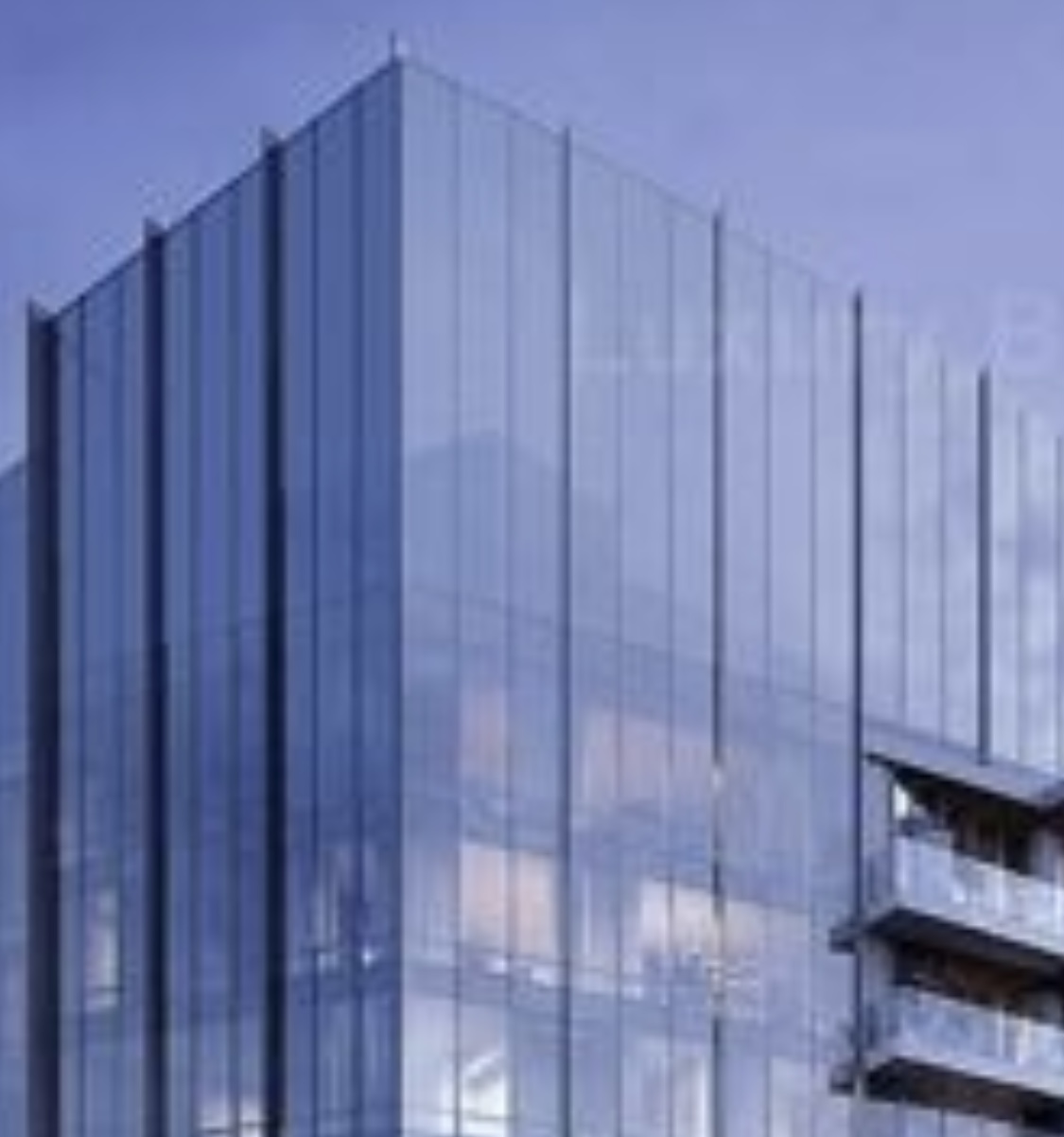
If you zoom in on the crown of that render it appears that you can see the little box inside there. Pretty crazy.

Wow, that is pretty incredible. Good on you for noticing, but also, who the heck rendered this thing? I mean, reflections are hard, but opacity (or levels thereof) is next level.If you zoom in on the crown of that render it appears that you can see the little box inside there. Pretty crazy.
View attachment 23412
The picture does seem to indicate that the mech screen will be a story (roughly) higher than the box on the western side. You can see the eastern side being even with the box. Nitpicking aside, the box is the highest thing "inside". Laughing while recalling the current discussion about Winthrop vs Millennium...can anybody tell me how tall this is? Is the box considered an "occupied floor"? Please no.
Last edited:
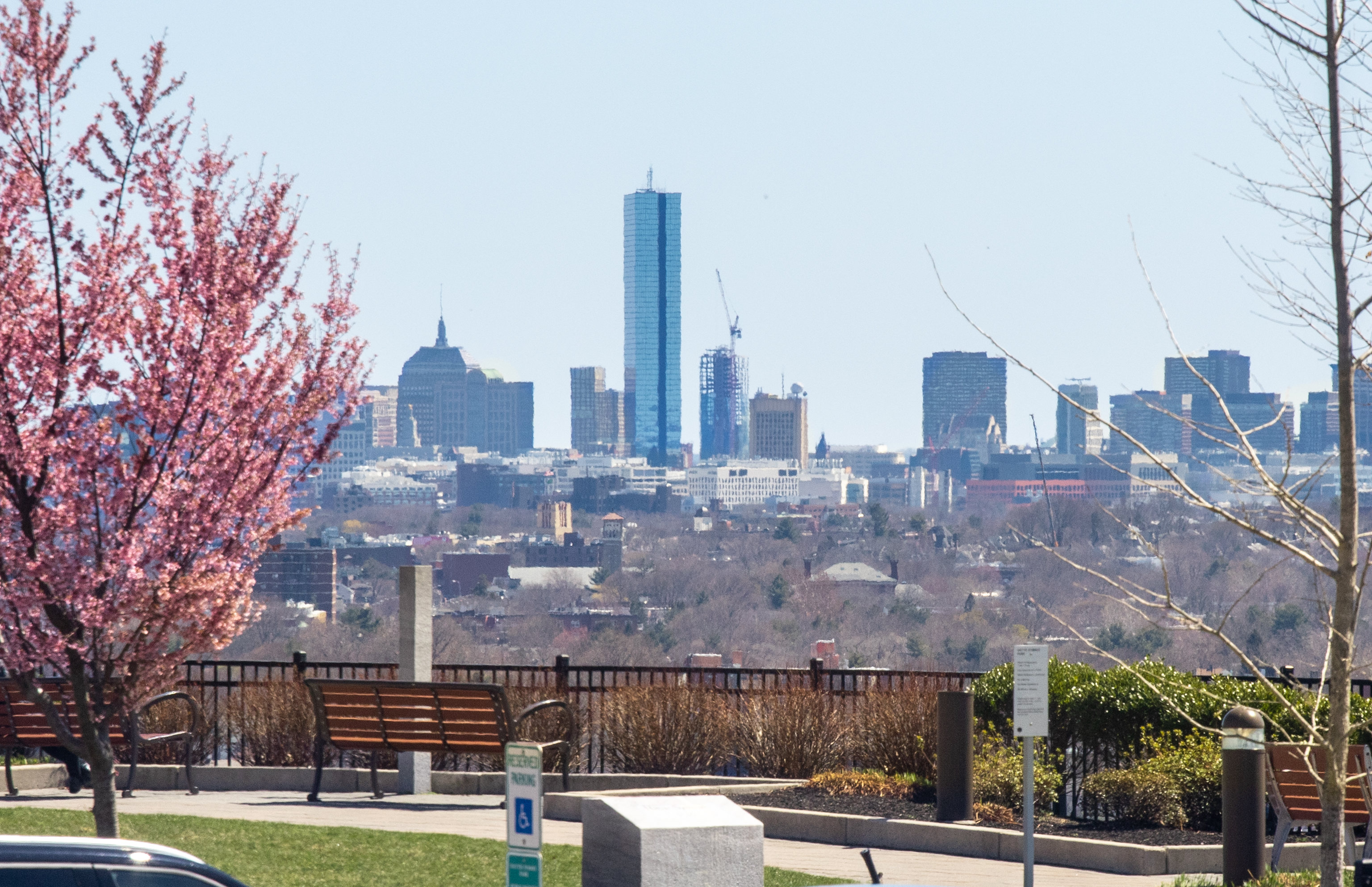
Does anyone know how much higher this is getting? I think I'm kind of in the minority and I should see it in person, but I just don't like this building. It looks like a stump next to the Hancock and why the blue glass to compete with the Hancock. I don't understand a lot of the thought process that goes into designing a lot of buildings in Boston.
HenryAlan
Senior Member
- Joined
- Dec 15, 2009
- Messages
- 4,446
- Reaction score
- 5,176
It looks better in person than the impression you get from the more distant taken pictures in this thread. Seen from a distance, and so close to the 200 Clarendon Hancock, it looks stumpy and out of place. But when you see it from street level in the surrounding neighborhood, it looks quite good, and more properly contextualized against the old Hancock and "The Clarendon" tetris style building, both of which are in the same height class.Does anyone know how much higher this is getting? I think I'm kind of in the minority and I should see it in person, but I just don't like this building. It looks like a stump next to the Hancock and why the blue glass to compete with the Hancock. I don't understand a lot of the thought process that goes into designing a lot of buildings in Boston.
Does anyone know how much higher this is getting? I think I'm kind of in the minority and I should see it in person, but I just don't like this building. It looks like a stump next to the Hancock and why the blue glass to compete with the Hancock. I don't understand a lot of the thought process that goes into designing a lot of buildings in Boston.
If you're saying that this should have been taller, I would agree. It would have been nice for this to be another 125-150 feet.


 IMG_0149
 IMG_0166
 IMG_0209
 IMG_0239
 IMG_0240
 IMG_0242