Ragon Institute | 624 Main Street | Kendall Square

Is there an AB award for "what looked like a drab 3-5 story lab building that should have been taller, but has amazing exterior cladding and is shaping up to be a stunner"?
 
Is there an AB award for "what looked like a drab 3-5 story lab building that should have been taller, but has amazing exterior cladding and is shaping up to be a stunner"?


Some of us argued early on, in the very first page of this thread, that this had all the markings of a unique stunner. I LOVE this building - - what an epic homerun, on so many levels.
 
Last edited:
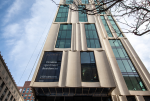
They are now buttoning up the corners of the facade (5/11):

rgi-33-9.jpg

rgi-33-8.jpg

rgi-33-7.jpg


The tapering gradient of the "V" mullions creates a sweeping effect on the curve:

rgi-33-6.jpg

rgi-33-5.jpg

rgi-33-4.jpg
 
Now THAT is the way to artfully space those white curved panels!!!!

Contrast Ragon's beautifully spaced and crafted method to the diabetic-pouring-five-packets-of-sugar-into-the-coffee Bay Village Tower/212 Stuart Street:

1689340484730.png
 

Attachments

  • 1689340332393.png
    1689340332393.png
    983.9 KB · Views: 53
Last edited:

It is worth taking a moment to click through that slideshow they have of the renders (some of which I believe are new relative to what's been posted here). This is just a really thoughtful design all around.

If nothing else, these folks should win an award solely for how gracefully they integrated all the lab mechanicals. It's absolutely incredible how well hidden the mechanicals are.
 
Now THAT is the way to artfully space those white curved panels!!!!

Contrast Ragon's beautifully spaced and crafted method to the diabetic-pouring-five-packets-of-sugar-into-the-coffee Bay Village Tower/212 Stuart Street:

View attachment 40234

In this case I think you're comparing good to great. There's no real reason to tear down one in order to prop up the other. My only lamentation with Ragon is that it feels like we wasted some of the best cladding in the metro on a barely visible land-scraper. Imagine this at like 850'? I think that would be a building worthy of eclipsing the Hancock. It would be so incredible that this whole forum would probably have a collective stroke.
 
Now THAT is the way to artfully space those white curved panels!!!!

Contrast Ragon's beautifully spaced and crafted method to the diabetic-pouring-five-packets-of-sugar-into-the-coffee Bay Village Tower/212 Stuart Street:

View attachment 40234

This building is beautiful and I will fight all dissenters.
212-stuart-street-residential-building-howeler-plus-yoon-architecture_3.jpg


Ragon is fine. It's a different approach - ubiquitous glass envelope with a subtly varying screen. Vs a residential/hotel program using units in a tower.
 
In this case I think you're comparing good to great. There's no real reason to tear down one in order to prop up the other. My only lamentation with Ragon is that it feels like we wasted some of the best cladding in the metro on a barely visible land-scraper. Imagine this at like 850'? I think that would be a building worthy of eclipsing the Hancock. It would be so incredible that this whole forum would probably have a collective stroke.

Please God, not with the height fetish again.........It's a LAB, not an office building or residential. And it is one of the greatest lab buildings I've ever seen - - not to mention the HUMAN street level aspect (as opposed to the coffee table photo book - 'Houston has wicked cool skyline') will liven up the streetscape.

But this is a LAB. I would agree with you if this was that REI hut next to the new Lechmere Station. But this is a LAB in Cambridge.
 
Shmessy, for what it's worth, and I could be wrong, but I did not read DZ's post as saying this specific lab building should be a tall tower. I read it as: wow, someone invested in some crazy good cladding, why can't that be the case for buildings whose facade is actually visible from more than just 60 feet away in each direction. I viewed it as a (deserved) dig at other buildings more than a dig at this building.

But I think there is another interesting set of lessons implicit from this building and other nearby success stories, given that greater Boston will inevitably have labs:
You CAN build labs that are tall-ish if needed (see: Broad annex in Kendall, Blackfan at Longwood), you CAN build labs with crazy good facades, and you CAN almost completely hide the mechanicals.

The swooping ramp-up of the roofline height to create mechanical penthouse volume on one side, and spending the $$$ to extend the facade all the way to the top of the mechanicals, is ingenious. You could do a roofline like that on other lab buildings. But I am sure it is hella expensive, and developers don't do it. But I don't think this is a for-lease lab building from a developer; I think this is an example of institutional development for the long haul - and hence we get a building people are spending money on.

So MY point is: hold lab developers accountable for quality architecture. It is possible.
 
Please God, not with the height fetish again.........It's a LAB, not an office building or residential. And it is one of the greatest lab buildings I've ever seen - - not to mention the HUMAN street level aspect (as opposed to the coffee table photo book - 'Houston has wicked cool skyline') will liven up the streetscape.

But this is a LAB. I would agree with you if this was that REI hut next to the new Lechmere Station. But this is a LAB in Cambridge.

Ok well then WHY WAS YOUR EARLIER POST DIRECTLY COMPARING A RESIDENTIAL TO A LAB?!?!?!

Also, if you want to talk about a lack of logic, you're the same person who constantly posts in the Globe that South Station Tower should have had a spire to accentuate its height better. Tell me, how does chopping the roof of a 677' that is already hitting the FAA limit and is flanked by a pair of 600' going to make it seem taller than what they are doing now? It would look like the same height as the Fed and 1 Financial, except with a stick on top (ie it would look like 1 Financial). How does that make any shred of sense whatsoever?

Also even if we're just focusing on labs, we can compare this brilliant one to the ghastly cladding on the 300' new Somerville tallest Edge lab and wish they were switched. How about that Blackfan is 350', Edge is 300', MXD is about to build a pair of 320', all LABS?

But again, it doesn't have to be a lab. We got 5 huge buildings this boom (counting south station tower) and they're all some shade of blue glass. Why couldn't awesome cladding like this be transferred onto a regular office building or even a super high-end residential?

I swear I'm the only person on the whole site who would get criticized for lamenting that a wonderfully clad building is barely visible.

Also (not you Shmessy) if somebody specific keeps publicly liking anti-DZH posts, then I am going to release the emails that person sent me and get them banned from this site. I consider that to be part of an ongoing harrassment and the next time will be their last.

I wasn't referring to the height of 212 Stuart Street at all. It's height is good for residential (and, I'm with you regarding residential, as with office - - the taller the better for those -although height isn't the only preoccupation for me. Style (yes, a spire for SST and a sibling spire for North Station would have been very neat city-transpo hub meaningful design markers) and human street level activation to make this a dynamic/living 24/7 city, is.

.....and I fully agree with you about the over-use of blue glass, but I won't beat that dead horse anymore.

And, yes, if a poster has been emailing you unsolicitedly - that's kinda weird. Discussion and debate with alternate opinions is HEALTHY, don't be afraid of it. However, getting personal, uninvited, on this kind of forum is not.
 
Last edited:
......So MY point is: hold lab developers accountable for quality architecture. It is possible.

100% agree. IMHO, Ragon is a superlative architecture. But opinions are just that. It's interesting to see the reactions of people to this building in this thread. Seems pretty clear how venerated it already is amongst most.

In this section of town, for this lab purpose, the first thing that comes to my mind (although I understand Odurandina/Tosh, DZ and some others may look at it differently) is not "Imagine this at 850 feet tall". But vive la difference.
 
Last edited:
Ok well then WHY WAS YOUR EARLIER POST DIRECTLY COMPARING A RESIDENTIAL TO A LAB?!?!?!

Also, if you want to talk about a lack of logic, you're the same person who constantly posts in the Globe that South Station Tower should have had a spire to accentuate its height better. Tell me, how does chopping the roof of a 677' that is already hitting the FAA limit and is flanked by a pair of 600' going to make it seem taller than what they are doing now? It would look like the same height as the Fed and 1 Financial, except with a stick on top (ie it would look like 1 Financial). How does that make any shred of sense whatsoever?

Also even if we're just focusing on labs, we can compare this brilliant one to the ghastly cladding on the 300' new Somerville tallest Edge lab and wish they were switched. How about that Blackfan is 350', Edge is 300', MXD is about to build a pair of 320', all LABS?

But again, it doesn't have to be a lab. We got 5 huge buildings this boom (counting south station tower) and they're all some shade of blue glass. Why couldn't awesome cladding like this be transferred onto a regular office building or even a super high-end residential?

I swear I'm the only person on the whole site who would get criticized for lamenting that a wonderfully clad building is barely visible.

Also (not you Shmessy) if somebody specific keeps publicly liking anti-DZH posts, then I am going to release the emails that person sent me and get them banned from this site. I consider that to be part of an ongoing harrassment and the next time will be their last.
What's actually wrong with you? You're not ok
 
There is no way a BL4 is going into Kendall Square. The NEIDL is an edge-case and I have not heard that additional BL4 capacity is needed now, and Ragon has used the BU/NEIDL facility for some of their more challenging projects. There are a surprising number of BL3s around the city (not all advertised) so wouldn't be surprised if there's one here again.
 

Back
Top