Residential / Executive Suites | 601 Newbury St | Fenway / Kenmore

JumboBuc

Senior Member
Joined
Jun 26, 2013
Messages
2,646
Reaction score
1,515
Eighty-five unit (36 apartment + 49 "executive suite") development proposed for 601 Newbury St, looking over the Pike just off of Brookline Ave behind Kenmore Square, where the old Art Institute of Boston building is now.

Another Khalsa Design Special; these are all over the place in Somerville but I can't recall another south of the Charles.

601newbury.jpg


Current Conditions (Google Maps)

Small Project Review (PDF)
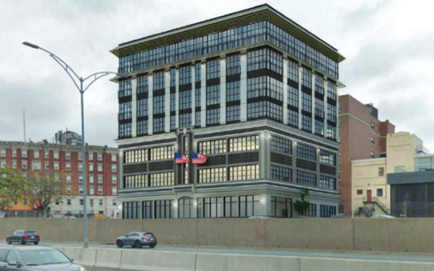
 
Given that they're starting with the bottom half, it's not a bad job. Does not come across in that drawing that the facade brick is actually red, so I wonder if they're changing it out...
 
Feels like it needs a slight set back for the new portion... dunno feels out of proportion the way it is right now.
 
BPDA should talk to the Somerville DRC. Almost every Khalsa design needs at least two or three revisions to fix the garish attempts at contextualism.
 
This is fine, it's not a very noticeable location, so just adding some density in a simple design form works. I'd like to see something more significant happen on the abutting triangular Santander Bank parcel that is currently a low rise plus surface lot.
 
? It's depressingly bad. Instead of a handsome background building it is calling way too much attention to itself with faux historic detailing on the addition. That giant cornice in particular looks lacking in detail. Vertical additions can be so good but this is just a typical Boston exercise in maxing out the floor plate with some added decoration.
 
I don't know what I'd do about this. If you strip the extras on this, it reads too much like a glass box addition. If you decrease or increase the height, the proportions become unnatural. Setbacks don't seem to help either. I think an iteration that may work would be to embrace the modernity and add some bolder horizontal elements rather than the vertical ones that have now. (Khalsa would never do that)
 
It kind of reminds me of this, although not quite as good. Can't remember the name of this building, or the original circumstances.
 
The shift from the masonry corner on the old, to the glass corner on the new, bothers me the most. It should continue the masonry corner up to the top.
 
It kind of reminds me of this, although not quite as good. Can't remember the name of this building, or the original circumstances.

That's a Frank Gehry project. Whole nother kettle of fish
 
With a building that's this small and ugly - why wouldn't they just take it down and keep the foundation and go up from there? Is that possible - and/or seriously more expensive to do?
 
With a building that's this small and ugly - why wouldn't they just take it down and keep the foundation and go up from there? Is that possible - and/or seriously more expensive to do?
I'm just guessing, but my first thought was that keeping the existing building is a regulatory play. This fits under "Small Project Review" since it's under 50k sf, but perhaps keeping the existing structure makes the path to approval easier by taking advantage of existing dimensions?
 
I'm just guessing, but my first thought was that keeping the existing building is a regulatory play. This fits under "Small Project Review" since it's under 50k sf, but perhaps keeping the existing structure makes the path to approval easier by taking advantage of existing dimensions?

And code for existing is typically easier to meet than new construction. They might have also been encouraged to keep the existing by the city.
 
^Boo. Go file your nails on something concrete and let the rest of us enjoy this.

Edit: Ah. I mistook you for “Beton Brut”, but I liked the clap back so I won’t delete the post. 😁
 
I don't understand how this stuff gets through the BPDA...I've gone through the process and I can't imagine how this kind of thing happens. It's the ugliest wedding cake I've seen in decades.
 
I don't understand how this stuff gets through the BPDA...I've gone through the process and I can't imagine how this kind of thing happens. It's the ugliest wedding cake I've seen in decades.

Because it's a "small project" ?
 

Back
Top